


News Posts In Category
Windows 8 UI strategic mistake, argues design guru - Computerworld
Text Tools for Mac OS X: Free At Last!

Some variation of these text tools have been included in CrystalClear Interface, as well as Crystal Black, since those applications were first released. However, the tools have nothing to do with the theming of buttons and windows, or with the general appearance of Mac OS X. I added them because they address a real need of mine, which no other software could do.
As a writer, I need ready access to a range of text functions, and I need them in whatever application in which I happen to be writing. In most of the rich text editors I use, those functions are available somewhere in the app’s menus, but typically they're in different places within each app. Some apps don’t include one or two key functions at all.
Mac OS X has a rich text framework that provides just the set of editing tools I require, and it would be extremely handy to be able to access those tools consistently across apps. This is precisely what the MarsThemes Text Tools do: Grant easy access to the key Cocoa text tools that writers and editors need but can’t find.
So, what text tools am I talking about? Here’s a list of the key tools:
- Tables. I often find formatting content into rows and columns an extremely useful way of organizing information, but few RTF applications seem to agree with me. Mac OS X includes a quite functional table-editing tool that I can quickly use when needed without opening a
 professional word processor such as Pages, or reaching for a spreadsheet app like Numbers.
 - Lists. From time immemorial, both humans and Martians have found organizing information as lists to be an essential tool for viewing and encapsulating that information. Again, finding the built-in list feature can be a problem, especially in apps that don’t let you access Mac OS X’s RTF “Ruler” tool (more on that momentarily).
- Links. In the internet age, writers often need to add hyperlinks to their documents, yet finding the built-in hyperlinking tool can be a challenge. The tool either isn’t there, it’s buried in a set of menus, or it’s somewhere that doesn’t make sense.
- The Ruler. If you’ve ever used a Mac OS X RTF editor such as TextEdit or Bean, or some kind of information management application like DevonThink Pro, EagleFiler, or Journler, you’re probably familiar with The Ruler (though didn’t know it had a name). The Ruler is the strip of tools that appears above whatever text document you’re working on. It contains a menu of handy (and customizable) text styles, alignment tools, a customizable menu for setting line and paragraph spacing, a menu for setting and customizing lists, and a group of tools for setting margins, tabs, and indentation. Sometimes The Ruler appears automatically, but other times you must hunt for access to it. Unfortunately, many applications feel the need to replicate these functions in some quirky unique way (such apps include Evernote and MacJournal). In my ideal editing environment, I want to summon The Ruler when needed, and dismiss it when it’s not.
- Strikethrough. Oddly, the only straightforward way of striking through text (a very useful thing to do!) is to open the Mac OS X Font panel, which has a menu that includes strikethrough and underlining functions.
- Copy and Paste text styles. Yes, there are standard keyboard shortcuts for these functions, but I find they don’t work in all applications, and I often forget what they are. Yet I use the functions frequently.
One of my favorite uses of the Text Tools is in applications or text fields that support rich text but provide no access to RTF editing tools. An obvious example of this is Apple’s Stickies application, which apparently assumes that users only want to type paragraphs with no formatting. Using the Text Tools, you can add The Ruler, a table, and all the rest.

Other note-taking apps I use heavily likewise provide no way to toggle The Ruler or add a table are Edgies and Sticky Notes. Both have some of the Text Tools accessible in their menus, but using their menus may be awkward. Since the MarsThemes Tools provide a contextual menu, the tools are always at your fingertips.
Other examples I like to point out are the Comments field in Xcode’s snapshots window and in the application Packages, the Notes field in Interface Builder, any text view you’re formatting in Interface Builder’s edit window, the image description field in Little Snapper, and various others. (For my developer colleagues, I should point out that using the tools in Interface Builder is especially nice, because it lets you enter attributed text without having to format it in an external RTF editor and then copying/pasting it into IB. Note also that I still use Xcode 3.2, so IB is a separate application.)
Then there are applications like Yojimbo, which should provide a way to format text, but don't. Here, the Text Tools let you add The Ruler, a table, etc.
As mentioned, the Text Tools are activated as a contextual menu — using either a right-click or a Ctrl-click — in the field or document you want to edit. The Tools also provide a keyboard shortcut — ^⌥ Y — to pop up the menu. The shortcut is particularly handy in fields  (such as those in Interface Builder) that usurp the field’s normal contextual menu.
The MarsThemes Text Tools have only two user options, which you can access from the “Manage tools” item in the Text Tools menu, or from the “Text Tools” item in the application’s menu. The two options are:
- Show more text tools
- Show Manage Tools menu at top.
 Selecting the first option adds the following tools to the menu:
- Styles (used for adding a custom style to your personal list)
- A “More Tools” menu, which includes the Capitalize functions, which normally appear in a submenu, as well as access to two handy formatting tools to control inter-letter spacing and baseline setting.
- Access to the Substitutions setting panel.
- A link to open the very handy Special Characters panel.
 By default, the Manage Tools menu appears at the bottom of the Text Tools menu, but you can change that.
The Manage Tools menu also includes functions for checking updates, uninstalling, and getting help.
Finally, the Text Tools application is programmed so that it only loads into software that it detects has some kind of editing functionality. There’s no use loading the Text Tools into System Preferences or the Finder, for example. This keeps its overall footprint on your Mac as small as possible.
Text Tools is freeware, so give it a try! Hope you enjoy it as much as I do.
The software will be added as a premanent item on the MarsThemes website, under Software. You can download it here.
The Text Tools run as a plugin to the Mars Theme Loader (MTL) framework. If you do not have MTL installed, the Text Tools installer will do that for you. If you uninstall the Text Tools, the uninstaller will disable the MTL agent at that time.
There are very few components to the Mars Text Tools:
- The plugin (TTFilter.bundle) located at /Library/Application Support/MarsThemes/plugins, and
- A folder containing this document (as a PDF file) and the Uninstall program. That folder is at /Library/Application Support/MarsThemes/TextTools
To uninstall the Text Tools, open an application where they're active, open the Text Tools menu (easiest way is from the Application's main menu) and select "Uninstall Text Tools." If you have trouble finding an application that's running the Tools, open the folder referenced above and run the UninstallTextTools application.
“Just Say No To Flash”
Join The Campaign! Add A Banner To Your Website
 In the past few years, Adobe Flash has become more than an annoyance that some of us have kept in check by using "block Flash" plugins for our web browsers. More and more, entire web sites are being built with Flash, and they have no HTML alternative at all! This goes way beyond annoying, into the realm of crippling.
I had noticed the trend building for quite awhile, but it only really hit home when I realized that Google, of all companies, had redesigned its formerly accessible Analytics site to rely heavily on Flash for displaying content. This wouldn't be absolutely horrible except for the fact that Google provides no HTML alternative. I tried to needle the company through its Analytics forums, but only received assurance that yes, indeed, one must have the Flash plugin running to view the site.
Keep in mind that content like that on Google Analytics is not mere marketing information, like the sales pitch on the Analytics home page.
Those of us who are disturbed by the trend need to be a bit more vocal about our opinion. Hence, I'm starting a "Just Say No To Flash!" campaign, with its own web page, graphics for a banner, and the CSS and HTML code to deploy it on your own web pages.
I've mentioned this to some of my family and friends, and they often come back with: "So, Why should I say no to Flash?" I admit that as a power browser and a programmer geek type who, shall we say, makes more efficient use of the web, I'm more keenly aware of the ways that Flash is chipping away at the foundation of web content.
In the beginning, it seemed harmless: Flash was an alternative to animated GIFs, and an easy way to embed movies on web pages. But then advertisers wrapped their meaty mitts around it, and that's when Flash started to be annoying. However, one could block Flash in the browser, as part of a strategy of shutting out obnoxious advertising.
But publishing content via Flash is just wrong, for a number of reasons.
➠It's A Proprietary Technology
I don't think Flash is what Tim Berners-Lee had in mind when he created the first web browser and the markup language called HTML to run the web. Then, as now, the web is meant to be open to all. It is meant to be built using open standards that belong to no individual or company. The main open formats that should be used to build websites are simply:
- HTML
- CSS
- JavaScript
- Images (open formats)
Open standards for video, audio, vector graphics, virtual 3D graphics, animated graphics, and others are also available to be thrown into the mix.
Adobe PDF is also a common format for distributing final-form documents, and PDF is based on open specifications for both PDF and PostScript that Adobe published back in the 1990s.
➠ It Isn't Backwards-Compatible
If you install a Flash plugin today, there's no guarantee you'll be able to view Flash content created 2 months from now.
If you have a Flash plugin from 5 years ago, it's probably useless today.
Flash is designed with built-in obsolescence, forcing users to repeatedly visit the Adobe website to get an upgrade. This is not only a bother, it forces one company's advertising into the world's face every time it releases a software update.
➠It Can't Be Customized
From time immemorial (well, at least since the beginning of web time), a web page's text could be customized to suit the user's taste and needs. All web browsers provide the tools to increase/decrease the font size, as well as to specify custom fonts for different page elements (headers, paragraphs, etc).
Flash throws all of that out the window with a terse shrug, "Let 'Em Eat Helvetica 10pt."
➠Its Content Is Inaccessible
No, you can't drag and drop images or text from Flash content. This most basic method of interacting with a web page—dragging images off the page, or selecting sections of the page to drag onto an email or text processor—is a non-starter if it's part of a Flash file.
Copy and paste? If the Flash programmer has been thoughtful, you should be able to copy and paste text. But don't even try to copy any other page element.
And that includes copying a link's URL. Right-click (Ctrl-click) anywhere in a block of Flash content, and you get the standard Flash popup menu. Not very helpful.
➠You Can't Save The Page
Another common task many web users take for granted is the ability to save a web page as text, as HTML, or as a format like rich-text format. With Flash, this is impossible.
You may be able to save the file as a web archive, but there's no open standard for a "web archive," and getting at the content inside one is almost as hard as getting inside a Flash movie.
➠Flash Consumes More Of Your Computer
When I'm running Flash — as I am now while shopping at Adobe — my Activity Monitor shows it's consuming a continuous 5-percent of my processing power, and about 130 MB of my RAM.
For What? There's nothing a Flash movie can deliver that can't be delivered using open formats. its heavy resource drain is one reason I keep Flash turned off when browsing the web.
➠You Can't View Flash on an iPhone or iPad
Apple has very good reasons for not supporting Flash on its tiny devices. As the previous point makes clear, Flash isn't a delicate, lightweight technology that your processor and RAM won't notice.
When trying to build hardware and software for small devices that work well and don't lead to memory problems or application crashes, why wouldn't you ditch unnecessary technologies like Flash?
Obviously, Steve Jobs stepped into a hornets nest here, but I think the hornets were wrong.
Make Your Site Say No To Flash
It's easy! Just follow these two steps:
1. Download the Image(s)
You can copy and save one of the following images, or download the Photoshop source and make your own.


2. Add the CSS
Here are two CSS styles for positioning the Just Say No To Flash banner on your web page. One positions the banner at the top-right, and the other at the bottom-right. To use the styles, just copy and paste the following code into the <HEAD> portion of your HTML.
<style>a#noFlash {position: fixed;z-index: 500;right: 0;top: 0;display: block;height: 160px;width: 160px;background: url(images/noFlashTR.png) top right no-repeat;text-indent: -999em;text-decoration: none;}</style>
<style>a#noFlash {position: fixed;z-index: 500;right: 0;bottom: 0;display: block;height: 160px;width: 160px;background: url(images/noFlashTR.png) bottom right no-repeat;text-indent: -999em;text-decoration: none;}</style>
3. Add the HTML
Add the following to the beginning of your HTML, just below the <BODY> tag, or at the end, just before the closing </BODY> tag:
<a id="noFlash" href="http://www.musingsfrommars.org/notoflash/" title="Just Say No To Flash!"> Just Say No To Flash! </a>
Please always link your image to http://www.musingsfrommars.org/notoflash/ so everyone can find the information associated with the image.
Thanks to the "Too Cool for Internet Explorer" campaign run by w3junkies for the concept behind "Say No To Flash," as well as for the general outline of information that campaign provided.
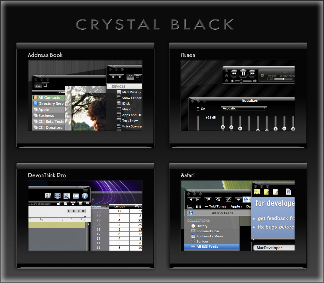
Theming Snow Leopard:
How Hard Could It Be To Paint A Leopard Black?

Dark interface themes are extremely popular with a small, but very passionate, group of Mac users. Sadly, since Apple introduced Leopard (Mac OS X 10.5), the old, relatively simple method of creating such themes on the Mac can't be used, and it took the theming community a good year and a half to figure out the current, relatively hobbled tools to theme the few bits of the interface that can be themed.
Given the weakened state of theming on the Mac, it's not surprising that the number of themes available has dwindled to a mere handful. And even those only go part of the way compared with what we used to be able to achieve with ShapeShifter. Still, the yearning for Mac themes remains strong among this community, and black themes are virtually nonexistent now.
Black themes have always been a challenge, because the frameworks used to build applications were designed to assume that text would always be black and the color of windows and buttons always light. Apple introduced a dark-theme paradigm a few years ago with its Heads-Up Display window style, which, with its translucent black background actually assumes that text will be white.
Starting with Leopard, developers using Xcode could tap into the HUD window style and use it whenever they want to, but most application windows aren't well suited to this, and Apple's user interface library still assumes that regular windows will be light, with black text.
It's not only desktop applications that make this assumption. Web pages with button widgets also assume that the widgets will be light and their text black. On the Mac, it's becoming common for desktop applications to embed the WebKit for parts of their user interface—meaning that the button widgets are HTML- and CSS-based, not AppKit-based.
In addition to this basic problem, there's also the challenge of handling legacy applications based on Apple's earlier Carbon frameworks, as well as apps that are a blend of Cocoa and Carbon. Complicating this issue is that, as it turns out, applications built for the older PowerPC processor platform use a different part of the system graphics than those built for Intel chips.
If you try to design a theme that introduces black interface controls, you run into another challenge that has nothing to do with text. Many interface widgets use images rather than text to convey their purpose, so what if—as is usually the case—the application designer provides only black images for these buttons? Is a themer supposed to provide white images for every application a themee might want to use?
One specialized case of the images problem is the Mac OS X statusbar. Here, applications represent themselves almost exclusively as images, and nine times out of ten, the images assume that the menubar is light, so they should be black. Some enterprising themers have tried to solve this one by providing alternative white images for the most common statusbar applications, but usability can still suffer if someone using a black menubar launches an application that insists on putting a black icon up there.... one for which no white alternative exists.
Given all this, why would anyone undertake an effort to introduce a fully black theme for Snow Leopard?
I suppose it's because we Martians just can't step back from a challenge. Not to mention the fact that we, too, are afflicted with the passion for dark themes that many Earthlings suffer from. I also have a good starting point, having developed some useful techniques for the challenge through building CrystalClear Interface.
That said, the best I can offer still has compromised usability, which I detail below. But for the most part, I think I've succeeded in bringing to life a useable version of the legendary Cathode theme for ShapeShifter, in a redesign appropriate for Snow Leopard. The theme covers window backgrounds, background colors for tables and outline views, interface buttons, menubar, and text colors. It also coerces various types of windows to theme themselves in HUD style.
To acknowledge the theme's heritage, I've dubbed the theme Crystal Black. Crystal Black will be available for download soon, with a 15-day trial period and a purchase price of $6.00
It's important to note that Crystal Black and CrystalClear Interface can not coexist on the same system. You can't install Crystal Black until you uninstall CCI.
For my own documentation of this work, as well as to highlight the theme's strengths and weaknesses, the following list shows the various unique challenges I've faced in building Crystal Black and the solutions, if any, devised. Other challenges have been faced—and largely solved—in developing CrystalClear Interface, so I won't spend time on them here.
In the list, I've used a small graphic to indicate the degree of success in addressing each challenge:
★ Solid solution
☆ Partial solution
∅ No solution
For Cocoa applications:- Images on buttons and in column headings ★
- Images and icons in the statusbar ★
- Text color of buttons in web pages ★
- Applications that use non-standard buttons and GUI frameworks. ☆
- Text color on Finder items with color labels ∅
Cocoa applications that can't or won't take theming by Crystal Black ☆(Problem solved 4/13/11.)- Cocoa applications that are on the user's "Disabled Applications" list ☆
- Text color for control widgets ☆
- Color of titlebar and toolbar text ∅
- Window and control object background colors ☆
Cocoa applications
- Challenges
-
- All images need to be made white, but without making custom button images for every possible application. Somehow, black images must be inverted as windows load.
- Some images are already "templates," easy to invert. However, other images look like "templates," but aren't, and making them templates isn't a reliable technique.
- Images with color (hue > 0) need to be distinguished from black/white ones. Knowing the image's color space doesn't help.
- Some images are "Core Image" images, which don't have a bitmap representation that can be easily analyzed. In this case, Crystal Black must create a bitmap representation in check it out.
- Images in column headings aren't buttons, so they require extra processing. In many cases, they change often so must be analyzed repeatedly. Some have proven inaccessible.
- Solution
- Each button and column heading in application windows are analyzed as they load to determine whether—and how—they require inverting. If inverting is needed, Crystal Black generates a new image and sets in place of the original.
 Still, there are a few cases that haven't yet been addressed. One is the case where a pull-down menu contains an image. I hope to deal with this in a future update.


- Challenges
-
- For nearly all applications that have a statusbar item and associated image/icon, the image/icon is black in normal state and white when highlighted. This means the image is unreadable against a black menubar.
- Unfortunately, the solution to the problem of images on buttons can't be applied to images and icons in the statusbar. In a few cases, the technique of inverting "template" images works, but applications with statusbar helpers that have invertable images are in a large minority.

- Solution
- Most of your applications that have a presence in the statusbar—including all of Apple's—must have custom-built images. In Crystal Black, these images are installed in the application's Resources folder, while maintaining a backup of the original images. Crystal Black also runs an inversion method that works in a few cases, but can't be relied on for most.
- Challenges
-
- Requires digging through the page's document object model and checking for buttons. Technique for theming push buttons is quite different from that for pop-up buttons.
- Many pages use nonstandard button styles, themed through CSS, and these are much trickier to coerce into using white text.
- Solution
- Crystal Black installs a custom CSS style sheet, which can be used with browsers that support custom style sheets. In the case of Safari, Crystal Black enables the style sheet automatically. Although this works, it manages to destroy a lot of custom-designed buttons along the way...


- Challenges
- Many newer Mac applications have buttons that are subclassed from the standard Cocoa button class and therefore don't respond to theming. Similarly, various open-source frameworks for building windows and buttons are in use, with similar challenges to theming.
- Solution
- Unfortunately, since Crystal Black cannot convert such buttons to its dark theme, it must apply a custom modification for each application to ensure buttons are readable. This means that some apps will have buttons with white text, since they aren't accounted for in Crystal Black.
- Challenges
-
- When the Finder is in column or list view, and these views have the dark background users normally prefer in themes like Crystal Black, the names of files and folders that have colored labels cannot easily be read.
- Despite numerous attempts, I have not discovered any method for changing the colors of these labels to provide ☆suitable contrast for white text.
- In addition, because of the way the Finder's file browser works, it's not possible to coerce a specific file or folder to use black text instead of white, when the item uses a label.
- Solution
- There is no good solution to this problem. To keep Finder's column and list views readable, Crystal Black prevents the background color for these views from darkening to the point that would trigger the use of white text. In other words, the names of files and folders in the Finder will always display as black.


 Challenges
- If a user disables Crystal Black for a specific application, the software no longer has a way to transform text or images from black to white.
Without some action, this would be the same as a user downloading the (free) Crystal Black system graphics files and installing them without the software: You wouldn't be able to read a lot of the interface elements.
 Solution
- The problem can't be totally solved. However, Crystal Black does three things to maintain usability. First, the CB filter module (which is what determines whether to load Crystal Black or not) installs a minimal set of color instructions before declining to load the core software. These colors keep text on buttons readable. Second, the old Extras resources files have a few text-color settings that still have an effect, and these take care of text color on segment tabs. Third, Crystal Black sets some specific defaults for the disabled application that prevent it from using a totally black window frame. These defaults are swapped out if the user re-enables the app for CB.
Carbon applications
Carbon applications are incapable of loading Crystal Black to any meaningful extent. However, some such applications have components built with the Cocoa frameworks, and these components will load Crystal Black (unless the app is in CB's disabled apps list). An example of the latter is Adobe Photoshop CS4, which itself is a Carbon-based lifeform, but may have plugins that are Cocoa-based. In this case, the plugin will load Crystal Black as long as Photoshop itself does not have CB disabled.
At the time of this writing, the Carbon universe is split into two difference species: Those that will only run on PowerPC chips, or under Rosetta on an Intel chip, and those that will run natively on both kinds of chips. The distinction is important, because the different species, it turns out, use different system resources for some of their graphics.
In any case, the challenge for affecting Carbon applications with a dark theme is that it must be done in the "old-fashioned" way—using the graphics files that used to enable theming in the age of ShapeShifter.
- Challenges
- How to enable white text on black buttons and other interface elements without using software or the post-Leopard system resources.
 Solution
- To a large extent, this is solved by relying on the pre-Leopard Extras resources files. Carbon applications make more use of these than Cocoa ones do, and Carbon apps that require Rosetta under Leopard make even more use of them.
 Challenges
- How to enable white text on the labels of toolbar buttons and on window titlebars, without using software or post-Leopard system resources.
- Solution
- No solution found. This is one challenge Crystal Black has been unable to overcome. Since toolbars are an interface element that's uncommon on Carbon applications, the toolbar label problem isn't a huge issue. (The only such app I use is Yummy FTP.) However, nearly all windows have a title, and it remains black against a black background.
 Challenges
-
- The background colors of various objects on a Carbon window are drawn from ancient system resources that aren't straightforward to use and that can mix with unexpected results.
- The elements that must mesh to make a smooth, pleasing, darker-than-white color are nested, and some resources are used for more than one level in the nest.
- One complication that became clear from this exercise is that resources used differ between Universal-binary applications and apps that must run under Rosetta.
- The background color must remain light enough to provide contrast for both white and black text.
- Solution
- Ultimately, this goal required detailed mapping of resource "PPAT" (pattern) objects in the Extras files to observed results. Thereafter, a good deal of trial and error was required to get the colors to mesh—for example, the background color of a "group box" nested in a "tab view", and the background color of buttons and other controls nested inside the "group box."
I couldn't theme some elements to my satisfaction, however. In particular, I wanted the background color of a group box within a tab view to be lighter than that of the tab view. This isn't a problem, but, because the background color of objects within the group box use the same pattern resource as the tab view, the objects have a darker background than that of the group box itself. You can set distinct background colors of control objects that are inside a tab view from those that are outside the tab view, and of those that are in a tab view from those that are nested inside "secondary group boxes" within the tab view. But you can't do the same for objects within the tab view and those within nested group boxes.


The Future for Home Computing
The Ultimate Solution To Window Clutter:
You Can Call Me SAM
Or, Everything You Always Wanted To Know About Single Application Mode But Didn't Know Who To Ask
One flaw in Single Application Mode (SAM), alluded to but not sufficiently stressed in the article, is its impact on the Mac OS X application switcher (accessed with the keyboard shortcut Cmd-Tab), which is a function of the Dock. When SAM is running (regardless of which software you're using to run SAM), the switcher doesn't automatically toggle to the previously selected application when activated. Instead, it typically defaults to the current app. So if you want to repeatedly toggle between the front two applications, SAM is troublesome.
The solution for me has been to substitute LiteSwitch for the built-in application switcher. With LiteSwitch (which has its own SAM implementation), this problem disappears, and you get a much more powerful app switcher to boot. However, LiteSwitch isn't freeware (I think it's $15). I haven't found a freeware solution, but will keep looking. Perhaps I'll figure out how to build it myself! Stay tuned.
I've observed that one of the most intractable problems bedeviling computer users, which makers of operating system software never seem to solve, is that of "Window Clutter." The inability to …
- Stay focused on the window you're working in, while
- Keep auxiliary windows handy and visible when needed,
- Avoid confusing any of these windows with those of other running applications, and
- Maintain some reasonable level of aesthetic quality to your computer desktop.
… is a nettle that keeps on pricking. At least, judging from continued user grumbling about it and the continued, less-than-satisfactory, though often valiant, solutions that user-interface experts keep offering users as the final salvation from this longstanding hindrance to productivity, I conclude that the nettle is alive and well.
That Window Clutter should still be a topic of conversation among engineers at Apple (I don't think Microsoft has any high-level staff who really care about or understand the issues surrounding interface usability, and Linux developers don't have the time to do so) is testament to their failure to stamp out a problem that appears from Mars to have a fairly simple solution, namely:
- Make it so that only one application's windows are visible at any one time.
Being highly curious creatures, we Martians find it hard to resist interrupting our work to find out more about something unknown, like the peculiar way humans endow the use of words like "nettle," "wazoo," and so on, with meanings they didn't originally have.  Fortunately, doing such a trivial thing on the Mac is so simple it's hardly an interruption. As I wrote at length in an article some years ago, all you need do is right-click on the word that interests you, select "Look Up In Dictionary" from the context menu, and Boom! You've got your definition without having to leave your document. The magical thing is that this works in any application on the Mac that's built with Apple's Cocoa frameworks (which is just about everything nowadays).
Affectionately referred to as Single Application Mode, or SAM, this is the default desktop environment on Mars. It's also widespread on Earth, though its human adherents often practice SAM quietly or even in secret because it's not an official, supported Mac OS X desktop environment.
Still, we find SAM the best way of dealing with today's large monitors, huge RAM capacity, and equally huge software options—all of which spell Window Clutter at a scale never before experienced.
SAM does require some adaptation and adoption of new tools and techniques, which I'll go into in more detail later in the article. If you're interested in SAM but afraid it would be too disruptive to your work habits, let me remind you that one of the proudest characteristics of homo sapiens is your ability to quickly adapt to changes in your environment.
On Mars, we learned to love SAM when using DragThing a few of years ago… We noticed that DragThing offered the option to hide other apps when switching to a new one. Further, it allows you to specify certain apps that you don't want to hide when you switch to other particular ones. After adopting Quicksilver, I discovered that it offered the same option, but without any customization. After that, I started noticing the Single Application Mode option offered in a surprising number of applications. (You can find a large list of such apps later in the article.)

So, if you're not satisfied with Apple's previous attempts to diminish Window Clutter on your Mac (Expose, Spaces, and Visual Differentiation), and if you abhor the idea prevalent among Windows users that one should simply zoom every window to the full size of your display, this article intends to share with you Everything You Always Wanted To Know About SAM (But Didn't Know It Was A Topic).
There's a lot to cover here, so I'll give you just a few hints up front that you should remember even if you don't read the whole tome. By the end of the lesson, you should at least know the meaning of the following terms, and how to use the software they refer to on your Mac:
- Single Application Mode, and how it differs from Single Window Mode.
- Application Switcher, referring to the one built in to Mac OS X.
- Running Dockless, meaning an application that runs without a Dock icon and without a main menu, but which is able to spawn its own windows of various types. The term also covers Dockless applications that run inside other apps.
- Tear-Off Menus, a technology that dates back to the NeXTSTEP operating system, the foundation on which Mac OS X was built.
This article is presented in several sections. Here's a list of the sections so you can easily jump around to one of the topics that particularly interests you.
- How Bad Is Window Clutter, Anyway?
- "Tradition Myths" About SAM
- From Apple's Archives: Single Window Mode and the Dock
- Getting Started With SAM
- Window Clutter: A Little History
- Alternatives To SAM For Slaying Window Clutter
- Glossary of SAM Speak
How Bad Is Window Clutter, Anyway?
The problem of window proliferation today is not so much a factor of the number of windows you have open in a particular app, but rather how many apps you have open. Figure the average user has five or six apps open, each with one or two windows. You can easily end up with 10-15 windows vying for your attention on the screen, and even with monitor resolutions of 1920x1200 or higher, that's a lot of f*cking windows!
By using SAM to limit the number of visible applications to one, you can immediately reduce the number of onscreen windows by a factor of n, where n is the number of running applications that have open windows.
To demonstrate this mathematically (we love algebra on Mars!), consider the Mac OS X computing environment of a typical professional user these days. In this scenario, our user is running the following apps, each with its own set of windows and auxiliary panels (names shown are just typical examples):
| Application | Windows | Panels | Persistent Windows |
|---|---|---|---|
| Finder | 4 (or more) | 0 | 4 |
| 2 | 2 (Activity panel, Preferences) | 4 | |
| iTunes | 1 | 0 | 1 |
| iChat | 1 | 3 (Video preview, buddy lists, etc) | 4 |
| Safari | 1 | 1 (Downloads) | 2 |
| Preview | 1 | 1 (Inspector) | 1 |
| iPhoto | 1 | 2 (Effects, Adjust) | 1 |
| Pages | 1 | 3 (Colors, Fonts, Inspector) | 1 |
| Third-Party App One (DevonThink Pro) | 2 | 1 (Inspector) | 2 |
| Third-Party App Two (Amadeus Pro) | 2 | 3 (Playback, Markers, Actions) | 2 |
| System Preferences | 1 | 0 | 1 |
Note that the calculation of Window Clutter doesn't include any number of other applications that run only from the global Menubar (or Statusbar), and which don't have a main menu of their own. This doesn't stop them from wanting to take up screen real estate, however. Typical applications in this category include:
- menuCalendarClock iCal (may have one persistent window)
- Quicksilver (pops up when summoned)
- CoverSutra (may show current playing tune and/or a tune controller)
- Edgies (may want to keep one of these stickies-like items onscreen)
- A system monitor of some kind (for example, I always keep MemoryStick onscreen)
- Helpful edge-tab tools (e.g., DragThing, Fresh, DevonThink Pro, Yojimbo, the Dock)
We also won't include the multitude of tiny windows called "desktop icons" (yes, they are windows) that users typically keep visible. (Can you feel me shuddering from way down there?) Remind me to share the secret of eliminating that source of Window Clutter as well.
There is another class of applications (of which we dare not speak!) which have no user interface of their own, per se, but rather live inside the interface of other apps. I use some of these religiously, and they all require screen real estate even though they aren't really "there:"
- StepMenus. An invaluable open-source app that provides a movable, "tear-off" copy of an app's main menu.
- CrystalClear Interface. Also invaluable to me—but hey, as the developer I guess I'm biased—as a way of making Mac OS X even more beautiful and functional than it already is.
- SafariStand. This free add-on to Safari has more useful features than you can shake a fistful of Martian sand at. (I devoted a whole article to SafariStand some years back.) This app has several useful panels that I may have open from time to time.
- Visor. A SIMBL plugin that enhances the interface to Apple's Terminal utility.
Now, into our equation we must figure that some auxiliary panels hide themselves when the application to which they belong isn't active. For example, color and font panels are only visible when the app that spawned them is active, or "in front." On the other hand, the very useful "Special Characters" panel persists across apps. (However, most folks don't know that if you click its Maximize button, you actually minimize the panel to a tiny square.) Apple is pretty careful about following its own user interface standards and makes sure that all "Inspector" windows (including the Effects, Image Adjust, and Media Browser panels that typically accompany the iLife apps) only show up when their particular application is active.
Even in Apple's apps, however, exceptions do arise. In Safari, the Downloads panel is visible even when Safari isn't active. In Mail, the Activity panel likewise stays visible. And in virtually all apps, any preferences panels you may have opened stay visible even if they have no relevance to the application you're working in.
So, back to our equation.
Let n = Number of open applications
Let v = Average number of visible windows per app
Let x = Number of persistent windows
Let y = Number of persistent auxiliary panels
Let z = Total number of visible windows
Given these variables,
z = (x1 … xn) + w
v = z/n
For the hypothetical desktop listed previously, this yields:
- z = 23 + w
v = (23 + w) / 11
If we let w = 1, then
v = 24/11 = 2.2
By this calculation, then, in all likelihood there will be 24 visible windows on your desktop under the usual setup. And if you eliminated all but the active application's windows, the total would fall to between 2 and 3 windows.
A dramatic end, indeed, to the problem of Window Clutter… wouldn't you say?
Now, to graphically answer the question posed by this section, let's take a moment to visualize the above scenario. The screenshots below have the same application/window configuration, based on the preceding table: 11 applications running, together generating 24 visible windows. The first image is a default Snow Leopard desktop, without Single Application Mode. The second image has CrystalClear Interface 2.5 running, but with SAM turned off. The last image shows the dramatic difference when SAM is activated.
")
")

"Tradition Myths" About SAM
Despite its demonstrable power in dealing with Window Clutter, Single Application Mode is embraced by only a relatively few "power users" and, of course, by Martians everywhere—those of us who live among you as well as those on Mars. However, Martians have no real influence on the way humans interact with their computers, and in fact we have some difficulty articulating our ideas in a way humans refer to as "evangelizing." Therefore, despite its rational foundation, SAM continues to be shunned as a solution by Apple and by influential Mac pundits… Why?
There are several reasons, all of which are based in "tradition myth," and none of which outweigh the true virtues of SAM.
- I need to be able to see windows of other applications so I can drag text from one to the other. No, you don't. Using Apple's Application Switcher (invoked by ⌘-Tab), it's a simple matter to select text in one application and drag it to a given window in another. Simply:
- Select your text.
- ⌘-Tab. While holding ⌘-Tab, select the application you want to drop the text in, using either your mouse or moving the cursor with an arrow key.
- Release -Tab and drop the text where you want it in the other application.
Alternatively, of course, you can copy and paste rather than drag. - I need to be able to drag images or files from one application to another. This is a variation of the first myth and has the same solution.
- I need to be able to see values (numbers, text, colors, images) in two applications at the same time. This is not a myth but is a real need that any solution to Window Clutter must address. Fortunately, virtually all SAM implementations make this relatively simple.
- The base solution is to hold the Shift key while selecting a second (or third, etc) application from the Dock. Just hold the Shift key each time you need to switch from one application to the other while working.
- Better solutions let you define which applications you never want to have hidden while using SAM or, better still (but requiring more configuration), define groups of applications that should remain visible together. Several applications that implement SAM offer this functionality.
- Why bother when I can just use the "Hide Others" keyboard shortcut (Option-⌘-H) as needed? Well, my response is that if you want to use the keyboard shortcut each time you switch apps, then you should be using SAM. SAM is mainly a convenience, automating the task hiding other apps rather than adding the task to your regular workload.
Finally, the most insidious deterrent to the use of SAM is one that arises from ignorance or from age-old blinders that keep their wearers from seeing full 360-degree panoramas about the issue. To explain what I mean by this, I need to take a quick detour into some history about a relative of SAM's called "Single Window Mode."
From Apple's Archives:
Single Window Mode and the Dock
It's strange, but true, that the Mac OS X Dock has a "single application" mode of its own. To try it out, install Secrets, a GUI tool from Blacktree—the company that brought us the incredible open-source workhorse, Quicksilver. Secrets lets you enable the hidden Dock setting for "Single App Mode." You can also activate this Dock setting by typing these two commands in the Terminal (the second command restarts the Dock):
com.apple.dock single-app
killall dock
That the Dock has an implementation of SAM is curious, and it may be useful for some. However, it has several drawbacks from the Martian point of view:
- You have to use the Dock alone (read: click on Dock icons) to launch and switch apps, in order to make other apps hide when you do.
- Launching apps from Spotlight doesn't trigger SAM.
- Launching apps from the Finder—or from any other application launcher—won't trigger SAM.
- Switching apps using the Application Switcher doesn't do it, either.
- Curiously, you don't go into SAM mode even if you launch an app from a Dock Stack, such as one showing recently launched apps.
So, the Dock version of SAM is only useful if you use the Dock for all app launching and switching, which obviously isn't practical or efficient.
 Another tantalizing remnant of Apple's flirtation with SAM is found in the graphics bundle that's been used by Mac OS X since day one. In addition to the usual red/yellow/green "stoplight" indicators at the top of every window, there's a purple one that's never been seen outside the few developers who worked on the earliest builds of Mac OS X… plus all those who saw Steve Jobs' Keynote presentation at MacWorld in January 2000, when Apple first unveiled its new Aqua interface.
For those of us who are fans of SAM, it's validating to listen to Steve extol the virtues of what was then dubbed "Single Window Mode." In fact, he spoke of it at length in a demo that concluded his entire presentation about the coming greatness of Aqua. During that speech, Jobs describes a solution Apple was building into Aqua in order to conquer the challenge of Window Clutter (see video of this segment below):
Let me go ahead and click a button that's on the right side of the top of the window pane. And this button is pretty cool. What it does is it says, "You know, when we have a lot of windows around on our system, it can get rather confusing for beginners, and even for pros.
If you're working back and forth between Illustrator and Photoshop or Photoshop and something else … These things can get very complicated on the screen.
What could we do to make life easier for our pro customers and for beginners? We came up with something pretty neat. You can click it from any window. You can turn it off and on.
And it's called Single Window Mode. So you just click this, and every other window on the screen is miniaturized. And when I click another window… Boom! They switch places.
It's very easy.
Wow… even from Mars we were impressed with Jobs' insight. Here's a guy who really understands user interfaces to software. He understands the needs of computer users, often even before they do. We had observed Steve Jobs and his return in 1997 to the promising company he helped found, and it was clear that this guy knows what he's talking about when he says things like, "Boom!"
What the heck is a wazoo? And what do people mean when declaring something is "out the wazoo?" 
Hmmm… Does "wazoo" really mean "anus"? Now we're really confused! To clarify, I click on the little "More" button in the lower right-hand corner of the pop-up, and I'm whisked to the Dictionary app itself, which explains:

Sure enough, our early impressions of Jobs were correct, and he's clearly not only a transplanted Martian, but that extraordinary Martian who is able to mind-meld successfully with humans. Since then, we've been importing Apple products "out the wazoo," as you say here on Earth.
Sadly, however, Apple didn't pursue this initial idea for a Single Window Mode. From the snapshot we were given, it appears that SWM was somewhat flawed, and I'm not referring to its unfortunate acronym. If SWM worked the way Jobs demoed it, it would have minimized all the other windows in the current application, as well as those in other applications. Clearly, that's not going to work, which may be why Jobs was talked out of it.
As one of the major gurus of Mac-Think, John Gruber gave us a clear explanation for the opposition to SWM in those early days of Mac OS X. This excerpt is from an interview by Marcin Wicary, keeper of the marvelous website covering the history of computer GUIs, Guidebook Gallery, in July-August 2005:
Q: Was single-window mode such a bad idea? Moved from the purple button to the confines of System Preferences, wouldn’t it be useful for beginners or refugees from the Windows world?
A: It might be a good idea for some entirely new system, but I think it was incompatible with the existing Mac UI paradigm. The Mac UI was, and is, meant to revolve around multiple windows. If you’re only going to show one window at a time, what’s the use of even calling it a “window”? Just take up the whole screen.
TiVo, for example, effectively is a computer with a single-window UI paradigm. But it’s screen-based, not window-based. In the same way that it didn’t make sense for Apple to add a single-window mode to Mac OS X, it wouldn’t make sense for TiVo to add a new multiple-windows mode.
As for beginners and Windows refugees, I don’t think they need protection or shielding from the true Mac UI. What would – and does – help them is when the regular UI is consistent, obvious, and intuitive.
My current theory is that this antipathy for SWM has swallowed any official support SAM might have had all these years. And yet, SAM is the solution that SWM was not.
- SAM is SWM evolved.
Getting Started With SAM
But perhaps the best reason SAM isn't more widely adopted is that, especially for experienced Mac users, it takes some getting used to. This is why I refer to it in the CrystalClear Interface Preferences as a "new paradigm." The rewards of embracing SAM are great, but embracing SAM also means unlearning certain behaviors, and learning new ones. If SAM were openly incorporated into Mac OS X, its adoption could be more seamless than it is, of course.
So, OK, say I want to try using SAM. Where do I start?
Despite its relative obscurity, SAM is implemented as an option in a great many Mac OS X applications that have some application-switching functionality. Here are some of the apps I know of that offer SAM as an option. I've personally used Quicksilver, LiteSwitch, and DragThing for this functionality and ultimately settled on LiteSwitch as the best option.
I chose LiteSwitch not just for its SAM-ability, but for its many other irreplaceable virtues. I now use CrystalClear Interface for SAM, but I cherish LiteSwitch because it improves on the Mac OS X switcher in so many ways. Of particular relevance to SAM is LiteSwitch's inherent app-switching behavior.
Apple's switcher doesn't allow you to repeatedly and quickly toggle two applications with one simple ⌘-Tab shortcut. After you toggle once, it forces you to navigate (with arrow key or mouse) to the other application you want to toggle.
For me, this is key, since without the quick toggle, I end up doubling the toggling effort. LiteSwitch doesn't have this drawback, and I would be hard-pressed to do without it. (By all means take a look at the more in-depth review of LiteSwitch I wrote a few years back.)
I am pleased to see that Proteron, the company that built LiteSwitch, appears to be back in business after a 2-year hiatus. What a relief to know that it'll be available and supported once again!


Here's that list of SAM-capable apps I mentioned earlier:
- Application Wizard
- CrystalClear Interface
- Desktopple Pro
- DragThing
- Flying Windows
- Keyboard Maestro
- LiteSwitch
- MenuStrip
- MultiXFinder (free)
- Quicksilver (free)
- Shoo Apps
- Spirited Away (free)
- TransparentDock
- Window Cleaner (free)
- Make the Mac OS X Application Switcher your best friend. Once this mode of switching apps is second nature, SAM will also seem completely natural (if it doesn't at first), and you'll wonder why you suffered so long with all those windows cluttering up your screen! To invoke the Application Switcher, use the keyboard shortcut ⌘-Tab to show all your running applications. As an alternative to Expose, you might also find it convenient to start using ⌘-Tilde, which toggles through the various open windows in your current application.
- Hold the Shift key to add windows of other applications to the visible mix. For me, this requirement pops up when I use an application like the delightful color utility iPalette, and want to capture colors from another window and experiment with them while keeping the source window in view.
- Get used to the idea that drag and drop is just as easy between two windows that can't see each other as it is between two that can (setting aside for a moment the notion that windows can "see"). Think of this technique as an analogue to the Finder's spring-loaded folders, where you drag a file from one visible folder to another that only becomes visible after you've passed through one or more folder "dimensions."
Only, dragging from window to window is easier. To do this, just make your selection and start to drag. Then, switch applications using the Application Switcher (⌘-Tab) and drop the item into your document as you normally would. You can use this technique for dragging text, files, images, etc., just as you would if the two windows were visible at the same time.
One thing that's even nicer about this approach is that you don't have to move windows around to set up the right view for dragging between visible windows. (What a drag that can be! "Oh, Martha, he thinks he's such a wit, don't he?") However, you do have to make sure that the target window is active in the the target application, since you won't be able to switch windows in the target app during the drag.


As those of you who've tried to get used to Spaces know, many attempts to solve Window Clutter create new problems rather than really solving the old ones. This isn't true of SAM, because it really does solve the problem of Window Clutter. However, it does introduce some problems that need to be solved somehow. Fortunately, we Martians have found free and easy solutions to all of them!
- Problem 1.
- Many applications let you set a given window as "floating" so that it stays "on top" of your window hierarchy even when you switch to another application. Only problem is, the window's "floatiness" is tied to the visible window hierarchy itself rather than to your workspace as a whole. As a result, the supposedly "floating" window gets hidden along with its application when you switch apps using SAM.
Typically, this problem occurs with respect to user interface elements that you want to remain visible no matter what other apps are active. Apps in this category typically include:
- Launchers
- Sticky notes
- To-Do lists
- Monitoring tools (e.g., clocks, system info)
- Interfaces with inactive apps
- iTunes controllers
- Screen capture tools
- Automation tools (scripts/shortcuts/workflows)
- Desktop customizers
These kinds of apps play a role similar to the one that the Color and Font panels play in an application. If you open them, you want them to stay open—and not to hide behind other windows or apps—while you're working. In the context of SAM, tools of the categories above are ones you want to remain visible even if you switch to another app.
Apple provides many such interfaces to its own applications, including the following:
Yeah, well, if you rely on iTunes' floating controller, and aren't willing to part with it, SAM won't work for you.  Thankfully, there are dozens of free alternatives that provide more functionality than the iTunes floater, so if you're willing to give one of them a try, you can still use iTunes to the full extent, but control playback with something else. For some ideas, refer to an article I wrote a couple of years back on iTunes controllers. It's out of date now, but still worth a look. Some newer alternatives are listed in the table below.
- The Dock
- Spotlight
- Various statusbar items:
- Airport
- iSync
- Time Machine
- Sound preferences
- Fast user switcher
- Script menu
- Application Switcher
- Dashboard
- Expose
- Time Machine
- Front Row
Solution: Find applications that allow themselves to be removed from the dock and to appear without a Main Menu. Such apps are referred to in the Apple developer documentation as "agent" applications, and many of them make themselves available as a statusbar item. There are quite a few apps that can morph from a regular app to an agent as a user option, and many that are agents from the get-go. Here are some of the apps I've used that I always want to remain visible while open, and which can accommodate that need nicely with SAM without any special effort. (I've organized these according to the category of apps listed above.)
Note: The apps with links in the table are ones that are not linked elsewhere in the article. Other than that, I'm not making any kind of particular statement about them. ![]()
| Category | Application |
|---|---|
| Launchers |
Quicksilver ClawMenu DragThing Butler Overflow iKey |
| Sticky notes |
Sticky Notes Edgies |
| Monitoring tools |
Growl BackTrack BwanaDik MenuMeters iStat Menus |
| To-do lists |
MenuCalendarClock iCal Pluto Menubar |
| Persistent interfaces to inactive apps |
DevonThink Pro Yojimbo DropCopy Quicksilver Fresh BackTrack Evernote LiteSwitch |
| iTunes controllers |
CoverSutra YouControl Tunes Butler ClawMenu Quicksilver |
| Screen capture |
Little Snapper Mac OS X keyboard shortcuts |
| Automation tools |
Quicksilver AutoPilot iKey OpenMenu TextExpander Hazel Shortcuts Spark |
| Desktop Customization |
Picture Switcher DeskShade Wallsaver QCDesktop |
- Problem 2.
- What about applications that don't offer an option to run outside the Dock and without a menubar? I have several such apps that I run daily or frequently, and SAM really wouldn't be feasible if I hadn't found an easy way to "bend such apps to my will," so to speak. Here are some of my "problem," essential apps:
- QuartzClocks. A freeware app, this is simply the best desktop clock I've ever seen. Sadly, its developer had abandoned it the last time I looked, but you can still download it from MacUpdate.
- Sticky Notes. There are oodles of sticky-note apps in the Mac universe, but this is one of my favorites. The feature that makes Sticky Notes stand out from the crowd is that you can bind individual notes to particular applications. This is exactly what I want from a notes application… it's like putting a sticky right on the app itself! It's also perfect for SAM, because the notes are always there when the relevant app is open. The only problem arises for notes that aren't tied to a particular app…
- FlySketch. The very best app for annotating screen captures. Incredibly innovative… there's nothing like it.
- PixelStick. Great freeware for measuring screen coordinates when doing pixel-based design.
- iPalette. Terrific freeware for experimenting with colors. For developers, it's a great way to easily get RGB values for NSColor in your apps.
Solution: What you need is an easy way to toggle any app on your system between being a regular Dock/Menubar app and being an "agent" app that doesn't hide when you're using SAM. If you're a programmer or are otherwise technically savvy about the inner workings of Mac OS X, you could do this manually by editing a small file that appears in every Cocoa app's "bundle." But how much fun would that be? Although there aren't many utilities that will perform this feat automatically, there are a couple I know of, both free.
- Dockless does precisely what you want. Dockless is reliable, simple, robust, free, and open-source! (Another cool thing about Dockless is that it also lets you go the other way: Make normally "dockless" (agent) apps appear with a menubar and Dock icon.) (For more words from me about Dockless, refer to my 2006 review.)
- Configure Application Dock Tile has a trés ungainly name, but it can be more useful than Dockless for quick changes. The best way to use this app is to add it to the toolbar of Finder or Path Finder, and then use it as a "droplet." To toggle an app between having a menubar/dock and not having one, just drag the app to the toolbar icon for Configure Application Dock Tile (yuck!), change the checkbox state and save.

- Problem 3.
- If you use Dockless or Configure App… to eliminate an app's menubar, how do you gain access to the menubar when you need to? After all, most such apps have Preferences to set, or Help to access, or various functions that only appear in their menubar. Apps that offer a built-in Dockless mode take this into consideration and make their menu functions available in other ways, but apps that are coerced into running Dockless don't.
 Solution: As with problem #2, there aren't many options that address this. But fortunately, the one I've used for ages still works great on Snow Leopard and, like Dockless, is free and open-source: StepMenus. By default, StepMenus provides a small floating panel that duplicates an app's main menu. You can position this menu panel wherever you like, or you can use the StepMenus System Preferences interface to exclude it from running in a particular application. (If you're a user of CrystalClear Interface, you'll undoubtedly see a similarity between the StepMenus preferences pane and the one for CCI. The similarity isn't accidental: I used some of the StepMenus code for CCI, since it was precisely what I needed for that app.)
Window Clutter: A Brief History
In the beginning, there was the very low resolution monitor for working with graphical operating systems, like the Mac and, eventually, Windows. For a very long time (in computer years), resolution was so low (600x800 pixels or less) that the only sensible way of working was to zoom each window to its maximum extent.
This hardly hindered one's productivity, of course, because it wasn't until the mid-1990s that computers had enough built-in memory to run multiple applications reliably. Still, you quite often needed to have two or more windows open in a given application—for example, in word-processing apps like Microsoft Word or WordPerfect. The number of windows you needed to work with doubled or tripled once sophisticated design applications like Photoshop and PageMaker came on the scene. At this point, working with multiple zoomed windows became a real pain, yet squeezing them to smaller sizes seemed to only make things worse.
For the longest time, it seems that a great deal of my time was spent repositioning windows so I could see what I was doing. Working in a word processor was one thing. Working in Aldus PageMaker was another thing entirely.
In a word processor, it's often desirable to see only one window at a time, as a way of reducing distractions. In fact, a few years ago it became de rigeur (at least in the Mac world) for such apps to enable a full-screen mode for composing text. This became a major selling point for rich-text editors like WriteRoom, and it soon became a standard feature of most apps that included a writing function.

When one is word-processing, having a single window consuming all of your screen real estate is not a bad thing, especially since you can specify margins so the text doesn't spread across the entire area.
As screen resolution rapidly rose through the 1990s, however, the habit of zooming every window to the full size of your monitor began to look pretty silly, and could actually dampen productivity. It's a known fact that humans read less efficiently when a column of text is too wide, because the eye has trouble making its way back to the left-hand margin while keeping each line in sequence. (For examples, see this or this in Google Books.)
When monitor resolution was 640x480, this was not a consideration. But on a 1024x768 monitor, line length in a word processor (or PDF file, web browser, or whatever you may be trying to read) becomes far too great to read efficiently. Still, zooming windows to the max remained the preferred, and expected behavior (especially on Windows)… readability be damned!

The first great idea for dealing with multiple applications and windows on a PC actually appeared first in Microsoft Windows 3.x. It was then (and, I think, still is now) a feature known and used mainly by power users, but it was a brilliantly simple implementation. I refer here to the Alt-Tab keyboard shortcut, which displays a horizontal band of all your currently active apps and windows. The Windows implementation was fairly rudimentary, and it didn't change much (if at all) until the release of Windows Vista.  To navigate the Windows switcher, you had to to everything with those two keys. In other words, you had to hold down the Alt key, press Tab, and then keep pressing Tab to navigate through the items (you could go backwards by throwing a Shift into the mix, but still had to keep holding Alt as well). This was useful, but seemed downright awkward after Apple finally implemented a similar feature in Mac OS X 10.3 (Panther).

Apple's innovations to the application switcher were not only visual (and it was very cool visually), but greatly enhanced functionality as well. You could navigate like in the Windows switcher, but you could also navigate using the arrow keys, select with the mouse, use the scrollwheel to navigate, drag items onto the applications to launch them, and hit Q to quit an application. There are a variety of other keyboard shortcuts as well. (See here.)
I understand that in Windows Vista, Microsoft has incorporated some of Apple's enhancements: You can now navigate through the items with arrow keys or your mouse. Unfortunately, from what I've read, the Windows switcher doesn't expand horizontally beyond its size in earlier versions of Windows; rather, it expands vertically in rows.

One of the most irritating aspects of the Windows switcher is that it displays both documents and applications. Therefore, it's not strictly speaking an application switcher, and there doesn't seem to be any way of making it so. (This is the main reason I can't bring myself to use Witch, an otherwise useful, once-free-but-now-shareware switcher alternative on the Mac. Witch has no way to limit its display to applications, either.)
Instead of displaying both windows and applications at the same time, Apple has sensibly separated the two, providing a different shortcut—⌘-Tilde—to navigate your open windows.
It wasn't long before monitors got bigger not only in resolution but also in physical dimensions. Can you imagine working on a 15-inch monitor nowadays? And yet, this was the standard size throughout the 1990s (unless you were very special indeed). With such a small monitor, most people didn't max out their screen resolution because at 1024x768, for example, screen type becomes way too small to read.
Soon enough, though, monitor size zoomed to 17-inch, then 20-inch, and now 24-inch as the expected standard for your basic computer system. Heck, the current model iMacs sport a 27-inch monitor in the top two configurations. (And here I thought my 23-inch Cinema Display of a few years back was so huge. And it is!)
For creative professionals, the problem of dealing with Window Clutter has long been handled by using multiple monitors. That's fine if you can afford it, but using multiple monitors introduces its own set of problems. I won't go into them now, but those of you who work that way know them all too well.
In the meantime, computer memory soared, so that what application developers, users, and hardware makers considered a baseline standard was an ever-shifting target. And no one ever seemed to get it quite right. Technical standards have simply moved far more swiftly than humans could adapt to them. (I wryly note that this deficiency is not shared by your Martian neighbors.)
It's sobering to actually review the timeline of the amount of random-access memory (RAM) that personal computers have relied on. As we all know, in 1984, Apple Computer introduced the Macintosh—the first commercially available personal computer with a graphical operating system. It was also the first computer to boast 128KB of RAM! By the end of the year, for only $10,000, you could buy AT&T's new microcomputer and luxuriate in a full 512KB of RAM.
The race for more memory had begun, but it seemed to remain in Lilliputian dimensions for a very long time. By the end of 1989, Apple's Macintosh was still in the lead, with its top-end system boasting 4MB of RAM. IBM and Compaq PCs maxed out at 2MB. A decade later, top-of-the-line systems still peaked at 512MB or 1GB of RAM, while consumer systems like the iMac were holding 256-512MB.
Since 2000, It was in the last decade that RAM size really took off. The amount of RAM a desktop computer can consume nowadays seems ridiculously huge, a reflection of the transition to 64-bit operating systems. My 2-year-old Mac Pro can hold 32GB, and I've got 16GB installed. To buy a consumer system with less than 4GB these days is to buy a computer that won't run modern operating systems or the latest versions of the most apps. Heck, the $599 Mac mini has 2GB, and the $799 model has 4GB! The standard RAM for Microsoft Windows-based systems is similar, starting at 2GB for entry-level computers and rising from there.
For the purposes of this article, the main impact of exploding system memory has been to increase the number of applications one can keep open at the same time. It has become habitual for a typical user to leave applications open indefinitely, and then to not understand why their system may be slowing down after a few days. ![]() (For a followup to this discussion, refer to the earlier section of this article, How Bad Is Window Clutter, Anyway?)
(For a followup to this discussion, refer to the earlier section of this article, How Bad Is Window Clutter, Anyway?)
Alternatives For Slaying Window Clutter
I still think Expose is a visually cool way to view your open windows, but I frankly have never used it much because it just doesn't work for me. Rather than spending many more words explaining Expose, take a look at the preceding link and let Apple do the talking.
Basically, Expose has three modes, with the following default keyboard shortcuts:

- F9. This displays all the windows of all active applications on your system. Curiously, however, this doesn't show windows of applications that are hidden. Therefore, if you're using SAM, there is no difference between F9 and F10. (Perhaps that's one reason I've never taken to Expose…)
- F10. This displays all the windows of your current application.
- F11. This hides all windows and displays your desktop.
A very useful feature of Expose (which may not be widely known) is that whether you start with F9 or F10, you can navigate through your other applications and their windows by hitting the Tab key. Each click of Tab takes you to the next application set. Within an application set, you can navigate using the mouse or the arrow keys.
Still, Expose is at best a useful way of finding windows on your Mac, and is neither a practical application switcher nor a solution to Window Clutter. After all, as soon as you exit Expose, your cluttered Desktop returns, like Cinderella at midnight, to its former unlovely self.
Back in 2006, I opined at great length about why Virtual Desktops as a technique--and why  Spaces in particular--are poorly suited as a solution to Window Clutter. Rather than repeat all those arguments and observations here, I invite you to read the article, "Leopard’s Spaces: Virtual Desktops for the Rest of Us?", which I wrote while having access to developer releases of Mac OS X 10.5.
Even after I discovered Hyperspaces, a marvelous enhancement to Spaces that adds all the features I felt were missing in Apple's implementation, the basic problems inherent in Virtual Desktops remain:
- They simply create more confusion than they eliminate,
- They make it harder for you to find your application windows, and
- They aren't really practical since the idea of segregating your different kinds of work into different desktops is impossible if you have even modestly complex kinds of work involving more than one application.
Apple has progressively enhanced the visual distinction between your active window (typically the one you're typing in or whose controls you're manipulating) and the others in your active application. Windows in inactive applications have a slightly different appearance than inactive windows in your active application. (Say that twice fast.) But practically speaking, it's impossible to tell them apart.
This is why those who don't use SAM either must use something like Expose or ⌘-Tilde, or forever find themselves activating the wrong window.
Even when using SAM (either with or without CrystalClear Interface), distinguishing between your top-level window and the others in your window hierarchy is very important. By default, Apple helps differentiate the active window by adding an extra-huge, 3-D shadow (introduced in Leopard), as well as hints in the button widgets (color vs. no color, or faded vs. active appearance, or bright vs. dim, etc.).
In addition to Apple's visual techniques, CrystalClear Interface lets you further distinguish windows by their transparency, which is completely user-customizable. By default, the front window is mostly opaque, and the inactive windows are 50-60 percent transparent. Utility windows (Find panels, Color panels, and the like) retain the opaque appearance of the main window and are distinctively themed as translucent black (HUD) panels. Besides setting default values for all inactive windows, users can also set the transparency of individual windows that have unique titles to some custom value, retained across sessions.
In addition, CCI provides the option of turning shadows off for your inactive windows. This just takes Apple's approach one step further: Rather than minimized shadows in background windows, you can remove shadows from background windows entirely.
The bottom line is that Visual Differentiation as a strategy of solving Window Clutter is absolutely necessary and quite helpful. However, it is not sufficient to eliminate the problem entirely.
And that explains why here on Mars, we use Single Application Mode as the solution to Window Clutter.
- Agent
- An application that does not show a dock icon or have a Main Menu in the menubar. This type of application sometimes has an icon for accessing its functions and preferences in the Statusbar.
- Dockless
- An application that runs as an Agent.
- Statusbar
- The part of the System Menubar that extends from the Spotlight icon on the right to a point on the left that's not occupied by the current application's Main Menu.
- System Menubar
- The narrow strip at the top of the Mac workspace that contains the application's Main Menu and the Statusbar.
- Main Menu
- The part of the System Menubar occupied by the current application's menu items. The Main Menu usually starts with an item with the application's name, just to the right of the Apple Menu, and extends to an item named "Help" on the right.
- SAM
- Acronym for Single Application Mode.
- Tear-Off Menu
- An item from the Main Menu, or one of its submenus, that can be "torn off" and positioned as a free-floating window.
- Auxiliar Panel
- A window that contains tools used to change settings of various kinds in the main window. Such windows include the Font and Color panels, as well as Inspector panels such as those in Apple's iWork applications, or the ones in Preview and QuickTime.
- Floating panel
- A window that by default always appears above other windows in the application's hierarchy, except those that are also floating panels.
- Single Application Mode
- A Macintosh workspace configured so that only one applications windows are visible at any one time. Other application's windows can be configured to be temporarily visible as well. Any open windows of Agent applications also remain visible.
- Single Window Mode
- A Macintosh workspace configured so that only one window is visible at any one time. SWM exists in concept only.
- Active [Window/Application]
- The Active application is the one the user is currently working in. The Active window is the window of the Active application the user is currently working in, using either the mouse or the keyboard (or some other input device).
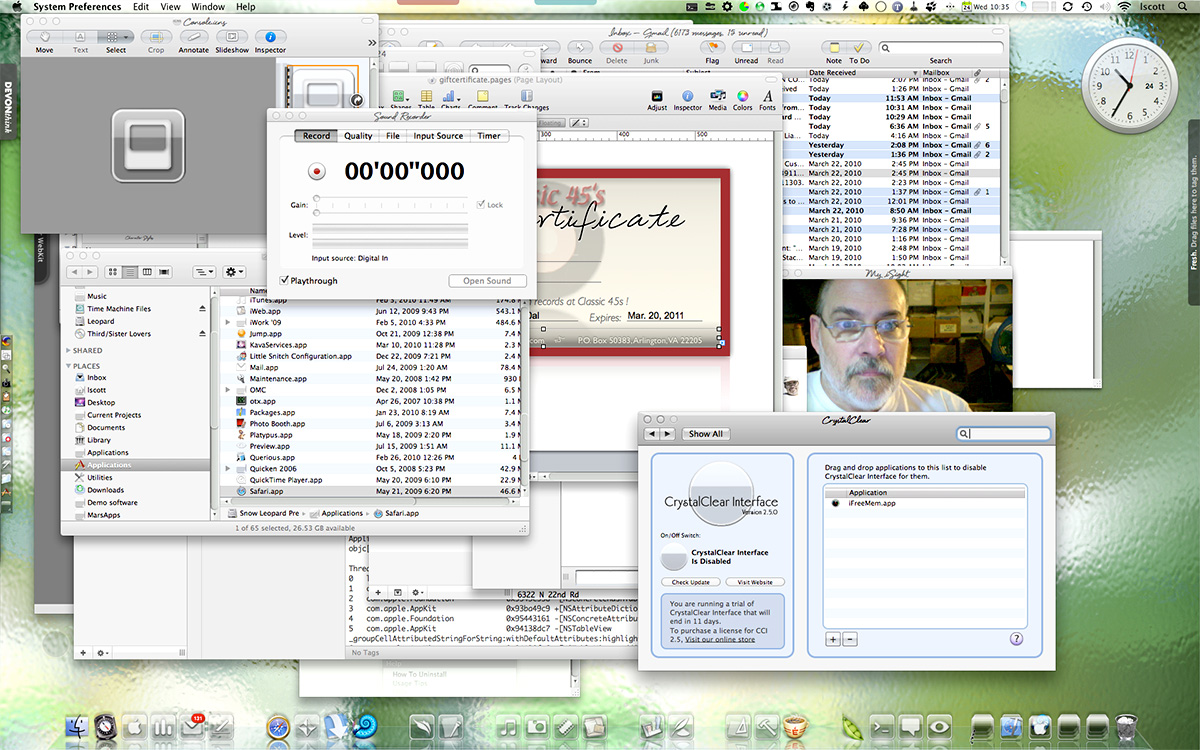
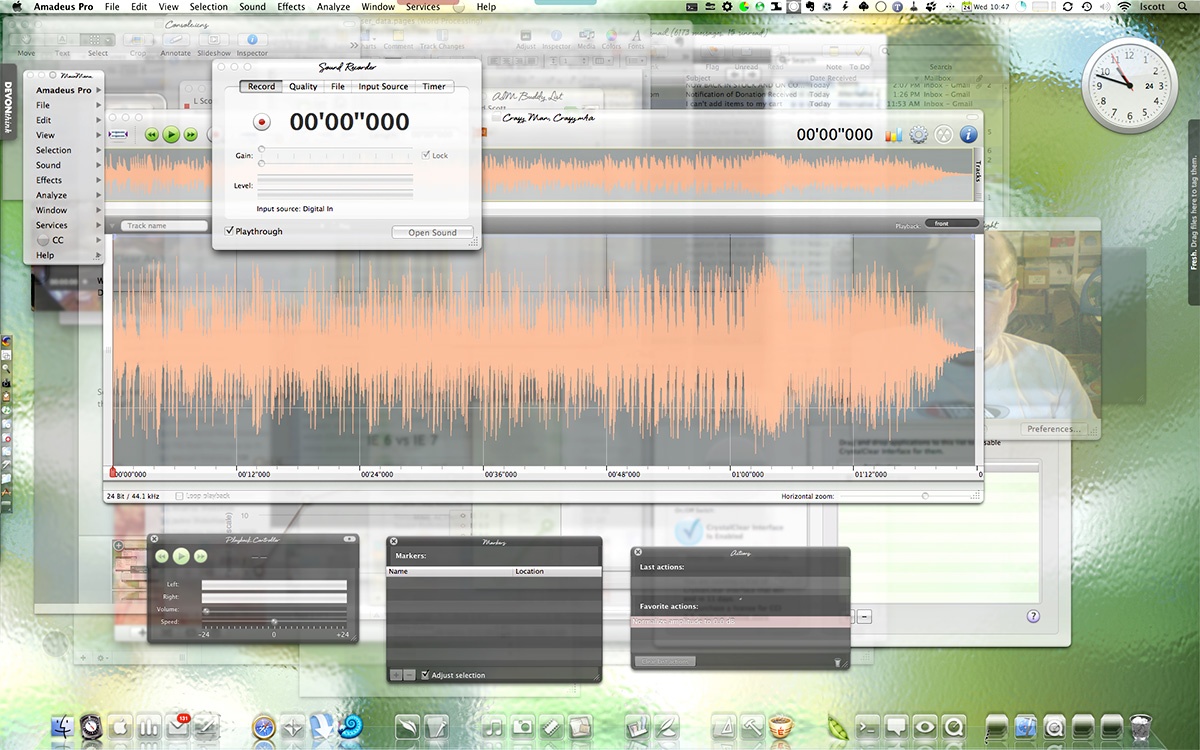
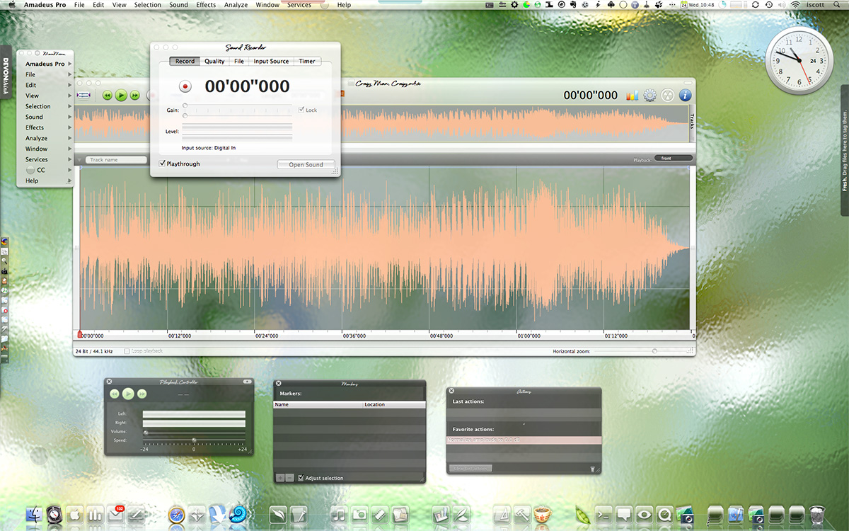
Amar Sagoo: Software Design for Usability
I first encountered this programmer several years ago when I downloaded and was awed by his Tofu application. For a very long time, I feared that Sagoo had abandoned the project, but today I was delighted to see that he has put out a new (2.0) version of that little eReading marvel.
In checking out the rest of his site, and some of his newer (freeware) software projects, I also found he's written some very insightful essays on the subject of interface design and usability. Definitely worth bookmarking for future reference...
Meanwhile, I've got to try to convince him to develop an iPhone version of Tofu. It puts similar eReader attempts like Stanza to shame!
A New JavaScript Library Handles Keyboard Shortcuts
Ajaxian » Cross Browser Keyboard Handler
Quietly, Safari Finally Gains WYSIWYG Editing Powers
A quiet revolution has taken place for Mac OS X Safari users, but I haven’t seen anyone celebrate it… and I’ve looked! There isn’t even a mention of this dramatic change in Safari’s powers on the Surfin’ Safari blog, where the open source team that’s evolving the WebKit rendering engine used in Safari announce new features and updates. Lately, this team has implemented a number of really amazing features from the CSS 3.0 specification, and each has been trumpeted with some eye-popping examples. But not a word about this.
Well, I for one am celebrating the upgrade with this article and proclaiming to the world that finally, at last, Safari is gaining parity with the other modern browsers in letting users perform WYSIWYG editing whenever the application calls for it. Mac users like me who have simply done without rich-text editing in their WordPress blogs and Gmails, bristling with an unfamiliar envy at the vast majority of users who take this functionality for granted by now, can finally save ourselves some typing and edit in our web browser with the same ease we do in a word processor.
A Little Browser History
Since its debut in June 2003, Apple’s Safari web browser has had a hard time gaining respect among web developers. This has a little to do with its Mac OS X platform restriction, but it’s mostly because of incompatibilities in its underlying rendering engine that have taken its developers a long time to correct.
From the beginning, Safari was incompatible with a fairly large number of websites, but most of this was because those websites were poorly designed to work only in Microsoft’s Internet Explorer browser. Apple encouraged its users to report bugs, through use of a convenient toolbar button in Safari, and I’m sure its developers’ energy was consumed with bug fixes for the first year of its life—when they weren’t implementing novel functionality like a built-in RSS reader.
After Firefox 1.0 was released in November 2004, interest in that browser slowly began to turn the minds of developers away from pure IE compatibility to a more cross-browser mindset based on open standards. Thus, in 2005-06, Firefox began to eat significantly into IE’s market share, to the point that no one could ignore Gecko compatibility anymore. Most Windows-based developers are surprised to learn that the share of Safari also rose dramatically during that time (from 1.5% to 4.5%), though remaining at a much lower level than Firefox (which rose from less than 4% to more than 13%). In mid-2005, Apple open-sourced WebKit, the core rendering engine used by Safari, and since then, interest in—and respect for—Safari has steadily increased. (Note to those who know… the underlying HTML rendering engine in Safari is actually called “WebCore”, but it’s a distinction that would simply confuse this history and provides no useful information. If you want to learn more, here’s a nice, brief summary on the Apple developer website.)
Part of that newfound respect is due to the WebKit team’s vigorous pursuit of web-standards compliance, and this improved compliance with standards dovetailed perfectly with the shift away from developers’ reliance on IE’s non- and sub-standard implementations of CSS and JavaScript. Thus, by the time Ajax became a buzzword in 2006, consensus in the web developer community was strongly aligned with adherence to standards, and Safari was by then just as standards-compliant as the Mozilla browsers and Opera… and in some cases more so. (Safari was the first browser to pass the Web Standards Project’s Acid2 test in 2005.)
Safari Remains “contentUnEditable”
And yet, many developers continued to grumble about problems dealing with Safari in discussion forums and blogs. When pressed for the reason, it nearly always boiled down to one of two things:
- The developer hadn’t worked with Safari in at least a year, or
- The developer was frustrated at not being able to deploy a web-based rich text editor that would work in Safari.
As far as number 2 is concerned, you can count me among the developers who’ve had that little problem. I’ve worked on development teams to build several Intranet systems for web content management over the years, and early on, we just had to give up on Mac users. Ironically, the scripting functionality that lets a developer make any element of a web page editable with WYSIWYG editing controls originated with Internet Explorer, beginning in 1999. After a fair amount of public nose-holding, the Mozilla team incorporated the Microsoft specification into its browsers fairly early on, and most projects developing rich-text editors for browsers were able to achieve Mozilla compatibility several years ago.
Yet still Safari lumbered on with little or no acknowledgment of the admittedly non-standard (but still vital) “contentEditable” property. And so the browser continued to receive scorn, even as it was leading the browser pack in other areas of standards compliance and functionality. It’s true that Apple incorporated what turned out to be very buggy support for contentEditable in Safari in late 2004, starting with Mac OS X 10.3.9. But this implementation was apparently so unreliable that it probably just angered developers who tried to use it more than it impressed anyone. (To find out just how angry, try Googling the phrase “Safari contentEditable” some time…) Fortunately, the new implementation appears to me as a user to be the real thing!
The Wait Is Over!
So it was with a great deal of surprise and delight that I awoke one morning a couple of weeks ago and realized that the long wait was finally over! On one of the Apple rumors websites, I read that a key feature of the latest beta release of Mac OS X 10.5 (”Leopard”), is support for rich-text editing in Safari 3.0 that’s fully compatible with the “ContentEditable” specification.
But that isn’t the really exciting part for me personally. Since Safari 3.0 is simply incorporating the latest build of WebKit, I surmised that WebKit itself was probably now capable of handling standard rich-text-editing duties on the web. Perhaps all of those sites that couldn’t be made Safari compliant because Safari didn’t properly handle ContentEditable might now be opened to me without reaching for Firefox, Camino, or Opera!
At first I assumed that I’d have to turn on some silent default in WebKit to make this happen, as I did with the resize-textarea CSS 3.0 feature. Not the case. The latest WebKit nightly build can handle WYSIWYG editing with nothing more than a download.
Well, that’s not completely true, but only because many websites and WYSIWYG editing tools are hard-coded to not let Safari or WebKit use their tools. But nearly all of these can be “spoofed” into thinking WebKit is IE 6.0 or Firefox, and will then open their toolbox for me to use. About the same number of sites are built correctly—that is, to identify whether a given web client recognizes a given DOM property, rather than merely asking for its name and number—and would let me edit content with no spoofing at all. Among the badly coded pages is WordPress’ administration area (at least through version 1.5), and among the well coded sites is Google’s Gmail.
Not Something To Brag About . . .
For Mac users, this is huge news. We like to think our platform is the best there is, and that Apple is way out in front on new technologies and usability standards. But in this case, the Mac has been way behind for a long time, and it will be very pleasant to put this behind us.
I first started researching WYSIWYG editing tools in late 1999, and even though Safari and Mac OS X didn’t even exist then, finding WYSIWYG editing tools that would work on the Mac has been an ongoing struggle and source of embarrassment.
How could Apple have ignored such core functionality for so long? That’s a rhetorical question, but it’s a clear demonstration of the fact that Steve Jobs and the brilliant folks at Apple aren’t flawless by any means. I think I was on the early side of recognizing the key value to web-based content management of letting end users edit content using tools that mirrored what they were used to in a word processor. It was clear to me that if you want to spread use of the browser in an organization as a tool for managing content on your website or in a database, you have to give them something more than a course in HTML and a good book.
Given their druthers, they would return to Microsoft Word every time to do their editing. And why not? Why should a nontechnical user struggle to piece together an HTML table for her data, or be forced to type code to tease a bullet list out of her content, when this problem had already been solved in the computer interface? Of course, they shouldn’t, and support for WYSIWYG editing in the browser clearly had no champion at Apple for a long time.
The only other end-user technology that Apple, unfortunately, remains way behind the curve on is video screen capture. I hope someone there realizes that static screenshots no longer suffice for many purposes, and that the screencast is a tool of immense strategic importance for marketing and education uses in the 2007 World Wide Web. Yet Mac users still don’t have a free tool for simple video capture, as Windows users do. But the purpose of this article isn’t to grouse, so I’m not going to grouse further on this subject here. ![]()
Some Evidence for the Skeptics
For those of you who simply aren’t happy unless you can see what I’m talking about, as well as those who require physical (or at least visual) evidence of what I’m saying here, I’m providing a few screenshots that you can peruse at your leisure.
For the web developers out there who have built websites that shut Safari users out by name and number, now is the time to fix your site so that it asks the browser whether it understands the ContentEditable property. This will let folks like me who are using the nightly WebKit in, and will let the hordes who upgrade to Leopard see what they’ve been missing once Apple releases it. It will also let users of the WebKit-based shareware browser OmniWeb enjoy the new trick. OmniWeb incorporates WebKit code faster than Safari in most cases… or at least, on a different schedule… and the latest release supports WYSIWYG editing just as WebKit does. OmniWeb is the only WebKit-based browser I could find that does, however… the rest appear to use the core built in to Mac OS X 10.4 (”Tiger”).
For Mac OS X web users who’d like to start using Writely, Google Spreadsheets, and WYSIWYG editing in tools like WordPress and Gmail while staying in Safari or OmniWeb, by all means download the nightly WebKit browser or the latest OmniWeb release and start living life a little more fully!


From the Genii Software’s comprehensive list of web-based WYSIWYG editors, which they have been maintaining in recent years after “the list” started at the University of Bristol, I quickly tested the following tools which had online demos and were listed as supporting IE and Firefox but not Safari. Here’s a summary of the results when testing with WebKit (latest nightly build):
Free or Open Source:
- ConceptRTE. Worked when spoofed as IE 6.0.
- Cross-Browser Rich Text Editor (RTE). Worked fine without spoofing.
- FCKeditor. Couldn’t spoof.
- CMSimple. Worked fine without spoofing.
- TinyMCE. Worked fine without spoofing.
- Through The Web Rich Text (WYSIWYG) Editor. Worked fine without spoofing.
- whizzywig editor. Worked fine without spoofing.
- Xinha. Couldn’t spoof.
Commercial:
- Ektron eWebWP. Worked when spoofed as IE 6.0
- Rad Editor for ASP.Net. Worked fine without spoofing.
- WYSIWYG PRO. Couldn’t spoof with a recent enough client, but it’s clearly spoofable based on what happened when I spoofed as IE 6.0.
Pfeiffer Report Measures How Much Worse Windows Vista Is Than Both XP and Mac OS X
Leopard’s Spaces: Virtual Desktops for the Rest of Us?
I’ve been intrigued by the concept of virtual desktops since encountering them in a Unix system many years ago (I think it was an SGI Irix system), and then later when I set up Linux about 5 years ago to play around with that OS firsthand. Then, a couple of years ago I saw an early build of Virtue Desktops and thought it was pretty cool. I really loved the nifty transition effects and all the desktop customization you can do with Virtue.
However, Virtue seemed pretty flaky at the time, so I looked around to see what other virtual desktop environments there were for Mac OS X. To my surprise, there were several in addition to Virtue… including some commercial implementations. After trying all the free ones (I wasn’t interested in paying for this feature, since I didn’t even know if I’d like it), I decided Virtue was the best of the bunch.
But I also decided that Virtue’s flakiness was simply adding more time to my routine rather than helping me organize my work, and I finally broke down and decided to try You Control Desktops. Now, it may be a total coincidence, but just after I installed Desktops and restarted my system, the whole OS began to flake out, and I ended up having to trash my hard drive.
Needless to say, whether that was You Desktops’ fault or just a bad hard drive kicking in, it soured me on the whole idea of virtual desktops for awhile.
Then, when Apple announced in August that one of the premier features of its forthcoming Leopard OS would be a virtual desktop system called Spaces, I thought that maybe someone would finally get this thing done right on Mac OS X. Maybe the problem has been that the implementations I’d tried just weren’t intuitive enough, or right-featured enough, to be useful to me. I even said this out loud in an article of video snippets from the WWDC keynote that I published in mid-August.
![]() Apple’s initiative with Spaces also made me question my previous conclusion that virtual desktops were not worth the effort. If Apple is investing the energy to bring virtual desktops to “the rest of us” someone at Apple must believe that they are a user interface enhancement that will really benefit “us.”
Apple’s initiative with Spaces also made me question my previous conclusion that virtual desktops were not worth the effort. If Apple is investing the energy to bring virtual desktops to “the rest of us” someone at Apple must believe that they are a user interface enhancement that will really benefit “us.”
So, I opened my mind once again to the idea of virtual desktops. As a member of the select Apple developer group, I’ve been getting the Leopard “seeds” as they’re released, and I’ve taken the opportunity to try out Spaces along with other new features of Leopard. Given my nondisclosure agreement with Apple, I’m not going to say anything about Spaces that isn’t revealed in Apple’s own presentation of it on the Leopard website. Instead, I’m going to spend a few minutes sharing my impressions of virtual desktops in general and of four other specific VD applications that are already available for Mac OS X:
At the outset, I’ll confess that my note-taking for this exercise wasn’t as rigorous as usual… I didn’t test for the same set of features in each application. Unfortunately, I can’t go back now and refresh my memory for the commercial products, because their demo licenses have expired. The reason for my relatively sloppy approach probably reflects my renewed conviction, after thoroughly testing Spaces, that for most computer users, virtual desktops are a waste of time and effort. Simply put, they’re an idea whose time has passed.
That’s a pretty harsh judgment, I realize, and one likely to make a good number of fellow geeks stop reading right here. After all, some users of virtual desktops feel strongly that they are highly valuable and necessary—for them. And I suspect that’s true. Given the probability for misunderstanding when expressing an opinion on a topic like this, I want to begin by exploring why virtual desktops arose in the first place and what benefits users get (or believe they get) from them. I also want to explore the expectations users have of virtual desktops like Spaces, in the very likely event that they’ve never actually used such a system themselves.
![]() From what I’ve read of the history of virtual desktops (VDs) and some of the discussions among those who question their value and those who defend their necessity (for links, see the Addendum), I’ve concluded that the reasons for virtual desktops can be summarized as:
From what I’ve read of the history of virtual desktops (VDs) and some of the discussions among those who question their value and those who defend their necessity (for links, see the Addendum), I’ve concluded that the reasons for virtual desktops can be summarized as:
- They provide a means of dealing with “window proliferation”—that is, they provide a way for users to segregate certain windows of the same application into different compartments, to make them easier to locate and refer to.
- They are a strategy for compartmentalizing one’s work at the computer. For users who perform several discrete tasks during a computer session that involve specific, mutually exclusive applications, VDs can provide a space for each task. In this case, having VDs set up is kind of like having several computers in one.
- They are a way of eliminating visual clutter, both from windows and from desktop icons. Even with tools like Expose and Dashboard, and with the rise of tabbed applications like Safari, window clutter can easily become both distracting and visually unpleasant. And if you are the type who likes to be able to see your beautiful desktop picture now and then, nothing beats escaping to a VD without all the desktop clutter for a few minutes.
- Closely related to (3), VDs provide a way of dealing with small laptop screens. Visual clutter on laptops is almost unavoidable, but perhaps if you use VDs, you can effectively enlarge your desktop several-fold.
All of these arguments seem perfectly reasonable, and they do hold out intriguing possibilities to the rest of us. However, I’ve concluded that relatively few users will actually benefit from a system like Spaces. Further, I think there’s a much simpler, less complicated solution to some of these problems that Apple would do better to concentrate on. The solution I refer to is already used by a select few who discovered it on their own, whether by accident (like me) or while seeking a more OS-9-like windowing system.
![]() The users who actually might benefit are probably the same ones who developed virtual desktops to begin with. Remember that VDs proliferated as a desktop paradigm on Unix systems, where most of the users were system administrators working with X-Windows if they were running any GUI tools and with text-based Unix shells, each of which were holding a session with (most likely) some remote system. For system admins who need to monitor multiple systems on one console, I can tell you it’s pretty difficult to distinguish one shell window from another. Further, if you’re responsible for managing and monitoring performance on system X and system T at the same time, it’s much easier to keep a set of windows for system X segregated on a VD and switch back and forth than to try to arrange windows for both systems on one relatively small monitor screen. If you are a real super user and have responsibilities for many more than 2 such systems, VDs become more than just a nice trick–they become a real necessity. Of course, if you switch to using a tabbed terminal app like iTerm together with a tabbed browser, some of the problems system admins faced in earlier years disappear.
The users who actually might benefit are probably the same ones who developed virtual desktops to begin with. Remember that VDs proliferated as a desktop paradigm on Unix systems, where most of the users were system administrators working with X-Windows if they were running any GUI tools and with text-based Unix shells, each of which were holding a session with (most likely) some remote system. For system admins who need to monitor multiple systems on one console, I can tell you it’s pretty difficult to distinguish one shell window from another. Further, if you’re responsible for managing and monitoring performance on system X and system T at the same time, it’s much easier to keep a set of windows for system X segregated on a VD and switch back and forth than to try to arrange windows for both systems on one relatively small monitor screen. If you are a real super user and have responsibilities for many more than 2 such systems, VDs become more than just a nice trick–they become a real necessity. Of course, if you switch to using a tabbed terminal app like iTerm together with a tabbed browser, some of the problems system admins faced in earlier years disappear.
I’m sure there are some other types of jobs that fall into this kind of situation–where each VD really does represent a totally different task with its own unique environment and applications–but it’s hard for me to think of any others right now.
Most of us have several applications that we use throughout the day for all the tasks we do, and if you fall in that category, I think you’ll just find VDs confusing. As an example, if you’re someone who needs to keep an email client close at hand for pretty much your whole day, don’t make the mistake of trying to pin that client–or one of its windows–to a particular desktop.
Another such application for many of us is our web browser. I found it impossible to segregate one browser window and its tabs for “task A” and another window for “task B” and one for “personal” etc. Browser tabs and windows are just too unpredictable and hard to control. And the minute you find yourself wasting precious moments trying to remember which desktop you left Gmail on, you’re using up whatever goodwill you allocated to virtual desktops at the beginning of your experiment. Besides, let’s recall that VDs arose before web browsers supported tabs, and now that they do, it’s easy to use tabs to create multiple “desktops” within your browser itself.
![]() And what about apps like Activity Monitor or Disk Utility? Do they get pinned to a particular desktop, or are they free to float among them? Depending on which VD tool you try, you may or may not find it confusing to get a particular window to show up on all your desktops, and even more difficult to erase it from one while keeping it on the other three. From my experience, the minute you start trying to custom-assign windows to particular desktops, you might begin experiencing flakiness. As I said, if you find yourself going from desktop to desktop searching for a tool like Activity Monitor, you’re working too hard at the whole virtual desktop thing.
And what about apps like Activity Monitor or Disk Utility? Do they get pinned to a particular desktop, or are they free to float among them? Depending on which VD tool you try, you may or may not find it confusing to get a particular window to show up on all your desktops, and even more difficult to erase it from one while keeping it on the other three. From my experience, the minute you start trying to custom-assign windows to particular desktops, you might begin experiencing flakiness. As I said, if you find yourself going from desktop to desktop searching for a tool like Activity Monitor, you’re working too hard at the whole virtual desktop thing.
There’s also a bit of a catch-22 involved if you have several applications (as I do) that you need to have at your side throughout the day. On the one hand, if you try to put all your “always need them” apps in, say, one desktop, you end up just making them harder to reach than they are now. How? Well, think about it… Using a VD is kind of like using Dashboard: Getting to it requires first some keystroke or mouse movement and the time for a transition effect. Unlike Dashboard, if you use more than one VD, you also have to remember exactly which set of keystrokes will get you there. If you use a “pager” you have to first invoke the pager and then click on it with the mouse or use a keystroke.
One of the main reasons more people don’t use Dashboard, from what I’ve read, is that it exists on a separate layer from the desktop: You have to “travel” to get there, as well as to get back. Not much effort, you say? I fully agree. And yet, it presents an obstacle that many would rather avoid. As much as I love the Dashboard, I don’t keep anything there that I need to refer to more than once or twice a day. Instead, I use the developer mode and move any truly critical widgets to my desktop.
OK, suppose you decide to let your critical apps show up on all of your VDs. So that each VD will have a Finder window or two, a browser window, a mail window, a chat window (if you partake), your VOIP client (ditto), a word processor or spreadsheet, and so on. If you take that route, you’re back to where you started: Window clutter and everything all cozy together on one desktop.
![]() If you then have discrete tasks like photo editing or moviemaking or audio processing or animation or programming or whatever it may be, you end up with separate virtual desktops for each of these tasks, with each desktop differing only in the one or two apps associated with those tasks. Now, if this is the case, and if you don’t actually need Soundtrack open when you’re using Photoshop, or you don’t need Smultron open when you’re using Aperture, or iMovie can simply sleep when you’re blogging with Ecto, then why not just close them when you’re done and reopen them? Wouldn’t that be easier on the old virtual memory and processor? Keeping a set of applications open just so they’re ready for you when you visit once a day merely puts stress on CPU and ties up virtual memory, thereby reducing efficiency in the applications you’re currently using. On top of that, doing this consumes an extra brain cell or two to remember which desktop applications “belong” in.
If you then have discrete tasks like photo editing or moviemaking or audio processing or animation or programming or whatever it may be, you end up with separate virtual desktops for each of these tasks, with each desktop differing only in the one or two apps associated with those tasks. Now, if this is the case, and if you don’t actually need Soundtrack open when you’re using Photoshop, or you don’t need Smultron open when you’re using Aperture, or iMovie can simply sleep when you’re blogging with Ecto, then why not just close them when you’re done and reopen them? Wouldn’t that be easier on the old virtual memory and processor? Keeping a set of applications open just so they’re ready for you when you visit once a day merely puts stress on CPU and ties up virtual memory, thereby reducing efficiency in the applications you’re currently using. On top of that, doing this consumes an extra brain cell or two to remember which desktop applications “belong” in.
So, what did I hope to get from virtual desktops like Spaces? I had most of the hopes expressed in the four rationales stated earlier, but here’s what I learned and the alternatives I’ve adopted for each.
Reducing window proliferation
My solution for window proliferation is Single Application Mode (SAM). SAM isn’t an “official” part of Mac OS X, but there are quite a few tools that support it. What is SAM? Basically, it’s a mode that causes the active application (and all of its windows) to hide automatically when you switch to another app. There are a multitude of applications and utilities that enable this mode, and all of them that I’ve tried define the Shift key as a default override, so that if you don’t want the active app to hide, hold the shift key while you select the next one.
 After beginning to write more about SAM at this point in the article, I’ve decided that the topic is too big–and too interesting–to distract from the main topic of this article. So look for another article soon that will take an in-depth look at SAM and its history and uses on Mac OS X.
The bottom line is that SAM keeps your workspace clean and uncluttered. You never have to worry about seeing multiple app windows sprawling across the desktop and trying to find the right one. With SAM, you just use the application switcher (Alt-Tab) or Dock to switch apps, and all apps are readily available on the same desktop. If you need a better way to organize related apps than either the Dock or Finder provide, most users will do better to try one of the many “dock replacement” apps that are out there—apps such as Drag Thing, Overflow, Drop Drawers, or the freeware Yada—or go with a full-service menubar utility like Butler, ClawMenu, MenuStrip, or You Control, which let you easily define your own custom groups of apps and access them from the menubar.
Keeping work spaces separate
This is one of the motivations for VDs that I thought had the most promise starting out. I began by considering the distinct work processes I engage in both at home and at work:
- Blogging (writing articles)
- Programming (writing code)
- Designing (mostly for the web)
- Researching (for any of the above)
- Processing Classic 45s orders
- Adding Classic 45s inventory
- Testing software
- Communicating (with staff, family, friends, colleagues, managers)
- Managing projects (mostly software development)
- Shopping (for work and pleasure)
- Recording music (mostly from my 45 collection)
- Screencasting (mostly for the blog).
- Managing websites (various at work at home)
Contemplating setting up 13 different VDs, however, seemed like too much work… at least until I was convinced of the value of doing so. Instead, I tried starting with three desktops: One for non-Web activities, one for web-related activities, and one for personal activities. The problem with this was that so much of my life got crammed into the web-activities desktop that the others seemed superfluous. The main benefit to this arrangement was that when my manager would pop in, I could quickly switch from my personal desktop to one of the other two, thereby hiding activities I might not want the upper types to know about. ![]()
I really couldn’t think of a logical way of dividing my activities into discrete desktops in a way that made sense, because so many of them are interrelated–at least, in terms of the applications they rely on. Let me go through my analysis of this, starting with the above activities list:
- Blogging

- Safari/WebKit (research)
- Ecto (writing)
- DevonThink Pro (research/testing notes)
- Photoshop (illustrations)
- TextEdit (HTML tools)
- Constrictor (screenshots)
Even if I had only one window for each of these applications open in my Blogging Desktop, it would be so cluttered without SAM as to be no better than no VD at all. Typically when I’m blogging, I keep all of these apps running, as well as some other tools like Activity Monitor, Observation Post, Skype, Ovolab Phlink, and Remote Desktop. And that’s just the ones that have windows! I never know when I’ll need to refer to Activity Monitor, and Observation Post lets me know via Growl when USB connections, network ports, or Bonjour services come and go. Skype is my VOIP phone, and Phlink notifies me via a small bezel who’s calling on the land line. Remote Desktop is just part of my continual duties as household system admin.
- Programming

- Smultron (text editor)
- WebKit/Firefox/Opera (testing)
- Photoshop (graphic design)
- PixelStick (graphic design)
- YummyFTP (file transfers)
- CocoaMySQL (database tool)
And that’s just for starters. If I’m working on a Dashboard widget, I might be also running Widgetopia or Dashcode, and if I’m doing heavy CSS coding I’ll have StyleMaster open, as well as a couple of Dashboard widgets running on the desktop (e.g., my PHP reference widget, CSS reference, etc.). Again, this is way too many windows to fit onto any one desktop, and to separate them onto different desktops would make my work harder—not easier.
- Designing web graphics

- Photoshop (graphic design/editing)
- Constrictor/SnapzPro (screenshots)
- Safari/WebKit (preview)
- Smultron/TextEdit (HTML editing)
- PixelStick (graphic ruler)
Again, just the basics. This comes closest to working, but if you try to have all of these visible on the same desktop, you’ll either find yourself constantly arranging the windows to keep your environment from looking like a bad Windows desktop, or you’ll understand why Windows users yearn so for a “true” maximize feature in Mac OS X so they can make the other apps hide by basically creating a full screen view of each app. Sorry, in my book “true maximize” is just another way of achieving single-application mode. Only, you no longer have any desktop real estate for anything else, either aesthetic (like a desktop picture or background Quartz composition) or functional (like Activity Monitor or Dashboard/Yahoo widgets). If what you want is SAM, then do SAM the Mac way!
I think you get the picture by now… certainly, talking through it has only convinced me of the fallacy behind this particular rationale for virtual desktops. And that’s without even considering what to do with apps like iTunes, System Preferences, Mail, and Preview that I’m likely to have open most of the day no matter what I’m doing.
Eliminating visual clutter
Isn’t this the same as “window proliferation”? Well, it’s certainly very closely related. However, when people talk about using virtual desktops to eliminate visual clutter, they’re typically thinking of easily enabling an environment free of desktop icons as well as application windows. Many users need this in order to take clean screenshots of their desktops, while others just want to escape for awhile to a specially designed desktop picture or movie that isn’t compromised by unnecessary visual elements. Unfortunately, from my tests, none of the current crop of virtual desktop apps can eliminate desktop icons, and they don’t let you define specific desktop items for each desktop. Your desktop folder is still your desktop folder, and it shows up even if you can customize the desktop picture for each VD.
To eliminate desktop icons, there are numerous alternatives that are easier to implement and use than virtual desktop software. My choice at the moment is an application enhancer called DesktopSweeper, which simply sweeps away all the desktop icons whenever I navigate away from the Finder. It’s highly customizable and does its thing automatically, without me having to worry about it. This means my one desktop is always free of clutter, unless I’m working in the Finder. And even then, it’s my choice to see the desktop icons when Finder is active. If you don’t want to run Unsanity’s APE, there are other options. One I just discovered recently comes in the unlikely form of the Mac OS X maintenance/customizer utility MacPilot, which has “Show icons on the desktop” as the first checkbox in its Finder pane. Just deselect this checkbox, restart Finder, and you’ll find that all your desktop icons are gone… even when you’re in the Finder! This may be a little extreme for most folks, so I strongly recommend DesktopSweeper.
If you want to temporarily switch desktop pictures, there are again a large number of options. For a fee, you can use DeskShade, which works quite well and also lets you run QuickTime movies on your desktop. A terrific freeware tool that I use is PictureSwitcher, which has pretty much the same basic features as DeskShade, but is actually a bit more convenient to use. If I need to switch to a standard Mac OS X desktop picture, or to a plain white background, PictureSwitcher lets me do this with a couple of clicks on its menubar icon menu. There’s also a fairly new Dashboard widget called Imperium that will do much the same thing.
However, lately I’ve found myself doing that less and less for simple screenshots. Since discovering Constrictor, I don’t need to live by SnapzPro X’s rules anymore. Constrictor has the very neat trick of letting you specify a background color for your screenshots, and it can preserve transparency when saving a TIFF screenshot. This lets you take standard-looking screenshots no matter what desktop picture you’re currently using. In fact, if you use Constrictor this way and set it to open its saved files in Photoshop, you’ll discover that they have no background at all! You have the application window and its generated shadow against a transparent background. From here, you can put whatever you need to in the background when finishing up the shot.
Enlarging small laptop displays
Oops! I said I’d tell you how I’ve dealt with each of these rationales for virtual desktops, didn’t I? I was mistaken… I’ve never used a laptop for any length of time, so I can’t advise you on how to deal with this. I’ll bet having a 15- or 13-inch display really sucks!
If I were in this boat, as I may be if I finally take the laptop plunge in 2007, I’m pretty sure I’d still find SAM a big help, and I know I’d also keep my 23″ monitor for use at home. Nothing beats a large monitor, and you’re going to be mistaken if you think Spaces or any other virtual desktop application can save you from this basic truth. ![]()
Conclusion
I still think the concept of VDs is cool, and the most rewarding aspect of using ones like Virtue Desktops is getting to see all those stunning animations as you change desktops. But as a practical tool to make me more productive, Not!
 If you’ve read any of my past articles on Mac OS X and Apple, you know I’m not a knee-jerk critic of the fine company in Cupertino. However, in this case I think they’ve chosen the wrong “cool new feature” to promote. That’s not just because the current, pre-release version of Spaces has failed to wow me: It’s because I don’t think VDs are the answer to anyone’s window clutter problems. In fact, VDs have the potential to make Mac OS X more complicated than necessary, which isn’t the way the company usually leads. If someone like me, who lives and breathes Mac software and computers in general, finds VDs confusing, I can only conclude that they don’t have much potential to enhance the overall usability of Mac OS X.
As far as innovation is concerned, there’s also nothing innovative about Spaces, as it turns out. The one innovation I assumed was Apple’s idea was the ability to drag windows and apps around in the “pager,” as the August WWDC demo showed. Certainly, that elicited a lot of “oohs” and “aahs” from the developer audience that day. What I didn’t realize is that both of the current commercial VD implementations—Codetek VDTP and You Control: Desktops—incorporate that feature. So, Apple doesn’t even have decent bragging rights with Spaces. (It’s true that Spaces shows live thumbnails of windows in its elegant pager, which is a distinct improvement.)
Of course, there’s always the possibility that I’m totally off-base here, and that VDs are a lot more valuable than I’m giving them credit for. Perhaps I just haven’t figured out how to use them effectively. Whether I’m right or wrong about them, I promise to keep an open mind, which is just the way I was brought up here on Mars. ![]()
Notes on the virtual desktop applications
| Virtual Desktops | Version | Price | Pros | Cons |
|
3.1 |
40 |
|
|
|
|
0.53r260a |
0 |
|
|
|
|
1 |
0 |
|
|
|
|
1.2 |
30 |
|
|
|
|
0.5.3 0.6 beta |
0 |
|
|
Addendum: A few VD Links
- Wikipedia article on virtual desktops
- Wikipedia article on X window managers
- Review of virtual desktops on the Apple Blog
- Article from MacProductive.com
- ATPM Review of Virtue Desktops
- MacMuser Thoughts on Virtual Desktops
- MacZealots article on Mac OS X 10.3 (Panther), followed by a representative discussion of the pros/cons of virtual desktops.
Computerworld Finds Picky Faults With Mac OS X
Streampad developer adds Ajax page history support for Safari
Three New Safari 3.0 Tricks Are Producing Leopard Lust
You’ve heard about one or two of them, and you may even have seen a YouTube video of Safari 3.0’s tab tricks. But let me tell you, as part of my Building Leopard project, discovering Safari 3.0 has left me with an insatiable desire to work in Leopard full-time. There are three standout features that I really miss when I “degrade gracefully” to other modern web browsers on my Mac—and that includes Firefox 2.0x, Opera 9.x, and Safari 2.x as my regular web companions.
Even though Firefox has enough cool extensions to keep a software addict fed from now until next year, none of them match the upcoming features Apple has cooked up for Safari 3.0 in Mac OS X 10.5 (”Leopard”). Likewise, Opera and its talented development team is going to be left behind the curve for awhile, as are better-than-Safari wannabes like Shiira and OmniWeb on the Mac. (It took Microsoft 5 years to add tabs to its browser, and from the way they’ve implemented them, I still don’t think they quite get it. So, no, I’m not expecting any innovative new ideas in web browsing from Redmond any time soon.) (Update 10/5/06, 7:30PM EST. Someone has pointed out that Firefox does indeed now have an extension that enables resizable textarea boxes in Firefox 1.5! It doesn’t work quite right yet in 2.0, but it will soon I’m sure. See this site to download it.)
Ok, with a buildup like that, I can hear you Safari naysayers out there beginning to clear your throats in preparation for throwing out some canned dissults about Safari. Save ‘em.
I’m not sharing these in order to put down anybody else’s browser of choice (well, IE is so far down it’s hard to do anything else!), and I’m not suggesting they are going to revolutionize web browsing, even remotely. The ideas Apple has implemented are not so unique that the company should have taken out patents or anything. Rather, these are incremental innovations of the sort that keep the art of web browsing moving forward. It’s ideas like these that could potentially jog the minds of other creative programmers, who will then go off and imagine some other cool new enhancements for Firefox or Opera or Shiira or OmniWeb.
In the end, it’s all good for web surfers like you and me. (Hey! Are humans and martians who browse the web “web browsers”? If so, when do we get new features?)
One final note before I get to the good stuff is that these three features aren’t the end of the story for Safari 3.0. There are lots of other enhancements, small and large. Two of the large ones are Web Inspector, which I’ve blogged about before, and which is now incorporated into Safari (if you enable the “debug” menu). And the feature Apple highlighted in the August developer keynote: Instant widgets, which Apple is calling “Web Clips.”
Trick One: Tabs on Steroids
With that, here are three short screencasts showing Safari 3.0 in action. The first is showing off Safari’s new tab tricks. Besides catching up with most other browser makers in letting users reorder their tabs through drag-and-drop, Apple is adding the ability to drag tabs off your browser and make new windows with them. Or you can drag tabbed windows from one window to another. You can also ask Safari to consolidate all open windows into one, making tabs for each. In all, these new tricks promise to make power-surfing even easier! (Note: Safari users have had several plugins available to enable rearrangeable tabs for quite some time… just not the real thing!)
Update 10/5/06, 8:00PM EST. It turns out that OmniWeb 5.5 now includes the capability of dragging page icons—the OmniWeb equivalent of tabs—from one window to another. However, you can’t drag them into new windows, and the mechanics of dragging to another window can be awkward since you can’t switch windows while dragging. However, for another take on tabs—and another glimpse into the future of web browsing—take a look at the article I wrote about Shiira a couple of months ago… more droolworthy tab goodness.)
Streaming QuickTime (1 Min, 7 Secs). Audio On | Off

Trick Two: Lightbox Searching
It’s very old news to Firefox fans that the Mozilla crew devised a wonderful enhancement to in-page searching some time ago, which lets you search “live” on any web page. Hitting Ctrl-F or Cmd-F (depending on whether you’re the Control type or the Command type) produces a nifty horizontal search area just above the browser’s status bar, and lets you enter various searches or navigate through results. Firefox also gives you a “Highlight All” button and a checkbox to do case-sensitive searching. Now, this is all well and good, and it’s one Firefox feature that I’ve really wanted Apple to bring to Safari. But you didn’t think it was the be-all and end-all of in-page search, did you?
With Safari 3.0, Apple’s engineers have buffed the idea to a fresh new sheen, in the process simplifying it and enhancing it so that it’s a noticeable improvement over the Firefox original. The simplifying part comes from eliminating the “Highlight All” button, for example. Apple’s usability radar clearly understood that having to make that a separate choice is simply redundant. Why not make “highlight all” the default? Who would want to see only one instance of their search term, anyway? When you’re looking for a word or phrase, you usually want to see all instances so you can pick the right one. One step eliminated.
The enhancement part comes from understanding the human mind’s need for contrast and clarity. It’s often difficult to pick out the highlighted search term, depending on how “busy” and colorful the web page you’re searching is. On a page with a lot of yellow graphics, a small yellow background behind your search term is not going to pop out at you. So, Apple deployed the same “lightbox” technique they invented for Dashboard—and which has since taken Web 2.0 by storm via a plethora of cool and useful JavaScript implementations, mostly for web galleries: Why not dim the page background and shine a sort of spotlight on the search terms? Hmmm… good idea!
Streaming QuickTime (1 Min, 5 Secs). Audio On | Off

Trick Three: TextAreas Come Alive!
As I note in the short video on this feature, this new capability of Safari 3.0 fulfills a dream that web designers have had since web applications were babies. How many times we’ve had to size and re-size TEXTAREA boxes to satisfy user requirements, while also maintaining some semblence of good page design? And how many times have we rearranged whole applications in order to avoid TEXTAREA input fields that were too many, too big, or too small?
So, what if you didn’t have to worry about that anymore? After all, is there a perfect-size-fits-all for a TEXTAREA field? Nah, definitely not. It depends on how much you have to say, and on how territorial you are.
Safari 3.0 in Leopard, at least in the preview release I’m working with, enables a “resize” corner that lets the user drag the damn text field to be as big as you want it. Could it be more perfect? Probably, but at the moment it doesn’t seem obvious to me how that would be possible. Take a look and see. (Note: This feature flickered briefly in and out of the nightly WebKit builds this summer… I guess it was Apple leprechauns trying the code out.)
Oh, by the way… Many enterprising JavaScript coders have figured out how to do enable resizable text fields by hacking the form code using CSS and JavaScript. So this feature is coming one way or the other. For a brief period, Firefox had a plugin that enabled resizable text fields, but for some reason that didn’t survive the transition to Firefox 1.5. I’m sure, after seeing this feature in Safari 3.0, the Mozilla folks will figure out how to bring it back. ![]()
And just so you don’t think I’m leaving anyone out… The bright guys at OmniWeb have added a similar feature to their latest browser. At least, it’s going after the same usability problem… but from a different angle. Instead of resizable fields, OmniWeb users can click an icon to bring their text into a larger, resizable window to do their editing. A click in that window sends the text back to the text field. Sweet!
I just think the resizable TEXTAREA is better… it’s more intuitive for the user, and is more likely to bring a satisfied smile to their eyes.
Streaming QuickTime (2 Min, 33 Secs). Audio On | Off

And Another Thing The Mac Can Do That Windows Can’t: Remember Your !*?\&^!*% PaS$w0rdZ!
4. Easily Manage Your Hundreds of Passwords
I didn’t intend to write this article today… In fact, I’m right in the middle of three others that I want to finish. However, it just leaped at me from the front page of today’s Washington Post Business page, and I couldn’t resist. In an article called Access Denied, the writer bemoans the many passwords and PINs and such that the modern, web-connected human must juggle in daily life. People today have so many passwords to remember, they simply can’t, and this undermines the very security the passwords are set up to ensure, since companies will typically allow a shortcut to someone who claims to have forgotten a password—for a bank account, for example.
 The Post article requires a registration, but even if it didn’t, it’s worth quoting a few paragraphs from it before proceeding:
Between work and personal e-mail, multiple banking and retirement accounts, two association memberships, photo sites, Web communities, and retailers like Amazon.com and eBay.com, C. David Gammel maintains 130 online accounts, each requiring a user name and password.
Gammel tracks his sundry log-in information in a file on his computer, but on at least two occasions he’s confused or mistyped his password, and been locked out of his SunTrust bank accounts, forcing him to call the bank or look for an open branch to regain access.
“It’s frustrating — if understandable,” said Gammel, a consultant in Silver Spring. He has also been denied access on a news site when he couldn’t remember his log-in information, he said. “I bail on them if I’m having a difficult time,” he said.
Password peeves come as a cost of doing business online using multiple computer applications. A typical professional relies on a dozen or more programs or Web sites to manage his life at home and work, and many of those require user authentication for access.
But the increased reliance on technology and the commensurate accumulation of passwords has reintroduced human fallibility into the security equation. Consumers’ memories are straining under the pressure of remembering so many passwords. And when they fail to, companies increasingly are having to rely on the judgments of their employees to decide how to field calls from forgetful customers.
The average number of passwords used at work is between six and 12, and is increasing at about 20 percent a year, according to RSA Security Inc., a software and security consulting firm. To make matters more complex, Web sites and workplaces often ask users to change passwords at regular intervals, or require a mix of lower-case and capitalized letters, numbers, and special characters such as “#” or “$” — a practice that makes it harder for a hacker to guess at a person’s password.
But the abundance of frequently changing passwords — and the confusing jumble of permutations and combinations most computer users create — are not only inconvenient, they often undermine the very security goal they were meant to achieve.
At two-thirds of companies, workers kept passwords by writing them on a piece of paper kept in the office, according a study released last week by RSA. Another 59 percent stowed them in files on their computer, and 40 percent wrote them on sticky notes pasted around their computer monitor, allowing any passerby to see.
My first thought was, “Hmmm… These guys obviously use Windows. Probably never heard that life is not this way on a modern Mac.” Now, before you Windows bigots get your backs up and start thinking to yourself, “Oh, right. This guy is biased, always proselytizing for the cult of Mac, acting smug and superior”, just consider the possibility that Apple has figured this one out better than Microsoft, and that a reasonable solution actually does exist to ease the password burden.
My wife is always amazed when I whip out Keychain Access and look up a password to some long-forgotten website where I’d shopped once upon a time. Or if I forget my login to Wachovia, I just do a quick search in Keychain Access for the password. Again, in the interests of time, I’m going to skip a third-party description of what a Keychain is, and give it to you straight from the horse’s mouth (in this case, from Apple’s “Help” documentation on Keychain Access):
About keychains
You can use keychains to reduce the number of passwords you have to keep track of. A keychain can store all your passwords for applications, servers, and websites; cryptographic keys and X509 certificates; or even sensitive information unrelated to your computer, such as credit card numbers or personal identification numbers (PINs) for bank accounts.
When you connect to a network server, open an email account, or access any password-protected item that is keychain-aware, your keychain can provide the password so you don’t have to type it.
You start with a single keychain, which is created automatically the first time you log in to your Mac OS X user account. Your default keychain has the same password as your login password. This keychain is unlocked automatically when you log in to Mac OS X and is referred to in Keychain Access menus as the “login” keychain.
You can create different keychains to store passwords for different purposes (for example, one for work and one for online shopping) or make a copy of a keychain so you can take it with you to other computers.
Keychains can be accessible to just a single user or shared with the other users of the computer.
Now, I’ve done some research on this topic, folks, and as far as I can determine, Windows has no concept analogous to Apple’s Keychain. If someone knows otherwise, please enlighten me. You can write your own blog about how the Washington Post writer was being ignorant and not using his computer to his best advantage.
As that writer points out, you can buy third-party Windows software and services that attempt to do what Keychains do, but there are several pretty important ways that this solution is inferior to Apple’s:
- They cost money.
- They require learning yet another password.
- If you forget that other password, you’re f**ked.
- If you use one of the web-based services, your passwords are floating out there in someone else’s data server, vulnerable to breakins. Especially if they’re being stored on a, god-forbid, Windows server.
- They require setup.
- They might break if basic Windows APIs for password or security change in the future.
- They rely on companies that might go out of business, possibly taking all of your passwords with them.
Apple’s Keychain technology has gotten much better as Mac OS X has matured. In the first round or two—up until Jaguar (10.2)—it seemed to me that Keychains were vulnerable to getting mixed up. Not in a security-problem way, but just that you couldn’t always rely on Keychain Access to find a lost password. However, that was years ago now, and Keychain today is a marvel of efficiency and ingenuity. It’s saved me dozens of times from having to get a new password—which usually means having to change the password again—or, worse yet, having to call up a company, sit on hold forever, and convince the bored answering-service attendee to give me a new password.
As the Post article points out, this is a frequent possibility given the number of times we have to log in to websites and applications nowadays. Keychains and Keychain Access are simply wonderful tools that Mac users have at their disposal to ease one of the burdens of modern life.
I’ll leave it to the curious reader to discover an in-depth discussion of how Keychains work in a Mac user’s daily life. Very briefly, most Mac programs that set passwords give the user the option of storing that password in their Keychain. Safari and other WebKit-based web browsers have a preference setting that lets users store their login information to websites in their Keychain. One of the reasons I don’t use Firefox regularly is that it doesn’t have this option. I just really like having all my passwords consolidated in an easy-to-search, secure archive. Not only that, Safari can be configured to automatically fill in usernames and passwords for any items you’ve stored in the Keychain… something Firefox, unfortunately, just can’t do. (Note: Safari won’t do this for passwords stored on secured websites, but you can still look the password up in your Keychain if you don’t remember it.)

When I forget a password, I launch Keychain Access, which is a surprisingly sophisticated application that I use in a very simple way. Namely, I enter a search term in the search field, which invokes a live search on the Keychain database and displays matching results below. Each result shows the username associated with the website or application, so it’s easy to find which Key I’m looking for. Double-clicking on the Key brings up a dialog panel that gives me some management capability on the particular key. I’m sure this is cool and significant, but I go straight for the “Show password” checkbox.
 If I’m trying to access a password in a Keychain other than the one I logged into the Mac with, clicking on the “Show password” checkbox will require that I authenticate to see the password. If I don’t have rights on that Keychain, I’m blocked. But normally, the Key I’m looking for is one associated with my own user account, so when I click on the checkbox, my password displays in the little text field there.
That’s all there is to it.
Actually, I hardly ever see the Keychain Access interface in the screenshots I just showed you, lovely though they may be. That’s because I’m a Quicksilver user. Quicksilver can do just about anything, you know… including quickly looking up lost passwords. Just a couple of keystrokes here, a couple of flicks of the arrow key, and voila! Here’s a short movie to show you what I mean:

Miraculous? Hardly. Obvious? Definitely. Convenient? LOL
A reason to switch from Windows? Nah. I wouldn’t call Keychains a Windows killer, unless they happened to be your last straw.
I’m keeping this short because I’ve learned from previous writeups that the old adage, “You can lead a horse to water, but you can’t make him drink”, is definitely true for stubborn Windows devotees. They will always think of some reason why this or that feature of Mac OS X is unimportant to them, and why they should continue acting as if Macs don’t really exist. This article is not intended to benefit those guys (and gals). It’s simply intended to point out that password management doesn’t have to suck.
If you were looking for a last straw to consider ditching Microsoft Windows, Keychains just might be it. In any case, they’re definitely another small thing Macs can do that Windows PCs can’t.
A Roundup of Articles and Techniques Toward Accessible Ajax
Degradable Ajax: Ideas for Making Ajax Friendlier for the JavaScript-Averse
Tofu: Improves Onscreen Text Readability and Navigation
Tofu version 2.0 is available for alpha testing, adding columns to PDF files as well as HTML
 Originally downloaded 3/28/06. This should be interesting… having been a typesetter at one point in my life and having worked in print media for longer than I care to remember, I know how hard it must be to develope a reliable algorithm for this kind of reorganization. Still, it really could make online reading easier. The alpha release of Tofu 2.0 is a first attempt to apply the algorithm to PDF documents as well as web pages. Oh, and it’s free, by the way.
Update 8/29/06 I meant to move Tofu to my “Recommended” list a long time ago, but forgot. I don’t use it all that often, but it’s an amazing demonstration of how to make text more readable onscreen. Works great with PDF files as well as regular text. I only wish the developer would spend a little more time stabilizing Tofu, because unfortunately I find it crashes more often than I’d like. Definitely give the 2.0 “alpha” a go, since it has some very nice extensions to the 1.1 version. One aspect I haven’t tried is Tofu’s speech recognition, which would make navigating multicolumn onscreen text even easier than with a mouse.
Version as tested: 2.0a2
3D-Space VFS: File Viewer/Launcher in Fly-By 3D!
3D-Space VFS (Visual File System): Fast, Spectacular 3D File Browser/Launcher
 Originally downloaded 7/29/06. After a year’s lull, this project came back in June with a new release, and now they have another upgrade. I’m curious to see if the “major rewrite” that occurred prior to the June release had a significant impact on usability. Certainly, this is a cool idea, and worth taking a look-see. It’s shareware, with a free trial.
Update 8/27/06 I’m delighted to report that this alternative Finder interface is making terrific progress, and though it’s not yet an actual Finder replacement, it’s certainly a heckuva lot of fun! The current version (as tested) is stable, fast, visually stunning, marvelously addictive to navigate with, and provides a glimpse of what a usable 3D file system could be like. The developer has plans to fill some crucial functional gaps (as noted in the “cons” below) soon, and when he does, I expect to be using 3D-Space VFS for more than simple entertainment value. ![]() At that point, I’d gladly plunk down some bucks to encourage his efforts on this little jewel. In the meantime, I highly recommend downloading and trying this one out. If nothing else, you can amaze your friends—whether they’re running Mac OS X already or are still hanging on to Windows!
At that point, I’d gladly plunk down some bucks to encourage his efforts on this little jewel. In the meantime, I highly recommend downloading and trying this one out. If nothing else, you can amaze your friends—whether they’re running Mac OS X already or are still hanging on to Windows!
Here’s a list of the pros and cons I noted in testing the software over the last few weeks:
|
Pros |
Cons |
|
|
Version as tested: 1.9.3
Wired News: It’s the Attention To Detail, Stupid!
Getting Ready for Screencasting: A Review of Video Screen Capture Software for Mac OS X
I’ve been hooked on the idea of screencasting ever since Jon Udell started pushing it a couple of years ago. He pointed out some very effective screencasts that others had made and posted several excellent screencasts himself, interspersed with articles on best practices, tools, and tips. As Udell pointed out in “Movies of Software,” Apple has done a less-than-stellar job at making screencasting on the Mac as super-simple as other creative and educational tasks are. He was also dismayed–well, at least, I was dismayed–to report that he was doing his screencasting on a Windows machine mainly because Microsoft had provided superior, free tools for doing so.
 *Groan* Let’s see… that was a year and a half ago! I thought surely someone from Apple would have read his blog post and rushed an update to QuickTime Pro to make amends. Not that it’s completely equivalent, because QuickTime Pro isn’t free, but at least Mac OS X users wouldn’t have to go hunting and pecking for a tool to do a basic job like screen-capturing. The problem is, you see, that the world has moved on from Grab, and when I think “screen-capture” today, I don’t just think still pictures. Heck, no. I want to capture motion… I want to capture sound. I want to capture software.
The sound part is easy, thanks to the truly superior tools Apple provides in iLife… in this case, GarageBand. But the video… Like I said, *Groan*! On a Mac, you can capture yourself making funny faces in both stills and videos… You can create little video miracles of your family at play… You can turn yourself into a budding American Idol with GarageBand and iMovie. But you can’t do a simple thing like capturing the beautiful animations and user-interface delights that Mac users enjoy while working with their software. In other words, you can’t capture videos of Mac OS X in action.
So, one of the categories of software I’ve been keeping an eye on–and cataloguing possible purchases in–has been video screen capture products. I don’t think I’d ever have the time–or talent–to prepare true screencasts in the Jon Udell mold, but I have found myself wanting to capture small videos of Mac OS X software in action on many occasions. In fact, little videos have been creeping into my software reviews and other blog posts for the last 6 months or so.
What I’ve lacked, though, is a standard process for doing these. You can’t really do a thing optimally until you settle on how it should be done. Imagine heading out for your daily commute never knowing the best route, never knowing how long the commute will take, and with no clear idea how much money you should budget for this activity. What? This is your standard state of affairs, you say?
Perhaps that was a bad example. ![]() But actually, it’s pretty close. Because as a result of those kinds of unknowns, you can’t get to work on time, you dread the daily battle… the unplanned shortcuts… the unplanned long cuts. Your commute simply takes too much time, and it isn’t any fun.
But actually, it’s pretty close. Because as a result of those kinds of unknowns, you can’t get to work on time, you dread the daily battle… the unplanned shortcuts… the unplanned long cuts. Your commute simply takes too much time, and it isn’t any fun.
Doing screencasts for me has been kind of like that. I would prepare myself to do one, head off to capture my screen and its cool activity, and find what should be a 15 or 20 minute exercise turning into 45 minutes to an hour. I don’t know about you, but I simply don’t have that kind of time to throw around these days.
Hence, I took a great deal of time to do as much testing as I needed in order to settle on a video screen capture product and work out a standard operating procedure for turning a captured screen video into a little screencast for a Musings from Mars article. Since I’m not a magazine with a full testing staff, you are more than welcome to take my product ratings with a heaping helping of salt. That’ll be especially true the farther away you get from July 2006, since who knows the trajectories these particular products will take in the coming months and years. I’m sharing this review for two reasons:
- My memory for certain kinds of details is horrible, and this way I’ll be able to look back and remember what problems I had, or delights I discovered, with each of these products. In other words: What did I test back in 2006, and why did I pick “X”. One of the truisms about software is that versions more than 5 years old are worthless. It’s because the technology advances so fast that any good software is bound to get much better, and any bad software is not going to be around. That leaves middlin’ software, such as that from a particular powerhouse in Redmond, Washington, which often muddles through from one upgrade to the next with enough musclepower and usability to stay in business, but not enough brainpower and beauty to attract attention from … but I digress.

- The second reason is that I thought, Hey! Maybe one or two people out there are in the same boat I am and will find this review useful. I’m happy to share my thoughts if it’ll help reduce the shopping time for other software hunters.
After gathering up all the known–and in several cases, unknown–software products that capture videos of software in action, I ended up trying out 7 different products:
Without further ado, and with a minimum of space and fuss, here’s the result of my quest, beginning with a few summary bullet points:
- I ended up buying a license for iShowU, even though I already have one for SnapzPro. iShowU isn’t perfect, but its developer is actively enhancing the product, and it left a trail of inventiveness and fun as it launched its way across my desktop. It’s fast, intuitive, and has excellent built-in support for audio capture. Sure, I have a gripe or two, but in the end iShowU was the clear standout for my needs.
- ScreenMimic and Screenography can record in both Flash format and QuickTime formats. I liked them both, but
- ScreenMimic had some usability problems, and not enough flexibility for me, and
- Screenography has some really nice features and is the spittin’ image of SnapzPro but better for video (including Flash), but it suffers from some fool factors that made me sick of it after a few days of testing.
- ScreenAction Studio and ScreenTool aren’t really Mac OS X products… they’re half-backed software projects that nevertheless someone is charging good money for.
- DisplayEater is potentially a good product, but it was totally unreliable in operation and took too much CPU power and time to be a standard Martian tool.
- SnapzPro is overrated, outdated, boring, and often downright irritating as a screen capture tool for static graphics, and it has only basic video screen capture chops. Which is why I went shopping in the first place.
| Name | Version | Price | Formats | Fun | Cool | Looks | Idiots | Power | Yes? | Notes | |
| DisplayEater | 1.8 | $17.00 | QuickTime | No | Notes | ||||||
| iShowU | 1.13 | $20.00 | QuickTime | Yes | Notes | ||||||
| ScreenAction Studio |
1.0.1 | $30.00 | QuickTime | No | Notes | ||||||
| ScreenMimic | 1.5.1 | $25.00 | QuickTime Flash |
No | Notes | ||||||
| Screenography | 1.0.1 | 39.95 | QuickTime Flash |
No | Notes | ||||||
| ScreenTool | 2.0.3 | $11.95 | QuickTime | No | Notes | ||||||
| SnapzPro | 2.0.2 | $69.00 | QuickTime | Yes | Notes |
Even with a copy of the $500 Flash MX software, I couldn’t figure out how to compress a Flash file to a size similar to a QuickTime file. In the end, Flash seemed like more trouble than it is worth for this exercise. That may change in the future, of course, but that’s my story at the moment.
I’ll still need QuickTime Pro in order to compress the videos to an optimum size for web publishing, since none of these tools performed better at this task. The best among them simply embed the QuickTime export functions into their products
As part of my Flash experiments, I tested Video2SWF, which is another product from the company that makes Screenography. Video2SWF has some very interesting and potentially useful features for both Flash and QuickTime publishing. But though it does a passable job at compressing QuickTime videos for the web–in either Flash or QuickTime formats–it can’t do the same with Flash files.
Besides Video2SWF and QuickTime Pro, I also tested a few other video conversion tools as part of this study: VisualHub, iSquint, swfShrink, and Flash Optimizer. Of these, VisualHub is worth buying, but not for screencasting tasks. iSquint is VisualHub’s free, one-trick-pony sibling. swfShrink is freeware that may be of interest if you have the patience, and Flash Optimizer (in both its Heavy and Lite forms) is a joke.
In the course of testing, I managed to create a slew of little videos, and I thought it might be a good idea to include a few of them here. As it turns out, though, I’m only going to include one, and it’s the same one I used in my previous Mars article on Dashboard and Yahoo widgets. In this case, it’s not a video of a Dashboard or Yahoo widget–natch!–but rather it’s an Opera widget. That’s because it was the coolest one for video purposes and also because it happened to be the one I practiced my planned standard procedure on the most.
First, the video… then, the procedure.
This little widget was made with iShowU, which was first captured and saved at full size in .MOV (QuickTime) format. One of the coolest things about iShowU is that–unlike any of the others–you get an instant QuickTime movie the second your capture is finished. After fooling around with many permutations of quality and compression settings, I settled on the following as a preset for iShowU:
- 30 frames/second, normal rate
- 7 frames/second, “slow” rate
- “High” quality, with the slider just above average
- “Apple Animation” compression, which is a fairly new option that the folks who make iShowU recommend for the kind of software videos I’m doing. I also got excellent results using .h264 and MPEG-4 compression with iShowU.

Once captured, iShowU drops me off in QuickTime Pro with a 25-second video that’s about 25mb big. I found that reducing the dimensions and further compressing the file worked just as well, if not better, in QuickTime Pro than in any of the other tools. As I mentioned previously, in fact, the other good ones simply use a QuickTime plugin for this. So ending up in QuickTime Pro with the video open just saves me a few seconds.
In QuickTime Pro, I shave a few seconds here and a few seconds there off the video, to eliminate any “dead air” or “shaky pointer” moments. The goal is simply to eliminate any frames that don’t contribute to the demo, so the video file can be as small as possible while still of reasonable picture quality. Shaving in QuickTime Pro could hardly be simpler, so this takes just a minute or two.

I then export the file from QuickTime to a QuickTime movie file with the following settings:
- H.264 compression at “High” quality
- 15 frames/sec frame rate, with frame reordering on
- Scale to a custom width, in this case, 300 pixels, with QuickTime set to preserve the aspect ratio and fit within the specified size
- Filtered the video with a minimum Sharpen setting.

With a 25-second file, this export process is over in only 5 seconds or so… remarkably fast, compared with the slow save/export times of the other tools in this review. The 25mb file is now shrunk down to 250kb, and from 500 pixels wide to 300 pixels. I found the quality at these settings to be quite acceptable, given the huge video compression that’s occurred. How huge? It’s only a 99% reduction, but it’ll do. ![]()
With my 1% of video in hand, I then open it in my blogging tool of choice, Ecto, and let it write the code for displaying QuickTime in my article. This isn’t optimum, because of some change or other in Internet Explorer which… blah, blah, blah. I suppose I really should care, so I’ll follow Apple’s advice and start using the technique they now recommend for embedding QuickTime in HTML.
Now all I need to do is find the time to write more articles, so I can start making little movies! Gee, I wonder if there will ever be a Webby award for screencasting? *sigh*
Hey! A Martian can dream, can’t he?
Comparing Ubuntu with Mac OS X
How’re We Doing Now? An Update on DHTML/Ajax Browser Compatibility
 Since my original report on the browser and platform compatibility of some 50 Ajax JavaScript libraries in March, the market has continued to produce new toolkits at a rapid pace. I recently finished grading all (but one) of the 8 libraries added since March, and I’ve revisited the scores of another 8. With that, the time seemed right for a report on how Ajax library developers are doing at achieving cross-browser, cross-platform compatibility in the tools they’re giving us–tools which programmers around the world are using to hammer out their unique vision of Web 2.0.
I’m very pleased to report that the trend is moving strongly toward full compatibility. Of the eight new libraries, a full five of them achieve top grades of “A”. That’s a much higher percentage of the total than in March, and of the three non-A libraries, only one was a D (D+ actually). One was graded C+ and the other B. Of the revisited libraries, I was able to raise grades for three–Backbase, ICEfaces, and MochiKit. Only one library had a lower grade (Rico, down from A- to B), and the rest were unchanged.
Only two of the 8 new libraries have commercial licenses you’d have to pay for, and in one case you are really only paying for the IDE. Three of the new libraries require a java server architecture in order to be happy, one would prefer Cold Fusion, and the others are pure client libraries that are agnostic with respect to the application server. One library was added just a couple of days ago (Jitsu), and I haven’t had time to review it yet–but you’ll find it summarized here with the rest. Only one of these 16 libraries is DHTML with no Ajax controls–Uize. Even without Ajax, however, I think you’ll find Uize to be one of the most interesting here–especially in terms of visual richness.
Here is a tabulation of the results for this group:
| Name | Grade | Date Added | Date Rated | Date Revisited | Direction | Server Req | License |
| Libraries New to the List | |||||||
| Echo 2 | A | 6/4/06 | 6/5/06 | Java | Commercial | ||
| Google Toolkit | A- | 6/4/06 | 6/5/06 | Java | Open/Free | ||
| Jitsu | NA | 6/25/06 | .NET/Mono | Open/Free | |||
| jsLINB | A- | 6/4/06 | 6/18/06 | No | Open/Free | ||
| Neuromancer | C+ | 6/4/06 | 6/18/06 | ColdFusion | Open/Free | ||
| Uize | A- | 6/4/06 | 6/24/06 | No | Open/Free | ||
| Zapatec | A | 6/4/06 | 6/22/06 | No | Commercial | ||
| ZK | D+ | 4/27/06 | 6/23/06 | Java | Open/Free | ||
| Revisited Libraries | |||||||
| AjaxFace | E | 6/5/06 | o | Proprietary | Commercial | ||
| Atlas | D | 6/27/06 | o | Proprietary | Open/Free | ||
| Backbase | B | 5/3/06 | + | Proprietary | Commercial | ||
| Dojo | A | 6/5/06 | o | No | Open/Free | ||
| ICEfaces | B+ | 6/25/06 | + | Java | Commercial | ||
| MochiKit | A | 6/18/06 | + | No | Open/Free | ||
| Rico | B | 6/18/06 | - | No | Open/Free | ||
| Tibco General Interface | E | 6/23/06 | o | Proprietary | Commercial | ||
All of the notes about these libraries are now included as part of the original article, but I’m presenting the brief writeups about each one here as well, since some of these may be new to you. The libraries are presented in the same order as the preceding table–the new libraries first, and then the revisited libraries.
One other general observation I can make before getting into the details… It’s clear that the Ajax application market is splitting into two camps, pretty much the same two that have dominated application development teams since the dawn of the client-server era:
- Those who like, need, or want a visual development tool and a minimal amount of actual coding (in Ajax, this also means preferably as little JavaScript coding) as possible,
- Those who prefer to code with a text editor or equivalent, with as much control over the actual code as possible.
In general, the commercial tools lean toward the former approach, while the open source libraries lean toward the latter. The commercial products also tend to favor proprietary server-side components, either in the form of an actual server or in the form of the data formats delivered by their own GUI IDE tool. It’s probably as a result of their use of proprietary components that the scores for the commercial products are, by and large, much lower than the open source products in terms of platform and browser compatibility.
Finally, a quick note about the lengthy table on Microsoft Atlas: Atlas is the only one of the many libraries I’ve tested that doesn’t seem to understand that if a control or link causes a page refresh, it isn’t Ajax. In that case, it’s just a synchronous server connection like we’re all used to. One of the aspects of Ajax that makes it special is the ability to design a user interface that doesn’t disappear on you just because you entered some data or made a selection in a form. Web users have become accustomed to the page refresh as normal behavior, since it’s what all web applications do. Linking from one page to the next is just the web norm and has been since the web was born.
Don’t misunderstand me to be saying that Ajax is meant to put an end to the page refresh. It’s not, and I’m not. I’m merely saying that Ajax provides the technique to allow seamless contextual changes to a persistent user interface, where that’s appropriate… As it’s often described, Ajax lets you make web interfaces more like the interfaces of desktop software, which don’t do page refreshes. What we now call Ajax is a new tool that user interface developers can work with in order to improve usability as they continue on their quest for that Holy Grail of usability: Providing a truly intuitive web interface. Eliminating the page refresh is one of Ajax’s signature features, and the presence of a page refresh means it ain’t Ajax.
Many of the Atlas controls require a page refresh to get the job done, and therefore I have counted them as “not working.” Yes, some of them “work”, but not as Ajax controls, and that’s what Atlas is supposed to be providing. I have no idea what techniques Microsoft engineers are trying to use in Atlas, but I do know that by and large the controls Atlas provides are extremely pedestrian and have been available since DHTML was new. Why these simple DHTML behaviors would cause a page refresh in modern browsers like Firefox and Safari–and why they don’t work at all in Opera–is a complete mystery to me. By all means, visit the Atlas site and judge for yourself.
Note that nowhere in late June could I find a statement that Atlas is a “preview” or “beta” product, which was the excuse many Atlas defenders used when I pointed out some compatibility issues back in April. In April, the reference to “preview” release was on a page linked to the Atlas home page, but if such a statement exists today I couldn’t find it. My purpose here is not to “bash” Microsoft or any other developer, and if I seem to dwell on Microsoft’s weaknesses here, it’s only a reflection of the company’s dominating position in computing. Every action Microsoft takes automatically receives a great deal of attention, and many people who look at Atlas may have no idea how weak it is compared with most of the competition. In this field, not only was Microsoft late to the game, but they are entering with very few chips. The chips may appear large and shiny, but if you look closely, you’ll find they are quite thin–and actually hollow on the inside.
Once you try out the Atlas demos, be sure to also visit the many A-rated toolkits in this list, as well as in the full list from the April article. I think you’ll find that the A-rated libraries not only provide superior compatibility across browsers and platforms, but also embody amazingly innovative thinking and offer some truly elegant, mind-opening approaches that will get your wrists itching to get typing. ![]() I’ve tried to point out each library’s noteworthy features in the library summaries, but I’m sure I missed some. If you know of a particularly cool feature of your favorite library that’s not mentioned here, by all means let me know!
I’ve tried to point out each library’s noteworthy features in the library summaries, but I’m sure I missed some. If you know of a particularly cool feature of your favorite library that’s not mentioned here, by all means let me know!
Frankly, the hard part about settling on an Ajax library these days is getting over the yearning to try all the great ones out! I’ve personally been doing nearly all of my Ajax experimentation with Prototype and Script.aculo.us, but I really want to set them aside if time permits and try jQuery, Dojo, and MochiKit, all of which I find appealing for one reason or another. Did anyone say “kid in a candy shop?” That’s truly what delving into these wonderful JavaScript libraries has been like for me.
Ajax/DHTML Libraries New to the List
Echo 2
Grade: A
Server Required: Java
License: Commercial
Echo2 is the next-generation of the Echo Web Framework, a platform for developing web-based applications that approach the capabilities of rich clients. Echo2 applications are developed using only server-side Java code. No JavaScript, HTML, or XML development is required.
Echo 2 uses a java-based server architecture, plugged into a servlet engine, to transform HTTP requests into client-side Javascript that run in the user’s web browser. The FAQ’s claim that you don’t need to know JavaScript to build an Echo application, and if you use the company’s Echo Studio, an Eclipse plugin, you probably don’t as long as you don’t want to do anything Echo Studio can’t do. The library itself is free and open source, but the IDE is available as a 30-day trial. For the life of me, I couldn’t find anywhere on the site any information on how much a full license for Echo Studio costs. The Echo 2 website has a large number of sample applications and includes an interactive tool for building Echo widgets that presumably is similar to the kind of work you would do in Echo 2. Also available is a tutorial and a full javadoc (in HTML) that fully documents the java API.
Echo 2 has this statement about browser support: “Echo2 supports browsers that support the Level 2 DOM and CSS specifications and provide XMLHttpRequest support.” They specifically mention Firefox/Mozilla, and also note that they support IE “because of its widespread use.” I encountered no difficulties navigating the Echo 2 demos in Firefox 1.5, Opera 9, and Safari 2. Echo 2 has a complete set of DHTML and Ajax components that feel very robust and are thoughtfully designed, including an accordian widget, window widget, tabbed panes, and split panes. DHTML effects are limited to a few transition effects. I also downloaded the Echo Studio IDE, and it worked just fine in Eclipse on Mac OS X Tiger. If you’re a Java developer who doesn’t know (or want to know) JavaScript, HTML, CSS, and the rest, and who is used to working in a full-featured visual IDE, Echo 2 may be a good choice. Certainly, I saw no browser or platform-compatibility issues.
Google Web Toolkit
Grade: A-
Server Required: Java
License: Open Source/Free
Google Web Toolkit (GWT) is a Java software development framework that makes writing AJAX applications like Google Maps and Gmail easy for developers who don’t speak browser quirks as a second language.
The GWT has attracted the kind of attention you would expect for an Ajax toolkit developed by the company that released what many consider the first major Ajax applications: Gmail and Google Maps. If you’re a java developer, it’s especially appealing since you don’t have to know JavaScript or other server languages, just java. GWT comes with a command-line tool for compiling your files into a project, and that project can also be built to be Eclipse-aware. To avoid what Google refers to as “browser quirks”, the GWT is extremely spartan in the DHTML department, having only the kind of widgets that have been stable for many years: DHTML menus, trees, buttons, and tabs. It steers clear of effects completely, and in general reflects the developers’ disdain for JavaScript and the state of compatibility in today’s web browsers. Here’s Google’s statement about browser compatibility with the GWT: “If you stick to built-in widgets and composites, your applications will work similarly on the most recent versions of Internet Explorer, Firefox, and Safari. (Opera, too, most of the time.) DHTML user interfaces are remarkably quirky, though, so make sure to test your applications thoroughly on every browser.” Indeed, I found nothing that didn’t work fine in my test browsers.
Google Web Toolkit provides the fundamentals for Ajax application development, and if you favor the spartan appearance and functionality found in Google Calendar and Gmail, and if you are a java programmer who doesn’t require anything more than Eclipse for development, GWT is certainly worth a try, and you can be certain you won’t be building incompatible Ajax web apps. (Note: I’ve subtracted 1/2 point for GWT because it’s so bare-bones in the DHTML department. One of the reasons it’s able to be cross-browser compatible is that it eschews DHTML to a great extent.)
Jitsu
Grade: Not Yet Rated
Server Required: .NET/Mono
License: Open Source/Free
Jitsu contains an integrated set of tools to enable developers to build and deploy sophisticated user interfaces for web applications. These include an Xml markup language, page compiler, data binding engine, JavaScript runtime, control library, runtime inspector, animation engine, cross-platform library, Ajax, and back button support. Jitsu apps use DHTML and run in most modern web browsers.
Jitsu is an open-source Ajax toolkit and framework that’s been in development for a couple of years. Unlike most, it uses XML as the presentation language, and I believe it’s unique in providing a compiler for the XML. It works in all modern browsers and has the usual full range of user interface controls and widgets for web interfaces. The site has plenty of documentation, a free download (it’s an .exe), and a slew of demos available. It uses Microsoft’s .NET framework, so much run either on a .NET server or a Mono server (Unix port of .NET). The product has just entered public alpha stage, with production release planned for March 2007.
jsLINB
Grade: A-
Server Required: None
License: Open Source/Free
jsLINB (Lazy INternet and Browser) is designed to allow developers coding in a more targetable, clearly, and efficiently way. jsLINB is platform-independent and language-independent, which is C/S, B/S, RIA and Web2.0 compatible.
This toolkit appears to be the product of a Chinese developer, and the English documentation is shaky in spots. Oddly, the toolkit home page uses jQuery and moo.js rather than jsLINB itself for the DHTML bits. Like several other toolkits, the documentation itself is a demo of the JavaScript widgets and DHTML effects. The javascript navigation for the documentation loaded unreliably or not at all in Safari and Firefox. The developer states that the jsLINB library has been tested and certified in IE6/IE7, Netscape 8 Firefox 1.5, Opera9, and Safari 2.0 (limited). Indeed, I had no trouble running any of the widgets and demos except for the Windows widget, which didn’t work in Safari (though this may have been a temporary glitch). The developer doesn’t make the library available for anonymous download, but will provide the URL on request. Overall, my impression is that jsLINB is a work-in-progress by a single developer, who has developed some striking and unique approaches to JavaScript-enabled web interfaces using a rigorous object-oriented framework.
Neuromancer
Grade: C+
Server Required: ColdFusion
License: Open Source/Free
Neuromancer is a set of javascript libraries that provide a common interface between browsers and allow for javascript remoting.
This is an open source library with nightly builds that was begun in 2004. The library provides APIs for Ajax functions as well as “eye candy”–in other words, DHTML effects. The site has very good documentation and a set of sample applications built with Neuromancer. Unfortunately, it provides no systematic demos of all the Ajax/DHTML functions, and the demo applications don’t cover all of them. Further, the demo apps didn’t work consistently, or at all, in some of the test browsers. For example, the OS emulator partially worked in Opera, but the window wasn’t movable; the window wasn’t resizable in any of the browsers, though it’s not clear that it should have been. The first demo, the online presentation package, crashed Opera without trying too hard, and it was impossible to add text to the bullet lists in Safari and Firefox. The photo slideshow worked fine in Safari and Firefox, but failed to load images in Opera. My impression is that some of these applications may not be using the most recent version of Neurmancer, and that they are, in fact, old demos rather than ones prepared to show off Neuromancer. Therefore, it’s hard to rate the library objectively. I did download the latest version and ran the test page, but the server-side installation requires Cold Fusion in order to test. In fact, it appears that Neuromancer has been used thus far primarily with Cold Fusion as the back end app server. All three browsers passed the tests that don’t require a server, except Safari failed the cookie tests (even though I set its permissions to “accept all”). The rating given here reflects my inclination to give the Neuromancer developers the benefit of the doubt for functions I couldn’t test.
Uize JavaScript API
Grade: A-
Server Required: None
License: Open Source/Free
The UIZE JavaScript API is a suite of code libraries to help you create more effective user interfaces in your Web content and Web-based applications and services. Many of the UI widgets have been designed using the GLUE (Glue Logic Upon Elements) paradigm. At its heart, GLUE aims to aid the Web interface design process by decoupling the interface skin development from the interface functionality development.
UIZE provides some of the most sophisticated DHTML effects available from any library in these lists. The developer has conceived some truly original and unique user interface enhancements, particularly in transition “wipe” effects, a unique slide show widget, a “marquee” image viewer, dynamically beveled images, and many others. As the author states, UIZE is a “work in progress” that began in April 2005. Like Dojo, it comes with a “scruncher” to pack the code as tightly as possible. At this time, UIZE contains no Ajax functions, but it does have a sophisticated event model and highly evolved widget system. There is no simple download offered, but all of the javascripts are available in “scrunched” form at http://tomkidding.com/uize/uize-js-api/js/.
The UIZE documentation says nothing about the library’s browser support goals, but I’m happy to report that the vast majority of UIZE’s widgets and effects work fine in all the modern browsers. I noted that generally performance was slower–in some instances, quite noticeably so–in Firefox, although Firefox was the only Mac OS X browser that correctly displayed every UIZE demo. There were 6 demos out of the 40 total that didn’t work in Safari, and smaller subsets of those six demos affected Opera (5) and WebKit (Safari nightly build) (2) as well. Although some of the magic displayed here appears to be using Ajax, in fact the library doesn’t make use of the XMLHttpRequest method at all.
Zapatec
Grade: A
Server Required: None
License: Commercial
Jump start your AJAX deployment by using the Zapatec suite which includes six widgets, three modules and a library. Don’t be intimidated by the Suite’s breadth, its components are built with ease of use in mind, and you can start with one or two and migrate to using the full suite as your needs and familiarity increase.
The Zapatec Suite is a commercial toolkit for building Ajax-enabled, rich-interface web applications. It has modules and libraries that provide a wide range of DHTML effects and widgets. The Zapatec website is rich with examples and demos, and an evaluation copy of the suite can be downloaded, along with documentation. Some of the widgets come with web-based “wizards” that allow you to develop JavaScript code without knowing JavaScript. A “lite” license is available for free, which requires the developer to link to Zapatec for each module used. The commercial licenses start at $399 for a single-server license.
This is one of the most impressive commercial Ajax/DHTML suites I’ve encountered since starting this list. I downloaded the “lite” Zapatec suite and went through all of the demos with Firefox, Opera, and Safari on Mac OS X. I’m pleased to report that everything worked, and in fact worked in almost exactly the same way in each browser. There were a few anomalies that I noted–for example, the custom visual effects are “flickery” in Firefox, and the background color for the modal windows appears opaque black in Safari and Opera rather than translucent grey. There were a few others, but frankly the suite is so strong that I started noting every tiny discrepancy simply because there was so little deviation in appearance and functionality.
Particularly impressive are Zapatec’s powerful and flexible menu, calendar, tab, and table grid widgets, as well as the suite’s visual effects. To date, I’ve found the Script.aculo.us effects to be about the best out there in terms of variety and flexibility. But Zapatec’s go a step further. Like Script.aculo.us, Zapatec offers combo effects, but the effects are much smoother, and it’s much easier to set up and modify them. The table grid widget is likewise the best I’ve encountered. Not only can you do the standard column sorting, you can also filter the HTML table on any of the various column fields it contains. You’ll have to see this to believe me, but it’s truly remarkable. One of the grid demos shows how Zapatec can even take Yahoo search results and set them up as a grid on the fly, allowing you to sort on modification date, URL, title, etc. Simply amazing.
All this power would be for naught if the company had built it on lousy, proprietary, and difficult to maintain JavaScript. But I’m also pleased to report that their DHTML implementations are pure DOM scripting–Unobtrusive JavaScript in the very best sense. Behind their menus, tabs, table grids, etc. are simply HTML constructs with DOM ID’s–Unordered lists, HTML tables, and so on. All of the JavaScript is in the header, where it belongs. One additional advantage that helps in implementing the library quickly is that each set of functions is associated with a discrete combination of JavaScript files that have little if any overlap. Aside from a utility (util.js) file that’s common to all, you add to your application only the needed components, and those are clearly documented.
Which brings me to the final strength of this package–Documentation. Whereas Dojo has some terrific widgets, and even some you won’t find in Zapatec (yet… its scope is quickly being expanded), you also can’t find documentation on the Dojo widgets. The Zapatec developers have meticulously documented each and every function, widget, and demo they’ve provided, and it’s all presented in a clean, consistent manner with convenient print versions available as well. If you investigate, I do recommend downloading the full suite. In one case, I found a couple of drag-and-drop demos that aren’t on the website or in the demo index file, but which filled in a functionality it seemed to lack: Namely, sortable, draggable lists. Those are there, hidden in the drag/drop demo folder.
ZK
Grade: D+
Server Required: Java
License: Open/Free
ZK is an open-source Ajax Web framework that enables rich UI for Web applications with no JavaScript and little programming. With event-driven feature-rich components, developing becomes as simple as programming desktops. With a markup language, designing becomes as simple as authoring HTML.
ZK uses XUL and XHTML components, together with its own scripting language, XUML, to build rich interface Ajax applications. Your web pages are served up by any of a number of java servlet engines (including Tomcat and JBoss), and the XUML code is transformed into client-side javascript on the fly. The ZK website has a tree-based list showing all of its interface elements. When I first visited in April 2006, viewing this page generated an “unsupported browser” message in Safari 2.0.
Update 6/23/06: ZK’s support for Safari 2.0 didn’t improve over the last 2 months, but it does now support the WebKit nightly to a large extent. Although support for WebKit doesn’t substitute for support for Safari 2.0 (the latest supported browser), I’m giving the kit a “+” for it. Unfortunately, ZK also fails completely in Opera 9, on both Windows and Mac OS X. (I’ve made a screenshot of the javascript error message in Opera for future reference.) On the Mac, Firefox was supported to about the same extent as WebKit: The sliders didn’t work quite right (though better on Windows), and the right-click menus didn’t work at all. Even in IE6 on Windows, this library had some quirks: The tab boxes drew themselves painfully slowly–the only browser that exhibited this behavior.
ZK does have a couple of unique and worthy features. The two I really liked were the dynamic table demo, where data is pulled from the server as you scroll down a long set of data (sort of like the Google Maps functionality). And also this is the first attempt I’ve seen to demo drag-and-drop for tables where the user can move entire rows of multi-column data. All of the other demos of this kind show only single-column data.
Unfortunately, ZK has not reached the maturity level needed for cross-browser, cross-platform functionality, primarily because of insufficient testing by the development team. Here is their statement on browser support: “Theoretically, any modern browser supporting DOM and JavaScript could be used. However, due to compatibility issue, we don’t know whether a browser is supported, until we test and make some adjustments. Currently, ZK has been tested on Internet Explorer 6+ and Firefox 1+.”
Ajax/DHTML Libraries Revisited Since March
AjaxFace
Grade: E
Change from Previous Grade: No change
Server Required: Proprietary
License: Commercial
AjaxFace from VertexLogic is a framework for building rich WEB UI using client-side rendering architecture. The main component of the framework is a rendering-engine written in JavaScript. Developers use a high level API for constructing UI in JavaScript.
Evaluation copy available for download by registering. No documentation available on the website. Application scheduled for production in March 2006. Demos say they work only in IE 6.0 and that Firefox support is in development, “Please check back after 1/15/2006.” However, when I turned on Safari’s “spoof” mode to IE 6.0, the widgets loaded, though most were semi-broken. The data load function, in particular, did not work at all. (Note from 6/5/06: The individual component demos still have the same message originally reported in March–”Please check back after 1/15/2006″.) AjaxFace is a commercial product that uses a proprietary server component.
Atlas
Grade: D
Change from Previous Grade: No change
Server Required: Proprietary
License: Commercial
ASP.NET “Atlas” makes it easy to build rich, interactive web-based applications for personalized web experiences. It allows you to create rich web applications that also harness the power of the server and browser. This brings a richer, user experience to web applications without the traditional need to post-back to the server.
Since my first in-depth review of Atlas in mid-April, Microsoft has had a couple of small upgrades, one of which claimed that Atlas now supports Safari. So on June 27, I returned to test Atlas again, and much to my surprise, Atlas was actually no better than when it was first released in April. Although Microsoft is claiming they now support Safari, that’s not really true. Of 13 controls now available (up from 9 in April), only 4 work as they’re supposed to in Safari. Whereas 3 controls worked in Opera in April, none work in Opera now. This is actually moving backwards from standards compliance, folks, not forward. With Firefox, the same control that didn’t work in April still doesn’t work. It also doesn’t work in IE 6.0, as it turns out. Here are a few details of my latest test of Atlas.
|
Microsoft Atlas Control Toolkit (June 2006) |
|||||
|
Opera |
Safari |
Firefox |
Comment |
||
|
Always Visible Control |
No |
Yes |
Yes |
This control is so 1990’s. Why would you bother doing this, when you can use a CSS element with position:fixed? I don’t get it. Besides the control itself failing in Opera, the "Additional Text for Scrolling" link also fails. In Safari, each change in positioning causes a complete page refresh, which means it doesn’t work as an Ajax control. It works fine in Firefox. |
|
|
Cascading Drop Down |
No |
No |
Yes |
The submission form for this basic JavaScript form causes a page refresh in Safari. |
|
|
Collapsible Panel |
No |
Yes |
Yes |
Still No in Opera. Why doesn’t Microsoft just go to one of the other vendors on this list and borrow their JavaScript? Seriously, every library can do this but Atlas. |
|
|
Confirm Button |
No |
No |
Yes |
In both Opera & Safari, clicking these links causes a complete page reload. Note, this control worked in both browsers in April. |
|
|
Drag Panel |
No |
No |
Yes |
In Opera, nothing happens at all. In Safari, bizzarely enough, dragging causes the whole window to move, though at a somewhat slower pace. This was working in Safari in April. (Note: the window drag probem does not affect WebKit, the Safari nightly build.) |
|
|
Drop Shadow |
No |
Yes |
Yes |
This is the lamest drop shadow script I’ve ever seen. The script also tries to "round" the square box and sort of succeeds. The drop shadows are nothing a professional web designer would ever be happy with. If you want to see what configurable, good-looking drop shadows would be like, check out the ones implemented in Dojo. As with the shadows, this control’s “show more” link is the worst implementation of a simple DHTML animation I’ve ever seen. If you think I’m exaggerating, take a look at the screen movie of how it looks in Firefox. |
|
|
HoverMenu |
No |
No |
Yes |
As with the Reorder List control, this control completely refreshes the page in Safari in attempting to work some Ajax magic. Note that this is not the case for Firefox. Why can’t Microsoft achieve what so many other vendors with far skimpier resources have, and provide a uniform interface experience for all modern, standards-compliant browsers? This is far inferior to the many excellent in-page editing controls from other Ajax toolkits, such as Dojo and Script.aculo.us. In April, this control was the same in Safari as in Opera. Now, Safari gets the menu, but the whole page has to reload with each action you take. See screen movie. |
|
|
Modal Popup |
No |
Yes |
Yes |
Opera does a page refresh when you click the link, but that’s all. |
|
|
Popup Control |
No |
No |
Yes |
This is one of the four new controls. In Safari, you get the popups, but as the Atlas page notes they don’t work to populate the field. If you fill in the field manually and click the submit button, the page reloads and displays the new information. The same is true in Opera, except there you don’t see the popups, which are the whole point of the demo. |
|
|
Reorder List |
No |
No |
No |
The probem with drag/drop introduced for Safari and noted in the drag panel control affects this one, too. Firefox still has the bizarre refresh behavior. (See screen movie.) I also tested this in IE 6 on Windows, and it has the same refresh behavior. (Note: WebKit does not have the window-drag problem that Safari does.) |
|
|
Rounded Corners |
No |
No |
No |
Opera does nothing but a page refresh for each selection. Safari does a complete page refresh too, accompanied by a strange, jerky transition. (See screen movie.) Firefox does the jerky transition too, which appears as a flicker in some cases, but Firefox users are spared the page refresh. (See screen movie) IE6 is fine. |
|
|
Textbox Watermark |
No |
No |
Yes |
First of all, I object to Microsoft’s use of the term "watermark" in this context. This is not a watermark in any sense of the term (see Wikipedia’s disambiguation page for "watermark". This appears to be a case of Microsoft trying to make a commonly used technique sound more important and special than it is. There’s nothing at all special here… web designers have been putting labels and instructions in text fields for ages using standard JavaScript. Here, however, the control causes a page refresh in both Opera and Safari. (Now, that is special!) |
|
|
Toggle Button |
No |
No |
Yes |
As an indication of the amateurish nature of most of the Atlas controls, check out what happens when you load a page with this "toggle button" control. That’s right… in both IE and Firefox, where it actually works, the page loads with a regular HTML checkbox which is visible for a moment before being replaced by the thumbs-up image. How lame is that? In Safari, Microsoft has managed to get the thumbs images to work as in IE and Firefox, but not in Opera. And both Opera and Safari do a full page reload when you submit the form. |
|
Backbase
Grade: B
Change from Previous Grade: Up
Server Required: Proprietary
License: Commercial
Our goal is to make development of rich AJAX applications fast and easy for you. We want to provide you with AJAX development software that is fully based on open Internet standards, doesn’t require plug-ins and operates on all browsers, offers over 50 out-of-the-box AJAX widgets (including source code), and runs on any platform (e.g. J2EE, .NET, PHP, Coldfusion, or XML).
(Updated 5/3/06) Backbase has a lofty vision and promises to provide a comprehensive ajax/dhtml library with impressive gui controls, which will be free for noncommercial/noninstitutional use. Backbase eschews JavaScript on the client, instead introducing its own XML-based markup language, BXML. Backbase relies on an XML server to generate native JavaScript from the BXML/HTML pages it receives, tailored for each client. The Backbase server can be used with a variety of back-end server architectures, including J2EE, .NET, and LAMP. Although the Backbase home page still puts up a roadblock to Safari, Opera, and other DOM-compliant browsers that use neither an IE nor Gecko engine, Backbase this week released a public preview of its Backbase Explorer application for testing by Opera and Safari users. (Note! This pre-release of Backbase works only in the WebKit nightly build, not in the Safari that Apple includes with Mac OS X 10.4 (Tiger). References to Safari in this description are to the WebKit nightly.)
In my tests, I found the Explorer to be very slow, especially in Opera. (Backbase acknowledges slow JavaScript on Opera to be a known problem.) However, the vast majority of Backbase’s rich GUI widgets worked in both Safari and Opera on my test G5 PowerMac. The experience wasn’t 100%, however: With both Safari and Opera, Backbase’s drag-and-drop Tree Widget failed to function as expected. In addition, the Backbase datagrid widget failed (rather horribly) in Opera. Nevertheless, this is a step in the right direction for Backbase. Although this version of Backbase is not officially released, and though it’s still got some work to be fully functional in Safari and Opera, and though it still doesn’t support Apple’s official Tiger version of Safari, I’m upgrading Backbase’s score to a B from a C. Now all they have to do is finish eliminating those caveats, and they’ll be at an “A!”
Dojo
Grade: A
Change from Previous Grade: Unchanged
Server Required: None
License: Open/Free
Dojo is the Open Source JavaScript toolkit that helps you build serious applications in less time. It fills in the gaps where JavaScript and browsers don’t go quite far enough, and gives you powerful, portable, lightweight, and tested tools for constructing dynamic interfaces. Dojo lets you prototype interactive widgets quickly, animate transitions, and build Ajax requests with the most powerful and easiest to use abstractions available.
Dojo is one of the most mature and most popular DHTML/Ajax toolkits now available. It was initiated by and is still closely affiliated with Jot.com, which uses Dojo as the Ajax/DHTML engine of its powerful wiki system, Jotspot. (Updated 6/5/06) Dojo clearly states its broad browser support to include Safari 2.0+, Opera 8.5+, IE 5.5+, Firefox/Mozilla 1.0+, and Konqueror 3.5+. A new home page now provides a fully Dojo-powered, Ajax interface to all of Dojo’s many widgets and to its Ajax and DHTML features. Dojo’s documentation has also improved, as the company’s new wiki provides a growing set of API documentation and tutorials.
ICEfaces
Grade: B+
Change from Previous Grade: Up
Server Required: Java
License: Commercial
ICEfaces is an Ajax application framework that enables J2EE application developers to easily create and deploy thin-client rich web applications in pure Java.
This is another impressive framework for building rich web 2.0 interfaces using client-side javascript and ajax technologies, but using a java server framework to manage the view. ICEfaces is available in a free “Community Edition” that has most of the product’s full functionality, and a commercial “Enterprise Edition” that adds features of interest to large deployments. The ICEfaces website has a comprehensive demo of their user interface components, as well as three complete applications built with the product. Each of the demos is documented and provides a “peek” at the source code.
Update 6/25/06. ICEfaces was released as a production application in May 2006, so I decided to take a second look at the product. This time around, I tested all of the online demos in all of the modern browsers for Mac OS X, since previously the grade was based on IceSoft’s statement that Opera was not supported, while Safari, Firefox, and IE were.
As it turns out, ICEfaces doesn’t work 100% in any of the three browsers, though it supports all of them about equally. The failures are relatively minor and can generally be worked around by an end-user. Of the 22 interface demos, I noted 4 problems in Opera, 3 in Firefox, and 2 in Safari. (This document shows the specific problems I found.) In WebKit, the Safari nightly edition, ICEfaces worked perfectly. Given the relatively broad–but still incomplete–support for these browsers, I’m giving ICEfaces a “+” for effort. Clearly, they need to do a little more testing of ICEfaces on different platforms.
MochiKit
Grade: A
Change from Previous Grade: Up
Server Required: None
License: Open/Free
MochiKit is a highly documented and well tested suite of JavaScript libraries that will help you get things done, fast. MochiKit makes JavaScript suck less.
Updated 6/18/06. When reviewing Mochikit 3 months ago, the DHTML functionality provided was pretty weak, which is fine for some kinds of apps. The MochiKit team also had a relatively few number of demos available online. What a difference 3 months makes in AjaxLand, eh? Now, MochiKit has incorporated the Script.aculo.us effects library, has a full drag-and-drop suite, and has added a number of innovative demos to their site. Everything I tried passed with flying colors, and I noted that the team has this statement on browser compatibility: “Our current test platforms include all of the modern and popular browsers: Safari 2.0.2, Firefox 1.0.7, Firefox 1.5b2, Internet Explorer 6, and Opera 8.5. Other JavaScript platforms should work if they’re standards compliant.”
On top of its powerful Ajax and DHTML libraries, MochiKit provides some unique and extremely useful tools for developers–an interactive JavaScript interpreter, a logging pane (either floating or embedded) for displaying errors and debugging, a terrific code-display module that includes syntax highlighting (!), and “hundreds” of tests for–among other things–reporting errors in MochiKit back to the development team, led by Bob Ippolito. As Dan Webb noted in a recent article in SitePoint, MochiKit appears to be an extremely well designed JavaScript library that draws from both Objective C and Python for its inspiration, syntax, and structure. And if you’re looking for top-notch documentation, MochiKit will not disappoint. It’s very detailed and well organized. I noticed also that the TurboGears Ajax application development framework is built with MochiKit as the JavaScript backbone, and TurboGears itself looks very inviting, especially if you are a Python programmer.
Rico
Grade: B
Change from Previous Grade: Down
Server Required: None
License: Open/Free
An open-source JavaScript library for creating rich internet applications. Rico provides full Ajax support, drag and drop management and a cinematic effects library.
Rico is another DHTML/Ajax toolkit based on Prototype. It focuses on an accordian widget, a data grid widget, some effects, and an Ajax engine. It was originally financed by Sabre Airlines, which retains rights to widgets developed by Rico. All demos but those that use drag/drop work in Safari.
Updated 6/18/06. The original grade of A- was giving the Rico team the benefit of the doubt on their support for Safari. However, after 3 months, two of the drag and drop demos still do not work in Safari, and in general progress on this toolkit has been agonizingly slow. Rico’s best feature is the accordian widget, but if that’s your main interest, you can use Moo.fx for a lot less disk space. In addition to weakness in Safari support, Rico also has a couple of bugs in Opera 9. The first is a simple display anomaly in the first motion effects demo, but more seriously, the Ajax Weather widget demo fails in Opera. Also odd in Opera is Rico’s DataGrid demo, which shows the scrollbar below the table rather than within it (as usual).
A sneak preview of Rico build 31 is available for download, though it represents only a small part of Rico–namely, it serves to show some new “skins” for the accordian widget and presents four demos of the widget.
Tibco General Interface
Grade: E
Change from Previous Grade: Unchanged
Server Required: Proprietary
License: Commercial
TIBCO General Interface is a framework that enables you to quickly and easily develop and deploy rich Internet applications (RIAs) using AJAX—the asynchronous JavaScript and XML capabilities already in Web browsers.
From original March 2006 review: Tibco requires developers to register, but then use of the client-side toolkit is free (as stipulated). However, Tibco’s download is a Windows .exe file, and the company’s browser compatibility statement still claims that IE is on 97% of corporate and end-user desktops. Support for Firefox is “forthcoming,” and support for Safari is not mentioned.
Update 6/23/06: About a month ago (mid-May), Tibco announced plans to integrate their toolkit with Dojo and Yahoo! User Interface, saying “With our open architecture, we’re addressing the needs of developers who want to include open source and commercial AJAX components in their applications.” So I added a re-review of Tibco to the punchlist, hoping to get some better news this time around and raise their grade. Unfortunately, it turns out that Tibco’s marketing language is highly exaggerated. To say that Tibco has an “open architecture” is misleading in a style worthy of “Microsoft’s greatest hits” when you consider that this is one of the very few Ajax libraries that can only be used on a Windows platform.
Anyone who has worked with JavaScript and modern browsers know that you have to tie yourself pretty tightly to Microsoft’s Internet Explorer platform to have a hard time making your scripts work with Firefox, Opera, and Safari. And I don’t think basing your code on IE’s proprietary extensions can be called “open.” The best Tibco has been able to say to date is that partial Firefox support will be coming in “late Summer.” This means it’s taken them 3 months simply to get to the point of providing a timetable, and it’s going to be another 2-3 months before they’re ready to let developers try the code–and then, only Windows developers.
Tibco makes a point of saying that their applications require no special server or client components. But if you read the installation instructions, it’s clear that you can’t build or deploy a Tibco application without using their GUI Tibco General Interface software, which is a visual builder tool like Microsoft’s Visual Studio. It writes out proprietary format files that contain the XML, XSL, and JavaScript that will be transformed into your Ajax application when served through HTTP.
It’s clear from reading their developer forum topic on this subject that they have no intention of widening support beyond Firefox, which simply isn’t adequate unless you’re interested only in covering Windows users. To show their progress toward Firefox, they’ve posted a video of Tibco working in that browser, but unfortunately–like everything else they make available–it’s in a video format that’s very difficult to view on a Macintosh. With all the other truly excellent JavaScript libraries available today for DOM scripting and Ajax, I can’t imagine why anyone would even give a second look to Tibco’s tool if they care about providing truly open, standards-based Web 2.0 applications. Perhaps if a company is firmly committed to Windows and has no non-Windows desktops, Tibco might be appropriate for building Intranet applications. I’ll keep an eye on Tibco, only because they do so much advertising it’s hard not to. I hope things improve, and I’ll certainly document that here if they do.
Building an Ajax “Back Button” in PHP
OmniDazzle: Dazzle is Too Weak A Word To Describe This! Try “Awestruck”
 Don't go too much by Omni Group's slogan for this new application, which just entered public beta mode. OmniDazzle has 11 distinct functions, all having to do with the mouse, but not all having to do with losing your cursor. Some are just plain fun, others seriously silly, still others marginally useful, and one or two mind-blowingly cool and useful. I won't get into all eleven... you really have to see for yourself. It isn't too hard, either. Omni Group has provided little screencasts for each of the eleven, and then you can download the software itself to try it out. (Believe me, you won't be able to resist!) Once you do, you're in for a 12th surprise: OmniDazzle has implemented the most amazing, intuitive, dazzling, and functional preferences system you've ever seen! This is one more implementation developers are making that uses Tiger's Core Image system to stretch the bounds of user interface possibilities. Simply awesome.

I'm going to go ahead and recommend this creature without playing with it for more than 2 hours, because the feature I'm using now--which Omni calls "Focal Point" is just what I've been looking for. Focal Point draws a bright rectangle of light around the user interface object you're currently working in. If it's a form element--for example, the text box I'm typing in now--Focal Point brightly lights up that box. If it's a web browser window, then the whole window lights up. It's another example of the "Lightbox" effect that's become so popular with Ajax/DHTML web programming. Outside the bright area, the rest of the screen is dimmed... thus, the "Focal" aspect of the tool. I had previously used--and liked--a menubar widget called "Doodim", which did the same sort of thing, except it acted only on the front window, not on specific form fields within that window. But Doodim worked by a bit of Applescript wizardry that tended to be as distracting as it was useful. So far, Focal Point is just what the doctor ordered! These old eyes are growing a bit dim, and this really lights the screen up for me!

OmniDazzle has an undetermined release date, but the current beta will expire some time in July. Enjoy it while it's still free!
History Keeper - Yet Another Back-Button History Solution?
A Back-Button Fix for Ajax?
DIV A, the user ordinarily has no way to see the previous content using the back button. But with this hack (which at the moment works only in Safari, and then only in certain circumstances), you could help to "idiot-proof" your site. (Never underestimate the number of idiots on the web!) This page has a simple demo and access to the source code.
MacDailyNews: Vista To Alienate Business With Disruptive Security Features
Vista's new security features will make for such a disruptive user experience that business users might want to steer clear of the operating system for the time being... the new features will make it difficult for many enterprises to upgrade their users, because of usability issues..."You know Microsoft... nothing like making software that's always "in your face," especially when they really want you to know they're there for you.
WebKit Team Illuminates the Website Pixel Problem
Web-Based Collaborative Editing: Twiki, Tiddly, or TikiWiki?
 I spent a few weeks in December 2005 investigating the universe of wiki software, and confirmed what I already suspected: It’s a very big universe with many wikis! It would be impossible to explore them all, so I first tried to come up with a short list of wiki engines to focus on. Fortunately, there are a number of excellent sites that attempt to provide matrices of wiki software functions and abilities. Here are a few I used and recommend:
- Good reviews of wiki software at onLamp.com, a site devoted to open-source LAMP products.
- This is a very thorough “choice tree†for wikis.
- Splitbrain, which makes Dokuwiki, has a good comparison page on wikis.
- Best of all, don’t miss the new Wiki Matrix website, which evolved from a static HTML table matrix last fall.
After studying these various resources, I was able to narrow the list of wikis down to the following:
MediaWiki was the default choice, since I assumed it was probably the best of the lot, given its starring role in powering Wikipedia and just about every other high-profile wiki you encounter on the web. After a painless default installation of MediaWiki, I had the usual MediaWiki shell and did a few quick walk-throughs of the structure just to make sure all the plumbing was in place. It seemed to be, so I proceeded to install a few of the others from my short list.
In fairly quick succession, I installed Dokuwiki, PMwiki, and Tikiwiki, reviewed their documentation and capabilities, and did some basic configurations. They all seemed to be reasonably good, but none was noticeably superior, at first glance, to my initial configuration of MediaWiki. It seemed to make sense to stick with MediaWiki, given its large market share and equally large mind-share.
So, over a period of about 2 days, I began trying to configure MediaWiki to do some things beyond its default behavior–things I knew would be needed to provide a useful wiki for my target, non-technical clientele.
What a mess! I had spent 2 solid days without accomplishing much of anything toward setting up the desired wiki, which by the way was intended for use by a Federal organization that was interested in testing the use of wikis for developing and maintaining standard operating procedures for its divisions and branches.
Here is a summary of the problems I encountered with MediaWiki:
- Basic help on structured wiki markup was not available from within the software. In fact, no help files were loaded by default. Users are expected to create their own help pages.
- Basic help on structured wiki markup was not available from within the software. In fact, no help files were loaded by default. Users are expected to create their own help pages.
- The software’s documentation is terrible. The main problem is that there are so many sources of information, you get conflicting instructions. Many of the conflicts have to do with the various versions of mediawiki (1.3, 1.4, 1.5, etc).
- Creating simple navigation is quite difficult. One approach to navigation is to use “sub-pages,†but then forming links is tricky, and the page names include their parents by default. In other words, the relationships are discovered strictly by naming. Using piping, it’s possible to make the link text look OK, but the titles on the pages are another issue.
- MediaWiki includes no basic, web-based administration tools at all. In fact, there’s no detection of sysadmin capability at all in the interface. To change the links in the Navigation box, for example, it turns out (after hours of hunting) that you are supposed to change the text in a page called Special:Allmessages. Not exactly intuitive, and it’s set up by default so as to be editable by anyone.
- Another useful navigation feature–breadcrumbs–don’t exist, and they can’t be created without custom coding. (There’s an extension for this, but it only works in an older version of MediaWiki.)
- Skinning is also very difficult compared with the other wiki software I had looked at.
- A basic requirement for this project that I understood was not natively wiki-like was the need for some basic authentication and the ability to write-protect certain parts of the wiki tree for different groups. MediaWiki has a plugin for authentication, but it turns out that anyone who has administrator privileges can edit any part of the tree, and that wasn’t going to be sufficient in my security-conscious Federal agency.
After this experience, I decided to return to the drawing board, and take a second look at the short list packages. I also added a new one: Twiki. It’s written in Perl and uses flat files, but appears to be much more “mature†than some of the others.
In general, my impression after working with these various software packages is that wiki software is not nearly as “mature†as blog software. I was looking for an open-source wiki that would be as powerful as WordPress is in the blog world, while also being as easy to design, configure and administer as WordPress.
Twiki wasn’t much better, and neither was MoinMoin, which I also ended up checking out (even though MoinMoin is written in Python, and I had no Python programmers to call on). Despite much positive press, MoinMoin has the same deficiencies as other wiki software. And what are those?
Basically, wikis were developed for use by programmers as a way of sharing information on software projects. They developed around a culture of highly sophisticated hacker-types who didn’t need a lot of hand-holding when it came to navigation. The main concern was to allow rapid development of pages on a new topic, with automatic links to pages that hadn’t yet been written (but which needed to be written). Wikis were designed to grow organically, as one writer filled in the blanks in another’s page by adding information to it through hyperlinks, or as multiple writers contributed to fleshing out the details on a particular topic. In both cases, the result was to produce a decentralized information resource that relied primarily on search for finding things.
On Wikipedia today, it’s become clear to those “in charge†that strong editorial oversight is needed to keep a wiki useful. For one thing, wikis don’t automatically understand synonymous terms. One person may write a page that has a link to a new page called “WikiSystemsâ€, and another may already have filled in a page called “WikiSoftware.†Unless someone were watching “from above,†you could end up with two pages that covered pretty much the same ground.
Also, notice the terms “WikiSystems†and “WikiSoftware.†In wikis, the default way of linking is to write new pages in what is known as “camel case:†Two words “munged†together, each having an initial cap. Wiki software is designed to recognize camel-cased terms and to automatically hyperlink them. Again, this is useful in its original conception, but it’s not particularly intuitive for a nontechnical user base such as you would find in most business or government organizations.
Another shortcoming that many wikis don’t handle well is authentication. Most wikis are designed to allow content editing by anyone. Most also allow administrators to restrict editing to registered users only. However, the ability to restrict access to certain pages to only certain people is not a native ability in most wiki systems.
 Before I get around to describing the software I ultimately selected, I want to include my impressions of a few commercial software packages that have developed in the last year in an attempt to feed the growing market for wikis in corporate Intranets. One of the most well-known is Jotspot, an outsourced wiki system that can be purchased for a monthly fee. Jotspot is probably the most advanced wiki of this type, although since December there have been a fairly large number of newer entrants to the field, and it’s possible that Jotspot has some good competitors by now. Jotspot is actually more of a full-blown Intranet than a wiki. Indeed, it shares this characteristic with Twiki, which branches out way beyond the central wiki functionality. Besides being a wiki, Jotspot (and Twiki) comes with a large number of plug-in applications that can be used for various Intranet functions (e.g., Project Management, Bug Reporting, Company Directory, Knowledge Base, Call Log Management, Blogging, Group Calendaring, Meeting Management, Polls and surveys, Personal to-do lists, etc.) The hosted version has a reasonable price tag, maxing out at $199 a month for unlimited users.
Jotspot also has an enterprise version for companies that want to host the software themselves. I set up a test wiki at Jotspot, and although it definitely has a lot to offer, it also isn’t nearly as configurable as one of the open-source packages. In addition, I felt certain I could find a perfectly good wiki package for my target organization without investing a lot of money.
Another impressive, hosted wiki-like system is Backpack, and I also set up a test there. However, Backpack is designed to work best as a personal wiki, rather than for collaboration. The same company also makes a web application called Basecamp that looks like an ideal solution for project management uses, but is not designed for documentation or knowledge management–the two main uses that this pilot wiki would be put to.
And if anyone was interested in a personal wiki, I don’t think you could do much better than Tiddlywiki, an amazing, rich-web interface “wiki on a stick†that literally packs all of its information into a single portable file. It works an amazing amount of magic that could possibly be useful collaboratively, but that is designed to work best for individuals.
Finally, I looked at Projectforum, a commercial package that the customer was interested in. It turns out that Projectforum is not a wiki system, actually. Rather, it’s a discussion forum package (there are hundreds–possibly thousands–of such packages) that is trying to leverage the buzz around the term “wiki†and RSS.
The critical difference is that a wiki is primarily a content management system, not a system for user discussions. MediaWiki uses the term “collaborative editing,†because wikis typically have built-in discussion forums for each piece of content that gets added to the wiki. For example, if I post a Standard Operating Procedure on designing a website, readers would have the ability to create a discussion about that SOP. Also very important is the ability for users to interlink content into a growing content tree, producing in the end a very useful knowledge-base of information on a given topic.
Projectforum doesn’t have those features, and is missing other standard wiki features as well. As its name implies, Projectforum is actually designed for project management rather than content/document management, and it excels at the collaborative discussion part of project management. In that sense, it is similar to Basecamp.
So after this market review, I had almost concluded that no wiki was really yet up to the challenge I was hoping to put it to, when I decided to try a relatively new, little known package called Wiclear. After reading through the website documentation, I tried to quell my growing excitement, because on paper at least, Wiclear was designed to overcome all of the shortcomings that were so obvious in all the wikis I’d tried.
Developed by a French programmer and modeled after a French blog system called Dotclear, Wiclear shares with nearly all other wikis the virtue of being open-source. Meaning, I can freely download the source code and install it. Wiclear is written using PHP, an increasingly popular web programming language, and the open source database MySQL. Since I happen to have some expertise in both, I felt comfortable with the prospect of possibly having to tweak the system to my requirements.
Indeed, after only 3 hours of work, I was able to configure Wiclear with all the basic requirements:
- Apply a customized style sheet
- Customize the section navigation
- Customize the page elements
- Customize the heading
- Set up test users
- Enter test content
- Set up appropriate help documentation for a wiki-nubi.
Compared with my experience with the other wiki software–in particular, with MediaWiki, Wiclear was very easy to work with. Furthermore, Wiclear had the following required features, some–but not all–of which were available in one or more of the other wiki systems.
- Browser-driven installation
- Web administration interface
- Easy templating
- Hierarchical page structure enforcing parent-child relationships between pages
- Individual page access controls through use of industry-standard ACL’s (access control lists); the system provides an easy web-based interface for setting per-page permissions
- An automatically generated “site plan‖site map–for navigation
- Automatically generated “breadcrumbsâ€
- Automatically generated “sub-page navigation†(showing all child pages to the current one)
- Registered users can add comments about any page, whether they are the author or not. (This feature is configurable and is in fact a standard feature of most wiki systems.)
- Users can attach external files to individual pages (a relatively rare wiki feature, but one that I was sure would be “oohed and aahed†at by my customer base.
- Enables user self-registration, and provides flexible User/group management tools.
- Provides a “Post New Content†feature that’s unique in wiki’s, but extremely useful for adding new content to the tree.
- Usual features that made wikis so popular for collaborative editing in the first place:
- Page history
- Comparisons with and rollback to earlier pages
- Subscriptions by email
- RSS feeds
- List of recently changed pages
- Search
- “What links here†feature
- Simple editing system for easy content entry (with optional HTML entry), as well as an optional preview capability
Further, if my customers were ever to require the ability to support multiple languages, they could turn on one of Wiclear’s most impressive features: built-in multilingual support.
Wiclear has a clear, well documented code base, and with my knowledge of PHP and MySQL–plus HTML, CSS, and JavaScript–I was quickly able to add a few custom features that I thought my customers would appreciate. The first was a simple WYSIWYG HTML editor that would give our writers the comfort of having Word-like editing tools in place. For this, I chose Dojo’s excellent DHTML, rich-text editor, which is one of the few that supports Safari on the Mac as well as all the other usual suspects (Mozilla/Firefox and IE). The Dojo editor is a breeze to set up, and works beautifully. It doesn’t “do tables,†but my pitch to users is to keep the text structure simple, so hopefully nothing more complicated than headings and nested lists will be needed.
The second tweak that might be of interest to readers was a default setting to automatically subscribe an author to the page he/she has written. This ensures that anyone who authors a page gets notified whenever it has been changed. (You cannot opt out of this feature, but you can always unsubscribe.) I hope this will take care of the worry over unauthorized edits, since it will be hard to not know when “your†page has changed, and quite easy to go in and fix any errors.
The author of Wiclear has steadily continued to improve the product. There have been 3 new releases since I installed Wiclear in late November 2005. In fact, the author has incorporated at least one of the features I requested after my initial configuration–namely, the ability to define a “root†page that could be ACL-protected against accidental damage. This was kind of important to give my customers the necessary comfort level to know that their part of the tree wouldn’t be uprooted someday, either advertently or inadvertently. ![]() I actually hand-coded the hack into Wiclear at the time, but the software’s author had finished integrating that function by January.
I actually hand-coded the hack into Wiclear at the time, but the software’s author had finished integrating that function by January.
So far, I’m very pleased with my choice, and still relieved that I didn’t have to back out of the idea of testing the wiki waters for collaborative editing. Next comes the more difficult part–convincing users that this is a tool that can work for them rather than simply another complication to their working lives. Fortunately, there are several forward-thinking groups in the agency that are anxious to try the wiki out. I was delighted to set up the first group with their own branch of the wiki tree, and look forward to getting their feedback.
In a dumbed-down form appropriate for non-geeks, Wikis have great potential to be a key knowledge-management solution for a lot of content management problems in an organization. I think with Wiclear I’ve set up a foundation that won’t scare people away without even giving it a try, and that, in my organization, would be called a victory!
SelfService: Access Mac OS X Services by Drag’n'Drop
 This is another hack by Michael McCracken, and a very cool one at that. He was motivated, no doubt, by the same urge everyone who's discovered Services has felt--namely, finding a way to make using them easier. In this approach, you can select any number of your defined Services and float them in tiny translucent windows on your screen. Then, you can simply drag text or files to them to activate the service. Sounds like a great idea!
 For me, though, I'm filing this one in the wastebin, since it just isn't useful given the way I operate. With Quicksilver set to hide other apps when switching (which really helps keep window clutter under control), the little services windows are never there when I need them. And it's pretty tough to go hunting them down. Not only that, but since the software hasn't been updated in 2 years, it apparently is a little out of date with Mac OS X. It has a lot of trouble accurately listing your services, and the "Reload" button seems to simply load extra copies of your services, rather than doing an entirely new list.
But definitely A for innovation here. It's still a very cool idea, and you might find it works just great for you.
Ajax Usability Guidelines
Ajax Mistakes - What To Avoid in Implementing Ajax
Adaptive Path: 90% of All Usability Testing Is Useless
Dave Winer Should Stick To Scripting

This is just a quick “thank you”? to Les Posen for his patient defense of iTunes in the face of an incomprehensible attack by RSS and scripting guru Dave Winer yesterday. First, in case you haven’t read it, here is Winer’s opinion of iTunes, excerpted from one of his blogs:
The user interface on iTunes is awful. It’s the worst piece of crap I’ve ever used. People would tell me when I was a Windows user that it was because the Windows version of iTunes is crap but the Mac version is easy. Well, both programs are head-up-butt impossible to figure out. The user model makes no sense. When is something on the iPod? How many copies of the music do I have? Where the fcuk are they? How do you delete something? Is it really gone? Why does it wipe out the contents of the iPod when I don’t say it’s okay to?
Now, I know that Dave Winer thinks he’s a god, and probably a lot of others do, too. However, it’s important to understand that here on earth, if you’re God of Scripting or God of Podcasting, that doesn’t make you God of Interface Design as well. You don’t get to rule in that space. It’s just like the ancient greek gods… each one specialized in a certain field, and didn’t try to tell the other gods how to run their special areas. Can you imagine Poseidon, who was god of of the sea, giving a critique of some musical composition to Apollo, who was god of music? Or, even if he did, would Apollo (or any of the other gods) take him seriously? Of course not.
So we humans need to learn to just ignore it when a guru like Winer starts wining about an aspect of computer software he is not especially gifted in. But first we need to make a little fun of him. ![]()
It doesn’t take a genius to recognize that Winer’s opinion of iTunes is just all wacked-out. God knows what the origin of his blind-spot about iTunes is, but he’s clearly never approached the software with the eye of a newbie. Or even with the eye of someone who likes and uses a lot of GUI software. In any case, Posen does his incredulous statements much more patient justice than I would have. No, I would have skewered him the way I did to Jim Hurley when he made similarly stupid statements about the iPod last August.
Now, I know I’m way down on the Mount Olympus of computer gods–not even qualifying as a god at all, in fact–but even someone as low on the totem pole as I can tell when a god has put his foot in his mouth. Software as wonderful as iTunes doesn’t get to be as popular as it is by being “awful… the worse piece of crap…”? And the iPod would never have become as popular as it is without the brilliant interface that iTunes provides.
So go read Les Posen’s critique of Dave Winer, and you’ll discern a true user interface god in action.
Tell Me One Thing You Can Do With a Mac that I Can’t Do With Windows! (Part 2)
2. A Freakin’ Awesome Dictionary
I’ll bet those of you who read my first article in this series last spring are either Windows fans who have been chuckling, “See, he could only think of one thing!” Or you’re Mac fans who are disappointed that I started in strong to give the other side “what for,” but then left the match just when it was getting interesting.
Although you’d both be wrong, you have to understand that here on Mars, time moves at a somewhat slower pace than it does on Earth. You see, here it’s only been a month since I wrote that first installment, and I thought I was doing pretty good to be getting a second one in already. Then I realized how it might look from down here, and, well… I’ll try to get the third article done in a time frame that will make more sense to you folks.
Now, you ask, “Exactly how could something as mundane as a dictionary possibly induce envy in a Windows user?” Ah, I see you’re one of those who still hasn’t fully appreciated the awesome Dictionary.app built into Tiger (Mac OS X 10.4). It’s already been highlighted in all the Mac news magazines, glorified in all the Mac blogs, and praised endlessly in the Mac discussion forums. Yet I still encounter good, hardworking Mac users who don’t know about it yet. How could that be?
Well for one thing, the Tiger Dictionary ain’t exactly a flashy product. It doesn’t sit in your Dock, so it’s easy to miss. I don’t think Steve included it in any of his Tiger demos. On its website, Apple doesn’t do anything more than mention the Dictionary as one of Tiger’s 200+ new features. And, well, it’s just a Dictionary, after all.
You know, one of things I admire most about Apple is the way they nourish creative programmers who come up with crazy ideas that may or may not work out. Rather than forcing these guys (and gals) to prepare Business Cases for their ideas–as so many companies do–they actually allow them to flesh the ideas out into slick, ingenious new features of the operating system. Many of these features, like the Tiger Dictionary, bring to life functionality that no user was clamoring for, but that quickly becomes such an obvious improvement that you can’t imagine a Mac without it.
In a future article in this series, I’ll talk a bit more about a related technology that fits this mold–namely, application “Services.” With services, Apple’s engineers provided not just one little application, but rather an entire new software foundation upon which users and developers could build beautiful, intricate software playgrounds and tools. The Dictionary is, in fact, a specialized application service that’s been added to Mac OS X.
This is a pretty big buildup, fella. You better go ahead and get specific with the Dictionary hoopla, or I’m outta here!
OK, I hear you… On with the shew!
Imagine this scenario. You’re a Windows user (hey, stay with me for a minute on this! You only have to use Windows hypothetically, and only for a few minutes), cruising along in Internet Explorer (stay with me!), and you encounter a word you don’t precisely understand. For example, “registry.”
At this point, you have two options (without resorting to third-party software):
- You interrupt what you’re doing and open a new browser window to load dictionary.com (or one of many others). There, you type in (or, if you’re a geek, you cut/paste) your word and hit return. Back comes your definitions! In the old days, we thought this was pretty spiffy, because it sure beat option
- You can get up and hunt through all the bookshelves in the house for that dictionary you used to keep around for the kids to use, instead of Mom or Dad’s brain, to look up new words. If you can’t find the portable one, you can go leafing through the Webster’s Third International monster on its pedestal in the living room, which means making a trip back to your desk to retrieve your reading glasses since the monster has such teeny tiny type. (By the way, did Webster ever come out with a Fourth International? Hmmm…)
Incidentally, get a load of the irrelevant drivel I had to endure while looking up “registry” in the Internet dictionary:
Or perhaps you think that’s entertaining. Sorry! I didn’t mean to insult your obvious good taste by calling it drivel. ;-] Now that I’ve found my definition, I’m in a separate window, of course (IE still doesn’t support tabs!) and must make my way back to the window I started from. At which point I no longer have my definition before me… But that’s what the clipboard is for, right?
So, I can hear you saying, “What’s so bad about option 1?” To which I reply, “Well, I never said option 1 was bad… I was happy with it myself until Tiger was released earlier this year. However, just as option 2 has been mostly superceded nowadays by option 1, option 1 has now been superceded on the Mac by something better!”
How much better? Well, imagine you’re an Apple user running Tiger, and you encounter an unknown word… like, oh, how about “Adware”? Well now all you have to do is highlight the word, press a couple of keys or click your mouse, and Boom! The definition will materialize right over your mystery word. No more having to leave your current application or document, no more cutting/pasting to enter your word in the dictionary, and no more having to return to where you started while trying to remember the definition you ventured forth to find. [If you can play QuickTime movies, you're welcome to view the accompanying narrated screencast, which is provided in reduced-size h264 format (1.2mb) or in full-size h264 (3.5mb) or reduced-size mpeg4 (3.4mb).]
To get there in Tiger, you just select the word or phrase you want to define (on a Mac, this means just doubleclick the word) and use the contextual menu to select “Look Up In Dictionary.” This auto-magically pops up a small frame with the definition. If you want to load the full Dictionary application, click on the small “more” link in the lower right-hand corner of the panel. The full Dictionary window gives you some very cool ways to explore further, and I’ll get back to those in a moment.
By the way, roughly 90% of computer owners on this planet would never have to look up words like “Adware” and “Spyware,” I’m sure. But give us poor Mac nuts a break… We still don’t really understand what you’re going through. In fact, this whole page I used as an example is filled with words that simply don’t make sense when you’re talking about a computer–from a Mac perspective, that is:
- Spyware
- Virus
- Trojans (Gee, I thought I knew what those were… but for a computer?)
- Malformed
- Vulnerability
- Tracking threats
- Worms
But I digress…
Another neat feature of the little popup dictionary panel is the built-in Thesaurus. You can toggle between the Dictionary and Thesaurus information for each word you look up.
When you load the full Dictionary window for a word or phrase, you discover a totally new take on hypertext. Imagine a book where every word is a link to its definition, and you get some idea of what the Dictionary is like. To follow the trail of a word, just click on any interesting word on the page.
This is going to be huge for anyone still going to school or college! And what a relief for parents of young kids, too. Anything that makes looking up words in the dictionary easier brings them a step closer to actual learning, and a step away from laziness. In my experience, even the Internet has been too many steps for my sons to bother with, when they can always shout out to old Dad,
Hey Dad! What’s “enlightenment”?
So when you’ve embarked on a word-hunt in Apple’s Dictionary, you pretty soon find yourself a long way from where you started. And just like a web browser, the Dictionary’s back button provides a navigation trail. Hold the back button down to see the full list of all the words you’ve seen. For example, in my screencast that accompanies this article, I started with “Malformed” and ended up with “Malevolent.” I don’t know why Microsoft words like “Adware” and “Virus” automatically beat a path to words like “Malevolent,” but they always seem to. ![]()
By the way, you can also use the Dictionary on phrases. Just select the phrase and “Look Up In Dictionary” to see what it means. If you’re a keyboard kind of person, you’ll be happy to hear that there’s a built-in keyboard shortcut for this. Just hover the mouse over a word and select Ctrl-Cmd-D to see its definition.
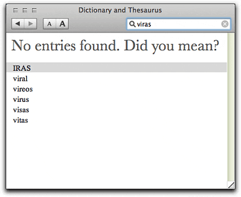 Did I mention that the Dictionary can also guess at a misspelled word? For example, when I first mis-typed “virus” into the Dictionary search field, here’s what it helpfully provided —»
Oh, and on a Mac, if you want to hear a word spoken, you can use another built-in software service, “Speech.” Just select the word and mouse to “Services/Speech/Start Speaking Text.” Like the Dictionary, the Speech service is available in all service-aware Macintosh applications. The Mac’s software services are a hard-working, invisibly wonderful part of the Mac experience nowadays. Along with the new Dictionary, they expand our understanding of what’s possible on a computer, providing one more way to make our interaction with them easier, more rewarding, and more fun.
I know it’s hard to imagine, but yes, the Apple Dictionary is actually fun to use! Perhaps one day Windows users will see such a feature built into their chosen operating system.* But for quite a while, I suspect, it’s one of the many things I can do with a Mac that simply aren’t possible on a Windows PC.