


News Posts In Category
An Audiophile Listening Room with Apple’s HomePod
Apple's HomePod has been the underdog in the "smart speakers" category since its introduction last year. It's more expensive than the offerings from Google and Amazon, and Siri doesn't seem to be as powerful. I haven't used Alexa or the Google AI assistant, so I can't say what the difference may be. But let me just say that HomePod is a revelation in audio quality, and its "smart" features are more than adequate for my needs. The most surprising aspect of HomePod is that it has finally let me put together an audiophile listening room without taking out a second mortgage!
At its most basic, HomePod is a smart speaker with Siri built in and truly gifted sound quality. It's a breeze to set up... you just use your iPhone to pair and copy settings, which takes about a minute. My first use was to add some smart light bulbs to the house, and with Apple's HomeKit app on the iPhone that's a simple matter too. To activate a new device, you just scan an icon on the packaging and then assign it to a "room" in your house. (In HomeKit, you can set up rooms and "scenes" for your devices.) Once set up, it's a simple matter to say "Hey Siri" and then turn on or off a given bulb. HomeKit also makes automation simple, so you can easily have lights come on and off at different times of the day. With scenes, you can automate multiple devices with a single command. For example, when I go to bed, I say, "Hey Siri, Goodnight," and Siri turns off the basement family room light and the foyer light.
I also subscribed to Apple Music as part of my movement to the HomePod, and I've thoroughly enjoyed being able to listen to any given album by voice command. Of course, HomePods are also AirPlay speakers, so you can easily play music to them from your iPhone, iTunes, or other devices. It's simple to play to multiple HomePods at once, and Siri can move the music from room to room by voice command if you so choose.
But the most surprising aspect of HomePod has been its audiophile sound quality. Even bass response is great, which is amazing given the small size of these speakers.
I got a new HomePod for Christmas (I already had two) and decided to put it in the living room. It sounded so wonderful I decided to buy another one and set them up as a stereo pair. That's when the true value of these little speakers became clear.
With two HomePods now in my living room, I finally have achieved an audiophile listening environment at a truly reasonable price. The two little speakers pump out amazing sound, and they only cost me about $700. To replicate a listening environment with traditional high-fidelity speakers would cost at least $2,000, because you need not only the speakers (minimum: $1,000), but also you would need a receiver/amplifier and some components to get music into the system: A CD player or turntable, for example. On top of that, you would need some place in the living room to house the speakers (much larger than HomePods) as well as the stereo components... and that means another piece of furniture as well as considerably more space than my current setup requires.
With my paired HomePods, I just need to plug them into the wall and put them on a shelf. And voila! Instant audiophile listening without all the other setup headaches and at a much lower cost.
And I love the fact that the speakers have Siri built in, which means I can raise or lower the volume by voice, get information on what's playing, skip a song, or repeat... all by simply asking Siri.
The HomePod's audio quality is more than just a differentiating factor when you compare it to Google and Amazon speakers. It truly is great enough to compete with high-end speakers costing much more, and you can easily set up a listening environment that will tickle the ears of even the pickiest audiophile. A surprising punch for such a tiny device.


The Future for Home Computing
ComputerWorld Pits Snow Leopard Against Windows 7 (Again)
As an IT professional, I support both operating systems at work. But I have Macs at home; after all, who wants to troubleshoot computer problems on their own time? My final verdict in this smackdown? It's not even close: Snow Leopard is the better OS.I couldn't have put it better myself.
Another Windows Guru Falls For A Mac
Review of Six Alternative Web Browsers
Computerworld goes beyond IE, Firefox, and Safari to take a look at six lesser-known and -used web browsers for both Mac and Windows. It's interesting to note that three of the six are based on WebKit, the core engine used in Safari.
A Treasure Trove of iPhone eReader Software Part II:
13 Apps for Managing Documents

This second part of my report on the iPhone application marketplace covers the class of software that, while still falling squarely in the overall eReader category, is designed primarily for storing and managing documents. The primary distinctions between this class and the one covered in Part 1 are that the eReader apps discussed here:
- Handle a wide variety of common file formats found in the workplace, rather than just text and proprietary eBook formats,
- Don't include controls for customizing fonts,
- Don't let users do full-text search on documents,
- Have good embedded browsers and follow web links,
- More easily let users move files to and from their iPhones, and
- Typically let users organize and rename files and folders within their interface.
It still surprises me how rapidly this market is evolving, and that evolution makes keeping tabs on the capabilities of each application--and even on the entire set of applications--quite challenging. As I was finalizing this report, a new application in this class came to market that,
This second installment covers 13 applications:
- Air Sharing
- A.I. Disk
- Annotater
- Briefcase
- Caravan
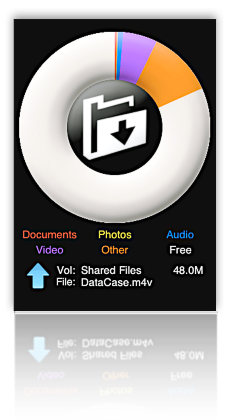
- DataCase
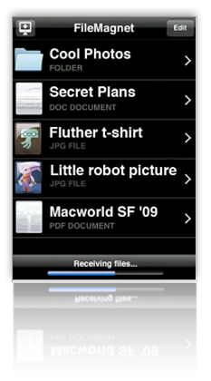
- File Magnet
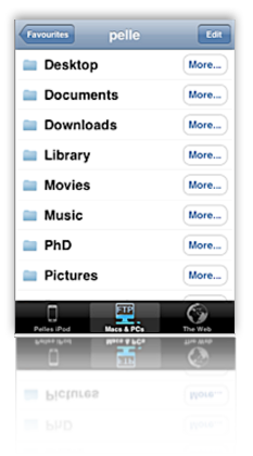
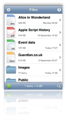
- Files
- Folders
- iStorage
- Mobile Studio
- TextGuru
- TouchFS
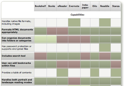
As was the case for the applications primarily for reading text, none of the eReaders designed primarily for managing documents fully satisfies all of the requirements I've specified for them. Nearly all of them show red blocks in the matrix of capabilities that follows this introduction. There are also too many "light green" blocks in the requirements designed as key (those in boldface with the shiny highlight). If I could conglomerate the best features of each application, however, I'd have what I consider an ideal eReader, one that would satisfy all of the following requirements (in no particular order):
- Handles most native file formats (including documents with images)
- Formats HTML documents appropriately
- Can organize documents into folders or categories
- User can add bookmarks within files
- Handles both portrait and landscape reading modes
- Follows web hyperlinks
- Lets user manage files and folders on the iPhone
- Works offline
- Easy to read and navigate documents
- Easy to add documents
- Provides a "full screen" mode
- Resizes content automatically for both portrait and landscape modes
- Remembers where you stopped reading
Because their orientations are quite different, the set of requirements for these "Document Manager" applications differs as well. Most of the above requirements are pretty self-explanatory, and I explained some of them in Part 1 of this review.
As noted in Part 1, any application that fully succeeds as an eReader must be able to read, navigate and appropriately format HTML documents. Whereas most of the applications covered in Part 1 could do that, only two in this list can. By "appropriately," I refer to the ability to wrap text lines while maintaining a given font size. HTML isn't PDF, and shouldn't be formatted as such. Most of these apps do this "appropriate" formatting for Word documents, and there's no reasons why they can't/shouldn't do this for HTML. That said, if an HTML file has been formatted using a rigid table structure, or if its text elements are set to specific widths using Cascading Style Sheets (CSS), an eReader can be forgiven for not parsing such files into device-agnostic HTML. (However, eReader software should check to see whether an HTML file has a separate "print" CSS style, which typically removes such formatting and can be re-wrapped with a decent font size for the iPhone.)
Unfortunately, nearly all of these applications have a file-size limit, and I used one long test HTML document (about 700kb) that consistently crashed them. The exceptions were applications like TextGuru, which warned me that it couldn't handle such large files rather than trying to load them and then crashing. The file size limit seems to be much higher for some file types (e.g., PDF and web archives) than for others.
By "Easy to read and navigate documents," I mean the extent to which an application presents a document's text at a readable type size, and to which it provides appropriate navigation controls. Relying solely on the iPhone's native "tap" and "swipe" gestures isn't usually sufficient, since such gestures don't necessarily translate into navigation actions. For example, it's typical for a double-tap to mean "expand text view to fit the display," yet some of these programs also expect such a gesture to move a document forward or backward a page. Confusing the two makes navigation pretty difficult. Similarly, some of these applications use a tap gesture to mean "unhide navigation controls" when a user is in full-screen mode. If this is the case, and the user can only navigate by tapping, the full-screen mode becomes worthless. For navigating and reading documents, the best apps in this list are Air Sharing, Briefcase, File Magnet, and Files.
Since a major distinguishing factor of this group of applications is their ability to let users manage documents, it's pretty important that they provide ways for users to do just that. This means not only being able to move folders of files from your desktop computer, but also being able to rearrange and rename files and folders on the iPhone. Otherwise, the software doesn't really work optimally as a document manager. The best applications for this feature are A.I. Disk, iStorage, and MobileStudio.
One of the tantalizing possibilities that these applications offer is the ability to not only browse the web from within their interface, but also to be able to save web documents to the iPhone. Sadly, only one of these (Caravan) can actually do that at this time; hopefully others will take up the challenge eventually. That said, several of the apps have well-designed, integrated web browsers that let users follow links to the web and easily find their way back to the starting document without having to leave the application's interface. Those that have mastered this trick so far are Air Sharing, A.I. Disk, Caravan, iStorage, MobileStudio, and TouchFS.
A general complaint I have about these application is their inability to display PDF files appropriately in either portrait or landscape mode. In both cases, the display should focus on the text or page margins, not on the page borders. Not doing so makes PDF files difficult to read and navigate. The only app that handles PDF files well is Annotater, which specializes in that format. Annotater (yes, it's really spelled that way) at least eliminates the irritating "page border" and focuses on the page margin. It also automatically resizes PDF files in landscape mode, another important factor in PDF readability. PDF readers could be improved, however, by providing a "zoom" feature that would adjust the display to the text, rather than to the margin. It's difficult to do this by pinching, and after that, navigation can suffer if the document display slides off to the right or left.
As the matrix that follows this introduction shows, all 13 of the reviewed applications have something to recommend them. For specialized uses, nearly any one of them would work well. The only ones I can't recommend at this time are Folders, iStorage, TextGuru, and TouchFS. Of these, iStorage has some remarkably good ideas, but they aren't all well executed in the current release. TextGuru is designed primarily as a text/code editor, and its file-management and eReader features clearly haven't been the focus of the developer's attention.
For overall usability as a tool for reading and managing documents on the iPhone, and other textual material, Of the 13 applications reviewed, I found three that are clearly superior, and three others that, while not as good as the top three overall, are certainly good enough to recommend:
- A.I. Disk
- Air Sharing, and
- MobileStudio.
Followed by:
- File Magnet
- Files, and
- DataCase.
If you already have an account with Apple's MobileMe service, or with any other WebDAV service such as Box.net or MyDisk.se, A.I. Disk is an obvious choice. Not only does it integrate seamlessly with such services, but it comes the closest of this group to meeting all of the requirements for applications in this category of eReader. In fact, it is the only one that doesn't fail a single requirement. Incidentally, A.I. Disk is made by the same company, Readdle, that released the excellent ReaddleDocs application, which I rated as one of the top eReaders in the "text reader" category in Part I of this report. (It's worth noting that A.I. Disk was released after I had nearly finished this review, and in fact its release ended up delaying the review so I could include it.) The main weakness with A.I. Disk, however, is that it relies solely on external WebDAV servers for file management, and can't move files directly from your computer.
WebDAV
Web-based Distributed Authoring and Versioning, or WebDAV, is a set of extensions to the Hypertext Transfer Protocol (HTTP) that allows users to collaboratively edit and manage files on remote World Wide Web servers. The group of developers responsible for these extensions was also known by the same name and was a working group of the Internet Engineering Task Force (IETF).
The WebDAV protocol allows "Intercreativity," making the Web a readable and writable medium, in line with Tim Berners-Lee's original vision. It allows users to create, change and move documents on a remote server (typically a web server or "web share"). This is useful for authoring the documents that a web server serves, but it can also be used for storing files on the web, so that the files can be accessed from anywhere. The most important features of the WebDAV protocol are: locking ("overwrite prevention"); properties (creation, removal, and querying of information about author, modified date, etc.); name space management (ability to copy and move Web pages within a server's namespace); and collections (creation, removal, and listing of resources). Most modern operating systems provide built-in support for WebDAV. With a fast network and the right client, it is almost as easy to use files on a WebDAV server as those stored in local directories.Courtesy of Wikipedia
Air Sharing makes the top cut on the strength of its terrific navigation tools and overall ease of use. Those and its ability to share documents directly with other iPhone users overcome its biggest weakness: Air Sharing doesn't let users manage their files and folders directly on the iPhone. Rather, you must set up folder structures and populate them with files on your computer and then sync with the iPhone. Hopefully, the developer will address this problem in a future release.
MobileStudio (originally known as MobileFinder until Apple asked the developer to change it) excels at just the task that Air Sharing leaves out: Creating, moving, copying, and renaming files and folders on the iPhone. MobileStudio was also the first app in this class that lets users create and edit text file. It can even read and write .zip files, and you can set specific permissions on each file or folder--all within its interface. However, MobileStudio is weak in document navigation. Although it offers a full-screen mode, its lack of navigation options in that mode make it functionally useless. (For more information on this, see the detailed description of MobileStudio.)
The next three applications in the recommended list (these are designated with a light-green background in the summary matrix) all have some excellent features that may trump those at the top, depending on the weight you place on each requirement. Files is easy to use and makes reading documents pleasant, but it can't manage files on the iPhone and doesn't have an embedded web browser. File Magnet has the best reading environment of any of these apps, as a result of its innovative "tilt scrolling" and "auto-scroll" mechanisms. Its biggest weaknesses are lack of bookmark support and inability to manage files and folders. DataCase has good built-in navigation controls and automatic "full screen mode." It's also one of the easiest to set up and move files to and from the iPhone. However, it doesn't let users create, rename or rearrange files and folders, it's not particularly good at displaying HTML or handling web links.
The remainder of this report consists of a summary matrix showing the various capabilities and usability features of each application. In the matrix, a green block indicates that the app fully meets the requirement, and light green means a partial score. A red block indicates that the app fails the requirement, and light red means if partially fails. The gloss overlay highlights the core requirements for this category.
Following the matrix are separate descriptions of each application, organized into lists of "Special strengths," "Special weaknesses," and "Other notes."
Summary: e-Readers for Managing Documents (Table 1)
Air Sharing | A.I. Disk | Anno-tater | Brief- case | Caravan | DataCase | File Magnet | |
Capabilities | |||||||
Handles native file formats, including images | |||||||
Formats HTML documents appropriately | |||||||
Can organize documents into folders or categories | |||||||
Has password protection or supports encrypted files | |||||||
Includes search tool | |||||||
User can add bookmarks within files | |||||||
Provides a table of contents | |||||||
Handles both portrait and landscape reading modes | |||||||
Follows web hyperlinks | |||||||
Can browse and download files from the web | |||||||
Lets user customize font faces and sizes | |||||||
Lets user manage files and folders on iPhone | |||||||
Can create and edit text files | |||||||
Works offline | |||||||
Works without external web account | |||||||
Usability | |||||||
Easy to set up | |||||||
Easy to read and navigate documents | |||||||
Easy to add documents | |||||||
Provides a full screen mode | |||||||
Resizes content for both portrait and landscape | |||||||
Remembers where you stopped reading | |||||||
Transfer Methods | |||||||
Includes dedicated desktop software to transfer files | |||||||
File transfers from documents stored on the web | |||||||
File transfers from computer via FTP/Bonjour/WebDav | |||||||
Overall Rating | |||||||
| ✓ | ✓ | ✓ | ✓ | ||||
Summary: e-Readers for Managing Documents (Table 2)
Files | Folders | iStorage | Mobile Studio | TextGuru | TouchFS | |
Capabilities | ||||||
Handles native file formats, including images | ||||||
Formats HTML documents appropriately | ||||||
Can organize documents into folders or categories | ||||||
Has password protection or supports encrypted files | ||||||
Includes search tool | ||||||
User can add bookmarks within files | ||||||
Provides a table of contents | ||||||
Handles both portrait and landscape reading modes | ||||||
Follows web hyperlinks | ||||||
Can browse and download files from the web | ||||||
Lets user customize font faces and sizes | ||||||
Lets user manage files and folders on iPhone | ||||||
Can create and edit text files | ||||||
Works offline | ||||||
Works without external web account | ||||||
Usability | ||||||
Easy to set up | ||||||
Easy to read and navigate documents | ||||||
Easy to add documents | ||||||
Provides a full screen mode | ||||||
Resizes content for both portrait and landscape | ||||||
Remembers where you stopped reading | ||||||
Transfer Methods | ||||||
Includes dedicated desktop software to transfer files | ||||||
File transfers from documents stored on the web | ||||||
File transfers from computer via FTP/Bonjour/WebDav | ||||||
Overall Rating | ||||||
| ✓ | ✓ | |||||

Air Sharing
Version 1.0.3, $6.99 Home Page
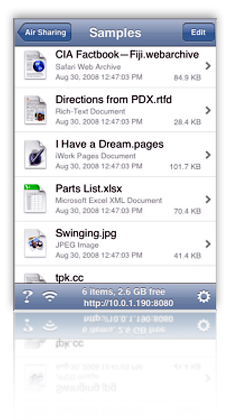
- Document lists can be resized by pinching
- Features navigation menu by clicking the top toolbar
- Can connect and share files directly with other iPhone users
- Handy navigation controls overcome some of the limitations of the click/double-click method. The next/last page buttons on the toolbar are especially helpful in navigating PDF files. Air Sharing also has an icon in the top toolbar that takes you back to the beginning of the file� really helpful for long files!
- Air Sharing remembers where you left off reading, and on launch returns you to the folder of the document you were reading last.
- Excellent web browser integration: If you link to a web page, you can continue browsing as needed and then use Air Sharing's back/forward buttons to return to where you started. However, you can't download web pages as you browse them.
- Automatic full-screen mode.
- Very useful built-in Help.
- Support for RTF documents is still very iffy. Often, opening one crashes Air Sharing. When it doesn't,
- formatting can become goofy--for example, everything starts to become underlined, and hyperlinked words or phrases get changed to "hyperlink." However, Air Sharing's documentation lists RTF and RTFD as supported formats.
- Doesn't follow links in PDF files
- Air Sharing doesn't let you set up files and folders on the iPhone, or move files or folders around within the folder hierarchy. To set up folders, you need to design the hierarchy on your desktop computer and then synch with the iPhone.
- Has a little difficulty switching between landscape and portrait modes, often getting stuck in between modes, or changing very slowly.
- Air Sharing supports the file formats that Safari does (including .webarchive files written from Safari), as well as Microsoft Office formats supported on the iPhone. Support for iWork files is limited to the file preview embedded in the file package, and support for RTF/RTFD isn't reliable. One extra class of formats Air Sharing supports is source code, which it can display with appropriate syntax colors.

A.I. Disk
Version 1.0.1, $7.99 Home Page
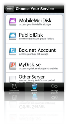
- Developed by Readdle, makers of the excellent ReaddleDocs reader, A.I. Disk is extremely easy to set up if you have an account with one of the supported WebDAV servers. Out of the box, A.I. Disk can connect to your MobileMe, Box.net, or MyDisk.se accounts, and you can add whatever other WebDAV servers you may use.
- A.I. Disk makes it quite easy to create new folders and to move documents and folders around within its interface.
- You can easily follow hyperlinks to web pages using the build-in browser, and A.I. Disk maintains back/forward buttons so you can find your way "home." Like most other apps in this category, however, you can't save web files to A.I. Disk.
- Supports adding bookmarks within your files.
- You can add an extra layer of security to your document store by setting a separate passkey.
- A.I. Disk offers a handy slider for moving quickly through large files.
- The software adds an "automatic bookmark" to return you to where you left off reading a document, though it always defaults to show you your root library folder when starting up.
- You can email documents from within the software's interface.
- In addition to Microsoft Office, HTML, and PDF formats, A.I. Disk offers full support for Apple-specific formats like those from iWork as well as Safari web archives. Curiously, it can't read RTF files, though.
- For relatively short files, A.I. Disk does an excellent job at resizing to fit both portrait and landscape mode, and it also reformats HTML files appropriately to fit the display (excluding files that have pre-formatted tables or CSS styles).
- A.I. Disk doesn't handle the display of large documents very well. It seems to take an unusually long time to finish loading such files, although it starts to display some of it fairly quickly. I found the early display more frustrating than endearing, since I couldn't use any of the controls or otherwise navigate the document until the entire file was loaded.
- On a related note, although you can manually activate full-screen mode, the change can take quite awhile for long documents, and equally long switching back. In addition, when in landscape view, the control for restoring the navigation bars disappears, so you have to switch back to portrait mode to close the document or do anything else.
- One of A.I. Disk's biggest weaknesses is its inability to transfer files from your computer. If you want to get such a file to A.I. Disk, you must first upload it to your favorite WebDAV account, and then download it to the iPhone.
- It would be nice if A.I. Disk offered a way to upload files to your WebDAV servers, but it doesn't at this point.

Annotater
Version 1.2.619, $4.99 Home Page
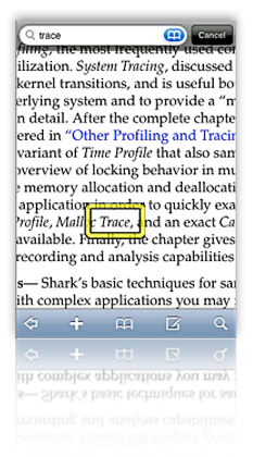
- Annotater is unique among the current crop of eBook readers for iPhone in that it is based solely on the PDF format, for which it has the best support. It is the only app that includes full-text search of PDF files, and the only one that supports PDF bookmarks (or the table of contents you can set up in Acrobat).
- Another unique characteristic of Annotater is that it supports PDF annotations, including drawing (in various colors, with your finger), text notes, and bookmarks.
- Annotator is the only application that does a good job of eliminating the screen-real-estate-wasting border that seems to be the default way of presenting PDF files.
- Synchronization through Annotater's desktop "Annotater Service" application is automatic and very fast. Once done, you can browse the files and decide which ones to keep. Whenever you launch the app, you can resynchronize, or add new folders to transfer. If you add more files to a desktop folder, you can have Annotater Service "reindex" the folder, making the iPhone aware of the new documents.
- The desktop app only accepts folders to synchronize with the iPhone, not individual files. The folders, however, can be deeply nested if necessary. You cannot change the folder structure on the iPhone, or in the desktop app. The organization must be set up on your file system. Annotater will only synchronize any PDF files it finds in the folder structure
- To use other file types, you need to first convert them to PDF, as Annotater cannot read HTML or any other native file types.
- Annotater does not support encrypted PDF files.
- No full-screen mode, although Annotater's settings let you define the toolbar's transparency, making it possible to read through.
- The application provides no navigation controls while reading documents.
- Annotater relies on a wireless, Bonjour-aware desktop application ("Annotater Service") that supports only Mac OS X (at the moment). The restriction to Mac OS X support probably reflects the fact that any file on the Mac can be "printed" out to a PDF file.

Briefcase
Version 1.1, $4.99 (Lite version, free) Home Page
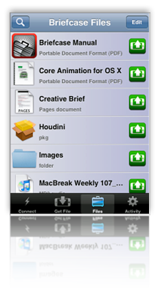
- Briefcase is the most impressive application so far with respect to ease of connection to your computer and the ease of transferring files back and forth. You literally have to do nothing but log in. Briefcase identified any Bonjour-enabled computers on your network and presents them instantly in its interface. You have the option of having Briefcase remember your password, but the app warns you to use the iPhone's password-lock tool if you do.
- You can not only connect to local computers, but also to any remote computers on which you have accounts. Even more useful for most users, iPhone users can transfer files among each other, assuming they have appropriate permission to do so.
- Downloads that are interrupted when you quit Briefcase will be automatically resumed the next time the software is started.
- Briefcase remembers where you left off reading and returns you there. But it doesn't remember which file you last had open or offer to reopen it.
- For Mac users, Briefcase offers a plethora of special features for uploading files to your Mac, including:
- Adding image files to iPhoto
- Adding audio files to iTunes
- Opening files automatically on the Mac
- Setting images as your desktop background
- Selecting specific folders to upload files, which you can bookmark in Briefcase for quick access later
- Although you can download folders from your computer to Briefcase, there's no way to move files to folders, create new folders, or rename files or folders from within Briefcase.
- In a typical first-release symptom, Briefcase's interface remains in portrait mode when you switch to landscape, making navigation and bookmark-setting awkward. Also, bookmarks you set in landscape mode don't take you to the same location when in portrait mode.
- In the 1.0 release, I found Briefcase frequently ran out of memory and started acting erratic or bumped me back to the iPhone screen.
- Many of Briefcase's special features are only relevant to Mac users. That doesn't make them any less special, but from the perspective of a Windows user, it makes Briefcase less useful. As the developer explains in his FAQ for Briefcase,
While Briefcase was designed to work optimally with Macs, Windows users (with a solid amount of technical knowledge) can use Briefcase as well. Windows does not support any open standards for remote login out of the box, including SSH which Briefcase uses. This means that one must install and set up an SSH server under Windows before Briefcase can connect.
Presumably, a Windows user would also need to install Bonjour for the automatic network detection to work. - Briefcase has a good built-in web browser that lets you follow links without leaving the app. Two problems, however, that hopefully will be fixed in a future release:
- Once you follow a link, there's no way to get back to your previous page (or to the Briefcase document you started with), and
- You can't save documents you browse to into Briefcase.

Caravan
Version 1.3, $2.99 Home Page
- Caravan is another impressive iPhone app, which provides among the best integration between web, iPhone, and computer desktop. For connectivity to the desktop, Caravan relies on Bonjour and FTP. (Windows users will need to install Bonjour for Windows on their systems in order to use Caravan.) Unlike Mobile Studio, though, Caravan presents your file system on the iPhone, and lets you browse and download contents from within Caravan.
- Using the same Bonjour connection, Caravan also lets users transfer files from the iPhone back to your computer's file system.
- Caravan has among the best embedded web browser solutions in this roundup. Not only is the browser truly "embedded," so you can browse without leaving Caravan, but Caravan provides a "Download" button for every page you visit.
- Caravan has an excellent interface for creating and editing folders on your iPhone. In addition, when downloading files, the user can browse to the correct folder--or even create it--before saving the file. Once downloaded or created, file and folder names can be changed as needed.
- Caravan also lets users create and edit text files within its file system. These files are searchable.
- Caravan has a related feature called "Edit as Text," which can be used to make changes to text files (including HTML) you download from your PC or from the web.
- In addition to Microsoft Office formats, PDF, HTML, .webarchive, and text files, Caravan can also store and play audio and video files, and supports picture viewing.
- A nice feature missing from too many others in this category is that Caravan follows HTML bookmarks within files. (Often, other apps try to reload the entire page to the bookmark which can cause your session to be transferred to the iPhone's web browser.)
- Caravan doesn't let you move files to or from folders once they're created or transferred.
- The "Edit as Text" feature, though great in concept, can destroy Word files if you try to use it with them. In fact, the main weakness in this feature is that it appears as an action for all file formats� even videos and images� whether or not they're actually "editable."
- Caravan has no support for RTF or iWork file formats.
- The application does not have any facility for adding bookmarks or other annotations to files.
- Caravan has no full-screen mode and provides no in-document navigation tools.

DataCase
Version 1.1.1, $6.99 Home Page
- Connects to Mac or Windows through Bonjour, setting up a drive in Finder or Explorer. Users can drag files to the drive(s) like any other folder on their system. This occurred without any action on my part.
- In DataCase, you set up drives on the iPhone, and each drive can have a separate set of permissions, including read/write/browse. You can also set the drive as hidden and can have the contents of the drive backed up via iTunes' normal iPhone backup.
- In addition, you can use a web browser to browse Database's content on the iPhone, using the iPhone's IP address at port 8080. Or, you can connect to DataCase's file store using FTP.
- DataCase lets you filter file your document library by type, and it supports in-document bookmarks.
- DataCase remembers where you left off reading a document, but not which document that was.
Bonjour  Bonjour, formerly Rendezvous, is Apple Inc.'s trade name for its implementation of Zeroconf, a service discovery protocol. Bonjour locates devices such as printers, as well as other computers, and the services that those devices offer on a local network using multicast Domain Name System service records. The software is built into Apple's Mac OS X operating system from version 10.2 onwards, and can be installed onto computers using Microsoft Windows operating systems (it is installed with iTunes, for example).Courtesy of Wikipedia
- Built-in navigation support is OK, with forward/backward and end/beginning buttons in the top toolbar. However, these aren't available in "full screen" mode, and DataCase doesn't support navigation of HTML files in this mode except by swipe. Further, there's no way to initiate full screen mode� it just seems to happen when you resize HTML to fit the display. I couldn't get full-screen mode to activate in PDF files at all.
- Follows web links in files, but doing so takes you outside of DataCase. This will close DataCase's connection with your PC, but DataCase warns you that this will happen.
- DataCase takes a long time, and often freezes, when trying to load long HTML documents. In general, the app is just not reliable for viewing HTML.
- A bug causes the DataCase interface to get confused now and then, with some buttons appearing where they shouldn't, etc. This requires closing and restarting the app.
- Supports standard Office documents (Word, Excel), PDF, HTML, audio, video, and images. (I had no luck with video files, however). It doesn't read RTF files, nor .webarchive files saved from Safari.
- For PDF files, DataCase resizes content when switching from landscape to portrait mode, but doesn't do this for HTML.

File Magnet
Version 1.1, $4.99 Home Page
- Very sophisticated and innovative navigation options, including a (for now) unique feature called "tilt scrolling." Using this method, you just tilt the iPhone to scroll the text� the more you tilt, the faster the scroll. File Magnet also includes a nice "page down" button that animates the text down one page, as well as a horizontal slider for moving quickly through the document.
- File Magnet has a very good embedded web browser that will follow hyperlinks within Word and RTF documents, including links to external PDF files. Within the browser, you can navigate to other web pages, but you can't get back to the document you started with from within this interface.
- File Magnet's file/folder list is better than most, since it provides very good icon previews as well as subtitles indicating file type.
- Though the application doesn't appropriately size text in HTML files, it does do this for RTF and Word documents.
- File Magnet has a very robust, automatic full screen mode, and it resizes documents automatically when switching from portrait to landscape mode.
- File Magnet remembers where you left off reading in all file types it supports, and it also remembers the folder you were last in. Most of the time, it also automatically re-opened the last file I was reading on launch.
- No support for PDF bookmarks or hyperlinks.
- Doesn't support bookmarks within documents.
- File Magnet doesn't support any kind of file or folder organization on the iPhone. Likewise, you can't rename or create files or folders. All of this must be done before adding files through File Magnet's desktop application.
- Uses a simple desktop application, available for both Mac OS X and Windows, for moving files and folders to the iPhone.
- Supports jpeg, gif, tif, png, html, rtf, rtfd, doc, txt, pdf, iPhone compatible movies and audio files. Now also supports native Excel, Powerpoint, and iWork files, as well as .webarchive files.

Files
Version 1.1.1, $6.99 (Lite version, free) Home Page
- Files does an excellent job at handling a very wide variety of file formats. Although it doesn't resize HTML content to fit the display correctly, it does preserve HTML formatting, images, and CSS styles quite accurately. Besides handling the usual baseline of PDF and Microsoft Office formats, Files also fully supports Apple's iWork formats (Numbers, Pages, and Keynote), as well as web archive files.
- Files remembers where you left off reading� an unusual gift in this category of eReaders. However, it doesn't remember which file you last had open or give the option to start there.
- Files has good navigation features� in particular, providing a page up/page down button is useful for content that a user has resized with a pinch-type touch. This keeps the page from sliding left or right and maintains a steady reading view. Files also has "go to page" and bookmark navigation options, and users can move quickly up or down a document by holding the page up/page down buttons rather than tapping them.
- Although Files doesn't win any special points for readability in general, reading PDFs in Files seems to be especially practical. For whatever reason, text in PDF files are very sharp in Files compared with some other apps. That said, it's disappointing that the app doesn't automatically resize PDFs or HTML files when switching from portrait to landscape view.
- Users can add files and folders to Files when uploading from their computer, but there's no way to modify the folder structure or file names on the iPhone. Users can, however, delete files from the iPhone.
- Files can follow web links in HTML and Office documents, but not in PDF or other file types. Further, following links takes the user out of Files, making it difficult to continue reading your original document.
- Files runs a WebDAV-enabled server that users can connect to from their desktop PC. Files provides the WebDAV URL on startup, and connecting to it is a simple matter (apparently a bit more complicated from a Windows PC than from a Mac). Files allows you to start and stop the server from within its interface. Once connected, the Files document store appears as a folder in the Finder or Explorer, and you can move files to the iPhone from this interface.
- To access Files on the iPhone, you must authenticate with a username and password. This security setting is optional and can be configured in the Files options window. In addition, you can optionally password-protect the Files store itself.

Folders
Version 1.4, $1.99 Home Page
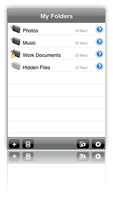
- Users can add folders and change the names of files (but not folders).
- Folders provides a built-in web browser that offers the capability of download HTML and other documents from the web. (However, see entry for this function in next section.)
- Folders lets users password-protect individual files and folders� in effect, "hiding" them from intruders.
- Downloading files from web is a great idea but is buggy and not very usable. The app reports an error with each file you try to download, and seems to download some of them multiple times. It wouldn't display a .txt file, but did display a .pdf one. The .html file I tried to download never made it.
- Many screens display a "tool" icon that doesn't work.
- Folders provides no way to transfer files to or from your computer, except by running your computer as a web server and connecting to that. The software description on iTunes speaks of being able to export files to your computer with WiFi, but I found no built-in way of doing that.
- Sometimes you lose the navigation icon back to your "home" list of folders and documents.
- You can't move files from one folder to another, nor can you add nested folders.
- Folders provides nothing in the way of in-document navigation.

iStorage
Version 1.0.4, $5.99 Home Page
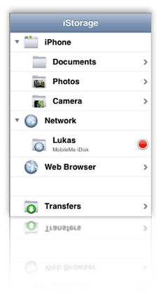
- iStorage has the best tools of any of these apps for connecting to network file systems and servers, navigating them, and uploading or downloading files. You can set up numerous network drives, which can read FTP sites, your iDisk (and other WebDAV servers), nearby Bonjour devices (such as other iPhones), and any computers on your local network you have access to. You can define and have iStorage remember the connection information for each server for later use.
- With iStorage, you can bookmark files and/or folders on any of these network drives for quick access later on. The bookmark feature also applies to web pages you might encounter. This capability is unique among these apps, and it's almost enough to overlook iStorage's lack of in-document bookmarks.
- Although the rest of the application's interface is confusing, inconsistent, and just plain buggy, the home screen is very nicely set up and very easy to use.
- It's easy to create new folders (and subfolders) in iStorage and to move files into them.
- iStorage has a number of excellent ideas, poorly executed. It's not clear what kind of application it wants to be. For example:
- You can download HTML files just fine, but you can't view it except as source code. (You can, however, edit the source.) The HTML view provides good tools for zooming in text, but no control over font color (white) and background (black). In any case, since you have to read source code, what's the point?
- iStorage has a nice built-in web browser, and a setting that lets it "Switch To Downloads." However, the interface provides no way to download files using the web browser.
- iStorage has terrific connectivity to various document stores, but every document you try to download generates an error. Even if a document downloads, often the downloads are incomplete.
- The application has poor navigation and toolbar functions. When browsing a network drive, it's easy to completely lose a way back to iStorage's home screen, for example. Likewise, when viewing a document list, there's both an "Edit" button, which only lets you delete files, and an unclear icon on the bottom toolbar, which you must use to move files into folders; as in other similar apps, these should be combined. Finally, one of the icons just duplicates the action of selecting a file from the list.
- iStorage's file format support is weaker than most. In the latest version, I could now read Word and Excel documents in addition to PDF and images. However, that leaves HTML, RTF, .webarchives, and iWork formats, among others, that it can't help you with. Even text files I created on the iPod couldn't be viewed in iStorage.
- Prone to crashing fairly frequently.
- When you follow a hyperlink from a Word document and then close it to return to iStorage, the application returns you to document directory rather than to the document you were reading.
- iStorage doesn't remember where you left off reading, loading each document from scratch on each access. I also found it annoying that you have to go through a set of menu choices when clicking on a file, one of which is to open it. The choices are great ("Info," which is how you'd change the file's name among other things, and "Upload," which lets you move the file to a server), but since I hardly ever used them, I'd rather have my choice of defaults (which would be "open").
- iStorage does a great job with switching from landscape to portrait mode when viewing documents, but it doesn't support this mode when traversing directories or using any other parts of the top-level interface.
- iStorage supports full-screen mode, but it's a manual process that's not totally intuitive.
- iStorage can follow hyperlinks from Word documents, but not from any other file type at this point.
- iStorage has a search feature that lets you search on filenames in a directory.
- For Word documents, iStorage resizes the file content when switching from portrait to landscape modes, but it doesn't do this for other file types that it can read (e.g., PDF).

Mobile Studio
Version 1.1, $1.99 Home Page
- One of the many impressive features of Mobile Studio is the ease with which users can copy, move, create, and rename files and folders, without relying on a desktop application.
- Mobile Studio is also one of the only apps reviewed that lets users create and edit text files within the Mobile Studio hierarchy.
- Mobile Studio also supports zip files. It can decompress zip files, and it can also compress files into zip format.
- This application has excellent security features. It lets you lock the application with a password, in addition to the password lock available for the iPhone itself. In addition, Mobile Studio lets users define whether a given file is readable/writeable/executable, effectively letting you "hide" files from external sources.
- Although it cannot download files from the web, Mobile Studio has an excellent embedded web browser, which lets users browse websites without leaving the app, as well as navigating backwards and forwards among the web pages they visit. Mobile Studio can follow hyperlinks in Word and HTML documents, but not in PDF or iWork files.
- The application provides a very responsive slider control for navigating long documents.
- Mobile Studio remembers where you left off reading (though not which file you last read).
- This app has unique tricks like importing images from your photo library with the option to resize and/or crop them before placing them in MobileStudio. Cool!
- Another unique feature of Mobile Studio is that it maintains a "trash can" that contains all the files and folders you delete� thus letting you restore files if necessary before deleting them for good.
- Mobile Studio does a good job of appropriately resizing Word and plain text document content to fit the iPhone screen, but it fails to do the same with HTML files.
- Users have no way to add bookmarks within their files, and there are no search or sort options.
- Setting up Mobile Studio for file transfer is harder than necessary, and is perhaps the most difficult of this group of apps.
- Navigating documents (I confirmed this in HTML, Word, and PDF) is a bit of a pain, since you can't use any kind of tap gesture to move back or forward. Doing so takes you out of full screen mode to use the slider. For HTML, this is also a problem since a double-tap gesture usually resizes the text to full width if it isn't already there.
- Mobile Studio has a handy "Home" button on the bottom toolbar, but every time I used it I ended up with a black screen and had to exit the application to actually return "Home."
- Mobile Studio relies on FTP (and an FTP client) for transferring files to the iPhone. The app has built-in instructions for doing so from Mac OS X, Windows XP, and Windows Vista.

TextGuru
Version 1.0.7, $4.99 Home Page
- Reading PDF and native Office documents with TextGuru is very good, with both landscape and portrait modes supported. Both of these modes offer full screen view and a slider for fast navigation. (The slider works better for Word documents than for PDFs.)
- TextGuru is first and foremost a text editor, so many of its greatest strengths pertain to those functions. Though irrelevant to its use as an eReader, TextGuru's ability to edit (including search and replace, cut and paste, etc.) HTML and text files is remarkable. Other file formats (such as a test Pages document) can be viewed/edited as ASCII or HEX.
- This application offers full-text search across your document store, and it can also do search and replace for editable files. For editable files, TextGuru navigates to the first instance of the search term and highlights it. However, there's no way to navigate to the subsequent instances.
- TextGuru not only remembers where you left off reading, it remembers which file you last had open and takes you there first by default. You can change this setting in the Settings pane.
- TextGuru is the only application in this review that by default reformat HTML content to a font size appropriate for the iPhone display. (Except, of course, where the HTML content is inflexibly formatted using tables or CSS styles.)
- No landscape mode for HTML files.
- No support for adding folders or editing document names. TextGuru's otherwise nifty FileServer software (available for both Mac OS X and Windows) also cannot share folders.
- The interface can become a little confusing as you switch from document viewing to document editing to document searching. Another confusing aspect is in the search feature for editable files. Doing a search here launches the "Search and Replace" screen, but the implication is that if you just enter a search, the term will be replaced with nothing if you don't enter a "Replace" term. (In fact, that doesn't happen, but this could be much clearer.)
- The search feature promises more than it delivers, in two respects:
- It delivers some false results (for example, a PDF file showed up in a search for the word "bold", but I determined that the word does not in fact exist in that file).
- It doesn't display the instances of the search text in the files when you open them. In the case of files of more than 1 or 2 pages, this renders the search feature less than useful.
- TextGuru reads neither RTF nor web archive files, and to read HTML files you must first bring the file up into its text editor, and then switch to a web preview mode.

TouchFS
Version 1.2, $14.99 Home Page
- TouchFS can follow hyperlinks in Word and HTML documents (but not in PDF files). It has an excellent implementation of an embedded web browser that doesn't take users outside of the TouchFS interface. The interface also lets user navigate backwards and forwards while they are browsing the web.
- For HTML files, TouchFS follows in-document bookmarks as well as external links.
- TouchFS lets users set up a username and password to authenticate against to protect access to the iPhone document store.
- TouchFS offers no ability to annotate or add bookmarks to your files on the iPhone.
- Users can't change the names of files or folders, or create or move them within the TouchFS interface.
- TouchFS has no built-in navigation tools to help users while reading long documents. All navigation relies on swipes, which don't work very well if you've enlarged a particular document (as you frequently want to do with PDF files.) Lack of navigation aids also hinders reading of HTML files, since a double-tap changes the page zoom as often as it causes a page scroll.
- The file list is difficult to use, since icons are so small you can't always tell what file type you're loading, and filenames typically don't display completely with the very large font size.
- TouchFS has no full-screen view.
- TouchFS resizes PDF files when switching from landscape to portrait view, but doesn't do the same for HTML. Like most of the apps in this category, it also doesn't attempt to appropriately format HTML to fit the screen with a readable font size.
- Expensive. Considering how many other, better eReaders there are in this category--all for much less money--TouchFS is clearly overpriced. It's by far the most expensive of the bunch ($14.99, almost twice that of the top-rated app here, A.I. Disk, at $7.99).
- TouchFS supports display of PDF, Microsoft Office documents, HTML, and text files The application will display image files, but won't play audio or video files. It supports iWork formats using the document's PDF preview.
- Like some of the other apps reviewed here, TouchFS uses WebDAV and Bonjour to connect the iPhone to your PC. The user connects to the iPhone server, which sets up a folder in Finder or Explorer from which you can add files and folders.
The summary table below uses some advanced CSS techniques that aren't yet possible with your browser. WebKit, the open-source browser engine underlying Apple's Safari browser (for both Windows and Mac), has implemented numerous features of CSS 3.0, as well as pioneered some candidates for new graphics functions using CSS. (For more information on these, see the Mars article on the subject, or visit CSS3.info.
In particular, the table uses CSS border-radius (which produces the table's rounded edge), CSS box-shadow (which gives the table a drop shadow), CSS gradient (which produces a gradient in the table headers), and CSS background-size together with background-attachment and background-clip (which lets me automatically resize a small tiled image-- ![]() --both horizontally and vertically to fit the various-sized table cells).
--both horizontally and vertically to fit the various-sized table cells).
Here is a screenshot of how the top part of a similar table looks in Safari:
Discover a Treasure Trove of iPhone eReader Software
Part I: Eight Apps for Reading Books

The iPhone application marketplace now offers a tantalizing variety of tools that can be used as eBook readers and file managers. As I concluded in the September 2008 report, "Without Even Trying, Apple's iPhone Takes the eBook Reader Sweepstakes," the iPhone and iPod Touch hardware finally enables truly practical eBooks, and the software now available for the iPhone platform just clinches the deal.
Having worked with the growing number of these applications since the first started appearing in June, I've concluded that the market is clearly divided into two major objectives:
- Applications designed primarily for reading text (books), and
- Applications designed primarily for storing and managing documents.
As I compiled notes and usability data on this group of applications, it became clear that trying to cover all 19 different applications for the iPhone that can serve as e-document readers in one article (a 20th was released just as I was finalizing this report) would be a bit much--for me as well as for readers. As a result, this will be the first of two installments of the overall report. (Note: All of these applications, with one exception, work equally well on both the iPhone and iPod Touch. For simplicity and brevity, I'll use "iPhone" to refer to both devices going forward.)
This first part covers the following iPhone applications, which are primarily aimed at reading text and HTML documents:
The second installment will cover applications that specialize in enabling document repositories on the iPhone: Air Sharing, Annotater, Caravan, DataCase, File Magnet, Files, Folders, iStorage, Mobile Finder, TextGuru, and TouchFS.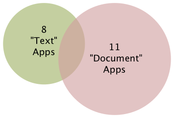
It's important to note that like any categories one devises for grouping things, theses two categories of necessity form a Venn Diagram. Some of the applications discussed in this article have characteristics that also make them useful for managing documents, whereas some of the applications that are most useful for managing documents are also quite good at reading text. Hence, my use of the qualifier "primarily" in the article title.
Venn diagram
From Wikipedia, the free encyclopedia
Venn diagrams or set diagrams are diagrams that show all hypothetically possible logical relations between a finite collection of sets (groups of things). Venn diagrams were invented around 1880 by John Venn. They are used in many fields, including set theory, probability, logic, statistics, and computer science.
Although most of these "Reading Text" applications are quite good--especially given how little time they've been in production--one of the frustrating aspects of this crop is that there is no single one that incorporates all of the potentially desirable characteristics. Some of the lacking abilities are, admittedly, optional. However, once you encounter the ability in one app, its absence in others becomes noticeable.
Again, because their overall orientation differs significantly, I found it fairer--and more helpful--to draw up separate sets of basic requirements for the two groups of applications. I'll go into the requirements for the "Document Manager" applications in Part II, but here are the requirements for those reviewed this time (in no particular order):
- Formats HTML documents appropriately
- Can organize documents into folders or categories
- Includes search tool
- User can add bookmarks within files
- Handles both portrait and landscape reading modes
- Lets user customize font faces and sizes
- Easy to read text
- Easy to add documents
- Provides a "full screen" mode
- Resizes content automatically for both portrait and landscape modes
- Remembers where you stopped reading
I think most of these are pretty self-explanatory, but let me elaborate on a couple of them.
To traditional publishers of eBooks, use of HTML as a document format has been troublesome for a variety of reasons, not the least of which is the difficulty of protecting copyrighted content using HTML. HTML is also perceived as being unable to easily handle included images, which some eBooks require. However, both Apple and Microsoft have developed archival formats for web pages, which encode the text and images into a single package. Although the package itself doesn't securely protect the content (there are "un-archivers" for both formats freely available), doing so is probably not beyond technical feasibility.
Sadly, only one of the applications in this review can handle .webarchive files (which you can create by saving web pages from Safari), which is a shame because this is the ideal, unlicensed format that preserves not only text, but also text formatting, tabular material, and images.
Still, a non-negotiable requirement, as far as I'm concerned, is the ability to read and appropriately format HTML. Fortunately, most of the applications in this list can do that.
By "Easy to read text," my main consideration is giving the user some control over the size of type that's displayed. If you can also change the typeface and/or display colors, that's a nice bonus. All of the applications in Part I provide this feature, and it's a major distinguishing factor compared with the applications in Part II, none of which provide any sort of font customization tools.
Finally, after some use I've determined that any e-Reader I'll use must work even if I have no wireless or other network connection. It's simply unreasonable to expect that Internet access will be available during my backpacking trip to Sequoia National Park or while taking in some rays at a remote beach on St. John. And those are just some of the places I'll want to have a good book along with me. A book that simply "stops working" is obviously no good, is it? As a result, I can't recommend some iPhone applications that have otherwise terrific features. My books must work offline. (Frankly, even if you do have wireless Internet, I've found that sometimes the servers hosting my online books report that they're unavailable. When was the last time a book you were reading told you it was busy and couldn't be read right now?)
As the matrix that follows this introduction shows, all 8 of the reviewed applications have something to recommend them. For specialized uses, nearly any one of them would work well. The only exception at this time is iSilo, which is just so badly designed that it's not only hard to navigate, but impossible to use in any practical manner.
For overall usability as a tool for reading books and other textual material, I've found five of the eight good enough to recommend:
Bookshelf and Stanza are both excellent choices for general text reading, though they're quite limited in the range of document formats they support. Stanza has superior annotation capabilities, as well as full-text search that Bookshelf lacks, but Bookshelf makes it much easier to get content onto the iPhone and does a superior job of converting documents. Unfortunately, Stanza's desktop application, still in beta, is unusable for converting non-text document formats (particularly HTML and PDF) to text files, yet it leads users to believe that it can. To use files with Stanza, you really need to convert to plain text format before opening in Stanza Desktop, which is the only way to get personal/business content onto the iPhone.
One of the major weaknesses of both Bookshelf and Stanza is their lack of integration with any kind of commercial e-bookstore. This reflects their current inability to display DRM (digital rights management) content, which of course is the security wrapper commerical bookstores use to protect copyright. This means that your book choices are pretty much limited to public domain classics and other free books. I, however, want a reader that will easily let me buy the latest novels by my favorite authors, and that's the reason eReader is among the recommended applications. eReader has allowed me to completely eliminate reliance on paperbacks and other tree-killing book forms for casual pleasure reading. It's delightful and very reliable for this kind of reading, even though it lacks some of the primary requirements noted earlier. To purchase a book, I log in to the eReader bookstore and buy a book online. This places the book in my online "shelf," and when I launch eReader on my iPhone, the new book is there, waiting to be downloaded.
Readdle is on the recommended list because it's a terrific cross-breed between the text reader category and the document-storage category. Readdle can handle many kinds of native document formats as well as HTML, it excels at folder and file organization, and it has a well integrated web browser with which you can download files to your Readdle library. Readdle users also have an online account, which is a password-protected repository of their files. The repository accepts files through a web form, from email, or, for Mac OS X users, from a simple, drag-and-drop desktop application. Readdle lacks some of the standard features of the best text readers, such as customizable fonts and the ability to remember where you stopped reading. This latter weakness is mitigated, however, by Readdle's excellent bookmark support.
With its latest improvements, Evernote is now one of the applications I recommend in this category. Like ReaddleDocs, Evernote spans the "text reading" and "document management" categories, and it's chock-full of great features for gathering and managing a document and text collection that most of the other applications lack. Besides handling your everyday work or personal documents, Evernote can clip web content (similar to Instapaper) and, using its desktop or web interfaces, be used to create and edit content for the iPhone. Previously, its signature weakness that prevented me from recommending Evernote was its inability to work offline. However, you can now designate "Favorites" to be stored on the iPhone. Unlike any of the other eReader applications for the iPhone, Evernote's desktop software adds greatly to its overall value, with features approaching those of a full-fledged personal information manager. Still, it's not perfect: Evernote doesn't remember where you left off reading, so it isn't good for long documents. In addition, it doesn't support bookmarks or landscape viewing.
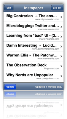
I really like Instapaper as well, but its use is limited to clipping web content and can't be used for storing/viewing personal or business documents. That said, Instapaper excels at saving web content for later use, and its ability to specially format HTML content for the iPhone is remarkable. For clipping full articles to read later, nothing beats Instapaper at the moment.
The remainder of this report consists of a summary matrix showing the various capabilities and usability features of each application. In the matrix, a green block indicates that the app fully meets the requirement, and light green means a partial score. The gloss overlay highlights the core requirements for this category, and red blocks show which application fails to meet those requirements.
Following the matrix are separate descriptions of each application, organized into lists of "Special strengths," "Special weaknesses," and "Other notes."
Summary: e-Readers Primarily for Reading
| Book- shelf | Bookz | eReader | Ever- note | Insta- paper | iSilo | Readdle | Stanza | |
| Capabilities | ||||||||
| Handles native file formats, including images | ||||||||
| Formats HTML documents appropriately | ||||||||
| Can organize documents into folders or categories | ||||||||
| Has password protection or supports encrypted files | ||||||||
| Includes search tool | ||||||||
| User can add bookmarks within files | ||||||||
| Provides a table of contents | ||||||||
| Handles both portrait and landscape reading modes | ||||||||
| Follows web hyperlinks | ||||||||
| Can browse and download files from the web | ||||||||
| Lets user customize font faces and sizes | ||||||||
| Lets user manage files and folders on iPhone | ||||||||
| Can create and edit text files | ||||||||
| Works without external web account | ||||||||
| Usability | ||||||||
| Easy to set up | ||||||||
| Easy to read text | ||||||||
| Easy to add documents | ||||||||
| Provides a full screen mode | ||||||||
| Resizes content for both portrait and landscape | ||||||||
| Remembers where you stopped reading | ||||||||
| Transfer Methods | ||||||||
| Includes dedicated desktop software to transfer files | ||||||||
| File transfers from documents stored on the web | ||||||||
| File transfers from computer via FTP/Bonjour/WebDav | ||||||||
| Overall Rating | ||||||||
| ✓ | ✓ | ✓ | ✓ | ✓ | ||||

Bookshelf
Version 1.2.1309, $9.99
- Excellent for reading text and HTML files, since the Bookshelf reader reformats them for the iPhone display and lets the user select font and font size for viewing.
- A recent update added welcome support for RTF files (but not for RTFD).
- Excellent navigation tools. Besides the usual click up and down to move from page to page, Bookshelf now includes a nice slider that lets you skip multiple pages forward or back.
- Has a customizable auto-scroll mode.
- Easy to use bookmarks function, and remembers which document you were reading and where you left off.
- Excellent website support and bug-tracking/feature enhancements section.
- Only supports HTML and text formats, plus some eReader formats (e.g., PalmDocs). Bookshelf tries to convert Word documents, but doesn't do so well enough to be useful.
- Hyperlinks in HTML files do not work.
- Doesn't support image files (in the documents I transferred).
- Although you can organize files into folders prior to transferring them to Bookshelf, after that you can't change the file names, or move them to folders, etc, on the iPhone Touch.
- Uses free Java QuickStart desktop app to move files to iPhone (through a wireless Bonjour connection).

Bookz
Version 1.3.2, $4.99

- Remembers where you left off reading
- Integrated full-text search
- Has cool page-flip animation for turning pages.
- Excellent support for bookmarks and tags.
- Portrait or landscape mode, but must be changed manually with the toolbar button (not by tilting device)
- Very readable with good customization for colors, fonts, and margins.
- Well integrated web browser includes support for bookmarks.
- Useful navigation widget lets you see, by percentage, how much of the document you've read and then use the slider to move backward or forward.
- Provides fine-grained customization for click control. Bookz lets users divide the display into 9 quadrants, each of which can be set to handle next page, previous page, toggle full-screen mode, show bookmarks, or add bookmark.
- Supports only text files for now; displays only source code for HTML.
- No facility for transferring files from computer. (The idea is that you'll get text files from web downloads or from libraries like Project Gutenberg.)
- Can't add folders to device's library
- Uploaded a .txt file to Google's Pages site, but the software wouldn't download it per the developer's instructions
- Can't activate landscape mode when using the web browser.
- Web browser offers to download "web pages," but then the application won't display it (except as source code).

eReader
Version 1.2, Free
- Integrated search, including easy tool for finding next instance, and ability specify the starting page for the search.
- Provides an integrated table of contents, from which you can select the desired chapter.
- Remembers where you left off reading.
- For books purchased from a compatible online store, eReader is the best application available today for overall readability.
- Though it doesn't support the use of folders, eReader has built-in sorting tools for books by name, author, and date.
- Excellent, customizable navigation controls and automatic full-screen mode (toolbars can be re-summoned with a small swipe).
- Besides its own and some other eReader formats, this app only reads HTML, .rtf, and .txt files, and it removes or simplifies formatting in the process. In my test, images were stored but not viewable in the reader. The $30 eBook Studio software with which you can convert files to palmDoc format is outdated and has limited and rather clunky options for compiling eBooks from source files.
- eReader's lack of support for common office file formats makes it unsuitable for business use.
- eReader provides no way to move files to and from your PC/Mac.
- There's no way to edit titles or other metadata (author, date) about the files in your eReader library.

Evernote
Version 1.5, Free Home Page
- Evernote is a multifunction content manager, capable of storing documents as well as text notes. In addition, Evernote can work with the iPhone or desktop computer to take photo, video, or voice notes. Further, it provides a browser "clipper" that lets you capture web pages (or portions of them) to your Evernote store. You can also email documents to add them to Evernote.
- In addition to the Evernote iPhone application, Evernote provides a desktop application for both Mac OS X and Windows, as well as similar functionality on the Evernote website (when you log in). The desktop application and website let you do rich-text editing of notes, and even web pages. All three apps let you add and edit text notes to any kind of document.
- Evernote supports full-text search for PDF, Word, Excel, HTML, and other kinds of documents. In addition to identifying files with search terms in them, the web and desktop versions navigate and display the terms at their locations in the documents. (The iPhone version also displays search terms in HTML files, but has no way to navigate to them.)
- With Evernote, you can access a wide variety of attributes for the files in your collection, including: Information on modification and creation dates, attachments, source of note, and "To Do" information. All of these attributes can be included with search terms, tags, and notebook names as filters for searches on your document store. Such "smart" searches can be stored for reuse.
- Evernote is very good for reading most HTML files, since it rewraps them to fit the display. Using the desktop application, you can further customize the display of HTML and text files by changing text fonts and sizes.
- Evernote is one of the few iPhone apps in this category that does not support landscape as well as portrait mode.
- Evernote's support for PDF viewing is weak. When opening one on the iPhone, Evernote doesn't download and display it automatically. Instead, it shows a small PDF icon that you must press to initiate the download. Once downloaded, Evernote provides no navigation tools or other assistance, so actually reading PDFs is all but impossible.
- Evernote does not provide a way to add bookmarks to documents, nor does it return you to the document--and the location in the document--when you reopen the application.
- To use Evernote, you must set up a password-protected account at the Evernote website. Accounts are free up to 40 MB per month of storage, and there are $5/month and $45/month subscriptions as well.
- With Evernote, users organize documents into "notebooks." This can only be done via the web or desktop interfaces. Although you can't set up "sub-notebooks," Evernote emphasizes the use of tags, which you can use as an organizing tool. You can add and apply tags in all three versions of Evernote.
- In setting up notebooks, you can specify "local" notebooks, which are accessible only on your desktop computer, as well as "public" notebooks, which contain documents you can share over the web. The default is "synchronized" notebooks.

Instapaper
Version 1.2, $9.99 (Free version also available) Home Page
- Excellent readability, since web content is reformatted to a text display on the iPhone.
- Extremely easy and effective bookmarklet for adding content.
- Introduced innovative "tilt-scrolling" feature, soon adopted by FileMagnet, which lets you scroll a document without touching the screen.
- When viewing on the iPhone, you can toggle between the original "web" view, and the reformatted "text" view.
- Instapaper is an excellent tool for gathering web content for later viewing, and its ability to save just portions of a page is very helpful.
- The Pro version remembers where you left off reading and returns you there by default.
- No search feature.
- Only supports HTML and text files.
- Follows hyperlinks, but frustratingly, can't add web content for later reading from the iPhone itself. Also, the application exits Instapaper when following a link.
- Files can be manually added if they are located on a web server, but only from the web version of your Instapaper store not from the iPhone application.
- Can't categorize, tag, or otherwise organize articles, either on the iPhone or on the Instapaper website.
- Instapaper can't handle articles that are published in multiple "pages," which is the norm on commercial websites nowadays. Each page has to be bookmarked separately. I tried bookmarking the "print" view of an article on Information Week, but Instapaper couldn't access it later. (This isn't true of all such "print" views, however.)
- Instapaper does not provide a way to add bookmarks to documents.
- Instapaper requires registration at the Instapaper website, which is the repository for notes you collect from the web. Instapaper is designed to easily save web pages, or snippets of text from them, for later reading.
- A $9.99 Pro version is available which adds some useful features such as "tilt scrolling," remembering where you left off reading, and a few others.

iSilo
Version 1.20, $9.99
- Nice integrated web browsing, though it's unfortunate you can't save documents you browse to.
- Full-text search.
- Conversion from web pages to iSilo format (Palm format) works extremely well in most cases. If the HTML is not well formed or uses "clever" CSS tricks for formatting, the result is not so good. When the HTML result is good, the files are extremely readable.
- From a converted web page, iSilo easily lets you navigate to other linked pages, displaying them in a likewise quite readable format. (Again, it's not clear why iSilo can't save these other pages directly.)
- iSilo attempts to build a table of contents from the page's HTML structure. It loads these into the document's Bookmarks menu.
- iSilo documents can have much richer elements than other eReaders reviewed here, including support for tables, images, linked sections, and others.
- iSiloX, the desktop tool for converting HTML files to iSilo format, does very well when handling well formatted and structured HTML. It did a remarkably good job, for example, with a long Word document that was opened in Open Office and then saved as HTML. I was impressed that the conversion preserved the formatting of tabular data in the file. The conversion also resulted in a useful set of bookmarks for the document's table of contents.
- Navigation and access to options is confusing. In many cases, the options either don't work or are too difficult to use. For example, the option to change a document's font face doesn't work. In another case, the option to enable auto-scrolling must be activated by navigating to another screen; when you return to the document, any click on the screen deactivates auto-scroll, and you must return to the option screen. Even worse, it's impossible to activate both auto-scroll and full-screen view at the same time, since each activation returns you to do the document view, and each access to the options view turns off the other option.
- In general, too many useful options are hidden in submenu screens.
- The application provides no useful navigation tools.
- iSilo utilizes too many non-standard user interface methods that are therefore nonintuitive. As a result, too often I had to resort either to reading the manual or (more often) consulting the company's online support forum. For example, the function to delete files is "hidden" as a popup menu accessible only if you hold your finger on a document's icon in document view. Once you know this, it works fine, but this means there's an unnecessary learning curve and with it additional user support.
- Loading one long document converted from a PDF file consistently froze my iPhone, requiring a reboot.

Readdle
Version 1.0.5, $14.99
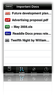
- Supports a variety of native office document and image formats, as well as PalmDoc format.
- Has a well integrated web browser from which you can bookmark and/or save documents from the web, including web pages.
- Remembers where you left off reading
- Provides a nifty slider for navigation within documents, as well as a good bookmarking tool. Files can be navigated with a click or double-click at top or bottom of the display.
- Supports "full screen" reading mode.
- Documents can be organized into folders and into subfolders, both within your Readdle Storage area and on the device. You can also move files into any of the folders on your iPhone.
- Readdle lacks support for RTF (despite what they say), RTFD, web archives, and iWork document formats.
- Unfortunately, Readdle can't save web documents that you link to from within one of your saved documents only when you manually switch to its integrated browser. This is an oversight that hopefully will be fixed in a future release.
- No search capabilities.
- To rename your documents or folders, you must visit your Readdle Storage area online.
- Readdle provides a desktop application (Mac OS X only) for uploading content to Readdle's server, or files can be uploaded with a web browser. You can also email documents to your Readdle account to add them to your library. Content stored on the Readdle server is password-protected.
- The Readdle iPhone app synchs with your Readdle storage, and files can be read remotely or downloaded for offline reading. Note that the synchronization isn't really that, since changes made in one repository aren't automatically made in the other. For example, deleting a document on your iPhone won't delete it from your online library.
- Users can register for a free account, which is limited in storage and has some other restrictions. An "optimum" service is $5 a month.

Stanza
Version 1.5, Free iPhone app, beta Desktop app Home Page

- Integrated search.
- User can group documents within the iPhone app and easily add downloaded files to them.
- User can increase or decrease font size, adjust color, font. Also customize background color, margins, justification of text. In addition, Stanza provides various other customization preferences, including navigation and display options.
- The application tries to automatically add chapter information derived from the text, but gives the user no way to change them. However, it does let users add bookmarks to the documents.
- Stanza's navigation mechanisms are terrific. Besides the chapter and/or bookmark options, Stanza has a slider that's particularly useful for moving within large documents. Navigation from page to page is similar to eReader just a tap on the left or right side of the display slides pages into view.
- Stanza has a great online library of content available for download. Besides free books available ubiquitously these days for eReaders, Stanza's library includes content from newspapers and magazines such as the New York Times, Atlantic Monthly, BBC, and Wired. These are all nicely formatted and very readable on the iPhone.
- Remembers where you left off reading, and even returns you by default to the last document you had open.
- Version 1.5 introduces some cool visual features that let users add custom images to their books and then displays them in a Cover flow view (when you switch to landscape mode).
- Stanza's support for standard office document formats is very limited. Its desktop software claims to read Amazon Kindle, Mobipocket, Microsoft LIT, PalmDoc, Microsoft Word, Rich Text Format, HTML, and PDF formats, but in my extensive testing of HTML, RTF, Word, and PDF, Stanza failed to format the content in any reasonable way. Most documents had such badly garbled page elements (headings, line breaks, lists, vertical white space, paragraph breaks) that they were unreadable when transferred to an iPhone.
- Besides page formatting, Stanza strips all documents of all character formatting (font size, color, style), tabular content, and images.
- Stanza provides no mechanism for transferring content from the iPhone back to your computer.
- I was frustrated that although Stanza offers the option of viewing text in left-justified format, all the documents I transferred showed up full-justified. This happened even when I specified left-justification on the Stanza desktop app.
- Stanza relies on a desktop application (currently in beta development) that can be used to open supported files and transfer them wirelessly to the iPhone. The app supports both Mac OS X and Windows. Lexcycle currently plans to charge "a small fee" for the software once released.
The summary table below uses some advanced CSS techniques that aren't yet possible with your browser. WebKit, the open-source browser engine underlying Apple's Safari browser (for both Windows and Mac), has implemented numerous features of CSS 3.0, as well as pioneered some candidates for new graphics functions using CSS. (For more information on these, see the Mars article on the subject, or visit CSS3.info.
In particular, the table uses CSS border-radius (which produces the table's rounded edge), CSS box-shadow (which gives the table a drop shadow), CSS gradient (which produces a gradient in the table headers), and CSS background-size together with background-attachment and background-clip (which lets me automatically resize a small tiled image-- ![]() --both horizontally and vertically to fit the various-sized table cells).
--both horizontally and vertically to fit the various-sized table cells).
Here is a screenshot of how the top part of the table looks in Safari:
Without Even Trying, Apple’s iPhone Takes the eBook Reader Sweepstakes
I recently decided it was time to look again at the state-of-the-art in eBook reader hardware. It seems like I've waited forever for a company to design one I could really use in place of the traditional paper-filled parallelepiped. I first got excited by the possibility while implementing the PDF format for a magazine on CD-ROM back in 1995. "Wow!," I thought, "Whoever wrestles PDF onto a small electronic device is going to make a mint!"
This article utilizes some WebKit-specific CSS coolness, which those of you running Firefox, Opera, or other browsers will miss out on. (Even users of Safari 3.1 can't see the image reflections... that CSS feature is as yet only available in the latest versions of WebKit.) These CSS 3.0 tricks eliminate the need for a whole slew of graphics, JavaScript, and other code that were previously needed to produce them. Instead, with one simple CSS style element, I can add shadows to page elements (like tables or boxes), set elements with rounded corners (even table cells!), and set reflections on images. It not only makes the page download faster, but it saves me a heckuva lot of time to boot! I'll be documenting more of these CSS advances in the ongoing Mars article, WebKit/Safari Keep Blazing the Trail to CSS 3.0.
Here are some screenshots in case you can't see what I'm talking about: Fancy image, Fancy table, Fancy box.
Of course, PDF turned out to be not particularly well suited to small viewing screens, since publishers would have to make a special layout for the PDF version. And so, years went by, with talk of E-Ink, electrowetting, electronic paper, and other exotic technologies appearing to be on the verge of practicality.
What most of the would-be designers of eBook readers have seemingly failed to grasp, however, is that to replace paper books, eBooks must be nearly as light and portable as a paperback. They must work without cords, and be compatible companions to one's daily trip to the little boy's room. (I've honestly never met a woman who reads in the john, but it seems nearly all men do.) They must be able to accompany you to the beach, the pool, or the mountains. I'd really like something I could read while holding it in one hand, like I do a paperback. I don't want a reader that will break the bank, either. And most of all, an eBook reader needs to be comfortable to use in bed or in your favorite armchair.
Even today, with devices shrinking towards the ideal size and weight, nearly all fail to meet my needs for one reason or another. Quite surprisingly, one device has in fact replaced books for me, and it's not one I ever thought would or could. Because I had bought the device for another purpose entirely, this eBook reader has actually cost me nothing whatsoever.
This article covers five eBook reader devices, including two that are full-fledged personal computers serving as an eBook reader by way of third-party software, and another that is a multifunction "smart phone" with eBook reader capabilities. All five devices have strongly positive characteristics, and two of of them possess the full range that would allow them to serve as portable eBook readers for organizations that need access to technical and policy documentation. Even though I personally need a reader that's useful for novels and such, I'm evaluating these based on their utility as devices for storing and reading technical and other documentation rather than literature, each of which have quite different requirements for eBook reading. The five devices reviewed are:
Of these five devices, the one that emerged as the runaway winner for both literature and documentation--much to my surprise--is Apple's iPhone or iPod Touch. The iPhone's small display, it turns out, is plenty big for comfortable reading, and its form factor make it the ideal eBook reader I've been looking for. Given its numerous other capabilities besides eBook reading, the iPhone / iPod Touch is an obvious choice. Among its virtues are its
- Ability to manage all the relevant native-format files an organization is likely to produce,
- Instantaneous availability,
- Easy navigation,
- Wide variety of eBook reader software,
- Simple and powerful connectivity,
- Integrated web browser and mail client,
- Bright screen,
- Excellent readability, and
- Advanced security.
In addition to its use as an eBook reader, the iPhone has many other enterprise uses, not the least of which are its built-in cellular phone, Bluetooth receiver, GPS, and synchronized email. The iPhone also has excellent support for Windows users and can be centrally managed by an IT organization to enforce configuration and security standards.
 For personnel who require a highly portable, full-featured PC, the Eee PC is an excellent choice. Given its very reasonable price, this device is an engineering marvel:
- Tiny, yet with a decent-sized keyboard,
- External controls for essentials like screen resolution and brightness,
- Built-in state-of-the-art Wi-Fi and Bluetooth,
- Ethernet port and 3 USB 2.0 hubs,
- Video camera and microphone.
With dedicated eBook reading software such as MobiPocket installed on the Eee PC's Windows XP operating system, this micro-laptop can serve users well as an eBook Reader. The only downside is the eBook reader software's lack of support for native document formats, which must be converted to the MobiPocket format (and many cannot be so converted). For users who do not need the resources of a full-blown PC, the iPhone or iPod Touch would be a better solution.
 The Iliad's primary virtue is its wonderfully readable e-Ink text display, and it also has a good, portable form factor and hardware navigation controls. The Iliad also allows users to set a PIN number to protect content stored on it. Beyond those positive characteristics, there's not much to recommend the Iliad as an eBook reader for use in storing and accessing documents other than literature. And the price one has to pay for this one-trick pony, literature-only reader is far too high, in my opinion.
The Amazon Kindle is an impressive dedicated eBook Reader. The device's
- Reading software,
- Navigation ease,
- Annotation support,
- Searchability,
- Readability,
- Rapid start-up time, and
- Form factor
 access to content stored on it. The Kindle does not accept USB "sticks," either, so the possibility of storing sensitive documents externally is limited to Amazon's online Kindle service. Unfortunately, in my testing, that service was not always available, so in emergency situations I would not want to rely on it (for now, at least). Like the Iliad, the Kindle serves no purpose other than as an eBook reader, and as such its price seems quite high.
The Samsung micro-laptop gets excellent scores for search, document-format support, ease of adding documents, bookmarking, networking, and eBook navigation. However, all of these scores reflect attributes of the top-notch MobiPocket reader software, as well as its accompanying Creator software, which does a good job at converting common office-type files to HTML and/or Mobi format. Unfortunately, the Samsung hardware, combined with its reliance on the underlying Windows XP operating system, make this a poor choice as a portable eBook reader. The device is very slow to start up, has a very tiny and hard-to-use keyboard, and offers navigation options that aren't suitable for the onscreen software. The Samsung supports touch control, but the display targets that one must interact with to navigate are much too small. The same problem holds for the device's  wand, which requires a very steady hand and precise accuracy to reliably trigger onscreen controls. The device's external keypad is horrible and requires far too much effort for an emergency operation. Using a portable keyboard is probably not a practical alternative, either, since it requires the user to have access to a table and chair to enter data or navigate the Samsung. Finally, when not plugged in to an electrical outlet, the display's screen is so dim that I had to bring out a magnifying glass in order to navigate. I won't even mention here how ridiculously expensive the Samsung is, since it can also be used (*wink* *wink*) as a portable PC.
The summary table below presents a matrix of the various attributes used for this review. Items in light green indicate the basic criteria were met, and items in the darker gradient green indicate that the device excelled in fulfilling that particular requirement. White cells are those where the given reader failed to meet a requirement. Following the summary table are detailed tables for each of the five devices, with my review notes organized into Pros and Cons for each.
Functions/Usability Matrix
| Device Characteristics | Iliad | Kindle | Samsung w/ MobiPocket | iPhone | EeePC w/ MobiPocket |
| Supports native formats including images | |||||
| Can organize documents into folders | |||||
| Is password protected or supports encryption | |||||
| Enables full-text search | |||||
| Documents can be easily transferred from a computer | |||||
| Bookmarks can be added within files | |||||
| Documents can have a table of contents | |||||
| Provides both portrait and landscape modes | |||||
| Support web hyperlinks | |||||
| Can browse and download files from the web | |||||
| Font faces and sizes can be customized | |||||
| Accessing and navigating content is easy | |||||
| Documents are easy to read | |||||
| Hardware design is well suited to reading | |||||
| Has easy connectivity to local networks, or supports USB | |||||
| Provides speedy access in emergencies | |||||
| Has good hardware navigation (pen, keypad, touch screen, other controls) |
Eee PC 901
(with MobiPocket Reader Software)
| Pros | Cons |
|---|---|
|
|
Irex Iliad
| Pros | Cons |
|---|---|
|
|
iPhone/iPod Touch
| Pros | Cons |
|---|---|
|
|
Amazon Kindle
| Pros | Cons |
|---|---|
|
|
Samsung Q1 Ultra Premium
(with MobiPocket Reader Software)
| Pros | Cons |
|---|---|
|
|
Image Reflections with CSS
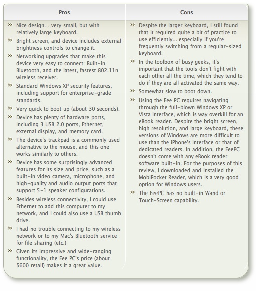
Box Shadows and Rounded Corners with CSS
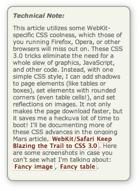
Box Shadows and Rounded Corners with CSS
A Close-Up Look At Today’s Web Browsers: Comparing Firefox, IE 7, Opera, Safari
My, we've come a long way in browser choices since 2005, haven't we? It's been a very heady time for programmers who dabble in the lingua franca of the World Wide Web: HTML, JavaScript, Cascading Style Sheets, the Document Object Model, and XML/XSLT. Together, this collection of scripting tools, boosted by a  technique with the letter-soup name "XMLHttpRequest," became known as "Ajax." Ajax spawned an avalanche of cool, useful, and powerful new web applications that are today beginning to successfully challenge traditional computer-desktop software like Microsoft Word and Excel. As good as vanguard products like Goodle's Maps, Gmail, Documents, and Calendar apps are, one only has to peek at what Apple has accomplished with its new MobileMe web apps to see how much like desktop applications web software can be in 2008.
That this overwhelming trend toward advanced, desktop-like applications has happened at all is the result of the efforts of determined developers from the Mozilla project, which rose from the ashes of Netscape's demise to create the small, light, powerful and popular Firefox browser. The activity of the Mozilla group spurred innovation from other browser makers and eventually forced a trend towards open standards that made the emergence of Ajax possible.
This article starts with a brief history of web browsers and then jumps into a look at the feature set of the four primary "modern" web browsers in 2008. The comparison of browser features begins by listing the core features that all these browsers have in common. The bulk of the article lists in detail "special features" of each browser and each browser's good and bad points, as they relate to the core browser characteristics. Following that, I present some recent data on the comparative performance of these browsers. The article concludes with recommendations I would make to organizations interested in making the switch from IE6 in 2008.
- Web Browsers in 2008: A Brief History
- Comparison of Browser Features
- Browser Performance
- Conclusions
- Bookmarks for Further Reading
Web Browsers in 2008: A Brief History
In 2008, web designers and programmers can finally see the light at the end of the very long, dark tunnel that began with the first browser wars of the late 1990's. That war introduced "browser incompatibility," as both Netscape and Microsoft struggled to establish their own, incompatible standards. At that time, the standards approved by the World Wide Web Consortium (w3c) were somewhat skimpy and behind the times in terms of what those companies wanted to do.
It wasn't long before the w3c approved a standard for JavaScript, which Netscape had introduced a couple of years before, as well as a standard for CSS Level 2.0, which was to be a major advance in the "designability" of web pages. CSS 2.0 promised an end to the ubiquitous use of "font" tags, invisible graphics, and HTML tables on which designers relied to convert their ideas, typically developed using visual design tools such as Photoshop, to HTML. However, those new standards were too late, since Microsoft was making aggressive use of its monopoly on corporate desktops to promote Internet Explorer at the expense of Netscape. That effort, of course, eventually succeeded, and Microsoft was found guilty of antitrust violations (though never effectively punished for them).
Even though IE eventually garnered a monopoly in corporate browser usage equal to Windows' monopoly as an operating system, web programmers and designers who developed content for the general public were still obliged to support two completely different and incompatible "standards," neither of which was truly standards-compliant. The dual nature of  the browser market caused programmers to shy away from JavaScript and CSS entirely, since it was too much of an effort to deploy them in a way that would render well on both browsers. Unfortunately, this meant that the state-of-the-web art remained stuck in 1998 until just the last couple of years, when Mozilla's Firefox and Apple's Safari browsers began slowly whittling away at IE's dominance.
Like earlier versions of Internet Explorer, IE 6, introduced in 2001 as part of Windows XP, maintained its own set of proprietary standards that largely ignored the leadership of standards bodies like the w3c. At that time, they could  afford to do so since there was virtually no competition left. However, by 2004, Firefox had emerged from the open-source Mozilla group (which evolved from Netscape's decision to open-source the Netscape browser code) as a very interesting, lightweight browser that prided itself on close adherence to w3c standards.
Meanwhile, in Europe, the Opera browser was moving in the same direction as Firefox--toward full implementation of w3c standards for JavaScript and CSS 2. In 2005, Opera became a totally free browser choice, where previously it had used advertising as a source of revenue for non-paying customers. At this point, Opera became a more significant player, which, despite its very small market share outside of Europe, continues today.
In 2003, Apple introduced Safari 1.0 for Mac OS X, and shortly thereafter Microsoft ceased support of Internet Explorer for the Mac platform. Safari was based on the open-source code used for the Linux browser Konqueror, and in 2005 Apple released the core Safari code--its "rendering engine"--as open source through establishment of the WebKit project. Since then, the WebKit team has made rapid progress in adopting w3c standards and bringing its code base up to the state-of-the-art as defined by those standards. Safari is the dominant browser on Mac OS X, with Firefox a strong second, and the increasing market share of Mac OS X in the last couple of years has resulted in corresponding increases in the market share of Safari. Now that Safari is available for Windows and is being used for Apple's iPhone platform, Safari's market share will likely continue to rise in coming years.
In 2007, Microsoft finally responded to the growing competition from Firefox and Safari, and released Internet Explorer 7.0 in concert with its release of Windows Vista. Although IE 7 maintains a significant lag behind the other browsers in adopting open standards, it has made important improvements over IE 6. And the early beta releases of IE 8, accompanied by assurances from Microsoft's technical engineers, suggest that IE 8 will make even more significant improvements in becoming standards-compliant.
It is the convergence of these trends that is causing that glow at the end of the tunnel at last. With the demise of IE 6 (whose market share is rapidly collapsing), the final major remnant of the ugly browser war of 1998-2000 will be a thing of the past. Since Microsoft appears serious about getting IE 8 to market in less than the 6 years that elapsed between IE 6 and IE 7, web developers can be hopeful that their use of JavaScript, CSS, and HTML will no longer be a struggle to find the right "hack" to accommodate all the browser choices out there. At that moment, the web will finally be ready to evolve into the platform that Java aspired to, but never managed to become: A platform on which developers can build applications that are agnostic both of the user's client and of their operating system.
That outcome is a win-win for everyone… except, perhaps, Microsoft, since it will bring to fruition the open Internet it has tried so long to keep at bay.
The next section of this report will look in detail at the feature set of the four primary "modern" web browsers in 2008, by market share. Following that, the report presents some recent data on comparative performance for these browsers, and finally I conclude with a brief set of recommendations. The browsers have all been tested primarily on a Windows Vista Ultimate platform, and the recommendations are geared to organizations that have been relying on IE 6 or IE 7 as their default browser. Safari, Firefox, and Opera have also been tested on a Mac OS X 10.5 "Leopard" system.
Comparison of Browser Features
This section looks in detail at the many features that both bind and distinguish the four browsers included in this study:
The first part of this section pulls together all of the features these four browsers have in common. This set of features can be considered a baseline that defines what a "modern" browser can do. Naturally, some of the browsers are more "modern" than others, so they go far beyond these features in distinguishing themselves from the others.
For each browser reviewed, the write-up begins with a list of the browser's "Special Features"--that is, its features that are unique or especially distinguishing. Following that, each browser's features are listed in comparison with each other in a list of "Good Points" and "Bad Points." Each item in these lists is categorized using the set of "Baseline Features" below.
Baseline Features
- Ability to define page colors and page fonts.
- Ability to set personal style sheets.
- Ability to easily resize fonts.
- Ability to prevent automatic loading of page images.
- Ability to set bookmarks for web pages visited
- Ability to organize bookmarks into folders.
- Ability to arrange bookmarks in a special toolbar. Toolbar can contain folders of bookmarks as well as individual links.
- Ability to import and export bookmarks as HTML.
- All of the tested browsers support use of a proxy server and use of an automated configuration file on the network for applying browser settings.
- Ability to define proxy and SSL (secure socket layer) settings, as well as supported HTTP protocols.
- Ability to identify errors (JavaScript at a minimum) when loading a web page.
- No common features.
- Ability to view browser history by date and to sort history items.
- Ability to search stored history items.
- Ability to set home page and define basics about what browser shows when opened.
- Ability to view page HTML source.
- Ability to define basic settings for cookies.
- Ability to define how long history items are stored, or whether they're stored at all.
- Ability to subscribe to and view RSS feeds.
- Pages that contain RSS feed information are identified with special symbol or option.
- Web search field located in the browser toolbar.
- Web search options include some basic customization.
- Ability to find words in the current web page.
- All browsers offer the ability to turn off JavaScript and plugins.
- Ability to block pop-up ads/windows.
- Ability to define level of encryption.
- Support for HTML 4.0
- Support for CSS 1.0
- Support for JavaScript/EcmaScript
- Support for DHTML
- Support for XMLHttpRequest
- Support for Rich Text Editing
- Support for basic image formats (JPEG, GIF)
- Support for tabbed browsing (viewing web pages in tabs rather than individual windows)
- Ability to rearrange tabs by drag/drop
- Ability to direct links and new pages to tabs rather than windows
The following matrix summarizes my analysis of each browser. The "positive" aspects of each are indicated with a light-green gradient, and where the positives are exceptionally strong, you'll see a darker green gradient. Likewise, the "negative" aspects are indicated with a light-red gradient, and negative traits that are especially bad have a darker red gradient. Where the background is white, the browser basically meets the baseline expectations listed above.
Firefox 3.0 |
IE 7.0 |
Opera 9.5 |
Safari 3.1 | |||||
Browser Characteristics |
Positives |
Negatives |
Positives |
Negatives |
Positives |
Negatives |
Positives |
Negatives |
Accessibility |
||||||||
Bookmark management |
||||||||
Configuration mgmt |
||||||||
Connection settings |
||||||||
Developer tools |
||||||||
Downloads management |
||||||||
History tools |
||||||||
Home page settings |
||||||||
Page information details |
||||||||
Privacy settings |
||||||||
RSS feed management |
||||||||
Search engine support |
||||||||
Search-in-page support |
||||||||
Security settings |
||||||||
Standards support |
||||||||
Tab management |
||||||||
Usability |
||||||||
Firefox 3.0

- Firefox lets users search within a page simply by typing (without invoking search function), a very useful feature.
- Ability to tag bookmarks and history items, and to organize those items using tags.
- Best range of add-ons that can provide a greatly expanded feature set.
- Ability to apply "themes" to customize the browser's look and feel.

- Firefox's import function is very good and easy to use… not only does it import bookmarks, but most other browser settings as well (cookies, history, etc.) However, on the Mac it imports only from Safari, and on Windows it supports only IE and Opera.
- Bookmark folders offer option of opening all links at once in a single window.
- Users can drag page links into folders on the bookmark bar directly, rather than having to visit the bookmark management page to do so. (Safari also has this feature.)
- Fine-grained tools for customizing security and connection settings.
- Full-featured Downloads window allows you to find downloads on your hard drive, open downloads, and search them. The window also displays the time/date of the download.
- Excellent history panel with lots of options for sorting/viewing and searching, as well as support for tagging history items.
- Great page info panel with all the detail you'd want.
- Easy to use, customizable web-search field on toolbar, which includes optional "suggest" feature. Like IE, Firefox users can also import new search engines from a web page.
- Excellent in-page search functionality.
- Fine-grained tools for customizing security and connection settings.
- Support for most non-basic web standards, including:
- CSS 2.1
- XHTML
- PNG, SVG
- HTML Canvas
- DOM 1, DOM 2
- Minimal CSS 3.0
- Supports dragging URLs to tab bar to open new pages.
- Offers the option of saving currently open tabs for the next session.
- Firefox's Preferences window is very similar to Opera's. It has grown more complex over the years, but retains the deliberate simplicity it adopted as distinguished from the full-blown Mozilla browser it evolved from. Except for the label "Applications," its tabs are intuitive. As with the other implementations, one could argue about the emphasis placed on the various settings, but in general Firefox provides a very easy way to customize user settings.

- Like Opera, Firefox is available for a wide variety of platforms, including Windows, Mac, Linux, and other Unix systems.
- Open source code means browser improvements and security fixes come more quickly.
- No support for Safari bookmarks on Windows.
- Only basic developer tools in the default configuration.
- Firefox's RSS implementation is noticeably weaker than that of the other browsers. While plugins exist to improve its support, this review looks only at the browsers' default options. One major problem with Firefox's RSS support is that if you choose to always use "Live Bookmarks" for a feed, without knowing what that means, you can't change your mind later on. Live Bookmarks are an inferior method of selecting items to read, since it doesn't show the textual summary or graphics that may be provided in the feed. Rather, it shows only the headlines. Further, I could find no way to manage my feeds by deleting them or organizing them into folders once I had subscribed. Even if you opt out of using Live Bookmarks from the get-go, Firefox places a large box at the top of each RSS feed page asking you whether you want to use Live Bookmarks. Firefox also provides no way for users to mark articles as "read," to sort or search articles, or whether to view headlines or full article summaries… options offered by all the other browsers.
- Only minimal support for major CSS 3.0 features, including lack of support for resizable text fields.
- Plugins and themes require reliance on third-party developers, who may or may not update a given plugin or theme for a new version of Firefox. They also require some user maintenance to keep updated, and users must restart the browser to install themes and plugins.
- Like IE, Firefox does not preserve information entered on a form if you use the back button and then forward again. Anything you've entered is wiped out, unlike Opera and Safari.
- Firefox is noticeably slower than the other browsers to launch and load the home page.
- Firefox cannot open PDF files natively in the browser window without requiring a plugin.
Internet Explorer 7.0

- IE 7 is the only browser that allows users to set more than one home page.
- IE7's tab implementation has a feature that the other browsers could benefit from: A view showing large thumbnails of all current tabs, along with their page titles. This feature is standard in Shiira, a WebKit based browser, but not in any other browser that I know of. (There is, however, a plugin for Firefox and one for Safari that accomplishes this.)

- IE has a large number of settings to help system administrators customize the browser configuration for users.
- Fine-grained tools for customizing security and connection settings.
- IE 7 has fine-grained tools for customizing privacy settings.
- A welcome addition to IE7 is its support for RSS feed subscriptions. Its implementation is quite good, and as with other browsers you can manage your subscriptions in the "Favorites/History" area.
- IE 7 adds a search field to the toolbar. It can be customized, but comes with Live Search as the default rather than Google or Yahoo (the industry leaders). You can, however, customize the choice of search engines by visiting a Microsoft website and adding items to the list. This is a very easy process.
- IE 7 lets you disable each plugin individually, so you can easily disable Flash once it's installed. (However, even after installing Flash, IE 7 could not load any pages on the website I was testing.)
- Fine-grained tools for customizing security and connection settings.
- IE 7 includes a "phishing" blocker, which should help users identify sites that attempt to steal user passwords by appearing to be standard e-commerce websites like Amazon, eBay, or banks.
- Unlike IE6 and earlier, IE7 joins the other browsers in partially supporting the PNG-24 standard, which allows designers to use images with alpha transparency.
- IE can bookmark a set of tabs into a folder.
- Design is clean and easy to understand for the most part.
- Like Safari, IE 7 offers users the ability to email full page contents as well as page links.


- The "Favorites Center" is missing a couple of essential features:
- There is no way to search your bookmarks (although you can search your history)
- I couldn't figure out how to add folders to the list.
- In addition, the process of changing URL's is cumbersome when compared with Safari or Firefox. For example, here is Firefox's excellent panel for managing history, tags, and bookmarks. It allows you to edit properties directly.
Likewise, here is Safari's view for the same functions (screenshot below that for Firefox).
By contrast, in IE you have to right-click and select a Properties window to change a URL. - Another shortcoming of IE's Bookmarks implementation is its inability to let users open an entire folder of links at once. This has become standard practice for awhile on modern browsers, by allowing users to quickly access a group of websites they use frequently as part of a single activity. Firefox, Safari, and Opera all offer this option.
- IE has very basic import/export functions for bookmarks. Like Safari, it requires users to browse the hard drive for the HTML bookmarks file to import. IE offers no other import features.
- IE is the only browser that provides no way for users to search their bookmarks.
- Only basic developer tools in the default configuration.
- I couldn't find a way in IE to set a folder for Download files other than the default folder.
- IE is the only browser that provides no "Downloads" window, by which users can see the files they've downloaded and navigate to and/or open those files.
- I found it annoying that there is no way to view your page history without opening the Favorites window/sidebar. Firefox and Safari both have a top-level menu item called "History" that shows your visited-page history. The only tool provided is a pull-down menu adjacent to the URL address field--the same approach as Opera--but this isn't nearly as convenient or comprehensive. And unlike Opera's single-click access to history, IE 7 requires a multi-click approach, unless you keep its sidebar open all the time (which isn't as easy to do as in IE 6).
- Unlike most other browsers, IE7's source code view merely launches Notepad (which it's done since IE 3) and has no method for viewing the CSS or Javascript sources or for making changes to those and viewing results in the browser window. (This feature is standard in Firefox and Safari.)
- IE's cookie manager is buried in an "Advanced" panel within the Privacy options. Unlike the other browsers, IE offers no way to delete all cookies, delete individual cookies, search cookies, or even view stored cookies.
- IE is the only browser that provides no way to identify all instances of search terms in the current web page.
- Because of the very large number of malware exploits that have targeted Internet Explorer, especially since the release of IE 6 in 2001, the IE Security settings have become far too complicated for the ordinary user to comprehend. Even system administrators who wish to secure IE 7 would need to have some specialized training in order to do so.
The biggest problem with IE, which has also been one of the main reasons for its high adoption by IT shops, is its strong support for Active X controls. Because IE is so tightly woven into the Windows operating system, Active X programs present a huge security risk, and it is largely through this channel that viruses, worms, spyware, and other malware has infected Windows PCs over the years. IE 7 has a plethora of settings designed to minimize the risk of Active X programs, but given the amount of work required both on developers--to secure their Active X programs in order to run in IE 7--and on administrators--to apply settings that strike the appropriate balance for users between usability and security, ensuring security for IE remains a negative aspect of this browser.
- Visiting some web pages--for example, the home page of the National Science Foundation--I found that IE 7 could not display the Flash content, so the home page wouldn't load. Apparently, there is a problem using Flash with IE7 under Vista. I noticed the warning about IE 7's "old" Flash player when visiting a number of websites that use Flash. On Windows Vista, IE7 was the only one of the browsers tested that could not load the NSF home page in its default configuration. Though Opera, Safari, and Firefox likewise did not have the Flash plugin, they displayed the static alternative (see top screenshot) and the rest of that page instead. Since nsf.gov uses Flash for its navigation bar, this means IE 7 cannot access any page on the NSF website.
- IE is the only browser that does not fully support CSS 2.0 standards.
- IE does not support any CSS 3.0 features.
- IE is the only browser that supports neither SVG images nor the HTML Canvas tag.

- IE 7's tab implementation is similar to the existing standard but doesn't offer as many options for managing tabs when you right-click on one of them. (For example, Safari offers the option of letting you bookmark or reload the current set of tabs.)
- Most Windows users--and Mac users as well--will be disoriented by the absence of a menubar in the default configuration. You can add a menubar, but it doesn't appear at the top of the window as user's will expect. In this regard, IE 7 works a lot like Opera has for awhile. As a Mac user, it's interesting to note that the IE 7 model of eliminating each window's menubar is the same as the Mac OS's traditional approach. However, unlike the Mac approach, Windows Vista has no persistent, system-wide menubar, which on the Mac changes contextually depending on the currently active application. Removing the menubar from IE 7's windows is merely reducing, not enhancing, usability.
- IE 7 departs from the standard browser design by removing the home button from the toolbar and moving the reload and "stop loading" buttons to an unexpected location. As a result, the URL field is far longer than is necessary, and the design creates a subordinate toolbar that could just as well be served by the missing menubar.
- More than once, I was asked if I wanted to turn on "Sticky Keys," a rather annoying intrusion.
- Users of IE6 and earlier will find using the sidebar more difficult. For one thing, there is no link to open it within the set of menu items. The sidebar opens up only by interacting with a new drop-down window that appears when you click on the Star icon (Favorites Center) at the left-hand of the tab bar (which doubles as the second toolbar).
- IE 7's Preferences (Internet Options) window remains the worst of any major browser. It's cluttered, has nonintuitive section titles, and features an "Advanced" set of preferences that are virtually impossible to use. Why? First, the type is too small for many users to read, second, the various options are all treated as if they have equivalent importance (but they don't), and third, the view provides no explanation for what each option means. This window is the same as that in IE 6.
- Like Firefox, IE does not preserve information entered on a form if you use the back button and then forward again. Anything you've entered is wiped out, unlike Opera and Safari.
- IE 7 is the only one of the browsers tested that is not available for Mac OS X or any other operating system besides Windows.

Opera 9.5

- Ability to apply "themes" to customize the browser's look and feel. Even better than Firefox, Opera can display and apply themes in the live browser without having to be restarted.
- A built-in, full-featured email client that integrates well with the browser content.
- Opera has the best and most useful sidebar of any browser, and with 9.5 they've integrated it much better than before into the interface.
- A built-in Notes tool for jotting down and storing notes. The tool lets you organize and search your notes.
- Opera lets you tag RSS feeds with "labels."
- Opera has a large inventory of available web widgets for various purposes, similar to those in Apple's Dashboard, Yahoo's widgets, and Microsoft's "gadgets," all of which run outside the browser. Unfortunately, Opera's widgets only work when Opera is running.
- Opera is the only one of the tested browsers that displays page
- thumbnails of the web pages in each tab, a very useful feature.
- The most customizable interface of any reviewed browser. Nearly every component of the interface can be rearranged, and there are a wide variety of buttons that can be added to or subtracted from each component. Further, Opera has a large stock of preset "setups" that comprise theme, button, and toolbar settings in one package.
- A "Small Screen" view that reformats the page to emulate what a user would see on a smartphone-type display.
- A "Links" function that pulls a list of all page links into a panel in the sidebar.
- Opera has easily accessible tools for customizing preferences for individual websites.
- Other unique features such as
- Trashcan history (for pages whose tabs you've deleted),
- "Speed dial," which lets you organize top bookmarks and see them each time you open a new tab, and
- A print preview feature that shows the print view immediately within the browser window.
- Robust session management, allowing you to save multiple sessions and return to them at another date.


- Opera has the most advanced and easiest to use tools for testing accessibility of any reviewed browser.
- Great tools for managing bookmarks... good sort and search options.
- Great new UI features... much more organized and logical from the get-go. I like the toolbar icon in upper left, and the standard home/navigation buttons with the URL field. The new Opera standard skin is also great.
- Folders in the bookmark bar can open all bookmarks at once in a single window.
- Opera has the most options for exporting bookmarks… either all or selected, and either HTML or formatted ASCII.
- Powerful and simple functions for importing bookmarks from other browsers--Firefox, IE, or Konqueror on Windows, and Firefox and IE on Mac OS X.
- Fine-grained tools for customizing security and connection settings.
- Full-featured "Transfers" window allows you to find downloads on your hard drive, open downloads, and search them. The window also displays the time/date of the download.
- Excellent built-in tools for web developers, including a JavaScript debugger and DOM viewer.
- Great tools for managing browsing history... good sort and search options.
- Excellent built-in options for subscribing and viewing RSS feeds. Opera also lets you tag feeds with various "labels."
- Full customization options for the toolbar search field, although the options are not as simple as those for Firefox and IE.
- Fine-grained tools for customizing security and connection settings.
- Support for most non-basic web standards, including:
- CSS 2.1
- XHTML
- PNG, SVG
- HTML Canvas
- DOM 1, DOM 2
- Minimal CSS 3.0

- Opera's Preferences window is well organized and reasonably simple.
- Like Safari, Opera preserves form information you've typed in case you need to go back a page or two and return to the form again. You can use the back button to revisit earlier pages and then the forward button to return to the form, and your entered data will still be there.
- Opera includes a feature called "Wand," which lets users store and reuse data for any of the forms they fill in on the web. This feature is similar to Safari's "Autofill," though it's more complicated to use.
- Opera offers a synchronization feature that lets users sync their browser data across different PCs that they use. This service is similar to that offered by Safari through Apple's for-fee .Mac (soon to be renamed "MobileMe") service.
- Like Firefox, Opera is available for a wide variety of platforms, including Windows, Mac, Linux, and other Unix systems.
- No support for Safari bookmarks on Windows, and import function doesn't cover history, cookies, passwords, etc. as does Firefox.
- Opera is the only browser that doesn't have an option to bookmark all currently open tabs, though it does have powerful session management features that offer similar capabilities.
- I found it annoying that there is no way to view your page history without opening the History sidebar. Firefox and Safari both have a top-level menu item called "History" that shows your visited-page history. The only tool provided is a pull-down menu adjacent to the URL address field--the same approach as IE 7--but this isn't nearly as convenient or comprehensive. However, at least Opera provides a single-click tool in its sidebar to access history, unlike IE 7, which requires a multi-click approach unless you keep its sidebar open all the time (which isn't as easy to do as in IE 6).
- Opera has no Page Info panel like Shiira or others that show in detail the resources loaded by the page.
- Opera has no advanced, in-page search capability like that of Safari or Firefox. However, you can see all instances of search terms using a function hidden in the main search field on the toolbar.
- Opera is overly zealous in identifying "insecure" websites in its default state. It expects all web pages to be encrypted, and doesn't honor standard SSL certificates.
- Setting many security preferences require knowledge that most web users don't possess.
- Little support for up-and-coming CSS 3.0 features.
- You can't drag URLs to the tab bar to open them, as you can in Safari and Firefox. There's also no contextual menu item to open the URL. Thus, the only option is copy and paste into the URL field.
- Doesn't support drag and drop text from browser. This is a drag!
- Dragging image from browser gave me the URL rather than an image.
- Notes view has no formatting abilities.
- Opera's mail client only supports ASCII text mail for formatting, though it can view HTML mail.
- Opera cannot open PDF files natively in the browser window without requiring a plugin.
- Some of Opera's "Advanced" preferences are not really that advanced, and I'd argue that individual tabs should be devoted to some of them rather than burying them here. For example, Opera devotes an entire tab to "Wand", which is their autofill implementation and another for "Search." Instead of these, most users would probably want to customize how the browser handles Tabs or Security more urgently. In addition, the tab labeled "Web Pages" is pretty meaningless and should probably be labeled "Appearance" or "Style" instead.
- Opera's interface can be confusing at times… for example, if you have the "Manage bookmarks" page open and select "History" from the side panel, the "Manage bookmarks" page doesn't get replaced with the corresponding History page. This pattern recurs throughout the sidebar/full-page functions. To further confuse users, the access links/menus to full-page details for each sidebar item aren't located in equivalent places in the interface. Some are easy to find… others hard. They should all work the same way.
Safari 3.1

- Safari features excellent drag/drop and copy/paste to word processing documents. Such copies preserve links and formatting. To the standard RTF Mac editor, TextEdit, such drags also include images and other media. Paste or drag to Apple Mail preserves almost an identical HTML copy of the original page. By contrast, the same page copied from IE 7 to Windows Mail loses most formatting while preserving links and images, but Wordpad,
 Microsoft's equivalent Rich Text editor, could only accept unformatted ASCII text. Neither Opera nor Firefox can copy and paste formatted HTML (with images) to word processing or RTF document editors. (See accompanying screenshots of the NSB home page. Shot on the left shows home page pasted into Apple Mail client. Shot on the right shows home page pasted into Windows mail.
 - Unique features such as
- Trackback, which makes it easy to get back to the web page that started a browsing session for a particular site (including Google searches),
- The ability to drag tabs from the tab bar to make new windows or to add them to other windows.
- On the Mac, Safari also features "WebClip," which lets you create live "widgets" from any part of a web page. This lets you easily view a given snippet--live--at any time without loading the web page in Safari.

- Best support of advanced CSS 3.0 features, including native support for resizable text fields. In addition, Safari adopts the following CSS 3.0 standards:

- Border image, which lets web page designers use a single image (either tiled or stretched) to create borders around box text.
- Box-shadow, a previously difficult--but very popular--design element that puts a drop shadow on page elements.
- Background-size, a technique that lets designers use a single background image for HTML page elements and resize the image as needed.
- Multiple backgrounds, which lets designers specify multiple images to form a composite background for HTML page elements.
- And many other advanced CSS techniques (some of which go beyond what's been drafted for CSS 3.0), including:
- Text shadows
- Transformations
- Animations
- Gradients
- Reflections
- Form styling
- Support for "Private browsing," which makes it very easy to let someone else use your computer without compromising your personal information. When private browsing is turned on, webpages are not added to the history, items are automatically removed from the Downloads window, information isn't saved for AutoFill (including names and passwords), and searches are not added to the pop-up menu in the Google search box. Until you close the window, you can still click the Back and Forward buttons to return to webpages you have opened.


- Very easy to use, integrated window for searching and organizing bookmarks, history, and RSS feeds.
- Folders in the bookmark bar can open all bookmarks at once in a single window.
- Users can drag page links into folders on the bookmark bar directly, rather than having to visit the bookmark management page to do so. (Firefox also has this feature.)
- Built-in synchronization of bookmarks through a .Mac ("MobileMe") account.
- Support for offline data storage, enabling more robust web applications by putting database info on the client rather than requiring a round-trip to the server.
- Top-notch built-in tools for web developers, similar to the Firebug add-on that's available for Firefox and much more powerful than Opera's native JavaScript debugger.
- Full-featured Downloads window allows you to find downloads on your hard drive, open downloads, restart stalled downloads, and identify the download URL.
- Very easy to use, integrated window for searching and organizing bookmarks, history, and RSS feeds.
- Along with Safari's "Page Inspector," which developers can use for debugging and probing detailed information about a given page's or element's structure and metrics, you also get an amazing tool for inspecting the page's resources. Each script, CSS file, HTML component, and image is listed along with information on download times and size. Clicking on an item lets you see the file contents (images or source code). The Page Inspector also has a search feature by which you can search the entire set of data it includes. (Firefox has an add-on called Firebug that provides information very similar to Safari's Inspector… but it's not included as part of Firefox itself.)

- Safari has the easiest, most accessible tool for emptying your browser cache. When you need to free up memory, make sure you're pulling a fresh copy of a web page, or remove the cached pages on your hard drive for privacy reasons, Safari's "Empty Cache" item in the main menu is very handy. Firefox's analogous function is called "Private Data," but without configuration in a sub-page of Firefox's preferences, this category includes a lot more data than simply the browser cache. Both Opera and IE 7 have this feature, but buried in various menus and preference panels and more obscurely named.
- Safari pioneered integration of RSS subscriptions into the web browse, and it still has the easiest and best RSS feed manager. Some reviewers consider Safari's inability to set separate "fetch" schedules for each feed a negative attribute; however, I'm not sure why anyone would want to do this nowadays. After all, the update schedule is really determined by the publisher of the feed... not by the end user.
- Safari offers the option to view and subscribe to feeds through Apple Mail as well, but still use Safari when it's more convenient.

- Safari has an excellent implementation of this feature, which was pioneered by the Firefox browser.
- Safari is the only browser that has passed the CSS "Acid 3" test developed by The Web Standards Project. Safari was also the first browser to pass the WSP's "Acid 2" test, which has now been conquered by all the browsers in this review except for IE 7. (See box "Acid 3 Test Results.")
- As previously noted, Safari is far ahead of the other browsers in adopting upcoming w3c standards for CSS 3.0.
- Safari supports the broadest range of image formats among the tested browsers. Besides the additional formats supported by Firefox and Opera, Safari also supports JPEG 2000 and TIFF images.
- Safari is the only browser that lets you delete links from your bookmark bar simply by dragging them off. With the others, you can delete using a right-click action, but Safari's method is much faster since there's no menu to navigate with the mouse.
- Supports dragging URLs to tab bar to open new pages.
- Offers the option of saving currently open tabs for the next session.
- Opera and Firefox both have a feature that lets you email the URL of the current page, but Safari goes one better and lets you email the entire page contents as well. IE 7.0 has this ability as well.
- Safari has the best support for form "autofill" of any of the browsers. Opera comes in second, only because it's a bit more work to enable this feature. With autofill, Safari can fill in data on most web forms you've used before. On the Mac, Safari data is protected by a master password using the Mac OS X "Keychain" feature.
- Preserves form information you've typed in case you need to go back a page or two and return to the form again. You can use the back button to revisit earlier pages and then the forward button to return to the form, and your entered data will still be there.
- Safari has a feature that lets you reopen all windows from your last session.
- On Mac OS X, Safari opens PDF files natively in the browser window without requiring a plugin, or they can be opened in the full-featured Preview application. On Windows Vista, Safari could not open PDF files in the browser window. In fact, like Firefox, IE 7, and Opera on Windows Vista Ultimate, Safari couldn't open PDF files at all without installation of the Adobe Reader.
- Safari has a very simple set of Preferences with 8 clearly labeled sections: General, Appearance, Bookmarks, Tabs, RSS, Autofill, Security, and Advanced. Users of the other major browsers may find the settings provided by Safari to be too sparse; however, as a Mac user I would argue that in general Windows software provides customizable settings that are far more complex than necessary. Safari provides settings for all major user requirements, without the distraction of having to decide on settings you don't really care about.

- Safari is built on the open-source WebKit project, so, like Firefox, browser improvements and security fixes come very quickly. (The Opera team also innovates rapidly, but Microsoft's browser development has proceeded very slowly over the years.)
- Safari has very basic import/export functions for bookmarks. Like IE, it requires users to browse the hard drive for the HTML bookmarks file to import. Safari offers no other import features.
- Relatively weak features for customizing privacy settings. However, Safari includes a unique "Private Browsing" option, described earlier.
- Search form on toolbar only supports Google and Yahoo. (Of course, those are the top two search engines today.)
- Relatively weak features for customizing security settings.
- Safari is the only browser that does not allow users to customize its popup-ad blocker settings.
- On Windows Vista, I found that Safari 3.1 sometimes had issues with its window display… the window seemed to frequently require refreshing in order to display the toolbar components correctly.
- Safari's feature set on Windows isn't quite the same as on Mac OS X. The main missing features I noticed were support for in-browser PDF files without a plugin, support for bookmark synchronization, and availability of the Webclip feature.
- Safari is only available for Mac OS X and Windows and has no support for Linux or other Unix systems.
Browser Performance
Measuring the performance of web browsers is an evolving science, and it seems that new tools for this purpose come out each year. There are three main measurements that these tests concentrate on:
- Speed of parsing JavaScript,
- Speed of parsing CSS, and
- Speed of loading HTML and graphics.


This section presents data from a few recent, representative studies that have analyzed these browser characteristics. Nearly all of them conclude that Safari is the fastest browser on both Windows and Mac OS X. Typically, Opera comes in second, followed by Firefox and IE 7.
ZDNet (May 2008)
This article, written by ZDNet staff in Germany, covers all four of the browsers reviewed in this report, looking at the performance characteristics listed above as well as measures of memory management. The article provides in-depth data on the testing equipment and methodologies used and displays numerous informative charts of the data results. The accompanying charts summarize ZDNet's data on JavaScript, CSS, and HTML page loads for each browser.

Lifehacker (June 2008)
Lifehacker, an award-winning technology-oriented blog, published a study of browser performance in June, looking at a variety of measurements. Its results, which are less ambiguous than those of ZDNet, are summarized in the accompanying chart.

Web Performance Inc. (October 2007)
Web Performance, a company that produces for sale a variety of products designed to measure performance of web applications, conducted a study last October that--ironically enough--largely eschews the use of automated tools. Their tests were designed to measure performance as a typical user would perceive it. Web Performance's test concentrate exclusively on the speed with which the tested browsers load a set of predefined websites, and doesn't look specifically at JavaScript or CSS parsing. Further, its results are based on Firefox 2.0 (since 3.0 wasn't yet released) and on a beta version of Safari 3.0 (rather than 3.1). In addition, the study does not include Opera. The study's results cover load times using the browser cache as well as from the live servers, and it also presents data for load times when the browsers are pulling data from a LAN-based proxy server. The accompanying chart summarizes these results for the three tested browsers.

Celtic Kane (March 2008)
From a respected web technology-related blog comes the latest in a series of tests looking at browser JavaScript speed. The author's previous tests have been widely cited and well documented. (The report page has a button that lets users run tests on their own browser to compare them to the report's benchmarks.) In the author's first test from August 2006 (before Apple had released Safari for Windows), the winner was Opera 9.0 (by a long shot), followed by IE 6 and Firefox 1.5. The previous test, from September 2007, found Opera 9.23 maintaining the lead, closely followed for the beta of Safari 3.0.3, IE 7, and--much further down the list--Firefox 2.0. The chart below summarizes results from the latest tests, conducted with the most recent browser releases in March 2008. He found that Safari 3.1 had taken the lead and was 1.5 times faster than Firefox 3.0 (a beta version), while finding that Firefox 3.0 had made an astounding performance leap over Firefox 2.0 in JavaScript parsing. The Opera 9.5 beta was nearly on a par with Firefox, while IE 7 was 3 times slower than Safari 3.1.
Coding Horror (December 2007)
JavaScript results from this widely-ready programmer's blog are based on the newly available SunSpider test, which by a wide consensus (based on its usage), is now considered to be the Rolls Royce of web browser JavaScript tests. One of the best things about this report is that the author takes some time to explain the meaning of the large range of individual metrics that the SunSpider test comprises. The chart below summarizes the results. A major finding that you can observe on the Coding Horror page but isn't reflected in the chart here, is that IE 7 is two times slower than Firefox 2.0 and four times slower than Opera, the front-runner in this test.
Ars Technica (April 2008)
In response to the recent swelling of interest in comparing the speed of Safari (and its open-source cousin, WebKit) with that of the newly released Firefox 3.0, Ars Technica used the SunSpider test to take a look recently. Their test only includes Firefox and Safari, leaving out Opera and, because it was run on an iMac, IE 7.0. Their test is one of the very few that also includes the nightly WebKit release, which typically runs several months ahead of Safari in its code base. Ars Technica found that WebKit was the fastest browser in parsing JavaScript, followed closely by Safari, and then--a good distance back--Firefox 3.0.
Additional Test Results
Zimbra.com: And The Winner of the Browser Wars is….
Computerzen.com: Windows Browser Speed Shootout - IE7, Firefox2, Opera9, Safari for Windows Beta
Summary
In nearly all of these tests, Safari is currently leading the pack on both Windows and Mac OS X systems in overall measurements of speed for loading web pages and for parsing JavaScript and CSS. For second place, the results are a mixed bag, with some studies showing Opera ahead and others showing Firefox. However, overall it appears that Firefox 3.0 has been given a major speed boost, and it tops the latest Opera release on Windows Vista. However, Opera remains significantly faster than Firefox on Mac OS X "Leopard."
Also not contested is the browser bringing up the rear in these tests. In virtually all of the recent browser tests, IE 7 measures significantly slower than the other modern browsers, especially in tests of JavaScript performance. That said, there are some tests of HTML-load performance that show IE 7 somewhat faster than Firefox 3.0.
Conclusions
From a purely objective standpoint, based on the performance characteristics and feature set of each browser in this study, I would make the following recommendations to organizations seeking to get beyond their reliance on the outdated Internet Explorer 6.0, or to offer their employees the best browsing experience today:
- Eliminate support for IE 6 as soon as possible, since it is a legacy browser with a dramatically inferior feature set as well as inferior performance. Originally, I had planned to include a section here that would go into detail to explain IE 6's shortcomings. However, the reader will infer from the fact that none of the recent industry studies even include IE 6 in their analyses, and from IE 6's rapidly dwindling market share, that IE 6 will be totally obsolete soon. I predict IE 6's market share will drop below 10% in 12 months.
- Add support for Firefox 3.0 as your organization's primary browser. Even though Firefox may not be the best browser in all categories, it is more familiar to those who have tried alternative web browsers, and its interface is not dramatically different from IE 6, so users can be migrated with minimal disruption. My only concern about Firefox is the many extensions that are available for that browser. Users will want to try these out, and it's not clear whether they will have the rights to do so in a tightly controlled network environment. Even if they do, users who have a large number of different extensions in their configuration could make support for that browser more difficult. Extensions can cause problems with the browser itself, and unknown extensions can make it more difficult for Help Desk personnel to determine the cause of problems that may arise. Extensions also increase the memory load required to support Firefox. My recommendation for this potential problem is that the organization's IT group canvas users and industry reports to determine a standard set of extensions that it will support. Beyond that, it may be wise to lock down Firefox so that users can only add further extensions with some sort of approval process.
- If you still run Windows XP on users' desktops, I'd strongly recommend that you make IE 7 available as a download and encourage everyone to upgrade from IE 6. However, IE 7's quirky interface will likely cause confusion among users who will already have questions about the use of tabs and RSS feeds, thereby increasing the resource cost of supporting them in such a transition. In addition, because IE 7 is so far behind the other browsers in adopting and adhering to current web standards, development of experimental web interfaces for your Intranet will be difficult. The Intranet is the best "sandbox" in which developers can try out new web technologies, adopting those that succeed in major internal web applications and rejecting those that do not. Therefore, it's very important that your primary web browser maintain parity with the state of the art in this regard.
- Make Safari 3.1 available as a download, both for Mac users and for Windows users who want to try it out. Safari 3.1 is, by a variety of measures, the best web browser now available, and IT organizations should make such a browser available to its employees. Safari's interface is extremely simple and easy to use, so training and help costs should be minimal. Further, Safari's inclusion in Apple's iPhone makes it an interesting platform for application development--not only for internal use but possibly for customers as well. There will be an explosion in the availability of iPhone applications this year and next, and your organization could certainly be part of that by providing tools useful to staff and customers.
Bookmarks for Further Reading
- Wikipedia: Timeline of Web Browsers
- Wikipedia: Usage Share of Web Browsers
- Net Applications: Browser Market Share
- ZDNet Australia: Browser faceoff: IE vs Firefox vs Opera vs Safari
- Web Browsers: Speed Testing the Latest Web Browsers
- Apple Safari 3 Performance Testing – Web Performance
- Web Browser Javascript Benchmark
- The Great Browser JavaScript Showdown
- Ars Technica:
- Squirrelfish
- And The Winner of the Browser Wars is….
- Large select list slow in IE 6
- No, Internet Explorer did not handle it properly
- Explorer Exposed!
- Hixie's Natural Log: Buzz: Hallucinogenic drugs?
- internetexplorerbugs
- The Web Standards Project
- CSS:
- IE 7 Conditional Comments (working around problems with CSS in IE 7)
An Intimate Evening With Two Dozen iTunes Controllers

In other iTunes controller news, I’ve now evaluated CoverSutra and am pleased to recommend it as well (see information in the table below). I still haven’t revisited iTunes Volume, which gave me trouble every time I tried it earlier in the year, but I will eventually.
One question that might pop into your head when you contemplate the fact that there are at least two dozen different software applications for Mac OS X that want to be your iTunes controller is, “So, why not just use iTunes to control iTunes?” If you’ve never used iTunes before, you might also be wondering, “What’s wrong with iTunes that makes so many people avoid using it directly?”
This is indeed a curious paradox at first blush. iTunes is the world’s most popular digital music jukebox software. It has a screaming wonderful interface that just gets better with each iteration. Its innovative design practically defines “ease of use” in this category. So, why have so many developers expended so much energy and creative imagination on redefining how we interact with it?
There isn’t just one answer to that question, but here are a few possible ones:
- Mac users are too impatient to switch applications in order to change songs. They want an application that can overlay whatever they’re currently doing, providing immediate access. Call this a variation of the “Instant gratification” impulse.
- Because the iTunes API makes building external interfaces to it so easy. You often get the impression that some iTunes controllers are their developers’ first foray into xCode and/or Cocoa programming. Call this a variation of the “Because we can” impulse.
- Because a programmer had a new idea that was too cool to pass on. Either the idea was really new, or it was building on someone else’s idea. Some of the iTunes controllers are clearly attempts to improve other ones that already exist. Call this simply the “Urge to create.”
Notice that none of these possible motives is an attempt to remedy a shortcoming in iTunes, or even to add significant functionality to the application. The only thing that comes close is the addition of tools to fetch album art from the web, or to integrate with a social music networking system like Audioscrobbler. Instead, they’re simply tools that extend the iTunes interface into every aspect of a Mac user’s workflow… making it practically ubiquitous as we work.
A couple of weeks ago, I set out to survey the market to identify all of the iTunes controllers that are currently supported. (There are still old links to some phantom controllers on MacUpdate, but I won’t tell you which.) Having found 24 of them, I clearly don’t have the time to prepare a full snapshot of each as I’ve done for other software categories recently. In order to keep this workload sane for me, I have to skinny it down to the basics–my notes, a link, price info, a version number, and a recommendation.
Of the total options, 15 are freeware. This puts a pretty high standard on any app that wants you to actually pay for its services, and 9 of them attempt to go there. Two of the shareware options are choices from the “Launcher” category… these are tools that include an iTunes controller among their many other features, so they aren’t selling themselves simply on their iTunes chops. That leaves seven that do want your money, and I was curious to see how tempted they would make me.
Of the freeware options, one is iTunes itself, which provides a fully functional mini-controller that you can keep nearby at all times. The rest run the gamut from the launcher category to minimalist menubar controller, many of which are very much alike, but a few of which show incredible breadth and ingenuity.
With so many to choose from, I still had little difficulty identifying the ones I would pick for myself, and my notes on pros and cons probably explains the choices. In everyday use right now, I use a combination of an option that isn’t even on the list and Quicksilver. The missing option is simply AppleScript. You can use AppleScript scripts to do just about anything you want to in iTunes. Many moons ago, I got a set of scripts (from Apple, I think, or from Doug’s Scripts for iTunes) and assigned keyboard shortcuts to them in iKey. Now, my fingers automatically go to:
- Cmd-Ctrl-Space to Play/Pause
- Cmd-Ctrl-Right Arrow to Play Next
- Cmd-Ctrl-Left Arrow to Play Previous
- Cmd-Ctrl-5 to Rate 5 Stars (etc.)
And that pretty much sums up the extent of what I need to do with iTunes from other apps. These are great, because they don’t launch any other app, yet magically exert my will over my music. Aside from those shortcuts, I use Quicksilver to search my iTunes library. This is quick and easy, as others have documented well in the past… Here’s Blacktree’s page describing the iTunes plugin for Quicksilver.
Outside of this, I was very impressed with a few of the shareware and freeware products and am considering incorporating them into my desktop. Here’s my short list of the creme de la creme:
 Menuet. (
$12.95now free) Part of the appeal here is Specere’s bundling of its splendid Art Collector app for the price of the equally delightful Menuet. It’s simply the best tool for collecting and managing your album art collection I’ve yet seen. You Control Tunes. (Free) Many people overlook this one because it seems like merely an invitation to buy the company’s other products. I’m no fan of You Control in general, but their free iTunes controller is simply the best all-around tool available, and it’s free. The only thing it lacks, in my opinion, is an API for developing your own skins, and a search function (a common deficiency in most of these tools). But it still has plenty of nice skins, if none that quite match the best of Synergy’s or Menuet’s.
 ClawMenu. ($19.95) ClawMenu is a frequently overlooked star performer in the Launcher category, but its joys are many and deep. As an iTunes controller, I find ClawMenu beats most of the competition… certainly, it’s far better than the functions in the similarly priced Launchbar and the free Butler. I might not buy ClawMenu just for its iTunes abilities, but they’re definitely worth writing home about.
 Quicksilver. (Free) Nuff said already. It’s free, so just get it and get to know it. You won’t be sorry.
 CoverSutra. ($14.95) A beautiful, unobtrusive controller with some nice extras like Apple Remote support. It doesn’t have great iTunes integration like the others, but what really snagged me (a die-hard 45 rpm vinyl collector) was its cool Laurent Baumann-designed 45 record sleeve, an option to the default CD jewel case, for displaying song artwork.
There were two tools that I categorized as a “Maybe,” meaning I still haven’t decided whether I’d actually use them, partly because they have a fairly narrow scope in the iTunes controller world. But I think they’re both pretty cool at what they do.
 Barquee. ($10) Barquee is the only menubar controller I’ve seen whose in-bar scroller is visually bearable. In fact, the more I live with Barquee, the more I like it. Plus, Barquee has a simple API for developing your own skins, which lets you incorporate them seamlessly into any Mac OS X theme you may be using. Plus it comes with a beginning inventory of some really nice ones. Still, it’s not something I really need.
 Krix. (Free) Krix is less an iTunes controller than an alternative iTunes interface. Still, this open-source project is coming up with some really cool ideas, and it does one thing iTunes doesn’t: Let you browse your music files outside of the rigid structure of iTunes. Yet, it does this while still leverage meta data about the files that you’ve stored in iTunes. Pretty cool! It’s a maybe at this point, because I’ve found Krix a little too unstable for regular use.
.
Then, there are a couple of tools that are in development or in planning but aren’t really in a state that even lends itself to review at this point. But they’re worth keeping an eye on for the future:
- Synergy Advance. ($12.95) From the developer of the classic Synergy iTunes controller, this “next generation” Synergy still has too much “planned” functionality missing to fully evaluate it.
- Radion. (Free for now) In limbo for a long time, Radion had a lot of good ideas. The current version (1.2), if you can find it, clearly shows the lack of attention to details, but the developer recently launched a new website with a promise for a new version of Radion by the end of 2006.
![]() Finally, it would hardly be a complete review of iTunes controllers without mentioning the many Dashboard widgets that can help you out with iTunes. There are way too many to list here—especially since I haven’t reviewed most of them lately—but my all-time favorite is Symphonic, which uses a simple search field to do more than you’d suspect. If you try Symphonic, be sure to check out the Help page, which explains all
Finally, it would hardly be a complete review of iTunes controllers without mentioning the many Dashboard widgets that can help you out with iTunes. There are way too many to list here—especially since I haven’t reviewed most of them lately—but my all-time favorite is Symphonic, which uses a simple search field to do more than you’d suspect. If you try Symphonic, be sure to check out the Help page, which explains all ![]() the commands you can use to fine-tune your iTunes control. The same developer has a companion widget called Harmonic that downloads song lyrics and adds them to iTunes as you play them. If you’d like a controller that can help you find and add album art to your collection, my favorite is Album Art Widget.
the commands you can use to fine-tune your iTunes control. The same developer has a companion widget called Harmonic that downloads song lyrics and adds them to iTunes as you play them. If you’d like a controller that can help you find and add album art to your collection, my favorite is Album Art Widget. ![]() It not only does album art, but includes controls for rating your tunes and for basic play/pause/previous/forward commands (even with keyboard shortcuts). But that’s just scratching the surface… Apple’s widget repository lists 118 widgets in the “Music” category, and most of those interact with iTunes in one way or another.
It not only does album art, but includes controls for rating your tunes and for basic play/pause/previous/forward commands (even with keyboard shortcuts). But that’s just scratching the surface… Apple’s widget repository lists 118 widgets in the “Music” category, and most of those interact with iTunes in one way or another.
Now, without further ado, here’s the list:
| Name | Pros | Cons |
| Barquee (Version 1.2, $10) |
|
|
| Butler (Version 4.1.2, Free) |
|
|
| ByteController (Version 0.8.5, Free) |
|
|
(Version 2.6.3, $20) |
|
|
(Version 1.1.6, $15) |
|
|
| GimmeSomeTune (Version 2.6, Free) |
|
|
| iController (Version 0.5b, Free) |
|
|
| iMote (Version 2.2.1, Free) |
|
|
| iTunes Manager (Version 2, Free) |
|
|
| Ivy (Illis) (Version 1.0 rc2, Free) |
|
|
| Krix (Version v16, Free) |
|
|
| Launchbar (Version 4.2 b1, $20) |
|
|
| Maestro (Version 1.2.3, Free) |
|
|
(Version 1.1 b2, |
|
|
| Play MiniTunes(Version 1.2, Free) |
|
|
(Version b51, Free) |
|
|
| QuickTunes (Version 2, Free) |
|
|
| Radion (Version 1.2, Free) |
|
|
| SizzlingKeys (Version 3.0.7, $5) |
|
|
| Synergy Classic (Version 3.1 b2, $7) |
|
|
| Synergy/Advance (Version 0.4, $13) |
|
|
| TuneHound (Version 1.1, $10) |
|
|
| TuneX (Version 2.5, $12) |
|
|
(Version 1.4.1, Free) |
|
|
My Passionate Fling With iWeb Is Wearing Me Out!
Since  releasing of Crystal Clear and VacuumMail earlier this year, my download traffic has overridden my .Mac account ... and twice (so far) I've had to upgrade my account to accommodate the bandwidth. I don't mind that, nor do I mind the additional traffic on the Mars Downloads pages. What I do mind is the time it takes me to keep those pages updated! In fact, it takes so long I haven't been able to keep them in sync with the new stuff I was making.
I've been a pro webmaster for, well, a long time... since 1994, in fact. So keeping a couple of simple pages updated shouldn't make me break a sweat, right? Damn right! Problem is, the Download pages started as an experiment with Apple's iWeb software last year, and iWeb and WordPress don't mix well. To help them get along, I devised a simple checklist so all I'd have to do was:
- Generate the raw HTML from iWeb
- Massage the HTML by
- Tweaking a few CSS styles,
- Doing a few search/replaces,
- Doing a bit of reformatting, and
- Plopping the iWeb HTML in the WordPress template, and
- Moving the iWeb graphics and other files to the server.
At least, that's how I thought it was going to go. As it turns out, the convoluted HTML and CSS code that iWeb generates invariably causes problems when running inside Mars. This means each update can turn into a 2-3 hour scavenger hunt, with each contestant (Me, Me, and Me) trying to find a lost px in a huge block of unreadable code.
So last week I vowed to find another way, and I think I have. The end solution means more work up front in generating the site to begin with, but should make it very easy to rearrange, add, or rewrite content or images on those pages.
iWeb: Lovely Siren for Mac Web Designers
The great thing about iWeb is that it's so easy to design beautiful web pages, and the process of designing beautiful pages is so much fun! In fact, even though I had decided to swear off iWeb from now on, going back to her last week just rekindled my affection. Yes, as an HTML pro, there are many missing pieces and frustrating aspects to iWeb. But as a designer, I can't help but have a good time putting designs together.
![]() And if you use iWeb to manage your site, it's equally easy: Just make the change in iWeb and click a button to push the site out the door. iWeb follows in the footsteps of older products like NetObjects Fusion, which pioneered this kind of totally visual approach. And iWeb's HTML code may even pass w3c validation tests, because it's not using any proprietary, browser-specific junk like Microsoft does with FrontPage.
And if you use iWeb to manage your site, it's equally easy: Just make the change in iWeb and click a button to push the site out the door. iWeb follows in the footsteps of older products like NetObjects Fusion, which pioneered this kind of totally visual approach. And iWeb's HTML code may even pass w3c validation tests, because it's not using any proprietary, browser-specific junk like Microsoft does with FrontPage.
My problem is that the iWeb code cannot be updated by hand. It just can't! Paragraphs of text get split into individual spans, each with their own lengthy inline CSS styles, and even more horrifying, the page content isn't presented in any understandable order. My best guess is that the iWeb code is generated as you add content to your page. This works because most DIVs on the page have a CSS style of position:absolute, meaning they are positioned by x and y coordinates, and each has the equivalent of a PostScript "bounding box" with a known width and height. As long as you change the content from within iWeb, this model, clearly derived from printing, works, since iWeb can recalculate the width and height and x and y positions of each "box" when it regenerates the code. But just try to do that on your own.
Fuggedaboudit!
And that's the main source of my frustration. Some users have complained about the size of the graphics files iWeb produces, but honestly I think that problem was either overblown, or has been remedied with iWeb updates. The way Apple handles drop shadows that you add to images in iWeb, for example, is ingenious for its ability to retain high output quality with small file sizes. It's an approach, again, that is difficult or impossible to replicate by hand. What iWeb does is generate a JPEG file for the main image, and a separate rectangular, 24-bit PNG image for the underlying shadow. (See the two examples here.) In the HTML, iWeb makes separate DIV layers for each, and positions the shadow layer precisely under the main image so that just its edges show.
")
")
") The reason this is smart is that JPEG is the most efficient format for full-color images (although iWeb could be improved by giving authors the ability to set a sliding scale of quality for those images... Apple opts for the highest possible quality), while 24-bit PNG is the only format that retains the shadow's alpha layer so it can be composited against any kind of background seamlessly. Apple could have used PNG for the entire image in order to preserve the alpha layer in the shadow (in fact, I think that's what was happening in early releases of iWeb), but that would produce real, unsustainable image bloat. 24-bit PNG files are huge compared with equivalent JPEG files, except for files like this drop shadow that are mostly transparent and consist of a single color. In this case, the 24-bit PNG shadow is actually more than 50% smaller than an equivalent JPEG file... even though it still retains that cool transparency. So iWeb is doing the most intelligent thing possible with these images from both a quality and a file-size angle: JPEG is best for the heart of the image (both in quality and file size), and 24-bit PNG is best for the shadow area (both in quality and file size).
The reason this is smart is that JPEG is the most efficient format for full-color images (although iWeb could be improved by giving authors the ability to set a sliding scale of quality for those images... Apple opts for the highest possible quality), while 24-bit PNG is the only format that retains the shadow's alpha layer so it can be composited against any kind of background seamlessly. Apple could have used PNG for the entire image in order to preserve the alpha layer in the shadow (in fact, I think that's what was happening in early releases of iWeb), but that would produce real, unsustainable image bloat. 24-bit PNG files are huge compared with equivalent JPEG files, except for files like this drop shadow that are mostly transparent and consist of a single color. In this case, the 24-bit PNG shadow is actually more than 50% smaller than an equivalent JPEG file... even though it still retains that cool transparency. So iWeb is doing the most intelligent thing possible with these images from both a quality and a file-size angle: JPEG is best for the heart of the image (both in quality and file size), and 24-bit PNG is best for the shadow area (both in quality and file size).
And yet... iWeb has this totally annoying and so-far-unresolvable habit of giving the image files it generates names that are either impossible to decipher, because they bear no relation to anything on the web page, or way too long to be absorbed by human eyes. The only approach to control image naming I'm aware of is to name files in iPhoto and then bring them into iWeb. But that's just not going to fit in my workflow very well, and besides, it doesn't help when iWeb goes to name the shadow file behind that image of Crystal Clear. No, it resorts to names like "imageEffectsBelow_desktop_preview_full_cclite.png." Or if you define an area in iWeb with a gradient background (for example), you get names like "shapeimage_7.png", which don't do much for the readability of the page code.
Anyway, I don't know if I'll be able to keep away from iWeb the next time I feel a web page design coming on, but I do know I'm not going to try to use iWeb's page code on Mars anymore.
If Not iWeb, What?
My search for an alternative was frustrating as well. Without going into detail (maybe another day), let me just relate the visual HTML editors I tried and tossed aside this week:
 Dreamweaver CS3. Yep... that's right, in my opinion the spanking new version of Dreamweaver, released as part of Adobe's Creative Suite 3.0, simply sucks. And I don't say that lightly, since I have been a Dreamweaver evangelist in all of my jobs since the very first version in 1998, although I began to drift /Volumes/Files/Sites/mars/images/away from it for personal projects a couple of years ago. Talk about feature and user-interface bloat! Man, and I used to pitch Dreamweaver as a good tool for beginners! Even though I'm familiar with Dreamweaver interfaces through MX 2004, as well as with the terminology of the web, CS3's convoluted interface simply boggled my mind. The simplest tasks are impossibly hidden in a submenu somewhere or a floating palette's hidden tab, or it wasn't there at all. In any case, I certainly won't be putting in for an upgrade to CS3 in order to get Dreamweaver!
 Sandvox. I'll keep watching Sandvox, but to date (through version 1.1.2) it's struck me as less flexible than iWeb for designing sites or pages from scratch. It is developing a raw HTML capability that will come in handy for pros, but its templates are more rigid than I'd like, with elements that can't be changed in any normal way. Unlike iWeb, you can't just drag images to Sandvox and place them wherever you like... and Sandvox has none of the advanced design tools for image alignment and enhancement (iWeb now includes an image adjustment HUD like iPhoto), or for fully flexible web "parts" like rectangles (rounded or not), lines, and other shapes, or even for typographic niceties like paragraph, character, or line spacing. Heck, you can't even insert a bullet list. Sandvox works best if you want to use one of their prebuilt templates, but is just frustrating as heck otherwise. Even if you add existing HTML using a raw HTML "pagelet," you can't edit it visually within Sandvox... it sits there like an alien "other thing," even though it's just HTML.
 RapidWeaver. I actually bought a license for RapidWeaver a couple of years ago, but found it totally incomprehensible from an underlying code perspective. RapidWeaver is a close cousin of Sandvox, but a bit older and in some ways wiser one. There certainly are a lot more, and more interesting themes, plugins, and add-ons for RapidWeaver by now. But like Sandvox, it doesn't really help you with the design aspect of the web, which is what iWeb does so well.
That left Freeway Pro from Softpress, which I would have tried again except they make it so hard to get a trial version, and the old one I had already downloaded no longer works. Besides, Freeway Pro is almost as expensive as Dreamweaver. I'm not sure whether GoodPage can do visual HTML editing, because likewise I couldn't get the software to run again after having exhausted the first trial last fall. (I think I opened it twice.)
![]() But wait! I nearly forgot... ! I also did a very interesting, though ultimately not usable, experiment with Apple's new Dashcode software, which will be officially released as part of Leopard in September (??) It's been available as a public beta since December. Dashcode is a visual IDE tool for building Dashboard widgets, but since such widgets can be nothing but HTML, JavaScript, CSS, and images, they are, as I've pointed out in the past, just little web pages. That being the case, could Dashcode be used to design a web page? The answer turns out to be, "Sorta." If you want to see a quickie sample made from one of my iWeb pages, you can download it here. Just for fun, of course! No, although Dashcode is fun to use in the same way iWeb is, it's even worse when it comes to writing out HTML and CSS code you could edit later by hand. Each element from the Dashcode library becomes a "part" that a special JavaScript file sets up when the widget runs. And then there's the very practical limitation of widget size. You can use big content for your widget, but Dashcode won't let you scroll down to see it while working. It's just not meant to be used that way. Still, it was a fun experiment.
But wait! I nearly forgot... ! I also did a very interesting, though ultimately not usable, experiment with Apple's new Dashcode software, which will be officially released as part of Leopard in September (??) It's been available as a public beta since December. Dashcode is a visual IDE tool for building Dashboard widgets, but since such widgets can be nothing but HTML, JavaScript, CSS, and images, they are, as I've pointed out in the past, just little web pages. That being the case, could Dashcode be used to design a web page? The answer turns out to be, "Sorta." If you want to see a quickie sample made from one of my iWeb pages, you can download it here. Just for fun, of course! No, although Dashcode is fun to use in the same way iWeb is, it's even worse when it comes to writing out HTML and CSS code you could edit later by hand. Each element from the Dashcode library becomes a "part" that a special JavaScript file sets up when the widget runs. And then there's the very practical limitation of widget size. You can use big content for your widget, but Dashcode won't let you scroll down to see it while working. It's just not meant to be used that way. Still, it was a fun experiment. ![]()
In addition, I tried the following programmers' text editors to see if they could clean up the iWeb code in any way, or make it easier to manage. None of them could help:
 Smultron. Has no particular facility with HTML, although it does have a web-page preview that works well unless you have a bunch of images that aren't located where Smultron can see them. This can be fixed by adding a meta tag for the base URL, but it would be nice to be able to set this up as part of the project definition. Still, Smultron remains a favorite for general programming since it offers great syntax coloring options, code folding, tabbed windows, and split views. Its syntax smarts aren't so good on cross-language files, though, as is typical with web code: HTML with CSS and JavaScript, or PHP with HTML etc.
 TextMate. This is probably the best of the lot for HTML, because it has a terrific built-in web preview and is enjoyable to use. But it's not exactly easy to troubleshoot HTML in TextMate, nor is it a good place to think about refactoring your HTML code. TextMate does offer code-folding, split views, tabbed editing (if you're working in a project), and much more. Unfortunately, its code folding smarts could use a brain boost, since they can be foiled by inconsistent indentation.
 BBEdit and TextWrangler. I'd used BBEdit for years in working with HTML, and though it does some things extremely well (code blocking anyone?), it's incredibly boring and ugly, and has no preview facility. The best thing about BBEdit is that it can open extremely large text files, which isn't something you find in HTML very often. It's worth noting that the recent upgrade to BBEdit 8.6 requires a license upgrade, even though the only noticeable difference to someone interested in HTML editing is a new icon. TextWrangler is a popular free version of BBEdit, minus various power tools and sporting a different icon.
 Coda. This new kid on the block has a lot of promise, but at the moment it's mostly a website management tool and can't replace the best text editors available for coding. I'll be doing a more complete review of Coda later on, but for now I'll just note that it falls down in several important respects: No searching across files, no code-folding or way of tracking HTML code blocks, weak code completion and indentation functionality, no code reformatting options. It does, however, have excellent built-in previewing, amazing eye-candy, split-view editing, and a parser that tracks and presents a list of
 DIVs withIDreferences. Its full-featured CSS editor looks great, but can't see or help with inline styles. JEditX. I had tried this earlier and rejected it mainly because it has no support for tabbed editing or anything similar.
 Xcode 3.0. As Apple has revealed in its Leopard "sneak peek," Xcode 3.0 has some rocking new features. Although it's still not exactly designed as a tool for building web pages or editing HTML code, Xcode 3.0 has a feature that beats everything on the above list in terms of making sense of your HTML (or any other language) and determining context, code block closures, etc: Apple's calling it a "focus ribbon," but I tend to think of it as code-folding on steroids. The worst thing about using Xcode for HTML is that it has no built-in preview function (though you can launch the page in a browser). Still, like Smultron, it's free!
![]() There are a few other text editors I've either tried before or plan to try soon, but didn't open them specifically for this project:
There are a few other text editors I've either tried before or plan to try soon, but didn't open them specifically for this project:
- Komodo Edit. The freeware version looks very good.
 SEEdit Maxi. I wasn't impressed with this when I reviewed it last year, but then, at the time I really thought I'd find a lot of HTML editors that offered basic WYSIWYG editing for things like tables and lists, so perhaps I was too hard on SEEdit.
 skEdit. Wouldn't open when I tried it last week in Leopard.
 Taco HTML Edit. I like Taco, but it feels very much like a project that got a great start and then stalled. I guess that can happen when you're not getting any income... but if Taco were actively being developed, it's appealing enough in various ways to tempt me away from Smultron or Xcode. See my recent review for more info on Taco HTML Edit.
 WebDesign. I had tried this out last year some time because of its tie-in to the terrific CSS tool StyleMaster, but didn't care for its interface. That said, WebDesign might be a good choice for beginners who don't mind actually working with the HTML code, and it's got a nice built-in preview window.
- WebScripter IDE. Has a wonderful-sounding feature set, but nothing works in Tiger as far as I could tell.
 HyperEdit. Sounds good... handles PHP and JavaScript as well as HTML.
 Eclipse (I've tried Eclipse several times in the past, but keep planning to give it another go. My main problem with Eclipse is its complex interface and way-too-complex set of preferences. Eclipse does so many things it can't keep track of context, presenting the user with irrelevant choices to what their currently doing. Still, I'm curious to see if anyone has beefed up the tool's ability to manage HTML, CSS, and JavaScript by now.)
 Aptana. This is a new open-source IDE specifically for website development.
And That Left... Photoshop?
Having exhausted all these options, I somehow remembered good old Photoshop. Then, after using it a few times to convert a design to HTML, I realized why none of the otherwise highly visual HTML tools previously mentioned (like Coda?) include the logical functionality of WYSIWYG design. Nearly all professional Mac designers use Photoshop, and that's been their tool of choice all along. I myself used Photoshop to design Mars... but I didn't use its HTML output capabilities. Instead, I made individual graphics from Photoshop designs and did the HTML by hand in BBEdit or Smultron. However, there's an easier way, which is probably what folks coming from the design side of the business are used to. So, even though I've used Photoshop frequently to design web pages and sites, I've never made the leap to thinking of Photoshop as a web design tool.
![]() I'd even used Photoshop a few times to generate HTML, but it was for very simple pages consisting totally of sliced-up graphics. I'd never consider using Photoshop as a website maintenance tool, because then you get into the same sorts of issues you do with iWeb. That said, the HTML code you can get from Photoshop isn't as bad as you might think, and it's way better than what you get from iWeb. That's because Photoshop's output options give you some control over file naming and code handling that iWeb doesn't. As a result, when you look at the images output by Photoshop after you've set up your "slices," you know what they are by name. And you can block out the page in slices in a logical way that makes sense to you, rather than trying to figure out the logic behind iWeb's automated slicing and dicing.
I'd even used Photoshop a few times to generate HTML, but it was for very simple pages consisting totally of sliced-up graphics. I'd never consider using Photoshop as a website maintenance tool, because then you get into the same sorts of issues you do with iWeb. That said, the HTML code you can get from Photoshop isn't as bad as you might think, and it's way better than what you get from iWeb. That's because Photoshop's output options give you some control over file naming and code handling that iWeb doesn't. As a result, when you look at the images output by Photoshop after you've set up your "slices," you know what they are by name. And you can block out the page in slices in a logical way that makes sense to you, rather than trying to figure out the logic behind iWeb's automated slicing and dicing.
As a result, what I ended up doing was recreating the iWeb Download page design in Photoshop and then putting the pieces of HTML, CSS, and images together by hand... in Xcode. ![]() iWeb still came in handy, because nothing in Photoshop makes it so easy to generate a reflection, or quickly design a page layout or a few buttons, and it's still easier to construct the text in iWeb than in Photoshop. Of course, the text bits now get copied from iWeb to TextEdit, which does a great job of generating clean HTML. iWeb and Photoshop also work well together when sharing data: Anything copied and pasted from iWeb goes into Photoshop as a vector "smart image", which can be edited in Adobe Illustrator if you have it on your system. Or you can rasterize them in Photoshop and work with them as bitmaps. The point is, you lose no quality, and even the iWeb effects get transferred.
iWeb still came in handy, because nothing in Photoshop makes it so easy to generate a reflection, or quickly design a page layout or a few buttons, and it's still easier to construct the text in iWeb than in Photoshop. Of course, the text bits now get copied from iWeb to TextEdit, which does a great job of generating clean HTML. iWeb and Photoshop also work well together when sharing data: Anything copied and pasted from iWeb goes into Photoshop as a vector "smart image", which can be edited in Adobe Illustrator if you have it on your system. Or you can rasterize them in Photoshop and work with them as bitmaps. The point is, you lose no quality, and even the iWeb effects get transferred.
So now that I've got the Download section set up with HTML code I can actually read, keeping it updated should be a breeze. When it's time to put up a new version of Crystal Clear (next week?), I won't have to spend an hour or two just to make a few changes to the text!
As good as this new process will be for me, what I really want is for Apple to release the new version of iWeb with all the silly bits fixed. As I said, in her current state there's no denying she is gorgeous, and I can hardly resist her when she calls, but for a sustained relationship she's far too high-maintenance for my health. ![]()
Window Tricks: Extending Your Power Over Mac Applications
I recently  completed a review of all the currently available tools that add a class of functionality that I’m calling “window tricks” to your Mac. Such tools have existed for years, but last year saw some new tools in this category, as well as more visibility thanks to an increase in the number of new Mac users who’ve migrated from Microsoft Windows.
What these users are looking for typically is some freedom from the Mac OS X user interface constraints on how you can move and resize your application windows. As new Windows users discover, Apple’s user interface guidelines prescribe very specific parts of the window that can be used to move it (usually, just the toolbar and titlebar) or to resize it (just the lower right-hand corner of resizable windows).
Longtime Mac users (me included) generally agree that these guidelines are sensible and work well. Unlike MS Windows windows, Mac OS X windows typically don’t have “chrome” on their sides that can be used for grabbing, and that’s precisely where Windows users are accustomed to resizing and moving theirs about. Apps that do have “sides,” like the Finder, can indeed be dragged about from there. But they can only be resized from the lower right.
- Afloat
- DejaMenu
- GeekBind
- Graffiti
- MaxiMice
- MegaZoomer
- MondoMouse
- OCSmart Hacks
- SetAlphaValue
- Smart Scroll X
- StepMenus
- WindowDragon
- Zooom!
Even so, all Mac users have likely experienced an occasion where they’ve managed to drag a window to a location from which it can neither be resized nor moved. Don’t ask me how at the moment, but believe me, I’ve been there. There are also occasions when it would be more convenient to resize a window by its lower left corner rather than the lower right. It’s not hard to imagine what kind of configuration I’m talking about there. And in these circumstances, it’s no doubt crossed your mind that it would be sure nice to have some way to grab that freakin’ window and move it without having to do a major dance, reshuffling other components of your desktop in order to make that one simple change.
So, those two are the foundation of Window Tricks, but there are a variety of others that have nothing to do with Windows switchers or with occasional yearnings by longtime Mac users. These are tricks that some creative Mac developer has dreamed up because he or she thought it would be cool. And by the way, here I’m using the term “Mac developer” very broadly. By way of heredity, the current Mac is a blend of two branches of the Apple tree: There’s the classic Mac OS, as it evolved after Steve Jobs left the company in 1985, and there’s the NeXT operating system, which Steve’s new company developed in the late 1980’s. Several of the coolest Window Tricks derive from the NeXT branch of the tree, as do the developers who have brought them back to life in Mac OS X. Here’s a complete list of the Window Tricks enabled by the entire group of apps I’ve tested:
- Moving windows
- Resizing windows
- Speeding up scrolling
- Enabling alternative scrolling:
- Edge scrolling
- Drag scrolling
- Keypad scrolling
- Enabling tear-off menus/submenus
- Enabling a pop-up main menu
- Adding screen magnetics (snapping windows to a grid)
- Flipping windows around, enabling input on their “back”
- Making windows stay “in front” of others
- Adjusting window transparency
- Changing window zoom
- Altering window/mouse focus behavior
Some of these enhancements (e.g., scrolling, transparency) are ones I had adopted many months ago, but I had been undecided about which tool to use for moving and resizing windows, and for enabling tear-off menus and pop-up menus. That leaves the tricks 7, 8, 9, 11, and 12, none of which are compelling or useful enough to influence my choice, but are still cool enough to take note of.
Since I’ve already done the reviews of most of these and discussed the others in the context of those reviews, I’m not going to repeat the findings here. Rather, the following table links to each review (as well as to the software’s home page) and shows which Window Trick(s) each software provides. Finally, the table also indicates the ones I’m using, ones I recommend possibly for others, and the cost (if any) of each.
Armed with this secret Mac Magic, I’m sure you’ll be able to go out and conjure up some really cool enhancements for your Mac, if you haven’t already done so. ![]()
| Software | Version | $$ | Move | Resize | Scroll | Tear-off | Pop-up | Alpha | Other | Custom? | Active? | Source? | |
|---|---|---|---|---|---|---|---|---|---|---|---|---|---|
| Afloat |
1.0 PR4 | 0 | x | x | x | x | |||||||
| DejaMenu |
1.2.1 | 0 | x | x | |||||||||
| GeekBind |
1 | 0 | x | x | x | x | |||||||
| Graffiti |
0.4 | 0 | x | x | x | ||||||||
| MaxiMice |
1.0 | 10 | x | x | x | x | |||||||
| MegaZoomer |
0.4 | 0 | x | x | |||||||||
| MondoMouse |
1.3 | 15 | x | x | x | x | x | ||||||
| OCSmartHacks |
2.0 | 29 | x | x | x | x | x | x | x | ||||
| SetAlphaValue |
2.2 | 0 | x | x | x | ||||||||
| SmartScroll X |
2.3 | 19 | x | x | x | ||||||||
| StepMenus |
0.3 | 0 | x | x | x | ||||||||
| WindowDragon |
1.1 b2 | 0 | x | x | x | x | x | ||||||
| Zooom! |
1.5 | 10 | x | x | x | x | x |
A few notes about this table:
- The “Review” link will load the review very quickly within this page. You can return to this article by clicking on the Return icon (
 ) near the top of the page. The link indicated with a ⤴ character will load the review in a separate window or tab.
 - The check mark indicates software I recommend for its purpose.
- The green cells show which software I personally use for each Window Tricks category.
- The column “Custom?” marks those apps that can customize their behavior for individual applications on your system, an important attribute in this kind of trickery.
- The “Active?” column marks applications that have been updated in the last 12 months.
- The “Source?” column marks apps that are available as open source code, usually providing an xCode project and all of its files and structure.
An Ongoing Review of Personal Information Management Tools for Mac OS X: No Perfect Solution (Yet)

- Updated 4/20/07: Removed myNotes⤴ from the list. It’s a notepad rather than a PIM.
- Updated 3/18/07 with review of KIT.
- Updated 1/15/07 with review of TopXNotes.
- Updated 12/6/06 with review of Daily vX.
- Originally published 11/7/06 with review of six PIM apps.
The list of PIM apps in the “review queue” for this ongoing review are listed in the Addendum. New items completed are noted there as well.
There are definitely some life decisions that you should think twice before revisiting. I’m talking things like your marriage, your decision to have kids, your choice of college, your upcoming vacation plans… maybe your car and house. But honestly, don’t politicians make too much of clinging to decisions they made that turn out to be wrong? And don’t some of them place way too high a value on consistency over a long period of time in one’s personal values and beliefs? Is that “fortitude” or “stupidity”? Heck, as Joni Mitchell once pointed out, “Life is for learning.” If you acknowledge that learning changes you by adding new ideas and insights, then individuals who never change their mind about things aren’t particularly good role models for an advanced society… are they?
Astute readers of this page are probably starting to wonder where the hell I’m going with this topic. “Is this an article about PIM software, or not?” Well, it’s actually highly relevant, because one type of decision we make quite often nowadays should be easily reversed. If it isn’t, we’ve made the wrong choice and should change our minds immediately. I’m talking about one’s choice of software applications.
Decisions about software should never be forever, but all too often people act as if they are, or must be. From my perspective on Mars, I can’t imagine why anyone would think it makes sense to cling to old software decisions. How can it make sense, when software is evolving at a more rapid rate than nearly any other human endeavor? Suppose I decide in 2006 that iTunes is the best digital jukebox ever, and that’s that. Then, 3 years from now, Google comes up with a startlingly new approach to managing digital assets that is so obvious and wonderful that it’s hard to cling to the idea that iTunes is better.
If I care about using the best (which I do), I’d better be prepared to try Google’s new software without regret that I invested so heavily in iTunes over the years. Fortunately, iTunes is the kind of software that lets me take advantage of its features without locking me in to them. Given my overall philosophy about software, portability of content and meta data is a pretty important feature in whatever I decide to use. This is actually one of my objections to Windows and the Microsoft way, which is to tie users to their software through proprietary formats that only Microsoft controls.
As a frequent, self-appointed technology consultant within my organization, I always make decisionmakers consider how they will be able to extract themselves from their software decision if it turns out to have been the wrong choice. My view is that in today’s software market, you have to be prepared to make software choices quickly, or risk never making a decision at all as the feature set and universe of software products rapidly shifts. But you have to be prepared to jump ship just as quickly. It’s telling, I think, that the decisionmakers who are least willing to consider jumping ship are those locked firmly into a Microsoft environment. Somehow, these folks feel that if only they could buy all their software from Microsoft—for everything from routers and storage to email and desktop—all their problems would be solved. How can they not see that with each decision to commit another chunk of their organization’s IT infrastructure to one company’s “DNA,” they further restrict their flexibility to make quick decisions, all but ceding their decisionmaking power to that other company. Anybody remember the Star Trek episodes about the Borg? ![]() Seriously, though, it’s very much like that if you let a software Borg get too close to you.
Seriously, though, it’s very much like that if you let a software Borg get too close to you.
It’s ironic that so many “technology experts” think of Apple as the company that locks users in with proprietary hooks, when Apple has never been the source of such danger at all. Yes, Apple’s hardware is proprietary, but think about it: If you want to extract your data from a computer, what form does the data take? Hardware? Of course not… it’s the software, stupid!
The danger of lock-in isn’t from hardware, it’s from software. Since Mac OS X hit the scene 5 1/2 years ago, Apple has been delivering a platform built on open source, standards-based software. Even when they come up with a proprietary file format, they will shortly reveal easy ways of getting your data into and out of that format. I’m not saying Apple has never been stupid about this, but their stupidity about formats is the exception rather than the rule. As a pure software company, Microsoft’s business model is built on secret, proprietary formats that hook in to secret code in Windows, closing the Windows environment and locking users into an apparently velvet prison.
I didn’t mean to digress onto Microsoft (yet again), but my point is that one of the main reasons I use Mac OS X drives a lot of my software decisions: I don’t want to get stuck. I want to be able to migrate freely to a new software application if the features and benefits are compelling enough, and I don’t want worries about how I’ll migrate my data to be a show-stopper.
With this in mind, I’ve been eyeing the market for personal information management (PIM) software on Mac OS X for a couple of years now. I’ve felt a little like a honey bee, alighting briefly on this software package, then moving on to another, and another, all the while sampling a dozen more. The tool I’m currently using has been my “flower” for the longest period so far: DevonThink Pro.
Though far from perfect, it’s the best tool I’ve yet found, with the most flexibility for getting data into and out of its data store. DevonThink Pro covers the widest range of data types, and encompasses a large universe of possible uses and usage scenarios. However, it took me quite awhile to get comfortable with DevonThink, and even now I continue to discover better ways of working with it. And because of a few glaring limitations, as well as my general Software Addict’s mindset, I continue to sample the competition.
This article is not about DevonThink Pro, although I’ll share a few thoughts along the way. Rather, it’s intended to be an ongoing repository of my observations about software products that overlap with DevonThink as I try them out. Given time constraints, these are not complete reviews of the various products, but rather they simply document my quickly written notes on pros and cons during the course of my evaluations. Because new versions of software often overcome limitations in earlier versions (but, as self-evident as this may be, it’s not always true), it wouldn’t be fair to set these notes in stone forever. For any products that have enough “pros” to make me want to return and sample new releases down the road, I intend to revise the entries as the products evolve.
One of these days, I’ll hopefully find the “perfect” product and can close the door on this category of software for awhile. But in the meantime, I’m keeping the door wide open and welcome any newcomers that look interesting and aren’t outrageously expensive. Here is my current list of required features for a PIM product:
- Flexible import and export of data in as many file formats as possible
- Excellent support for HTML formatting and/or conversion, since it’s the final resting place for all my writing nowadays
- Thorough, robust integration with Mac OS X application services, so I can interact with the application from whatever work I’m doing.
- Top-notch search interface for quickly locating my data.
- Flexible user interface for handling data of varying formats and complexity
- Support for smart folders as well as for deep nesting of tags, categories, and folders as aids for organizing data
- Support for to-do lists
- Support for regular word-processing tasks.
- Support for tabular presentation of data and/or spreadsheet-style organization
- Persistent utility for taking notes without having to open up the main application interface.
- Integration with WebKit to enable easy import of web content.
- Robust support for the PDF file format.
- Easy integration of image data, as well as audio and video files.
- Intuitive, easily understood navigation and toolbar functions.
- Excellent, extensive support for contextual menu functions.
- Full accessibility of functions to AppleScript and Automator to enable workflow automation.
One last introductory note… The products in this category overlap with those in the “note pad” or “sticky notes” category, but though I am reviewing those products too, I don’t intend to include those reviews here. In my ideal PIM application, there would be no need for a separate “note pad” or “sticky notes” category, because such functionality would be built into the PIM tool. But nothing that’s come along to date quite fulfills that vision, unfortunately.
The following list has links to the mini-reviews that are included in the article at a given time (in alphabetical order). Products that I intend to keep watching for awhile are designated with checkmarks (![]() ).
).
At the end of the article, I’m keeping a list of the software products that are in my “review queue,” and notes about these will be added here as they’re done. OK… enough jabbering… On with the show!
![]()
Daily vX
 Daily vX is a powerful and, in many ways, impressive personal information manager. Unique among the applications reviewed thus far, Daily is actually a FileMaker application that comes with a FileMaker 8.x runtime. (Note: I know extremely little about FileMaker, and didn’t investigate its capabilities for this review… I simply looked at Daily as a Mac OS X application and assessed its usability and functionality in my usual quirky way.) Apparently, it’s hard to hide this fact, because even if you look at the usual “About” page for Daily, all you get is “About” the FileMaker runtime. (Oh well…) Daily is a product of the German company INtex Publishing, which appears to use FileMaker as the foundation for all their applications.
Daily’s reliance on FileMaker is probably a strength for certain kinds of applications, but in general I found it to be a weakness. FileMaker gives Daily’s data entry system a consistency that would probably be great in a business environment, where you want all records of a given type to be entered the same way. However, for a PIM, it’s not that helpful, because it’s too inflexible to handle a wide variety of information types that you may want to enter. Reflecting its data structure, Daily entries have a certain set of fields for each entry. You can add more text fields, but you can’t, for example, add more than one image or other media file. For that matter, the main text field can’t contain images, and it lacks a number of formatting options that many consider essential for a PIM—for example, bullet or numbered lists.
It’s important to note that if you already have some FileMaker expertise, Daily’s structure becomes much less rigid. That’s because you can use the FrameMaker runtime INtex provides to develop new layouts and data models for your documents. In this case, you can add new fields of various types, rearrange them in the view, and more. As powerful as this capability is, however, it’s hard to imagine busy professionals finding the time to develop their own entry types, or even modifying the layout of existing ones.
Apparently, Daily’s underlying architecture also precludes it from leveraging standard Cocoa-framework goodies like application services, resizable interface elements, customizable toolbars, access to standard text styles, and so on. The interface itself is attractive, but eventually you realize it’s just one big window, and nothing within it can be changed. Reviewing Daily was an adventure unlike the others here, because it’s not a Carbon app… and it’s not Cocoa, either. This is a big drawback if you’re expecting users to take some comfort from standard interface components. Heck, you don’t even get aqua scrollbars!
Now, all of that said, Daily can do a heckuva lot with what it gives you. It has numerous ways to export your information (though there are drawbacks there as well, as I note in the table) and offers sorting and other database-related options that most PIMs don’t. Taken on its own, without the context of the Mac OS X desktop, I found Daily’s interface to be quite usable. In fact, if this were a web application instead of a Mac OS X desktop application, my expectations would be quite different, and Daily more impressive. Daily makes it relatively easy to bring content into its fields (though not by drag/drop) and has some useful hooks into other Apple applications (e.g., Mail, Address Book, Safari, iCal, etc.) At $19, Daily is pretty inexpensive, and if you have fairly rigid content types to manage, which you’d like to be able to export easily to HTML, spreadsheets, or other formats, you should check it out.
| Daily vX (Version 2, $19) |
|
|---|---|
| Pros | Cons |
|
|
![]()
Formation
 My summary impression of Formation is that it was developed from the point of view that users would spend most of their time in Formation, using the file system and Formation tools to browse to content, or to directly cut/paste content into it. Formation assumes that content is mostly created within its boundaries, and it’s exceedingly difficult to get external content into Formation without manually cutting and pasting. Formation is not taking advantage of the numerous facilities in Mac OS X for letting users put content in other applications without having to switch to them first. In this, it simply fails to provide what I consider core functionality: Use of application services, Applescript, contextual menus, Automator actions, PDF workflows, and other tools to make it easy to get content here and there the way that makes the most sense in a given situation.
| Formation (Version 1.14, $30) |
|
|---|---|
| Pros | Cons |
|
|
![]()
iData
 iData’s database orientation initially intrigued me, but after spending some time with it, I came to feel it was a serious limitation for the ordinary day-to-day business of managing personal information. Perhaps the iData developers have other audiences in mind—for example, companies who build specialized databases of content for their employees—but that’s not exactly how the software positions itself in its marketing. I found iData 2.0’s user interface to be confusing and inconsistent, and I had a hard time even getting started without reading some of the help pages. Some readers will be saying to themselves, “Well, why shouldn’t you read the Help pages?” Perfectly reasonable question if you think a user should have to read the manual before starting to use a software application. However, I think making users reach for the manual to do the most simple tasks is a failure of the interface design. We know how to build software that’s intuitive for most newcomers nowadays, but it requires thinking like a user rather than as a programmer or data-modeler. The iData interface is too much a reflection of the underlying application architecture, and not enough a reflection of how users think about the tasks they want it to do.
I notice that the developer has an early beta of iData 3.0 available now… I might give it another try, although it’s pretty far down on my list at the moment.
| iData (Version 2.1.8, $70) |
|
|---|---|
| Pros | Cons |
|
|
![]()
Journler
 Journler is an incredible bargain, and my hat is off to the developer who’s building this marvelous package. Journler is a cornucopia of Cocoa and Mac OS X goodies, and it takes advantage of every opportunity Apple’s engineers are providing to extend Mac software to the latest and greatest possibilities. Just a quick look at the full range of Journler’s capabilities makes me drool about its potential, and I’m in awe of the programmer’s skills and his generosity in making this hard work available for free. Here’s a concise list from the Journler website:
- Entries by date and folder
- Standard word processing capabilities
- Record audio and video entries
- iLife integration: iPhoto, iTunes, iMovie and Safari bookmarks
- Spotlight support
- AppleScript support
- Edit entries in tabs or multiple windows
- Inline media viewing: audio-video, images, pdfs, websites and archives, Address Book records
- Import and export entries: text, rich text, pdf, word, html, webarchive
- Print and export a single entry, collections of entries, or any dated range of entries
- Integrated iWeb, emailing and Address Book
- iPod notes export
- Integrated blogging: Blogger.com, LiveJournal and MetaWeblog API systems
- Relevance ranked searching and live filtering
- Elegant and easy to use, powerful with well documented features
- Unicode compliant, write in any language
- 256 bit AES encryption
At this time, however, my testing found Journler’s performance a bit spotty, and implementation of some of the features—in particular, the multimedia features—a bit weak. I took other notes indicating that Journler’s use of some Mac OS X technologies needs a bit more work. All in all, this is a marvelous product with loads of potential and numerous great ideas, and I’m definitely going to keep an eye on it. Journler already has a large, satisfied user base, and if you don’t have money to spend and need a tool for managing personal information, it’s a no-brainer to give Journler a try.
| Journler (Version 2.0.2, Free) |
|
|---|---|
| Pros | Cons |
|
|
![]()
KIT
 KIT is one of the least expensive PIM tools in this list, and its latest version clearly follows Yojimbo, Mori, and other applications into the new, Tiger application style—of which I’ve grown quite fond. As such, KIT is very attractive and easy to use. Its feature set is as complete as the others in the list of those I’ve given a “checkmark”, but there are just too many missteps in the user interface and unstable behavior in basic functions like search, to recommend. Like the others in my “checkmark” category, KIT is also missing a number of features I consider essential in a PIM: Ability to accommodate structured tabular data (i.e., spreadsheet-type views), support for nested folders, and support for smart folders that are smart enough to handle custom data types.
If it were just a matter of missing features, however, I’d give KIT a checkmark and keep it on the “promising” list for future reviews. Based on my experience with the current release, however, it appears that KIT has a ways to go merely to get basic application stability and user interface consistency under control, before tackling more complex functionality. My list of pros and cons will explain the specifics. KIT gets above-average reviews from sites like MacUpdate and VersionTracker, so clearly it has its fans… Price may well be a factor here, since you get quite a bit for $25. However, I also noticed some comments corroborating my experience with KIT’s search feature, and I do tend to have very high expectations in Mac software. ![]() (By the way, KIT stands for “Keep It Together.”)
(By the way, KIT stands for “Keep It Together.”)
| KIT (Version 1.3.2, $25) |
|
|---|---|
| Pros | Cons |
|
|
![]()
Mori
 Mori is a very attractive, powerful PIM tool that handles most of the tasks I threw at it well. It falls flat in one critical area, and after determining this I didn’t spend too much time exploring further.Â
It turns out that Mori is very weak at processing HTML. It can’t display HTML without converting to to RTFD, thereby losing formatting and some critical styles. Try importing a web page, and Mori will probably import only the text content. There was one plugin that sounded good, but it didn’t work when I tried it.
Speaking of plugins, Mori is one of the few tools here that has a robust plugin model. In fact, it already has a fairly large—and growing—repository of plugins written by the developer and third party users. If Mori fixes the HTML problem and addresses my needs for a “quick note” functionality, it would definitely be on my short list of PIM candidates.
| Mori (Version 1.4, $40) |
|
|---|---|
| Pros | Cons |
|
|
![]()
Soho Notes
 Soho Notes is really the only one of the commercial products I’ve tried that’s tempted me to part with my dough. It comes reasonably close to DevonThink in the import/export department, and it has one killer feature that I first remember seeing in Yojimbo: A persistent “dock” that appears as a tab on the edge of your screen, which can accept drag/drop input from other sources. In addition to this, Soho Notes’ dock has other uses, most notably, an amazing clipboard utility that makes it super easy to see and re-use your clipboard history. Soho Notes also has a menubar tool called “FlashNote” that serves as a search tool for your notes. Unfortunately, ever since I first saw this in Sticky Brain (the predecessor to Soho Notes), I’ve expected that FlashNote would be a tool to let me create notes, not just search them. I’m always disappointed to discover I can’t do this. That’s one feature from Yojimbo that I really want in my ultimate PIM tool. Â
Another thing I like from Soho Notes, which DevonThink doesn’t address yet, is the ability to use Soho Notes as a blogging tool. This makes perfect sense, since at the moment I have to switch from DevonThink to another tool (Ecto) when it’s time to publish my notes. Unfortunately, Soho Notes doesn’t have support for WordPress blogs in the current release, so I can’t make use of that feature.
All in all, Soho Notes is an impressive software package with a great icon. ![]() At the moment, it has too many limitations that would create more work for me if I were to switch from DevonThink Pro. You can read the gory details in the accompanying table, but suffice it to say that Soho Notes is sufficiently interesting at the moment that I plan to continue trying out new releases for awhile.
At the moment, it has too many limitations that would create more work for me if I were to switch from DevonThink Pro. You can read the gory details in the accompanying table, but suffice it to say that Soho Notes is sufficiently interesting at the moment that I plan to continue trying out new releases for awhile.
| Soho Notes (Version 5.6.2, $40) |
|
|---|---|
| Pros | Cons |
|
|
TopXNotes
 I don’t know the history of TopXNotes, but it looks like it comes from the class of Mac apps that were originally built for Mac OS 9 and achieved some success on that platform but have made an incomplete and awkward transition to Mac OS X. In the case of TopXNotes, it’s hard to imagine why anyone would choose it given the broad array of modern Mac OS X apps that do all that it does, plus more—and often for quite a bit less money. Not only is TopXNotes ugly (heck, it still uses unaliased text and doesn’t even offer aliasing as an option!), but the workflow it envisages doesn’t make much sense on the modern Macintosh. By this, I mean that TopXNotes offers no way to make a note without bringing its window to the front and either typing directly, or pasting something from the clipboard. Yet, Mac OS X now has tools that let customers create notes without ever leaving the app they’re copying from (called Services), or developers have built applications that let you take a note in a tiny window that doesn’t take over from the app you’re working in when the idea for a note hits you. In other words, PIM apps need to be able to take notes while in the background, so you can keep working without interrupting your train of thought. Another basic failing of TopXNotes is the absence of a search interface. This is software that apparently expects you’ll search by browsing, which might have been fine 10 years ago, but we all have information stores that simply require a robust search tool nowadays.
 Clearly, TopXNotes considers itself a PIM-type application rather than a Stickies replacement. Yet it doesn’t offer as much as some less-expensive Stickies replacements do. For example, Edgies is only $10, but it has a better interface (unobtrusive notes hide on the edges of your screen), app services, a notes organizer with search, and much more. Compare that with $30 for TopXNotes and you’ll understand my disappointment. It’s also disturbing that TopXNotes went from being $25 in June, when I first downloaded it, to $30 in October when a new version (1.2) was released. Version 1.2 did have some useful enhancements, but only ones that tried to catch it up with things that more modern tools like Yojimbo and Soho Notes offer for the same price. I think the developer considers TopXNotes’ “QuickNotes” feature innovative, but it’s quite lame in comparison with similar features from these other tools. For one thing, it only shows notes you put in a certain “Quick Notes” category… and then, only 10 of them. It doesn’t let you create notes or search through them.
The fundamental problem with TopXNotes, in my view, is that it’s based on the older Carbon framework, which doesn’t have access to features that become automatic and second-nature in more modern apps. For example, TopXNotes won’t let you store images, PDF files, web pages, movies, or other document types. Is this because it doesn’t have access to the Cocoa framework? I’m not expert enough in Cocoa vs. Carbon to say for sure, but I suspect it does. Further, because of its Carbon heritage, the interface is unintuitive to users of more modern Mac applications. More detailed observations are in my notes on pros and cons (below.)
| TopXNotes (Version 1.2, $30) |
|
|---|---|
| Pros | Cons |
|
|
![]()
Yojimbo
 When I first saw Yojimbo at the beginning of 2006, I thought, “Wow! This is It!” But once I took a closer look, I realized that Yojimbo’s charms are fairly shallow at this time. It isn’t really suited to heavy-duty research use, or for more than very light note-taking. The primary drawback is Yojimbo’s lack of support for nested folders. Without them, you kind of have to give up on the folder concept entirely, since otherwise the navigation panel quickly becomes too crowded to be useful. Further, like Soho Notes, Yojimbo comes with a set of default folders that you can’t change, and these defaults use up a good deal of your navigation real estate right off the bat.
Without those limitations, Yojimbo would be very tempting. It’s got the best persistent utility for taking notes of any tool here in its “Shelf”, which is like a tab that attaches to one edge of your screen. I wish Yojimbo would implement the Soho Notes behavior for this, however, so that one could take notes without the full application residing in memory. Soho Notes handles this by utilizing a helper application with a much smaller memory footprint, which starts up when you login, but at the moment it’s the only application with such a feature. What I really want is some combination of DevonThink, Soho Notes, and Yojimbo, and perhaps one of these days such a beast will be born. Until then, I’ll keep looking… and Yojimbo is one of the apps I’ll keep an eye on.
| Yojimbo (Version 1.2, $40) |
|
|---|---|
| Pros | Cons |
|
|
Addendum: PIMs in Waiting
Other applications in this category (some may actually be “notepad” apps, but I won’t know for sure until I try them out) that are in my “review queue” include:
- I Know & Manage⤴
- EagleFiler⤴
- Nifty Box⤴
- JournalX⤴
- Container⤴
myNotes⤴(Removed 4/20/07. myNotes is a notepad app rather than a PIM.)KIT⤴(Added review 3/17/07)- VoodooPad 3.0⤴ (I bought a license for VoodooPad once upon a time, but it wasn’t up to my needs at the time. I’ve put it back on the list because of a new version that came out a few months back.)
TopXNotes⤴(Added review 1/15/07)Daily vX Journal⤴Review added 12/06/06.Hot Plan⤴(Removed 12/5/06. Hot Plan is a personal organizer (”to-do list”) tool, not a PIM.)- MacJournal 4.0
- Circus Ponies NoteBook⤴ (Added to list 11/8)
- Dossier⤴ (Added to list 11/8)
- viJournal (Added to list 11/14)
- Snippet Mind⤴ (Added 11/28/06)
- Scrivener (Added 12/18/06)
- Tinderbox⤴ (Added 1/4/07)
- Chandler⤴ (Added 1/9/07) Note: Chandler is also a Personal Organizer, so it’s on that list as well.
- TAO⤴ (Added 1/23/07)
- Scrap Book⤴ (Added 2/16/07)
- NoteTaker⤴ (Added 2/16/07)
- Notae⤴ (Added 2/16/07)
- Caboodle⤴ (Added 3/3/07)
The following are apps I’ve reviewed already and marked with a “checkmark”, which have released new versions that I plan to try out:
- Yojimbo 1.4 (latest version released 1/9/07)
- Mori 1.5.1 (latest version released 1/23/07)
- Journler 2.5 (beta version available… to be released late March 2007)
As I look at these and others that may come along, I’ll update this article with my notes.
Mac OS X Spreadsheet Roundup:
A Few Excel, The Rest Should Be Shot

It’s a common myth in the Windows world that Mac users have to make do with only one software title for every 10 that run on Windows. The myth arises from the teeny-tiny or nonexistent retail space afforded to Mac software in the computer stores where Windows users shop. However, the reality is far from that perception. Prior to the emergence of Mac OS X, Mac users did commonly face slim pickings in many software categories, but times have changed dramatically, and nowadays many software categories present so many choices for Mac users that the situation is downright uncomfortable. I certainly feel that way at times!
One of these days, I’m going to do a study of the comparative availability of software titles between Mac OS X and Windows, and my going-in assumption will be that users have an equivalent or greater degree of choice on the Mac platform today in categories such as
- personal information management
- personal organizers
- graphic design tools
- 3D design and animation tools
- image management tools
- project management
- word processing tools
- programmers text editors
- Music mixing and editing tools
- News aggregators (RSS/podcast readers), and
- many others.
Notice that not all of the categories I’m listing are in the realm of creative arts.
However, one category that’s still under-served, in my view, is the original killer app, the good-old spreadsheet. I haven’t researched the Windows market for spreadsheet software, so perhaps the same dilemma affects those guys, too. Undoubtedly, the underwhelming selection of spreadsheets for Mac OS X results directly from the influence of Microsoft Office, and what is probably its best component, Microsoft Excel.
 As Mac history buffs know, Excel was a hit on the Mac market long before it won the battle for supremacy on IBM PCs. Because Excel was entrenched on the Mac OS from early on, there never really was much competition in this space, as there was on DOS and Windows.
 ![]() Combine that with Microsoft’s success in convincing everybody who makes software purchases for organizations, large and small, that installing Microsoft Office was a requisite for business success in the electronic age, and Microsoft hasn’t even had to breathe hard to stay way out in front of the spreadsheet race on Mac OS X.
Combine that with Microsoft’s success in convincing everybody who makes software purchases for organizations, large and small, that installing Microsoft Office was a requisite for business success in the electronic age, and Microsoft hasn’t even had to breathe hard to stay way out in front of the spreadsheet race on Mac OS X.
However, this situation doesn’t mean that spreadsheet users are being optimally served. In fact, coming to Excel from Mars makes its shortcomings quite clear. How is it that Mac users put up with an application that is so over-built, unintuitive, uninspired in design, and backwards technologically? Is it because Excel really is the quintessential spreadsheet experience? Is it just that we’re used to it? Or is it because we have no better options?
The answer, I believe, is mostly the second question, with heavy support from the third.
Even after Apple came along and gave Mac users a presentation package that runs rings around PowerPoint and a word-processor that makes Microsoft Word look like the illogical, incomprehensible morass of functions that it is, how many Mac users have turned off PowerPoint and Word and put Keynote and Pages in their place? I suspect the answer is “Not many.” Mac users may like to think they are more discerning than Windows folk, but most are also just as scared of switching software packages, in my experience. Most Mac users will take whatever their employer gives them for the key business processes of writing words and making bullet lists. Heck, some may even try Keynote and Pages and return to the hellhole of PowerPoint and Word because they are more comfortable there.
![]() However, if you’re the least bit adventurous where software is concerned, I challenge you to get a copy of the $79 iWork, install it, and then delete Word and PowerPoint from your system for 2 weeks. I guarantee you will not miss those Microsoft crown jewels one bit at the end of that time. I’ve been using both for over 2 years now, and no one in my organization has the slightest idea that I’m not using the “corporate standard” for word processing and presentations. These babies not only make preparing your documents much easier and more enjoyable, but they can read and write native Microsoft formats better than I thought possible. (Pages is particularly compatible… I always convert my Keynote presentations to high-quality, interactive QuickTime movies and use those if I have to present something on a Windows machine.)
However, if you’re the least bit adventurous where software is concerned, I challenge you to get a copy of the $79 iWork, install it, and then delete Word and PowerPoint from your system for 2 weeks. I guarantee you will not miss those Microsoft crown jewels one bit at the end of that time. I’ve been using both for over 2 years now, and no one in my organization has the slightest idea that I’m not using the “corporate standard” for word processing and presentations. These babies not only make preparing your documents much easier and more enjoyable, but they can read and write native Microsoft formats better than I thought possible. (Pages is particularly compatible… I always convert my Keynote presentations to high-quality, interactive QuickTime movies and use those if I have to present something on a Windows machine.)
All of this is prelude to my complaint that Apple hasn’t completed building its iWork triumvirate to replace Microsoft Office. iWork also seems incomplete to the thousands (millions?) of people who had relied on the company’s now dog-eared, orphaned gem, AppleWorks, as an Office stand-in at home. In other words, finding a spreadsheet that’s a solid replacement for Excel is still a challenge on Mac OS X.
This isn’t to say that it’s impossible, mind you. As you’ll see in a moment, there are several alternatives out there that can stand in for Excel just dandy, if you are just patiently determined to use something that’s not from Microsoft. Some of these feel obliged to don all of Excel’s familiar, flawed complexity and its stilted user interface, to make you feel at home. However, you gain nothing in functionality or usability, and you have to put up with quite a bit of pokiness and interface weirdness.
![]() There is also one spreadsheet package for Mac OS X that I would happily continue using if it weren’t so expensive. In its previous incarnation, RagTime had a free-for-personal-use option called RagTime Solo, which I have used for a couple of years. However, RagTime 5, on which Solo is based, had grown out-dated by 2006, and I found recent releases of Excel to be more responsive and usable. Therefore, I was thrilled when the RagTime 6 beta program began early last year. RagTime 6 is a marvelous suite of business software offering numerous significant improvements over the previous edition. I was happy to migrate to RagTime 6, content that my spreadsheeting needs were being well attended to. Imagine my dismay, then, to discover last fall that RagTime 6 wouldn’t continue a free version, and that I’d have to spend 249 Euros (what’s that… about $325?) to “upgrade” from Solo. This, I was assured, was a terrific bargain, since the commercial rate for RagTime 6 is 850 Euros ($1,100)!
There is also one spreadsheet package for Mac OS X that I would happily continue using if it weren’t so expensive. In its previous incarnation, RagTime had a free-for-personal-use option called RagTime Solo, which I have used for a couple of years. However, RagTime 5, on which Solo is based, had grown out-dated by 2006, and I found recent releases of Excel to be more responsive and usable. Therefore, I was thrilled when the RagTime 6 beta program began early last year. RagTime 6 is a marvelous suite of business software offering numerous significant improvements over the previous edition. I was happy to migrate to RagTime 6, content that my spreadsheeting needs were being well attended to. Imagine my dismay, then, to discover last fall that RagTime 6 wouldn’t continue a free version, and that I’d have to spend 249 Euros (what’s that… about $325?) to “upgrade” from Solo. This, I was assured, was a terrific bargain, since the commercial rate for RagTime 6 is 850 Euros ($1,100)!
*sigh* No matter how good I think RagTime is, I’m just not willing to spend that much money for a spreadsheet package… Sorry! And the German company that makes RagTime is making the same mistake other software vendors do: You have to buy the whole “suite” or nothing, even if, like me, you only use one of its many components.
RagTime 6.0 performs all of the tricks I require from a modern spreadsheet application. This list is quite specific to my needs, and no doubt leaves off key functions that other users find invaluable, but here are my “must-have” requirements (in no particular order):
- Read and write Excel files from the last 5 years without requiring anything more than superficial cleanup (e.g., font replacements).
- Support column and row hiding.
- Support multiple sheets per workbook.
- Unlimited rows and columns.
- Support antialiased fonts.
- Allow drag-and-drop reordering of columns and rows.
- Support styles or an equivalent method for styling cells with frequently used attributes.
- One-click support for optimizing row and column width.
- Handle copy/paste from and to delimited ASCII data files.
- Export to generic HTML as well as to Excel and delimited ASCII files.
- Speedy sorting of rows and columns by the usual range of options.
- Easy to use math functions for adding formulas to cells.
- Flexible copy/paste of cells, allowing visual formats, data formats, and formulas to be selected independently.
- Easy to use typograpic and visual style management, together with simple, intuitive manipulation of cell data types.
- Simple, intuitive controls for merging/splitting cells and for adding/deleting rows and columns.
- Simple, intelligent controls for printing spreadsheets.
- Simple, intuitive controls for merging sheets into workbooks and for extracting sheets from them.
- Simple, intelligent controls for charting selected data ranges.
- Intelligent handling of text and image content in data cells, minimizing user work in incorporating these data types into a workbook.
- Tools to easily change orientation of data: rows to columns, or vice versa.
See? “I don’t want much,” as Ringo Starr once said. But like Ringo, my tests have confirmed that the holy grail of Mac spreadsheets in 2007 just “don’t come easy.” In fact, as of March, I must report that it don’t come at all!
Still, it do come close. ![]() (Gotta stop talking in rock-lyric vernacular already!)
(Gotta stop talking in rock-lyric vernacular already!)
![]() I have, in fact, purchased a license this month for Mesa, which I’ve come to enjoy using quite a lot after learning a few of its quirky moves. And there is a new Mac spreadsheet package that is evolving swiftly toward my holy grail: With each new release since its debut last summer, Tables gets steadily better, and I’m hoping it’ll give Mesa a run for my affection in the near future. Of course, looming over the horizon, which we originally thought we’d reach in January at Macworld, is Apple’s rumored “Numbers” or “Sheets” or whatever they’re going to call the planned addition to iWork. Apple’s rumored spreadsheet application is probably giving the developer of Tables an ulcer, since I suspect it’s going to look and feel a lot like Tables does. Unfortunately, the U.K. developer of Mesa seems to be sitting this little contest out. My biggest gripe with Mesa is that the company hasn’t released a significant update in more than 2 years, even while both Apple and the Tables developer have been feverishly fixing up their entries in the “Great Mac Spreadsheet Sweepstakes” of 2007. Mesa is a terrific little software product, and I only hope it doesn’t get left behind in the race.
I have, in fact, purchased a license this month for Mesa, which I’ve come to enjoy using quite a lot after learning a few of its quirky moves. And there is a new Mac spreadsheet package that is evolving swiftly toward my holy grail: With each new release since its debut last summer, Tables gets steadily better, and I’m hoping it’ll give Mesa a run for my affection in the near future. Of course, looming over the horizon, which we originally thought we’d reach in January at Macworld, is Apple’s rumored “Numbers” or “Sheets” or whatever they’re going to call the planned addition to iWork. Apple’s rumored spreadsheet application is probably giving the developer of Tables an ulcer, since I suspect it’s going to look and feel a lot like Tables does. Unfortunately, the U.K. developer of Mesa seems to be sitting this little contest out. My biggest gripe with Mesa is that the company hasn’t released a significant update in more than 2 years, even while both Apple and the Tables developer have been feverishly fixing up their entries in the “Great Mac Spreadsheet Sweepstakes” of 2007. Mesa is a terrific little software product, and I only hope it doesn’t get left behind in the race.
![]() I also looked at a few semi-spreadsheet products that just don’t do enough of my list to qualify for this competition. They are, nevertheless, sufficiently interesting to list here, and those whose needs for formatted data are even less rigorous than mine may find them of value:
I also looked at a few semi-spreadsheet products that just don’t do enough of my list to qualify for this competition. They are, nevertheless, sufficiently interesting to list here, and those whose needs for formatted data are even less rigorous than mine may find them of value:
- TableX. Can read and write delimited ASCII data files. Best for use in read-only mode, though… not particularly easy to use for data entry. Totally unique metal-window interface, but you have to pay $20 for the privilege.
- XTabulator. Also limited to reading and writing delimited text files, but better at data entry and with a more flexible interface. That said, you can’t easily use the $10 XTabulator for textual data.
- nView. nView is very similar to XTabulator, with the same limitations. It’s donationware, though, and you can make one contribution good for any of the developer’s many interesting Mac OS X utilities. XTabulator has a much better icon, though.

 Then there’s an application that may in fact be a very good spreadsheet package, but I’ll never know because I don’t have the patience to review another application from this particular vendor. Please don’t take that statement as a sign of disrespect for the vendor’s Mac applications… I just happen to find Intex’s FileMaker-centric software uncomfortable to use. They all have this really quirky interface, an artifact of their heredity as FileMaker “documents,” which require a FileMaker “runtime” that launches them. Unlike regular apps, there is no version number you can find in an “About” sheet. Instead, the “About” sheet tells you what FileMaker version you’re running. (Oh, OK… that’s relevant, I guess.) They have some of the same un-Mac-like weirdness that make certain Java applications hard to use. I reviewed the company’s journal software, Daily vX Journal, in December, and many of the problems I identified with it apply also to their List vX software. But if this doesn’t bother you, you might want to check List vX out, since at 19 Euros, it’s reasonably priced.
Finally, it’s worth noting that many word processing apps for the Mac have a native ability to construct data tables. If your needs are pretty simple, they might be all you want. For example, the little chart you’ll see in the NeoOffice review below was done in Pages using its built-in spreadsheet tool. Pages doesn’t do everything an accountant would require, but for putting together a few numbers, with maybe a few simple formulas, and then quickly charting them, it’s much faster than Excel and can produce nicer results to boot! It’s far superior to the limited table-making tool Microsoft gives you in Word, though it makes no claims to being a full-fledged spreadsheet: You wouldn’t want to ask Pages to handle a table with 1,200 rows and 50 columns. Nevertheless, Pages has surprised me with some nifty spreadsheet-like tricks. For example, you can copy a range of cells from an Excel sheet and paste it into a Pages table. As long as the Pages table has the right number of columns and rows, it’ll parse the data without blinking. Similarly, you can copy and paste any tab-delimited ASCII file into Pages and easily make a handy, sortable, chartable table. Being a word processor, Pages is great at handling text and graphics, so… it’s better than you might suspect for most of the things I see people turning to Excel for.
 Besides Pages, there’s the previously mentioned AppleWorks, which, although a brilliant rethinking of the multipurpose office application, is probably a software dead-end now. Besides, its spreadsheet chops were always iffy, I found. For example, it immediately crashed when trying to open my test Excel file. Finally, a software suite called Papyrus has a table-making component, but in my testing it didn’t appear to be nearly as robust as the one in Pages and was more like that in Microsoft Word. Unlike AppleWorks, Papyrus couldn’t import or export Excel files of any kind, though it could handle delimited ASCII files. At $100, Papyrus probably has other virtues, but I only tested its spreadsheeting skills.
That left the following list of candidates from which I chose Mesa. As confirmation of the paucity of choice in spreadsheets, I have no candidates waiting in a review queue this time, as I have in previous roundups. Mesa is it, until Tables matures some more, or Apple releases a “Numbers” that does for spreadsheets on Mac OS X what Pages and Keynote have done for word processing and presentations. (Note that I’m giving Tables a checkmark, signifying that even though I can’t use it today, it’s close enough to my requirements that I plan to keep an eye on its progress.)
![]()
MarinerCalc
 I really hate to say anything bad about Mariner, a Mac software development company that’s been faithfully supplying Mac users with Microsoft-alternative office tools for many years now. Some of their newer products look quite good in fact, but Mariner Calc is not one of their newer products. Designed back in 1998 for the classic Mac OS, it has never really been redesigned for Mac OS X. In fact, from what I can tell, Calc hasn’t been significantly changed since July 2001, when Calc 5.0 was released. Since then, there have been point releases (which, unlike the Mac OS X ones, have really been just that), bringing Calc up to 5.5 today.
Calc looks and feels like a 5-year-old product, one that Mariner has essentially abandoned. Since Calc is probably the most widely used and best-known Mac spreadsheet app outside of Excel, I kept downloading new releases as Mariner offered them, in hopes that Calc would begin to incorporate some of Mac OS X’s enhanced user interface capabilities, but it always looked the same each year… and now I know why. The best thing I could find to say about it was that it opened my test Excel file successfully. Call me picky, but I have been living in Mac OS X since October 2001 when OS X 10.1 came out, and I have no desire to go back to OS 9, thanks very much. Heck, even Microsoft has done a better job updating their old Excel code for Apple’s new operating system, and Calc, sadly, just looks like a pale imitation product. Besides, isn’t anybody else getting tired of the Calc lady, who has been peering up at us from the cover of the Mariner Calc box for 5 years? Mariner, let me give you a word of advice: She ain’t no Betty Crocker or Aunt Jemima or Mr. Clean.
| Mariner Calc (Version 5.5.1, $50) |
|
|---|---|
| Pros | Cons |
|
|
![]()
Mesa
 Mesa is a refreshing spreadsheet to use after putting up with Excel for so long. It doesn’t meet all of my requirements, though the main one it misses is the ability to export sheets as HTML. I can work around that, but have asked the company to make it a priority for the next release. Spreaking of which, I found the U.K. company that makes Mesa to be very responsive and forthcoming about the questions I emailed them in January. As I mentioned earlier, I hope they take the work of updating Mesa seriously, or its quirkiness and slightly outdated feel will not keep pace with upcoming competitors. That said, after using it for a few weeks recently, I have found Mesa to be the best all-around spreadsheet (outside of RagTime 6) now available for Mac OS X, and I recently ponied up the $34 for a full license.
If you decide to try Mesa, approach it with a fresh eye. This is not an Excel clone, as so many of the other products I reviewed are. The Mesa developers have actually attempted to rethink a number of the activities one engages in while spreadsheeting, and they’ve made the process remarkably easy. But you do have to learn how Mesa does things occasionally, rather than expecting Mesa to behave the way you’re accustomed. My advice is, if you can’t find a ready function and begin to think Mesa can’t do a given thing, open up the handy Help file and take a look. Chances are, it can. In some cases, Mesa’s “ways” are actually ingenious improvements, but all too often they’re just clumsy missteps that the company should invest time in fixing. (I believe my list of Pros and Cons give examples of both, so I won’t go into detail here.)
 Like the best Mac software nowadays, Mesa utilizes an “Inspector” window where you perform a lot of the contextual work that older software stuffs into menus and toolbars. Mesa’s inspector looks a little dated now, but it’s definitely a welcome step. Also welcome is Mesa’s blissfully simple four-pane Preferences window. Between the Inspector and Preferences, Mesa is a good example of how software developers can simplify a user’s work in adapting to and using spreadsheet software, and it stands in stark contrast to all of the Excel clones in this regard.
One of the most complicated aspects of Mesa, though an example of delightfully simple complexity, is the way the company has utilized the standard Cocoa toolbar. Instead of providing one set of choices on a single sheet (as virtually all other apps I’ve seen do), Mesa lets you make the toolbar as robust and personalized as possible, giving access to any function that you see in Mesa’s menus. The simplest way I can describe this is that when you select “Customize Toolbar,” Mesa first says, “Which menu do you want to add functions from?” You then select, say, the “Edit” menu, and Mesa presents a set of icons representing those functions. You can make this as complicated as you like, by repeatedly digging into Mesa’s “icon chest” and adding items you use frequently to the toolbar. It’s true that all of the Excel clones have very robust toolbar-customization functions, but I just find the Cocoa toolbar’s easy access, customizability (large icons/small icons/text only, etc), and easy disposability a huge improvement over earlier software that envisions toolbars as row upon row of tiny, 16-pixel-square graphics whose purpose you must either guess or ignore.
| Mesa (Version 3.1, $34) |
|
|---|---|
| Pros | Cons |
|
|
![]()
NeoOffice
 I am probably the biggest proponent of open source software solutions in my agency, and I’m constantly at odds with the IT department over the issue. In my writings as well, no one would ever find anything but delight and joy in open source software development and the programming heroes who make it happen. Even so, as a Mac user I can’t say anything nice about NeoOffice or the project from which it sprung, OpenOffice. If the goal of this project is to provide a realistic, practical, cost-effective alternative to Microsoft’s Office monopoly, it’s going about it ass-backwards, in my humble opinion.
There… now that I’ve insulted all the hard-working, well-meaning, highly intelligent programmers who’ve been toiling for years to make OpenOffice a reality, let me briefly explain why I think their project is fatally flawed. Here’s a simple, one sentence statement of the problem: You can’t beat Microsoft Office by pretending to be Microsoft Office. There are two assumptions this team has made that I happen to disagree with:
- First, Microsoft Office is the cadillac of office suites, and everybody loves using it. Therefore, we have to make sure our product does as much as possible just like Office.
- Second, the Office Suite is an inevitable product of software evolution. We know this because Microsoft won the market, and Office is the standard that won.
Both of these assumptions lead directly to the path the OpenOffice movement has been following, namely: Why mess with success? If Office is what people want, we’ll give them Office… only, for free.
Un-Unh. You can’t win that way, and the reasons are long and complex and would take too many words to completely cover here. Let me try to summarize and hope this isn’t taken too literally: All software migrations are disruptive, no matter how little change is involved. They’re especially disruptive to the IT staff who has to manage the change, and it’s the IT department that will decide whether a company will switch from Microsoft Office to another product. It’s not the accountants or the CEO or the users. As long as the head of IT has a budget to defend, he or she will have no incentive to cut costs by adopting OpenOffice. The only actors that could motivate a company to switch from Microsoft Office today are strong pressure from users, strong pressure from upper management, or strong pressure from the market.
As a strong proponent of user-centric software, I naturally believe the best approach to toppling Office is to build a better mousetrap, not one that just looks like a cheap knockoff. This requires software developers to take a hard look at today’s requirements for (a) word processing, (b) number crunching, and (c) making “decks.” It’s a mistake to assume that the morass of coding that has evolved into Microsoft Office is the platform from which you should build a better experience for users. Surely we’ve learned something in the last 12 years about an organization’s needs for writing memos and reports, making lists and calculations, and making persuasive arguments in front of audiences that could yield us something better than Microsoft Word, Excel, and PowerPoint.
In my opinion, one of the things that’s wrong with Microsoft Office is its assumption that nobody wants to buy word processors, spreadsheet software, or presentation software a la carte. To see how flawed this assumption is, just recall that users didn’t benefit from this conglomeration one iota. It was a strategy concocted by Microsoft to win the office marketplace… and obviously, a very successful one. Clearly, once Microsoft prices its a la carte components ridiculously high, and sets a tempting price on the suite, it seems to make economic sense to buy the suite. Certainly, this is the case if there’s no one selling equivalent components at more reasonable prices. However, there’s no reason why Microsoft Excel should cost $200, if Microsoft can sell you the whole Office suite for $450. Right? Go to Microsoft’s site today, and you won’t find any incentives to buy Excel outside of the suite.
But why? Does every employee of every organization that uses Microsoft Office really use or need all of its components? What exactly do employees need in the way of a word processor in 2007? Does everyone need the same level of complexity in such products? How many of your staff did PowerPoint presentations last year? How many built a spreadsheet? If you begin to ask user-centered questions such as these, I guarantee you’ll come away with a very different set of requirements for office productivity software that looks nothing like Microsoft Office… or NeoOffice or OpenOffice or ThinkFree Office.
This is the fundamental tragedy facing those who are rooting for OpenOffice. OpenOffice isn’t like the Mozilla project, where software designers actually did some hard thinking about user requirements for a web-browser-based computing platform. From what I’ve seen, it’s an attempt to outdo Microsoft using Microsoft’s rules of engagement, and I just don’t think it’s going to advance the state of the art of office computing even if it’s successful.
Instead, take a look at what small, inexpensive software products like Mesa and Tables are doing. By taking a fresh look at the whole business of using spreadsheets, they’re moving the state of the art in the right direction. Apple has already shown one such improved approach in Pages and Keynote. NeoOffice, sadly, is not just a Microsoft Office knockoff, it’s a very bad knockoff that’s impossible to use. Sorry for the lengthy pontificating… take a look at the accompanying data on memory utilization for these products, and you’ll see one reason why they make no sense for Mac users. My test system has 4 GB of RAM, yet NeoOffice was straining my PowerMac’s capabilities after only a few minutes of use. Using ThinkFree Office had similar results, with OpenOffice not far behind. Note that since I’m expending so much hot air on a subject that really covers NeoOffice, OpenOffice, and ThinkFree Office, don’t be surprised if the writeups for the other two are much shorter. ![]() I’ll be mostly including the Pros and Cons noted during my testing.
I’ll be mostly including the Pros and Cons noted during my testing.
One last word for those who may not know the difference between OpenOffice and NeoOffice. OpenOffice is the core open-source project, with heavy backing by Sun Microsystems. The OpenOffice project was very slow in providing a build that would run on Mac OS X, but eventually gave us one that will run in the Unix X-Window system, using Apple’s X11 software. The NeoOffice project is a relatively small offshoot devoted to building a native Cocoa version of OpenOffice for the Mac. Resources for NeoOffice are likewise very limited compared with Sun Microsystems and the OpenOffice core, so work on the Cocoa build is understandably slow and the resulting software buggy. I have tried numerous times to becomes friends with NeoOffice, but each time, it slaps me back down, and reminds me why the whole project has struck me as odd from the start. That said, I am very grateful that Patrick Luby and Edward Peterlin initiated it, since otherwise the high-profile OpenOffice project was giving the Mac platform very short shrift. Now, at least, Mac OS X has some visibility among that developer community, and hopefully that exposure will be positive in some way.
| NeoOffice (Version 2.0 b3, Free) |
|
|---|---|
| Pros | Cons |
|
|
![]()
OpenOffice
 You can read all about OpenOffice and my opinion about its development in the preceding writeup on NeoOffice. The only thing I’d like to add here is that OpenOffice is frankly an insult to the Mac community. Why anyone would expect a Mac user (or any computer user) to have to fire up two applications in order to launch one is beyond me. And then, to expect Mac users to politely suffer the silly dialog-box behavior that Windows users take for granted is unreasonable. The final insult is to be expected to like software that takes 20 seconds merely to present the splash screen, followed by an unexpected but predictable recovery operation to rescue a document that didn’t appear to be in distress, with an inevitable invitation to take a few minutes to let Sun Microsystems know about the failed recovery (which was actually successful… I think). It’s nice to think that OpenOffice is actually usable on Windows or Linux, but it’s far from being so on Mac OS X. For even once the spreadsheet
  has been drawn (to the full width of my 23-inch monitor, natch), the software has buried my resize corner below the bottom of my viewing area, and it caused me a fair amount of frustration trying to whittle that rectangle down to a reasonable size. As if all this weren’t bad enough, every time OpenOffice attempts to communicate with me, I feel like it’s transporting me back in time to the 1990’s, when Windows was 95 or 98, and all text was square and all buttons were shaded to look faux-3D by use of a white pixel painted along the left and top sides and a black pixel along the other two. Sorry… I just can’t take OpenOffice seriously, and hopefully neither will you.
 ![]()
| OpenOffice (Version 2.0, Free) |
|
|---|---|
| Pros | Cons |
|
|
![]()
Tables
 As I wrote when Tables first appeared last summer, “Any time a new spreadsheet package comes out for the Mac, it’s cause for celebration.” With its clean, modern Mac OS X look and feel, Tables was—and remains—a breath of fresh air, but at this point it’s clearly still in development, and not yet up to the task of handling heavy processing loads. The good news is that it’s in active development, with new versions coming out once a month or so. In fact, it’s the only application in this group that had an update during the course of my testing. As usual, the new version of Tables let me scratch out one or two “cons” from the list, while adding one or two new “pros.” The developer seems to understand that his app isn’t yet fully sea-worthy, because he’s made the very user-friendly decision to let your 30-day demo license renew each time he refreshes the application.
At this point, if he can fix the problem with handling large spreadsheets  that I note, and make sure copy/paste operations are reliable and intelligent, I just might be willing to hand him a few bucks for his troubles. Like Mesa (and all of Apple’s iLife apps), Tables employs a handy Inspector window to help you out. Clearly understanding the best features of such tools, Tables lets you spawn multiple Inspectors if the need arises (some of Apple’s products, such as Pages, do this as well), and it understands that minimizing the screen real estate required for such helper windows is worth a programmer’s effort.
| Tables (Version 1.2, $51) |
|
|---|---|
| Pros | Cons |
|
|
![]()
ThinkFree Calc
 I had such high expectations for ThinkFree when it was first launched about 5 years ago. Here was a $50 office suite that even in its early stages was a good stand-in for Microsoft Office’s “Big Three,” and it was available simultaneously for Windows, Linux, and Mac OS X. Not only that, but the ThinkFree developers were thinking ahead to Web 2.0 by providing a web-hosted workspace for your documents, so that they could be always available, like the Web. In a November 2002 white paper to my agency IT directors recommending that employees be permitted to use Macs as an alternative to Windows (which was loudly ignored, by the way), I wrote of ThinkFree:
ThinkFree Office is a $49.00 office productivity suite that does an excellent job of mimicking Office formats—both in reading and writing them. It comes with modules for writing, spreadsheets, and presentation that are compatible with Microsoft Office. ThinkFree only implements a subset of the Office functions, however, leaving out many advanced functions. The ThinkFree interface is almost identical to that of Microsoft Office.
So what happened to ThinkFree? I checked up on their progress periodically, but there didn’t seem to be much happening. Trying ThinkFree Calc last week, almost 5 years after the first version came out, gave me a strong, sad sense of deja vu. For a nauseatingly long tirade on why I have come to think it’s a mistake to build products like ThinkFree to compete against Microsoft Office, check out the writeup above on NeoOffice. To that, I only have to add that it’s nice to see ThinkFree is still only $49.
Flying in from Mars over the weekend when I was using Calc, a friend looked over my shoulder and wondered why in the world these silly humans choose to spend $400 or more per user to equip them with software that could be had for a tenth of the price merely by switching vendors, and I shrugged my shoulders and quipped,
“Gets me. Free thinking comes naturally to us Martians, but here a product has to make the suggestion to get attention. And even then, the idea backfires when it becomes clear that the developers themselves weren’t thinking freely when they designed their almost-free alternative. Maybe some humans are more comfortable in chains, as long as they’re expensive and come with friendly, talking paper clips…? You know, I’ve observed that it seems to be a common human trait to automatically assume that the most expensive product in a market is the best one. Watch long enough, and you’ll see it time and again.”
My Martian buddy merely shook his head sadly and walked to the kitchen for a bowl of steaming hot fudge.
| ThinkFree Calc (Version 3.2, $50) |
|
|---|---|
| Pros | Cons |
|
|
Addendum: More Spreadsheet Apps?
At the time this article was originally published, it included information about every Mac OS X spreadsheet application I was aware of. Since then, readers pointed to the following two, related applications. I’ve checked them out and agree they should be covered here as well, so I’m adding them to my “review queue”:
- FlexiSheet (Added 4/6/07)
- Quantrix Modeler (Added 4/6/07)
Still Seeking Freedom From Quicken: Alternative Personal Finance Apps for Mac OS X
1/29/07: The .QIF import feature added to Cha-Ching 0.5 is buggy and unreliable. I was never able to import a file, even after trying different “line-ending” formats as suggested in the Cha-Ching forums. The developer has noted the problem and pledged to fix it by the next release… I’ll try again then.
1/23/07: Added Buddi to list of candidates in Addendum.

I’ve been using Quicken on my Mac for over 10 years now. Quicken came free with the very first Mac I bought back in 1996, and having nothing else to compare it against, it seemed like a pretty good thing. Sure, it was buggy, and as time went by I realized it was just a pale shadow of the version Intuit was providing to its Windows customers. But it definitely was saving my wife and I time at the end of the month in paying bills and reconciling the checkbook.
By now, I’ve grown accustomed to Quicken’s face, but unlike Henry Higgins’ statement in My Fair Lady, that’s not a compliment. I hate Quicken’s face, in fact, and I detest the continued second-citizen status Quicken consigns me to in the world of personal finance. That’s not totally Intuit’s fault, but they haven’t done a good job of improving Mac users’ lot much over time. I guess I should feel lucky that I can connect online and automatically download transactions from my bank. Too bad I can’t do the same with the mutual fund company where I have my IRA money.
The worst thing about Quicken’s face is the total absence of control over all the windows that get spawned. You think the Finder is bad? Then you haven’t spent much time in Quicken! Fortunately, I use WindowShade to keep my account windows from taking over, but do you know what? Quicken can’t remember from session to session where I’ve left my windows, or in what state I left them. This means I have to spend a minute or so each time I open the damn software to rearrange all those windows. What fun! :-{
The next worst thing is the incomprehensible set of menus and toolbar items. Quicken’s interface appears to have grown like the suburbs of most U.S. cities in the last few decades—that is, totally without order, logic, or aesthetics of any sort. This is probably why I never venture far when I enter QuickenLand… Just do my checkbook, pay a few bills, update a few stock prices, and get the hell out of there.
Naturally, Quicken has no concept of the Mac OS X Cocoa framework, so all the neat little user interface utilities I use in my other Mac apps don’t work here… or they work with a jerk. Application services? Ha! Automator actions or Spotlight support? Ha Ha! Intuit has made no attempt whatsoever to keep Quicken up to date with the latest and greatest Mac OS X technologies, and if I’m a typical customer, I can understand why.
I’m so locked into Quicken that it’s almost painful contemplating my escape. Not only do I have the last 10 years of financial data locked in there, but I also spent a lot of time early on entering all my data back to the early 1980’s. Some of my investment account data go back even further than that. I know that some Mac customers have gotten free, but I also know they probably had to spend a lot of time digging themselves out. And once they were out, did they feel like Neo waking up outside the Matrix? Lord, I hope not!
So I’ve been keeping a close eye on the various personal finance packages that are available for the Mac. In the last 2 years, there have finally been a few apps that looked interesting enough to do more than just open them, take a quick look around, and leave. I’ve now tried four of them and have at least four more to go. As I finish the trials, I’ll keep this article updated on my prospects for a Quicken escape.
![]() The first app I tried a couple of months ago was a definite reject… You can read my mini-review of Checkbook elsewhere on this blog. The next three, which I’m including in this article today, are more interesting. Thinking of picking up my belongings in Quicken and trudging over to these others doesn’t totally inspire me, but I do think it would be possible—and that’s a step in the right direction as far as I’m concerned. As I noted in my Checkbook writeup, there are several things that have to come together to create a truly painless transition from Quicken for me:
The first app I tried a couple of months ago was a definite reject… You can read my mini-review of Checkbook elsewhere on this blog. The next three, which I’m including in this article today, are more interesting. Thinking of picking up my belongings in Quicken and trudging over to these others doesn’t totally inspire me, but I do think it would be possible—and that’s a step in the right direction as far as I’m concerned. As I noted in my Checkbook writeup, there are several things that have to come together to create a truly painless transition from Quicken for me:
- Import my Quicken data, including all my accounts, categories, and other metadata. Preferably, this would involve merely importing one big .QIF file from Quicken, but may require many round-trips to export and import individual accounts.
- Handle online transactions with my bank.
- Support my historical and future investment transactions, and
- Provide a scalable financial repository with a reasonably fast interface to get things done.
Those are just the bare-bones requirements, and I’ll be happy if I can find an app that will handle just those. However, I’m really looking forward to working in an interface that acts like a Mac and isn’t afraid to show off a little.
As for the three apps I’m inaugurating this list with, I’ll have to either wait until one of them grows up enough to handle all of these requirements, or give up on one or more of them in anticipation that my monthly bill-paying exercise might be a bit more fun.
If I had to choose one of these today, it would probably be Liquid Ledger, which has the best combination of looks, usability, functionality, and Quicken compatibility. Its biggest drawback is an inability to handle investment transactions, but the company says that will be included in the next revision (due early 2007). Cha-Ching has a ways to go before it catches up to where Liquid Ledger and iBank already are. Its biggest shortcoming—it can’t import .QIF files—is due to be addressed in the next dot-release of Cha-Ching, so we’ll see how that goes. It definitely has the most innovative interface design. iBank has most of the requirements covered, though it’s quite weak at importing Quicken data, has a frustrating set of restrictions on its demo use, and produces more frustrating application behavior than I’d like—incredibly slow performance and/or application freeze/crashing. All the gory details on these three are included below, along with screenshots.
As I finish others in this category, I’ll add them to this list, in alphabetical order. Products that I especially like and intend to either adopt or keep watching for awhile are designated with checkmarks (![]() ).
).
For the future, I have a four or five other apps in this category that I plan to try over the next weeks (months?), and if new ones show up before I actually make my escape from Quicken, I’ll add them, too. These are listed in the Addendum
![]()
Cha-Ching
 Cha-Ching is still so early in its development that it’s hard to say for sure whether I’ll like it when it grows up. However, the developers clearly are trying to imbue a sense of fun into personal finance, and they’re trying to keep things simple. Too simple at the moment, unless you’re just starting your first checking account at a time when your finances are straightforward and, well, simple. Even then, if you do any electronic bill-paying, you might find it a pain that you have to enter all your transactions—incoming as well as outgoing payments—by hand. Still, for certain kinds of transactions—for example, a ledger accounting for all your personal belongings, or for a small collection of baseball cards or comic books—Cha-Ching offers some unique features that others in this category don’t, such as the ability to snap a photo of an object with iSight and attach it to your Cha-Ching entry. Hardly a core requirement, but it’s imaginative and indicative of a development team willing to think way outside the box. With its beautiful interface and tantalizingly cool features, Cha-Ching is an app I’ll definitely keep an eye on, but it can’t help free me from Quicken at the moment.
| Cha-Ching (Version 0.5, $25/$15) |
|
|---|---|
| Pros | Cons |
|
|
![]()
iBank
 iBank was the first of these three that I tried, and I was immediately impressed with its refreshing interface. After Quicken, iBank’s rethinking of how to organize the functions of a personal finance app into a single window was a revelation. I found the software to be immediately usable, and after only a short while I was pretty comfortable navigating and working in iBank. Of all the three initially reviewed, iBank is the only one that theoretically has all the bases covered except the one (ability to download banking transactions without leaving its iterface). It can import .QIF files from Quicken, handle investment transactions, and offers some great conveniences I hadn’t even considered when contemplating a Quicken replacement. For example, with its single window iBank can provide a handy snapshot of your entire financial situation through its different panes, including the nice automatic pie chart view.
That said, iBank falls short in a couple big respects that keeps me from jumping the Quicken ship right away. First, its handling of the demo trial is not only irritating, but it hobbles the entire demo process. It’s really impossible  to determine how well iBank can handle my entire data set without letting me import and work with it. Instead, iBank restricts transactions in any given account to 50… and then it announces it’s going to quit in 15 minutes. (See my notes for more on this.) Second, iBank was exceedingly slow at importing .QIF files, and tended to hang on larger ones. I had to force-quit a couple of times during the test. At a minimum, these impressions made me anxious to continue trying other solutions from my list. Yet iBank had enough virtues that if nothing better materializes, I resolved to ask the company to let me try out a less restrictive demo of the software.
| iBank (Version 2.1.8, $40) |
|
|---|---|
| Pros | Cons |
|
|
![]()
LiquidLedger
 I was really surprised by how much I liked LiquidLedger. In fact, until I discovered that it doesn’t yet handle investment accounts or transactions, I thought I had discovered my Quicken replacement and was ready to get out the checkbook. Liquid Ledger has the most useful interface I’ve yet encountered: Even though it doesn’t adhere to the single-window model of iBank and Cha-Ching, it’s a far cry from the one-window-for-each-account-and-everything-else-if-possible philosophy of Quicken, and the windows it does spawn make sense and add value to the experience. Its speed and accuracy at importing my entire set of Quicken data (minus the investment accounts and transactions) was astonishing, and this powerful feat alone made me realize I would eventually find a way out. Like Cha-Ching, LiquidLedger’s developers are thinking fresh about what users want in a personal finance application, and they’ve offered several unique options that go way beyond Quicken and make previously unthinkable tasks—unlike Cha-Ching, tasks whose value is immediately obvious—second nature. (I describe a couple of these in my notes.)
Unfortunately, there’s that little problem of my IRA account, stocks, mutual funds, and other investments. LiquidLedger picked up their names and categories, but that was all. I do hope the developers follow through on their plan to make that functionality a top priority for the next release, because otherwise I’d be hard-pressed to justify spending $75 for this software, which is already more than Quicken (or any of the other options I’m looking at) costs. Once I realized this functionality was missing, I decided to postpone further trials until later. That decision was helped along by the discovery that LiquidLedger’s way of keeping you from stealing its software is to make it impossible for you to save any accounts you create with the demo version. Thus, I had to throw away all I’d done when I closed LiquidLedger after my first run-through with it.
| LiquidLedger (Version 1.5.4, $75) |
|
|---|---|
| Pros | Cons |
|
|
Addendum: More Personal Finance Apps To Come
Here are the applications I’ve currently got on my review list as possible Quicken replacements:
- iCash
- iFinance
- Money (from Jumsoft, not Microsoft)
- Moneydance (I’d tried this a couple of years ago, but it seems to have evolved quite a bit since then)
- Buddi
As I look at these and others that may come along, I’ll update this article with my notes.
InformationWeek Review Finds Mac OS X Still Way Ahead of Windows Vista
Getting Organized and Planning Projects: Another Rich Vein of Mac OS X Software
The list of personal organizer apps in the “review queue†for this ongoing review are listed in the Addendum to this article. New items completed are noted there as well.
One of the problems I’ve had in picking a personal information management (PIM) application is the great degree of overlap among various related categories. For example, where does a “To-Do List” application end and a “Project Management” application begin? Or how about daily journal software and applications that organize your notes? And let’s don’t forget “sticky notes” applications, “shoebox” software, “scheduling” applications, “file storage” tools, and so on.
Truth is, a lot of these categories are slowly merging, and that’s part of what holds me up: Surely the ultimate convergence will be upon us soon, so just wait a little while longer. Yeah, right. The problem with this kind of logic is that convergence is a trend that never stops, and if you never dive in and pick something to help you manage information and/or get organized, you might never start.
The reason convergence keeps going is that each new software idea sparks another one. Both users and developers participate in this amazing dance, and ultimately we all end up winners. This is why I stress the importance of avoiding lock-in. Whatever you choose, try to make it one that won’t keep you from switching to another in a year or two, if the avatar horse you’ve chosen peters out before the finish line.
With that brief intro, I’m going to start a new series looking at a category of software commonly known as “Personal Organizers.” These differ from PIMs mainly in their strict focus on project management, with the humble to-do list being the foundation for all of them. In 2006, there has been a rush to market by developers wooing converts to the “Getting Things Done” approach to personal organization. GTD, as everyone seems to call it, is the brainchild of David Allen, whose website and rapidly growing “flock” come across to the unenlightened as a serious religious movement. Obviously (I think), it’s not that, but just having arrived from Mars, it looks that way to me. (Of course, zealous Mac users like me can come across that way, too, until you take a closer look.) GTD has numerous champions in the Mac world—in particular the popular 43 Folders website, which first came to my attention as a good source of information about using Quicksilver. It turns out that 43 Folders champions Quicksilver because it’s such a useful tool in helping folks adhere to the GTD Way.
Whatever you may think about David Allen and the specifics of his GTD prescription, most busy professionals today are definitely in need of help in Getting Things Done. If you find a tool or approach that helps you with that worthy goal, it’s worth adopting, and the arrival of so many innovative personal organizers will hopefully help more of us get a grip on all the to-do lists we’ve got floating around in our brain.
By way of clarification, what I refer to as Personal Information Managers (PIMs) can be thought of as a superset of applications that personal organizers fall mostly within. The PIMs have a jack-of-all-trades approach, recognizing that to-do lists are one kind of information we need to manage, but so are software serial numbers, online store receipts, web bookmarks, journal notes, blog entries, and so on. However, so far none of the PIMs I’ve tried can be used for project management as effectively as the best personal organizers. The reverse is also true.
In fact, I’m starting this series with a software package that could almost be considered a PIM, and I almost added it to that other list this evening. But ultimately, Process by Jumsoft is a Personal Organizer. Its focus is on helping you get things done, not on helping you organize all the information you have scattered around the house or office.
Besides Process, I have earlier looked at a couple of other products in this category, both of which fell pretty far short of the mark for me:
Others that I’ve tried in the past and found wanting include Burnout Menu (which is no longer “in business”), and CheckOff (which I haven’t tried in over a year). Both of these apps let you manage to-do lists in the main menubar.
I inaugurated this list with just one application, and as I finish reviewing others, I’ll add them to this list (in alphabetical order). Products that I especially like and intend to either adopt or keep watching for awhile are designated with checkmarks (![]() ).
).
- Frictionless (Added 12/31/06.)
 Process (Added 12/12/06.)
For the future, I have a long list of additional software in this category that I plan to try over the next weeks (months?), and as with the PIM article, I’ll likely be adding more to the list as time goes on. These are listed in the Addendum
Process
 Process is an impressive young application that’s already onto version 2.0 and has quite a lot to offer in the way of general project management. The user interface is particularly strong, and it embodies the kind of flexibility and user-centric thoughtfulness that thankfully is becoming the norm rather than the exception in the Mac market today. There are, however, some curious omissions and inconsistencies in implementation that kept it from sweeping me off my feet. Its price tag of $39, which makes it one of the most expensive apps in its class, probably helped moderate my enthusiasm as well. Still, it’s got enough going for it that I’ll probably keep checking for updates. My list of pros and cons explain the test results in more detail.
| Process (Version 2.0.2, $39) | |
|---|---|
| Pros | Cons |
|
|
Frictionless
 Considering that Frictionless is a free tool for managing the GTD process in your life, it could be quite a bargain if you don’t mind a few interface quirks and a bit of interface clumsiness. (I don’t mean that Frictionless is ugly… not at all. In fact, it’s quite pleasant to look at.) In terms of usability and “intuitiveness,” I got stuck on a semantic point that confused the heck out of me until I realized that in the Frictionless world, the terms “Project” and “Task” have the same meaning, and the developer uses them interchangeably. Not a good idea!
In terms of interface design, my biggest complaint is that Frictionless is window-happy… that is, it opens too many separate windows, which can lead to window clutter before too long. To a beginner, also, the many distinct windows require extra study to learn their purposes, some of which overlap a bit. For example, there’s a separate window for defining “Contexts and Priorities,” yet you can also define new contexts in the “Next Action” window, and the names of priorities would make more sense to define in a preferences pane. Clearly, Frictionless is a software project by a talented programmer who knows what he wants the software to do but is somewhat inexperienced in how to design an interface to do those things. Also, as much as I admired the forethought to include support for Quicksilver and Mail, I wish the author had gone an extra step and provided an installer for the AppleScripts that enable that interaction. For more details on my testing, check out the accompanying list of pros and cons.
| Frictionless (Version 0.8.4, Free) | |
|---|---|
| Pros | Cons |
|
|
Addendum: More Personal Organizers To Come
ÂAs you’ll notice, these tools run the gamut from very simple to-do list organizers to more elaborate project management tools. However, where they stop is at the scale of “personal”… I’m not going to attempt to evaluate project management tools aimed at organizations larger than a family (such as Daylite, OmniPlan, or Merlin):
- DoBeDo
- EasyTask Manager
FrictionlessReview added 12/31/06.- Ghost Action
- Hot Plan
- Life Balance
- Midnight Inbox
- PackRat
- DoIt
- ToDo
- Actiontastic (Added 12/18/06)
- Listz (Added 12/20/06)
- Chandler (Added 1/9/07) Note: Chandler is also a Personal Information Management tool, so it’s on that list as well.
- What ToDo (Added 2/8/07)
- Vortex (Added 3/7/07)
- iGTD (Added 4/4/07)
As I look at these and others that may come along, I’ll update this article with my notes.
Leopard’s Spaces: Virtual Desktops for the Rest of Us?
I’ve been intrigued by the concept of virtual desktops since encountering them in a Unix system many years ago (I think it was an SGI Irix system), and then later when I set up Linux about 5 years ago to play around with that OS firsthand. Then, a couple of years ago I saw an early build of Virtue Desktops and thought it was pretty cool. I really loved the nifty transition effects and all the desktop customization you can do with Virtue.
However, Virtue seemed pretty flaky at the time, so I looked around to see what other virtual desktop environments there were for Mac OS X. To my surprise, there were several in addition to Virtue… including some commercial implementations. After trying all the free ones (I wasn’t interested in paying for this feature, since I didn’t even know if I’d like it), I decided Virtue was the best of the bunch.
But I also decided that Virtue’s flakiness was simply adding more time to my routine rather than helping me organize my work, and I finally broke down and decided to try You Control Desktops. Now, it may be a total coincidence, but just after I installed Desktops and restarted my system, the whole OS began to flake out, and I ended up having to trash my hard drive.
Needless to say, whether that was You Desktops’ fault or just a bad hard drive kicking in, it soured me on the whole idea of virtual desktops for awhile.
Then, when Apple announced in August that one of the premier features of its forthcoming Leopard OS would be a virtual desktop system called Spaces, I thought that maybe someone would finally get this thing done right on Mac OS X. Maybe the problem has been that the implementations I’d tried just weren’t intuitive enough, or right-featured enough, to be useful to me. I even said this out loud in an article of video snippets from the WWDC keynote that I published in mid-August.
![]() Apple’s initiative with Spaces also made me question my previous conclusion that virtual desktops were not worth the effort. If Apple is investing the energy to bring virtual desktops to “the rest of us” someone at Apple must believe that they are a user interface enhancement that will really benefit “us.”
Apple’s initiative with Spaces also made me question my previous conclusion that virtual desktops were not worth the effort. If Apple is investing the energy to bring virtual desktops to “the rest of us” someone at Apple must believe that they are a user interface enhancement that will really benefit “us.”
So, I opened my mind once again to the idea of virtual desktops. As a member of the select Apple developer group, I’ve been getting the Leopard “seeds” as they’re released, and I’ve taken the opportunity to try out Spaces along with other new features of Leopard. Given my nondisclosure agreement with Apple, I’m not going to say anything about Spaces that isn’t revealed in Apple’s own presentation of it on the Leopard website. Instead, I’m going to spend a few minutes sharing my impressions of virtual desktops in general and of four other specific VD applications that are already available for Mac OS X:
At the outset, I’ll confess that my note-taking for this exercise wasn’t as rigorous as usual… I didn’t test for the same set of features in each application. Unfortunately, I can’t go back now and refresh my memory for the commercial products, because their demo licenses have expired. The reason for my relatively sloppy approach probably reflects my renewed conviction, after thoroughly testing Spaces, that for most computer users, virtual desktops are a waste of time and effort. Simply put, they’re an idea whose time has passed.
That’s a pretty harsh judgment, I realize, and one likely to make a good number of fellow geeks stop reading right here. After all, some users of virtual desktops feel strongly that they are highly valuable and necessary—for them. And I suspect that’s true. Given the probability for misunderstanding when expressing an opinion on a topic like this, I want to begin by exploring why virtual desktops arose in the first place and what benefits users get (or believe they get) from them. I also want to explore the expectations users have of virtual desktops like Spaces, in the very likely event that they’ve never actually used such a system themselves.
![]() From what I’ve read of the history of virtual desktops (VDs) and some of the discussions among those who question their value and those who defend their necessity (for links, see the Addendum), I’ve concluded that the reasons for virtual desktops can be summarized as:
From what I’ve read of the history of virtual desktops (VDs) and some of the discussions among those who question their value and those who defend their necessity (for links, see the Addendum), I’ve concluded that the reasons for virtual desktops can be summarized as:
- They provide a means of dealing with “window proliferation”—that is, they provide a way for users to segregate certain windows of the same application into different compartments, to make them easier to locate and refer to.
- They are a strategy for compartmentalizing one’s work at the computer. For users who perform several discrete tasks during a computer session that involve specific, mutually exclusive applications, VDs can provide a space for each task. In this case, having VDs set up is kind of like having several computers in one.
- They are a way of eliminating visual clutter, both from windows and from desktop icons. Even with tools like Expose and Dashboard, and with the rise of tabbed applications like Safari, window clutter can easily become both distracting and visually unpleasant. And if you are the type who likes to be able to see your beautiful desktop picture now and then, nothing beats escaping to a VD without all the desktop clutter for a few minutes.
- Closely related to (3), VDs provide a way of dealing with small laptop screens. Visual clutter on laptops is almost unavoidable, but perhaps if you use VDs, you can effectively enlarge your desktop several-fold.
All of these arguments seem perfectly reasonable, and they do hold out intriguing possibilities to the rest of us. However, I’ve concluded that relatively few users will actually benefit from a system like Spaces. Further, I think there’s a much simpler, less complicated solution to some of these problems that Apple would do better to concentrate on. The solution I refer to is already used by a select few who discovered it on their own, whether by accident (like me) or while seeking a more OS-9-like windowing system.
![]() The users who actually might benefit are probably the same ones who developed virtual desktops to begin with. Remember that VDs proliferated as a desktop paradigm on Unix systems, where most of the users were system administrators working with X-Windows if they were running any GUI tools and with text-based Unix shells, each of which were holding a session with (most likely) some remote system. For system admins who need to monitor multiple systems on one console, I can tell you it’s pretty difficult to distinguish one shell window from another. Further, if you’re responsible for managing and monitoring performance on system X and system T at the same time, it’s much easier to keep a set of windows for system X segregated on a VD and switch back and forth than to try to arrange windows for both systems on one relatively small monitor screen. If you are a real super user and have responsibilities for many more than 2 such systems, VDs become more than just a nice trick–they become a real necessity. Of course, if you switch to using a tabbed terminal app like iTerm together with a tabbed browser, some of the problems system admins faced in earlier years disappear.
The users who actually might benefit are probably the same ones who developed virtual desktops to begin with. Remember that VDs proliferated as a desktop paradigm on Unix systems, where most of the users were system administrators working with X-Windows if they were running any GUI tools and with text-based Unix shells, each of which were holding a session with (most likely) some remote system. For system admins who need to monitor multiple systems on one console, I can tell you it’s pretty difficult to distinguish one shell window from another. Further, if you’re responsible for managing and monitoring performance on system X and system T at the same time, it’s much easier to keep a set of windows for system X segregated on a VD and switch back and forth than to try to arrange windows for both systems on one relatively small monitor screen. If you are a real super user and have responsibilities for many more than 2 such systems, VDs become more than just a nice trick–they become a real necessity. Of course, if you switch to using a tabbed terminal app like iTerm together with a tabbed browser, some of the problems system admins faced in earlier years disappear.
I’m sure there are some other types of jobs that fall into this kind of situation–where each VD really does represent a totally different task with its own unique environment and applications–but it’s hard for me to think of any others right now.
Most of us have several applications that we use throughout the day for all the tasks we do, and if you fall in that category, I think you’ll just find VDs confusing. As an example, if you’re someone who needs to keep an email client close at hand for pretty much your whole day, don’t make the mistake of trying to pin that client–or one of its windows–to a particular desktop.
Another such application for many of us is our web browser. I found it impossible to segregate one browser window and its tabs for “task A” and another window for “task B” and one for “personal” etc. Browser tabs and windows are just too unpredictable and hard to control. And the minute you find yourself wasting precious moments trying to remember which desktop you left Gmail on, you’re using up whatever goodwill you allocated to virtual desktops at the beginning of your experiment. Besides, let’s recall that VDs arose before web browsers supported tabs, and now that they do, it’s easy to use tabs to create multiple “desktops” within your browser itself.
![]() And what about apps like Activity Monitor or Disk Utility? Do they get pinned to a particular desktop, or are they free to float among them? Depending on which VD tool you try, you may or may not find it confusing to get a particular window to show up on all your desktops, and even more difficult to erase it from one while keeping it on the other three. From my experience, the minute you start trying to custom-assign windows to particular desktops, you might begin experiencing flakiness. As I said, if you find yourself going from desktop to desktop searching for a tool like Activity Monitor, you’re working too hard at the whole virtual desktop thing.
And what about apps like Activity Monitor or Disk Utility? Do they get pinned to a particular desktop, or are they free to float among them? Depending on which VD tool you try, you may or may not find it confusing to get a particular window to show up on all your desktops, and even more difficult to erase it from one while keeping it on the other three. From my experience, the minute you start trying to custom-assign windows to particular desktops, you might begin experiencing flakiness. As I said, if you find yourself going from desktop to desktop searching for a tool like Activity Monitor, you’re working too hard at the whole virtual desktop thing.
There’s also a bit of a catch-22 involved if you have several applications (as I do) that you need to have at your side throughout the day. On the one hand, if you try to put all your “always need them” apps in, say, one desktop, you end up just making them harder to reach than they are now. How? Well, think about it… Using a VD is kind of like using Dashboard: Getting to it requires first some keystroke or mouse movement and the time for a transition effect. Unlike Dashboard, if you use more than one VD, you also have to remember exactly which set of keystrokes will get you there. If you use a “pager” you have to first invoke the pager and then click on it with the mouse or use a keystroke.
One of the main reasons more people don’t use Dashboard, from what I’ve read, is that it exists on a separate layer from the desktop: You have to “travel” to get there, as well as to get back. Not much effort, you say? I fully agree. And yet, it presents an obstacle that many would rather avoid. As much as I love the Dashboard, I don’t keep anything there that I need to refer to more than once or twice a day. Instead, I use the developer mode and move any truly critical widgets to my desktop.
OK, suppose you decide to let your critical apps show up on all of your VDs. So that each VD will have a Finder window or two, a browser window, a mail window, a chat window (if you partake), your VOIP client (ditto), a word processor or spreadsheet, and so on. If you take that route, you’re back to where you started: Window clutter and everything all cozy together on one desktop.
![]() If you then have discrete tasks like photo editing or moviemaking or audio processing or animation or programming or whatever it may be, you end up with separate virtual desktops for each of these tasks, with each desktop differing only in the one or two apps associated with those tasks. Now, if this is the case, and if you don’t actually need Soundtrack open when you’re using Photoshop, or you don’t need Smultron open when you’re using Aperture, or iMovie can simply sleep when you’re blogging with Ecto, then why not just close them when you’re done and reopen them? Wouldn’t that be easier on the old virtual memory and processor? Keeping a set of applications open just so they’re ready for you when you visit once a day merely puts stress on CPU and ties up virtual memory, thereby reducing efficiency in the applications you’re currently using. On top of that, doing this consumes an extra brain cell or two to remember which desktop applications “belong” in.
If you then have discrete tasks like photo editing or moviemaking or audio processing or animation or programming or whatever it may be, you end up with separate virtual desktops for each of these tasks, with each desktop differing only in the one or two apps associated with those tasks. Now, if this is the case, and if you don’t actually need Soundtrack open when you’re using Photoshop, or you don’t need Smultron open when you’re using Aperture, or iMovie can simply sleep when you’re blogging with Ecto, then why not just close them when you’re done and reopen them? Wouldn’t that be easier on the old virtual memory and processor? Keeping a set of applications open just so they’re ready for you when you visit once a day merely puts stress on CPU and ties up virtual memory, thereby reducing efficiency in the applications you’re currently using. On top of that, doing this consumes an extra brain cell or two to remember which desktop applications “belong” in.
So, what did I hope to get from virtual desktops like Spaces? I had most of the hopes expressed in the four rationales stated earlier, but here’s what I learned and the alternatives I’ve adopted for each.
Reducing window proliferation
My solution for window proliferation is Single Application Mode (SAM). SAM isn’t an “official” part of Mac OS X, but there are quite a few tools that support it. What is SAM? Basically, it’s a mode that causes the active application (and all of its windows) to hide automatically when you switch to another app. There are a multitude of applications and utilities that enable this mode, and all of them that I’ve tried define the Shift key as a default override, so that if you don’t want the active app to hide, hold the shift key while you select the next one.
 After beginning to write more about SAM at this point in the article, I’ve decided that the topic is too big–and too interesting–to distract from the main topic of this article. So look for another article soon that will take an in-depth look at SAM and its history and uses on Mac OS X.
The bottom line is that SAM keeps your workspace clean and uncluttered. You never have to worry about seeing multiple app windows sprawling across the desktop and trying to find the right one. With SAM, you just use the application switcher (Alt-Tab) or Dock to switch apps, and all apps are readily available on the same desktop. If you need a better way to organize related apps than either the Dock or Finder provide, most users will do better to try one of the many “dock replacement” apps that are out there—apps such as Drag Thing, Overflow, Drop Drawers, or the freeware Yada—or go with a full-service menubar utility like Butler, ClawMenu, MenuStrip, or You Control, which let you easily define your own custom groups of apps and access them from the menubar.
Keeping work spaces separate
This is one of the motivations for VDs that I thought had the most promise starting out. I began by considering the distinct work processes I engage in both at home and at work:
- Blogging (writing articles)
- Programming (writing code)
- Designing (mostly for the web)
- Researching (for any of the above)
- Processing Classic 45s orders
- Adding Classic 45s inventory
- Testing software
- Communicating (with staff, family, friends, colleagues, managers)
- Managing projects (mostly software development)
- Shopping (for work and pleasure)
- Recording music (mostly from my 45 collection)
- Screencasting (mostly for the blog).
- Managing websites (various at work at home)
Contemplating setting up 13 different VDs, however, seemed like too much work… at least until I was convinced of the value of doing so. Instead, I tried starting with three desktops: One for non-Web activities, one for web-related activities, and one for personal activities. The problem with this was that so much of my life got crammed into the web-activities desktop that the others seemed superfluous. The main benefit to this arrangement was that when my manager would pop in, I could quickly switch from my personal desktop to one of the other two, thereby hiding activities I might not want the upper types to know about. ![]()
I really couldn’t think of a logical way of dividing my activities into discrete desktops in a way that made sense, because so many of them are interrelated–at least, in terms of the applications they rely on. Let me go through my analysis of this, starting with the above activities list:
- Blogging

- Safari/WebKit (research)
- Ecto (writing)
- DevonThink Pro (research/testing notes)
- Photoshop (illustrations)
- TextEdit (HTML tools)
- Constrictor (screenshots)
Even if I had only one window for each of these applications open in my Blogging Desktop, it would be so cluttered without SAM as to be no better than no VD at all. Typically when I’m blogging, I keep all of these apps running, as well as some other tools like Activity Monitor, Observation Post, Skype, Ovolab Phlink, and Remote Desktop. And that’s just the ones that have windows! I never know when I’ll need to refer to Activity Monitor, and Observation Post lets me know via Growl when USB connections, network ports, or Bonjour services come and go. Skype is my VOIP phone, and Phlink notifies me via a small bezel who’s calling on the land line. Remote Desktop is just part of my continual duties as household system admin.
- Programming

- Smultron (text editor)
- WebKit/Firefox/Opera (testing)
- Photoshop (graphic design)
- PixelStick (graphic design)
- YummyFTP (file transfers)
- CocoaMySQL (database tool)
And that’s just for starters. If I’m working on a Dashboard widget, I might be also running Widgetopia or Dashcode, and if I’m doing heavy CSS coding I’ll have StyleMaster open, as well as a couple of Dashboard widgets running on the desktop (e.g., my PHP reference widget, CSS reference, etc.). Again, this is way too many windows to fit onto any one desktop, and to separate them onto different desktops would make my work harder—not easier.
- Designing web graphics

- Photoshop (graphic design/editing)
- Constrictor/SnapzPro (screenshots)
- Safari/WebKit (preview)
- Smultron/TextEdit (HTML editing)
- PixelStick (graphic ruler)
Again, just the basics. This comes closest to working, but if you try to have all of these visible on the same desktop, you’ll either find yourself constantly arranging the windows to keep your environment from looking like a bad Windows desktop, or you’ll understand why Windows users yearn so for a “true” maximize feature in Mac OS X so they can make the other apps hide by basically creating a full screen view of each app. Sorry, in my book “true maximize” is just another way of achieving single-application mode. Only, you no longer have any desktop real estate for anything else, either aesthetic (like a desktop picture or background Quartz composition) or functional (like Activity Monitor or Dashboard/Yahoo widgets). If what you want is SAM, then do SAM the Mac way!
I think you get the picture by now… certainly, talking through it has only convinced me of the fallacy behind this particular rationale for virtual desktops. And that’s without even considering what to do with apps like iTunes, System Preferences, Mail, and Preview that I’m likely to have open most of the day no matter what I’m doing.
Eliminating visual clutter
Isn’t this the same as “window proliferation”? Well, it’s certainly very closely related. However, when people talk about using virtual desktops to eliminate visual clutter, they’re typically thinking of easily enabling an environment free of desktop icons as well as application windows. Many users need this in order to take clean screenshots of their desktops, while others just want to escape for awhile to a specially designed desktop picture or movie that isn’t compromised by unnecessary visual elements. Unfortunately, from my tests, none of the current crop of virtual desktop apps can eliminate desktop icons, and they don’t let you define specific desktop items for each desktop. Your desktop folder is still your desktop folder, and it shows up even if you can customize the desktop picture for each VD.
To eliminate desktop icons, there are numerous alternatives that are easier to implement and use than virtual desktop software. My choice at the moment is an application enhancer called DesktopSweeper, which simply sweeps away all the desktop icons whenever I navigate away from the Finder. It’s highly customizable and does its thing automatically, without me having to worry about it. This means my one desktop is always free of clutter, unless I’m working in the Finder. And even then, it’s my choice to see the desktop icons when Finder is active. If you don’t want to run Unsanity’s APE, there are other options. One I just discovered recently comes in the unlikely form of the Mac OS X maintenance/customizer utility MacPilot, which has “Show icons on the desktop” as the first checkbox in its Finder pane. Just deselect this checkbox, restart Finder, and you’ll find that all your desktop icons are gone… even when you’re in the Finder! This may be a little extreme for most folks, so I strongly recommend DesktopSweeper.
If you want to temporarily switch desktop pictures, there are again a large number of options. For a fee, you can use DeskShade, which works quite well and also lets you run QuickTime movies on your desktop. A terrific freeware tool that I use is PictureSwitcher, which has pretty much the same basic features as DeskShade, but is actually a bit more convenient to use. If I need to switch to a standard Mac OS X desktop picture, or to a plain white background, PictureSwitcher lets me do this with a couple of clicks on its menubar icon menu. There’s also a fairly new Dashboard widget called Imperium that will do much the same thing.
However, lately I’ve found myself doing that less and less for simple screenshots. Since discovering Constrictor, I don’t need to live by SnapzPro X’s rules anymore. Constrictor has the very neat trick of letting you specify a background color for your screenshots, and it can preserve transparency when saving a TIFF screenshot. This lets you take standard-looking screenshots no matter what desktop picture you’re currently using. In fact, if you use Constrictor this way and set it to open its saved files in Photoshop, you’ll discover that they have no background at all! You have the application window and its generated shadow against a transparent background. From here, you can put whatever you need to in the background when finishing up the shot.
Enlarging small laptop displays
Oops! I said I’d tell you how I’ve dealt with each of these rationales for virtual desktops, didn’t I? I was mistaken… I’ve never used a laptop for any length of time, so I can’t advise you on how to deal with this. I’ll bet having a 15- or 13-inch display really sucks!
If I were in this boat, as I may be if I finally take the laptop plunge in 2007, I’m pretty sure I’d still find SAM a big help, and I know I’d also keep my 23″ monitor for use at home. Nothing beats a large monitor, and you’re going to be mistaken if you think Spaces or any other virtual desktop application can save you from this basic truth. ![]()
Conclusion
I still think the concept of VDs is cool, and the most rewarding aspect of using ones like Virtue Desktops is getting to see all those stunning animations as you change desktops. But as a practical tool to make me more productive, Not!
 If you’ve read any of my past articles on Mac OS X and Apple, you know I’m not a knee-jerk critic of the fine company in Cupertino. However, in this case I think they’ve chosen the wrong “cool new feature” to promote. That’s not just because the current, pre-release version of Spaces has failed to wow me: It’s because I don’t think VDs are the answer to anyone’s window clutter problems. In fact, VDs have the potential to make Mac OS X more complicated than necessary, which isn’t the way the company usually leads. If someone like me, who lives and breathes Mac software and computers in general, finds VDs confusing, I can only conclude that they don’t have much potential to enhance the overall usability of Mac OS X.
As far as innovation is concerned, there’s also nothing innovative about Spaces, as it turns out. The one innovation I assumed was Apple’s idea was the ability to drag windows and apps around in the “pager,” as the August WWDC demo showed. Certainly, that elicited a lot of “oohs” and “aahs” from the developer audience that day. What I didn’t realize is that both of the current commercial VD implementations—Codetek VDTP and You Control: Desktops—incorporate that feature. So, Apple doesn’t even have decent bragging rights with Spaces. (It’s true that Spaces shows live thumbnails of windows in its elegant pager, which is a distinct improvement.)
Of course, there’s always the possibility that I’m totally off-base here, and that VDs are a lot more valuable than I’m giving them credit for. Perhaps I just haven’t figured out how to use them effectively. Whether I’m right or wrong about them, I promise to keep an open mind, which is just the way I was brought up here on Mars. ![]()
Notes on the virtual desktop applications
| Virtual Desktops | Version | Price | Pros | Cons |
|
3.1 |
40 |
|
|
|
|
0.53r260a |
0 |
|
|
|
|
1 |
0 |
|
|
|
|
1.2 |
30 |
|
|
|
|
0.5.3 0.6 beta |
0 |
|
|
Addendum: A few VD Links
- Wikipedia article on virtual desktops
- Wikipedia article on X window managers
- Review of virtual desktops on the Apple Blog
- Article from MacProductive.com
- ATPM Review of Virtue Desktops
- MacMuser Thoughts on Virtual Desktops
- MacZealots article on Mac OS X 10.3 (Panther), followed by a representative discussion of the pros/cons of virtual desktops.
True Confessions of a Mac Software Addict
Hello, my  name is Leland Scott, and I am a software addict. Put me in front of a cool-looking website with cool-looking software to download, and I’ll use my hefty Verizon FIOS bandwidth to have that sucker on my hard drive almost before Safari has a chance to warn me that the download might contain an application.
This didn’t used to be a serious problem… it was just a harmless, fun pastime. But in recent years, Mac OS X software has been on a major growth spurt. Each year the problem gets worse. There’s a Windows blogger I know who has a similar problem, and I really don’t know how he copes. He developed a cool website to publish his thoughts and let the world know of his favorite Windows applications, called The Great Software List. He’s been doing this for years, and it shows: The site is well organized, and he clearly explains his standards for great software and why he’s chosen the ones he has. The author has 184 Windows applications on the list… these are the apps that have earned his highest 5-star rating.
When I think about how many mediocre Windows apps he has to wade through to find these gems, my head spins. Keeping up with the onslaught of Windows software releases has to be a more-than-full-time job. I’m assuming there are probably at least 5 Windows apps released for every Mac app these days… That’s purely a guess, deliberately on the low side of a hypothesis based on the assumed Mac market share. I would go absolutely bonkers if I tried to download and demo any more software than I already do, which is simply overwhelming nowadays. I wonder if worries about viruses, spyware, and other malware keep my Windows counterpart’s download addiction under some control? Maybe so…
For the last 12 months or so, I’ve been trying out a way to manage my software habit in a rational manner. Here are the steps I’ve taken:
- I stopped monitoring both VersionTracker and MacUpdate for new software and use only the MacUpdate RSS feed now.
- All software downloaded is tagged, with a brief description, version number, and home page URL, and I blog the download to my del.icio.us bookmarks as well as to the Software Addicts page I built for newly added software.
- As time permits, I go through that list, usually starting from the oldest items, and carefully try the software out, jotting down my impressions (pros and cons) and deciding whether to chuck it or adopt it.
- If the software is in a category for which I’ve already downloaded several apps to try out, I’ll try to demo them all as a group. In this case, the notes get stored in a DevonThink Pro sheet to keep them organized.
- When I make a decision, I’ll write up a mini-review.
- If it’s software I really like a lot, I’ll take some screenshots and often a screencast and publish them in the Recommended Software section.
- For full-category reviews, I’ll publish them as major articles on the Mars blog. Such reviews can take several days to prepare, given my over-meticulous attention to detail. I’ve recently published such reviews for iTunes controllers, podcasting tools, MySQL managers, personal information managers, and several others.
- For rejected software, I write up a mini-review for the Rejected Software section, often with screenshots, and usually with my table of pros and cons.
- Afterward, I clean up my hard drive, moving rejects out of the “Demo Software” folder and winners to my Applications folder somewhere. If a winner requires a license fee, I’ll pony up for that. (Do you see why I might be biased toward freeware on Mars?) In DevonThink, I toggle checkboxes to done, and I’m finished! Ta Da!
So, what exactly has this done for me? Mostly, it’s kept me from downloading the same software over and over. As an addict, I’ll download any software with a “download” button if I’m not careful. (Pathetic, I know.) My 50-year-plus brain just has a hard time keeping track of what software I’ve tried and what I’ve said “Yuck” to. I’m pretty good about remembering software I’ve adopted, especially if there was a price tag attached. But it’s the large—and exponentially growing—category of Software I Haven’t Tried that causes me problems. With this system, I can easily find out if I’ve already tried iSoftware or xApp and when. I can also recall what I thought of it, and what specifically was wrong with it. If I’ve already downloaded and registered a given app, this keeps me from doing that again.
The plan was to help me get through my demo software list more quickly. After all, that’s play-time for me. A huge part of my addiction is a love of the New: Seeing what new ideas programmers have come up with to solve a given computing problem. And as we all know, Mac users in general are typically the most creative in their field, which means Mac programmers are forever coming up with a better mousetrap of some kind or other.
However, the plan has failed miserably. Demoing software has become too much like work, and not enough like fun. My Demo Software folder just keeps growing, no matter how fast and efficiently I work at whittling it down. This means that I always seem to be running 6-9 months behind, trying out software I downloaded 6-9 months ago rather than the ones I downloaded yesterday and was so excited about.  Here’s a chart of my “software punchlist” that I started keeping 6 months ago (in June 2006). It shows the number of software packages I’ve reviewed and adopted, the number I’ve downloaded to try out, and the number I’ve reviewed and rejected. In some ways, it’s a gratifying measure of achievement, but it’s not exactly the achievement I was after.
For awhile, I was able to keep the “pending review” list stable at about 250, but it’s started to creep up again lately. Besides, stabilizing at 250 wasn’t the plan… I wanted to get that list down to zero over time, so I could try out the latest and greatest while they were still that! And even this relative stability has been achieved only by putting aside many of my other addictions: Programming, web site design, Mac OS X theming, record collecting, and writing on other subjects. So, something’s got to give, and it’s going to have to be my approach to managing software addiction.
From now on, my mini-reviews are going to be a lot more concise. Any software-category reviews I do will likewise be much more pithy. Fewer words. Fewer images and movies. I’ve simply got to spend less time writing up reviews and more time actually reviewing. This will also mean that rather than giving some software packages my full attention—in order to adhere to my innate notions of fairness—some will be dismissed or recommended after much shorter “spins around the block.” In other words, first impressions will prevail more often than not. Software that makes me get out the owner’s manual in order to get started isn’t going to get out of the parking lot.
One thing I have to keep reminding myself about here is that I’m not earning any money from this activity. I’m not asking software companies to give me licenses for reviewed software (well, very rarely), and I’m under no obligation to pay attention to what advertisers or sponsors of this website (which I aim to keep at zero) think about the views expressed here. Heck, I don’t even like the idea of cluttering the site up with Google adwords ads, let alone the numerous other “affiliate” ads I could take advantage of.
But there’s no shortage of Mac OS X software addicts shouting their opinions on software to the world these days. I think Mac users do this much more than Windows users, simply because there’s so much more great Mac software as a percentage of the total. So, does the world really need to hear from another Mac software addict blogging about what he thinks the best Mac OS X launcher software is? Or what his top 10 favorite Dashboard Widgets may be?
Actually, I think it does.
I have increasingly come to believe that pro technology journalists over time evolve to become an extension of software companies’ advertising strategy. There’s an inherent conflict of interest between the desire to fulfill a public good by conducting a fair review of new software—thereby aiding readers in making what may sometimes be difficult or confusing selections among competing or overlapping products—and the obligation a publisher feels to the companies whose products make its very existence possible. Getting to know and becoming pals with the development staff of software companies would sure be fun, but it doesn’t do much to help you maintain an independent viewpoint, does it? As much as I admire Macworld and its knowledgeable staff, its coverage of Mac OS X software has become increasingly suspect over the years. Perhaps it was always suspect, and I just didn’t know enough about the market myself to realize it.
I don’t mean to pick on Macworld unduly… I think the same thing is true of any commercial journalist who’s trying to cover a product market for her readers. Yes, they have bounds within which they need to operate in order to maintain credibility, but ultimately if you’re a food critic who is always treated like royalty at Restaurant A, you’re liable to end up promoting Restaurant A at the expense of Restaurant B, which you may never have heard of, or which didn’t know who you were when you stopped by to chow down. This is the topic of an entire other article. I touch on it here only to explain why I believe the world’s a better place for guys like me and my Windows colleague, who simply want to celebrate great software and let others know of their findings.
As much as I love great Mac software and relish trying out the latest and greatest new shareware, I’ll stop sharing my opinions if I ever think I’m getting too cozy to any particular product or company to be objective. Piss me off with a lousy upgrade, or neglect your previously great product while a newcomer rushes in to fill a growing need, and I won’t hesitate to jump ship and shout about why I think the newcomer deserves attention. Brand loyalty, be damned! You’ve got to earn my praise for each product, and you’ve got to keep your product up to date to sustain it. Like the author of The Great Software List, I’ve got high standards and a philosophy of interface usability that’s all too often disappointed by shoddy, mediocre software. One of these days, I’ll take the time to write those standards down.
One thing I refuse to do, however, is to get treatment for my software addiction. Great software is one of the reasons I love my Mac, and I simply won’t give it up. Yes… I am a software addict, and proud of it!
However, I do need to tone it down so that my other obsessions can be fed once in awhile, too.
Ten Ways To Make a Podcast, Plus One
In August 2005, I was all pumped up to make my first podcast, and the webosphere was full of great advice, new tools, and lots of encouragement from Mac zines and blogs. I was particularly excited to put together an "enhanced" podcast using the new iTunes extensions Apple had released earlier that summer. With enhanced podcasts, you can embed "chapters" into a single audio file, and mark each chapter with text and images. That way, when the podcast plays in your iPod or in iTunes, the text forms a set of hyperlinks so the user can hop from one part of the podcast to another, while your chapter pictures help set the mood. This was a great new publishing medium, and obviously publishers all around the world were excited to adapt their ideas to it.
The podcast tool market was still in its infancy a year ago, but already there were quite a few choices. There were fewer choices for doing enhanced podcasts, but I had no trouble finding a good piece of freeware for my experiment: ChapterToolMe was awkwardly named but easy to use, and in no time I had a podcast to submit to the iTunes music store.

The aim of my podcast experiment was to publish the latest mp3 snippets added to the Classic 45's "Jukebox," and I planned to include a brief, spoken narrative about each 45 rpm record. I used Soundtrack Pro to assemble the audio file, and that was the time-consuming part. Stringing the mp3 bits together didn't take too long, but getting the narrative just right did. After doing one, I decided I simply wouldn't have time to make a series out of this, and my life moved on to other creative endeavors. (To my surprise, I see that my original podcast is still in the iTunes inventory... you can find it by searching for "Classic 45s Jukebox" or perhaps trying this URL.)
In the last year, podcasting has become mainstream, and every organization that was publishing RSS feeds the year before is now getting podcasts out. I haven't honestly subscribed to enough podcasts to know how many publishers are preparing "enhanced" 'casts, but given the continued popularity of iTunes, I assume that format is still quite popular. All the while, the back of my mind has kept returning to the question of doing a podcast with the rich storehouse of music in the Classic 45's Jukebox. After all, I make the mp3's and write the descriptions up already. Since the snippets are only about a minute each, have very low-quality audio, and are typically from recordings that are no longer available commercially, I didn't think copyright issues would be... well, an issue.
A few months ago, I finally sat down and adapted my PHP script that updates the regular RSS feed for Classic 45's to create a new feed just for jukebox items, including an enclosure tag for the mp3 files. Then the project lay dormant until last week, when a possible method of automating the podcast process suddenly hit me.
 Rather than putting together one big audio file, with recorded narration, and then dividing it into chapters using an enhanced podcast tool, I could just release each mp3 file as a separate episode. Each episode could include the text narration and facts about the record, plus the label or sleeve scan I normally include on the site. I wasn't totally sure this would work, but it seemed worth testing. If it worked, I could release a podcast without eating away up any more of my precious spare time. When I pointed Safari to the mp3 feed I'd made earlier, it loaded the "podcast" right up, displaying the HTML and image content along with a link to the enclosed mp3 file for the last 36 jukebox items. I then went to iTunes and entered the feed URL as a new Podcast subscription, and lo and behold, iTunes also loaded the feed, even providing little
 ![]() buttons for subscribers to download each episode they want.
buttons for subscribers to download each episode they want.
So, the concept seemed sound, and the next step seemed to be a tools review. Was there some cool new application that would help me with the project? Perhaps there were new capabilities of the podcast specification that I could leverage. Thus, the usual sequence of my life played out again: One project led to another! ![]()
Somehow, I thought I'd still need the capabilities of Apple's Chapter Tool to embed images or text into the media, so my review would include "enhanced" podcast software as well as "regular" podcast makers. For those who aren't hip to the different kinds of podcasts, it boils down to these three basic kinds:
- Podcasts adhering to the RSS 2.0 specification.
- Podcasts adhering to RSS 2.0 spec plus Apple's iTunes extensions, and
- iTunes podcasts enhanced with Apple's Chapter Tool software.
The first two kinds refer solely to the XML code and content within the RSS file itself. (The main difference between podcasts, vidcasts, etc. and regular RSS feeds is that the 'casts have a media-file "enclosure" that becomes linked content for the feed.) Enhanced podcasts actually have a different kind of enclosure: An MPEG4 AAC file that has embedded meta data, which can include text and/or images. Apple introduced the free Chapter Tool software and this new kind of podcast with the release of iTunes 4.9 in June 2005. (How time flies!)
OK, lesson over...
Besides the ability to create enhanced podcasts and my usual exacting standards for the software's user interface, my ideal Podcast-making tool would have the following virtues:
- Import existing podcast feeds.
- Support for the iTunes RSS extensions.
- Support for the full RSS 2.0 spec.
- A built-in RSS validator.
- Built-in publishing of feeds to FTP/SFTP, Webdav (including .Mac), and local folders.
- Preview for HTML content in episode descriptions.
- Support for editing HTML content
- Ability to play the episode's audio content within the interface.
- Ability to easily add images for the feed and episodes.
- Built-in search for podcast and feed content.
So, what did I find from my podcast tools survey in November 2006? A heckuva lot of great podcasting software---that's what!
Honestly, I don't think I could actually pan any of these tools. There are clearly some shining stars here, but no black holes this time out. I did testing and took notes on the following 10 applications for developing and publishing podcasts on Mac OS X (the "shining stars" are labeled with a checkmark: ![]() ):
):
Once again, I know there are a few knowledgeable readers who are wondering why GarageBand---Apple's own Podcast-making tool---isn't on this list. There are several reasons:
- First, GarageBand isn't primarily intended for making Podcasts---that's just a new feature Apple tacked on to the 2006 version.
- Second, GarageBand was very flaky in the podcast department when I first tried it, starting with the fact that I couldn't get its podcast template to work. Every time I selected "Podcast" from the list of possible projects and enter a name for the project, GarageBand would return me to the "Starting Points" screen to select a project. That got old really fast.
- Third, about the time I figured out I could make an ad-hoc podcast by choosing that track type in any old GarageBand file, I realized that using GarageBand was going to be like Soundtrack Pro all over again. Its idea of a podcast is someone manually piecing together some tracks of music or some narratives and then lovingly massaging it with chapters, text, and images. But I'd decided I didn't have time for that.
- And finally, I realized that GarageBand was missing a key functionality: It couldn't import my remote podcast from its XML feed.
So, although GarageBand clearly doesn't suck for its main intended use, it definitely wouldn't be useful to me in my new podcasting enterprise. GarageBand was the first software I tried, and it just never made it onto my DevonThink spreadsheet. However, as you might notice when looking over the applications I did review, GarageBand would be perfect for someone who does want to make an enhanced podcast and doesn't care about automation and remote XML files. Plus, if you have a new-model Mac or have purchased iLife '06, you already have GarageBand on your hard drive!
For a wrapup and a few notes on lessons learned, see the Addendum.
Cast Life


Cast Life is a beautiful little Mac OS X Cocoa application that is marvelously easy to use, but somewhat limited in its abilities. At $10, it's the least expensive shareware product here, but you get quite a bit for that price. Cast Life has great range, handling regular text (news) feeds as well as photo, video, and music feeds (otherwise known as podcasts). The first time you start it up, Cast Life gets you going in grand visual style, with a Quartz ripple effect to transition the user from the starting points sheet to the feed data entry interface. Also noteworthy is Cast Life's excellent search tool and flexibility in publishing options.
As much as I like Cast Life, however, the "whaddaya expect for ten bucks" question popped up several times during testing. Most significant are the tool's tendency to crash, the absence of preview functions, and the limited support for RSS extensions and options in developing your feed. Although Cast Life has a nice iLife media browser, it gives you no way to browse your hard drive outside of the iLife content to import artwork and sound files. Still, I think it's a great starter podcasting tool, given its low price, ease of use, and good coverage of the basics.
| Cast Life (Version 1.4, $10) | |
| Pros | Cons |
|
|
ChapterToolMe

ChapterToolMe is pretty much the same application I used in August 2005, having had only one or two minor updates since then. As a free tool for developing enhanced podcasts, it still can't be beat and is definitely a step above working with Apple's free Chapter Tool software on your own. However, it doesn't have most of the basic functionality I'm looking for this year, so it wasn't hard to pass on it this time. If you have GarageBand, you're probably better off using that, since ChapterToolMe can only do the enhancement to your audio file. You then need a separate tool to prepare your RSS feed. With GarageBand, you just send the podcast file off to iWeb, and it will make a nice HTML page and the RSS feed to boot! It even lets you submit the feed to the iTunes music store (something a few of the other tools here do as well). What I'm saying is that time seems to have passed ChapterToolMe by... any Mac user today can get the same (and better-looking!) tools in the iLife suite, plus the rest of the podcasting "life cycle."
| ChapterToolMe (Version 1.4.3, Free) | |
| Pros | Cons |
|
|
Feedati

Feedati is so new it's only at version 0.1 today. According to the writeup on Feedati's website, it's incorporated the very cool Sparkle autoupdate framework, but thus far users haven't had a chance to make use of it. Clearly, Feedati is just at the beginning stage of the developer's vision, and only time will tell if that vision gets fleshed out further or Feedati fades into the very large background of fellow apps that time (and their developers) forgot. Not that there's anything seriously wrong with Feedati... it just has fairly limited functionality at this point, plus one or two very annoying bugs (for which I finally found a workaround). Two big drawbacks from my personal standpoint are that Feedati is iTunes-tag-specific (meaning it doesn't support the standard RSS 2.0 elements or options), and its XML export function is broken. Still, it's free, and might be worth a look for that reason alone if you have a very tiny (or zero) budget.
| Feedati (Version 0.1, Free) | |
| Pros | Cons |
|
|
Feeder

I distinctly remember Feeder from my look at tools in the summer of 2005, since it has the same distinctive icon. Then, as now, it doesn't support enhanced podcasts, and at $30 it's not cheap... both reasons why I didn't use it for my first podcast experiment. However, clearly the Feeder developers have been very busy in the last year, because their podcast software today is among the most polished and well-rounded of the bunch here.
The thing that struck me most when I tried Feeder last week was what a terrific job it does at previewing your feed. It defaults to a view that looks just like the standard Safari RSS template, faithfully displaying your HTML formatting and images. Feeder's user interface is very well designed, making it simple to find everything you need... while hiding the complexity of all the potential things you don't yet know you want. Feeder has full support for the iTunes extensions as well as the standard RSS 2.0 spec, and it's the only app here that provides a working preview of how your feed is going to look in the iTunes interface. On top of that, Feeder is one of only two apps here that provide a good HTML editing environment for designing your feed's description field, which---as the screenshot shows in one of my sample episodes---can also include images, hyperlinks, and all the rest.
Aside from one or two small bugs, the two deficiencies I noted in Feeder were its lack of support for enhanced podcasts, and its inability to attach a separate image to each episode (outside of the description field).
| Feeder (Version 1.4, $30) | |
| Pros | Cons |
|
|
FeedForAll
 (Note: Updated 11/20 with information for version 2.0.0.5. Changes from the original writeup are noted with cross-outs.) My initial impression of FeedForAll was "Yuck!" However, that was simply an irrational, visceral reaction to the software's obvious Windows XP roots. Not only does it have those awful, childish-looking icons, but when I first ran FeedForAll, it was so much slower than all the other Mac tools here I was certain it had simply crashed. Turns out I was wrong about that... it's just extremely slow. Eventually FeedForAll will finish loading itself, and when you ask it to import a remote feed, it will eventually finish loading the feed. You just have to be patient.
 Once I was ready to give FeedForAll a serious workout, I was impressed by the depth and breadth of its abilities. FeedForAll is a serious tool that has all the power most publishers will want from a podcasting experience. The first thing that impressed me was FeedForAll's built-in RSS validator: It helped me knock out a few syntax errors that might have caused trouble down the line. FeedForAll won't even import your feed until you correct the errors, by the way---this could be annoying or pleasing depending on your personality. Also impressive is the application's useful HTML editor and its ability to preview your HTML content. Another notable virtue in FeedForAll's favor is the wealth of PHP scripts the developer makes available to its registered users for manipulating RSS feeds in various ways.
On the downside, FeedForAll is the most expensive tool available for the Mac. At $40, that's only $10 more than its competition, but it's hard to justify given the quality of the $30 tools here. More seriously, FeedForAll fails iTunes users by not providing support for Apple's iTunes extensions, which really help in displaying your feed in the iTunes store. Although FeedForAll has a useful HTML preview, it doesn't let you preview your audio or video content, and it has no support for enhanced podcasts. , and your only publishing option is FTP... you can't publish to .Mac or even to a local folder. Continuing in the "fails to take full advantage of iTunes" vein, FeedForAll is also unable to associate an image with an episode, providing a feed-level image only.
Finally, as a non-Cocoa application, FeedForAll misses out on a lot of user interface tricks and functionality that Mac users are coming to expect---like sheets, panels, resizable drawers, and the like. Contrary to what I've heard from some naysayers, these Cocoa user-interface widgets make it possible to design much more functional and attractive software than is possible with Java, XUL, or COM interface objects. More than mere eye-candy, the Cocoa framework widgets simply make for better software design. (Or so it seems to me.) Given all of these "cons," I find it hard to fully recommend FeedForAll, but it's definitely a good Podcasting tool and might be worth a look if the features that are negatives for me don't mean that much to you.
| FeedForAll (Version 2.0.0.5, $40) | |
| Pros | Cons |
|
|
Podcast AV

Podcast AV is kind of like a professional-grade ChapterToolMe. Its basic functionality is pretty much the same as ChapterToolMe and GarageBand, but it has a much better user interface than the former and bests the latter by virtue of its simplicity and focus. I love software like Podcast AV that offers to start you out with a little interactive tutorial, and this tool's tutorial is both longer and more interactive than most. For my purposes, however, Podcast AV won't cut it, since it doesn't import existing feeds, can't actually prepare a podcast feed itself, and in fact can only help you prepare the audio file for one episode at a time. If you're planning on taking advantage of the enhanced podcast features, this app is definitely worth a look. For now, it's free, though the developer's site indicates they plan to charge for it whenever it gets out of the pre-1.0 beta stage.
| Podcast AV (Version 0.8.7, TBD) | |
| Pros | Cons |
|
|
Podcast Maker


In terms of sheer interface ingenuity, Podcast Maker gets my vote for the brightest star on stage today. Fortunately, its good looks and interface smarts are matched pretty well by its well rounded functionality. Podcast Maker does have a few missing features, but by and large it would probably be my top choice if I were buying one of these apps today.
Besides its stunningly cool user interface, which is so nice I had to capture it in a brief movie, Podcast Maker shines through its sheer speed in importing external RSS feeds, its top-notch support for iTunes extensions, its built-in support for enhanced podcasts through use of chapters, and its ability to add an image to each separate episode of a feed. Great publishing options, search, and audio preview capability add luster to its other virtues.
However, Podcast Maker is not my ideal "podcast maker." The main things missing for me are its surprising inability to preview content stored remotely, its willingness to ignore the standard RSS 2.0 enhancements in deference to Apple's iTunes extensions, its lack of built-in previews for HTML content (there's a Preview function that I could never get to work), and its lack of support for editing HTML. Still, Podcast Maker is a pretty young tool, and it wouldn't take much to take it to the must-have level for podcast publishers.
| Podcast Maker (Version 1.2.8a, $30) | |
| Pros | Cons |
|
|
Podcaster

Podcaster is one of the oldest tools here, having been released soon after the enhanced podcast spec came out last year. It and Podcast Maker are the only tools in the bunch that give users the tools to build both enhanced podcasts and regular ones, and similarly they alone can accomplish the trick of associating a unique image with each episode of a podcast. Naturally, it follows that both of these tools lean heavily toward the iTunes version of RSS and virtually ignore the RSS 2.0 standard. In fact, the basic functionality of Podcaster and Podcast Maker are virtually identical.
So, why have I put a checkmark by Podcast Maker but not Podcaster. This is where attention to detail really makes a difference, folks. Though Podcaster can do nearly everything Podcast Maker can, it does so with little if any finesse and with a number of annoyances. For example, to start with, Podcaster makes you download and install (by finding the right file and dropping it on Podcaster) Apple's Chapter Tool software in order to make enhanced podcasts. Until you do this, it displays an ugly "Install Chapter Tool" button prominently on its face. Another example: When you import an existing feed, Podcaster insists on taking the time to download every attachment it contains... which can take quite a long time in a case like mine with 36 episodes. (Occasionally, Podcaster will hang after such an import, forcing you to re-do it.) This might be worth the time if Podcaster could then let you play the attachments within its interface... but it can't!
Podcaster has the same limitations as Podcast Maker, and then some. Besides those already mentioned, the application provides no help file whatsoever for end users. That's just wrong! And although it has a compact interface, it's compact in a rather clunky way, thanks to its Carbon user-interface foundation. Podcaster comes in a $15 basic version, and apparently you have to pay another $15 to enable publishing to FTP sites and local folders; otherwise, it publishes only to your iDisk.
| Podcaster (Version 1.1.9, $15/$30) | |
| Pros | Cons |
|
|
ProfCast

ProfCast is clearly designed and marketed for educators, and as such it has some features I don't need, while lacking some I do. Prominent selling points that don't sell the app on me is ProfCast's built-in voice recording function and its ability to handle attached presentation files. I'm sure these are of keen interest to teachers and professors who want to publish podcasts of their lectures and presentations, and in general ProfCast seems like an excellent tool for that use case. Along those lines, ProfCast comes with plugins for Keynote versions 2 and 3, so clearly lecturers who use Keynote will find ProfCast particularly worthy of a tryout.
Other nice aspects of ProfCast are its ability to import existing podcasts and its easy-to-use interface for managing the podcast and adding new episodes. It also has all the bases covered for publishing. The ProfCast site says it has support for enhancing files with chapters, but I didn't see that capability when testing it. Instead, I noticed that ProfCast has a plugin for GarageBand, which lets you shunt your episode audio over to it "for further editing"---which I took to mean adding chapters and such.
Aspects of ProfCast I didn't like were its import behavior (similar to Podcaster), which included a tendency to crash repeatedly when trying to import my test feed. Its ability preview the audio files it spent so much downloading is also quite flaky, and its "Import to iTunes" feature was grayed out most of the time. Finally, ProfCast provides no HTML preview of your episode and no tools for editing your episode description. At $30, ProfCast is priced at what seems to be the norm for podcasting tools, and it's probably worth that if you value its lecture-focus functionalities.
| Profcast (Version 2.0b3, $30) | |
| Pros | Cons |
|
|
Vodcaster

Vodcaster is the best overall freeware product in this review. It easily imports existing feeds, either from remote URL's or from local XML files, and has an advanced options drawer that you can have Vodcaster pack with (nearly) every RSS extension in both the RSS 2.0 and iTunes repertoire. If you don't want that many options, just uncheck that selection in Vodcaster's preferences. Vodcaster also ably writes your RSS feed for you and lets you add new media files---either video or audio---with its built-in chooser. If you have an attached camera such as an iSight, Vodcaster can also record video (with audio) right there on the spot (but it has no video editing tools and can't enhance your media with chapter markers and images).
In general, Vodcaster has a nice interface, but there are some quirks, as noted in the table below. Perhaps befitting its nature as freeware, Vodcaster can't preview any HTML content you have prepared for the description, and it provides such a tiny rectangle for this field that you couldn't possibly enter or edit anything much there. And though Vodcaster can publish to .Mac or a local folder, it can't publish through FTP. Despite these drawbacks, Vodcaster is stable, has most of the required basics, and even has a few advanced touches. Well worth a try at $0, I'd say.
| Vodcaster (Version 2.5, Free) | |
| Pros | Cons |
|
|
Addendum
Unlike previous forays into the software market here on Mars, this time I'm not certain I'll be buying any of these tools. Obviously, given my enthusiasm for some of them, that's not because I didn't find anything worth buying. Rather, it goes back to my need to keep my time commitment for this project to a minimum. Since I'm capable of writing a little PHP script to generate an RSS feed from the Classic 45s MySQL database, I don't really need a tool to do that for me.
One thing I didn't know prior to this project was how to attach an image file to each episode. I had already added an image to the feed item's HTML description field, but how would I get that image to show up in iTunes, which doesn't support HTML in its feed descriptions?
As it turns out, the information for a given feed or episode that you see in iTunes is a combination of the podcast's RSS content and the mp3 file's ID3 tags. In particular, the ability to add a separate image for each episode is only possible through ID3 tags, because it's not something the RSS specification supports. The only image you can add in RSS is at the feed level, and RSS supports only one image per feed. (Not counting "photocasts," in which the episode's enclosure tag consists of a photo.)
But how do you add an ID3 tag with an image to your mp3 files? Two of these applications can handle that task---Podcast Maker, and Podcaster. Since these tools also do enhanced podcasts, they're already quite agile at adding metadata to your media files, and that's what the ID3 image tag is.
And yet... once I figured this out, I realized I can just use iTunes for this. In fact, that's what happens when you add an image to a song in your iTunes collection: It becomes part of the mp3 file's ID3 tagset. What I didn't know is that when you post such an mp3 on a server and someone else downloads it, the image goes along with the file and all of its other ID3 tags, and it shows up in the user's iTunes listing. Pretty cool. So, since that's precisely what I want in this case, I don't really need a podcast-making tool that can similarly add an image to my epidodes via ID3 (although it's a nice touch).
So the main value-added features these tools offer a geek like me are feed validation, ping-service submissions, and a few other esoterically advanced features. And I suspect those are things I can get for free off the web somewhere.
Of course, if you have some content you'd like to podcast and you're not a coder, a good podcast-maker will definitely come in handy. The good news is that there are a lot of great choices at reasonable prices. The bad news is that I can't help you out by recommending just one. But then, if you're a software addict like me, you'll want to download and try out a bunch of these anyway, and I hope this review will help get you started doing just that.
Oh yeah, and in case you're interested, here's a link to my new Classic 45s Jukebox podcast. I'm currently working on a Dashboard widget for the podcast, which will let you see the text and images and play the music from within the widget. What fun!
How Many Firefox Extensions Does It Take To Make One SafariStand?
The title of this  article is deliberately provocative: I don't know the answer to the question, and I don't really care. But having been there with Firefox many times, all I can say is that Safari add-ons like SafariStand make me grateful that I don't have to find out. For me, it's much easier to utilize and keep track of one extension rather than keeping, say, six or more in sync and up-to-date.
Our culture is generally dominated by a "more is More" attitude, so that the browser with the most plugins is believed by definition to be the best horse to bet on. This is the same argument some Windows users have made for years with respect to their choice of operating system: I want to use the computer that has the most software to choose from. This argument is proven empty when you actually sit down and compare the quality of Mac software in a given functional category versus that of Windows software (don't take my word for it: Actually do it yourself sometime), and that emptiness carries over to the issue of browser plugins. Certainly, there are some software categories that you legitimately need access to a Windows PC for. But if you notice, nearly all such categories cover business, rather than personal, requirements, and they're for very narrow fields of interest indeed. The only personal software category where the Mac actually lags Windows is gaming, and I predict that the gap in gaming titles won't be nearly so large a year or two from now as it is today.
As far as the supposed dearth of plugins for Safari in comparison with Firefox, SafariStand is an excellent case-in-point. There are other excellent multifunction Safari add-ons (Saft, PithHelmet, Safari Extender, for example), but I'm highlighting SafariStand because it's not only great, but also free. After all, if a Safari user finds they are starting to buy plugins, they really should consider paying for a browser that has dozens of plugins already built in, like OmniWeb. Being the cheapskate I am, I like free things, and SafariStand is one of my favorite freebies for Safari. Besides, most Firefox extensions are free, so it seems only fair to restrict this plugins conversation to those that Safari users can add without paying extra.
 In this article, I'm going to focus on just a couple of the best bits from the latest SafariStand beta, which are too wonderful to remain obscure from the Safari-loving hordes. But very briefly, here is a list of the main functions that SafariStand adds to Safari. To gather these functions into Firefox would require the gathering of a half-dozen or more separate extensions, each of which would have to be authorized and kept up to date, etc.
- Option to restore your last workspace, or any of the pages you had open, on launch.
- Add sidebar with thumbnail tabs.
- Customize search engines available in the standard Google search form.
- Automate "find" function without having to type Cmd-F.
- Add color labels to your bookmarks.
- Enable site alteration, customizing allowable plugins, images, JavaScript, style sheets, and more for any website.
- Colorize the HTML source window, and make it editable.
- Reorder tabs in a window (this is a native feature of Firefox and will be one in Safari 3.0).
- Use the "Stand Bar", a floating palette with searchable bookmarks and history, as well as customizable SafariStand folders and RSS feeds.
- Configure your "Bookmark Shelf," a floating palette that lets you build and access saved "workspaces," which are lists of sites you open up in a browser session and want to save for later use.
- Access one of the best "Page Info" stores now available for any browser.
- For any site you're visiting, easily see a list of all the cookies the site has set, examine their contents, and/or delete one or more of them.
 Believe me, that's not the entire list... but I think you get the idea. SafariStand is free, is continuously being developed, and works seamlessly and quietly with Safari. You access SafariStand's settings either by the "Stand" menu that's added to the top-level menubar, or via one of two new icons you can add to your Safari toolbar. (If you try SafariStand, be sure to customize your Safari toolbar in order to add at least the SafariStand Actions Menu icon... it's the only way to access the new Page Info window, which I'll describe in a moment.)
Yet Another Improvement To Browser Tabs
The two features I want to provide more information about just showed up a few weeks ago in the latest beta release. One is a really useful, but simple, enhancement to SafariStand's thumbnail-icon sidebar that actually makes this tool usable for me. A couple of months ago, I went into detail about the design of the forthcoming Shiira 2.0's graphical tabs, comparing them with those in the new OmniWeb 5.5. As it turns out, as much as I like Shiira's thumbnail tab implementation, SafariStand's innovation is a brilliant improvement. I hope the Shiira developers are paying attention!


The main problem I've had with thumbnail tabs up to now is that if you make them small enough so that they don't consume too much screen real estate, you can't (or rather, I can't...) distinguish them clearly enough to be useful. You might as well click on the tab to see what page the tab is for, since the teeny icon is too muddy to be recognizable. You could make the tabs big enough to see the thumbnail, but then you're eating up valuable screen space. (An approach some browsers have tried, including Opera and the forthcoming Safari 3.0, is to enable tooltip-like page previews when you hover the mouse over your tabs. This is another great way of letting users distinguish tab content, although it arguably takes more effort than well-implemented thumbnail tabs.)
 What SafariStand's developers have done is to add a cropping tool that lets you select the portion of web pages you want to see represented in the thumbnail. This lets you tell the browser to make a thumbnail of only a certain rectangular portion of a given web page. Since most web pages have their main graphical identification in the upper left-hand corner, you can now basically tell the browser to "blow up" that portion into your tiny thumbnail. This also lets you define how high the thumbnails will be, since you can define the height and width of the rectangle to be "iconized."
This is very cool indeed. It's also the kind of feature that a small movie can describe better than words, so check out the accompanying QuickTime animation if you're having trouble visualizing this functionality.

 The new SafariStand sidebar has also been cleaned up in small ways that bring it up to date with the latest and greatest Mac OS X software: You now have the light-blue background from Mail, Ecto, iTunes, and dozens of other Mac apps, and you have the "new" standard drag bar that you can use to resize the sidebar. The new sidebar preferences let you decide whether the drag bar goes at the top of the sidebar or at the bottom. All in all, I really, really like the new sidebar. I also like the fact that I can use it while still keeping my regular Safari tab bar, because I like it, too... for different reasons.
"Page Info" Goes Graphical
The second big news in SafariStand is the "Page Info" window. I swear these developers must have read my raves about Shiira's new "Page Info" window back in August, because the new SafariStand window bears a striking resemblence to the one planned for Shiira 2.0. I find this new window invaluable, since as a developer it lets me very easily identify and peruse all the components of a given web page.
Inside the new window, you've got a screen with the basic page information: File size, referrer, user-agent string, and server headers. Next, a pane showing the page's "Sub Resources," a list similar to Safari's standard "Activity" window.
Then we get to the really good parts. First, a pane listing all the CSS files used in the page. Like Shiira's, just click on one, and the CSS file's contents can be browsed in the pane below. The list of the page's JavaScript resources works the same way. Both of these are the easiest way I've seen of quickly peeking at the scripts and CSS instructions used for a web page.
 Finally, SafariStand's Page Info window has a paneful of the page's images. Here, rather than simply mimicking Shiira's excellent implementation, SafariStand's developer has improved on it. Where Shiira's window gives you a list of filenames, which you can then click to see each image in the lower pane (the same model used for CSS and JavaScript files), the latest SafariStand provides an instant preview of all the page's images, arrayed as in a Finder window set to Icon View. You also get a slider at the top of the window, which lets you set the scale factor for the icon view, so you can make the images larger or smaller. Click on an image, and a form at the bottom of the pane fills in information about it: Its filename, dimensions, and file size.
This is again so great, I had to capture a quick screencast of the way it works. Hopefully it's clear enough that you can get an accurate picture of how the window works.
Making Safari The Best That It Can Be
Now, it would be great if Apple would simply build some of these features into Safari. What I hear so often is that users think Safari simply can't do this thing or that thing... when I know for a fact that it can. You just have to find the right plugin. And there's a plugin for nearly everything you really want Safari to do. No, you can't have weather forecast information displaying in your status bar, and there's nothing quite like the Scrapbook you can use with Firefox. But honestly, there's probably more free stuff you can get for Safari than you realize.
 To begin exploring, start with Jon Hicks' great compilation of Safari add-ons at PimpMySafari.com. Here, you'll find over 50 great plugins for Safari, as well as an extensive collection of "bookmarklets," which are little JavaScripts you can add to your bookmark bar to perform a variety of useful tricks. (Hicks also maintains a similar site for Camino, Firefox's native Cocoa cousin that like Safari is viewed as "plugin poor" compared with Firefox and Mozilla. )
In a quick inventory of my own Safari add-ons, here's what I'm currently using in addition to SafariStand:
- SafariBlock, an excellent ad-blocking tool comparable to Firefox's AdBlock extension. It can block Flash as well as image content, is free, reliable, and very easy to use.
- The aforementioned Safari Extender, a $10 plugin that adds a variety of functions to your contextual menu in Safari.
- Acid Search, a free plugin that adds extensive search engines and customization to the Google search bar, as well as find-as-you-type.
- Safari Tidy, a terrific free plugin that validates web pages for (x)html compliance using HTML Tidy, and puts error and warning messages in your status bar. It also does some great upgrades to Safari's standard "View Source" window.
- SafariScript, a terrific extension that takes advantage of the fact that Safari can do a heckuva lot with AppleScript that other browsers simply can't. The developer's website is a wonderland of great scripts that you can add to your new Safari Script menu, including some which are full-fledged plugins themselves.
- WebDevAdditions, a plugin that corresponds roughly with Firefox's terrific Web Developer extension. It adds an array of menu items and contextual menus that let you parse, poke, and peek at a web page's structure, design, and functionality. It's gotten steadily better since it was first introduced in mid-2005.
 I highly recommend all of these add-ons to Safari, but if you're intrigued, be sure to pay a visit to PimpMySafari.com, where you'll find plenty more where those came from, with even more being added each month. You'll certainly find a prominent link to SafariStand as well! With all of these riches, there really is no need for Safari users to look enviously at the more than 1,500 extensions available for Firefox. After all, a huge number of the Firefox extensions merely cover functionality that Mac OS X "Tiger" users can get through Dashboard widgets (which are just little web pages, after all). And how many Dashboard widgets are available now, a year and a half after they were introduced? That's right... almost 2,400 as of today. Believe me, widgets are a heckuva lot more fun than browser extensions, and they're available when your browser isn't running, too.
 ![]()
Uh-oh, you got me started on widgets... So, just to keep this in perspective, if you don't have Tiger and want widgets, Konfabulator is now free and living at Yahoo. Wouldja believe there are now over 3,200 Konfabulator-style widgets at Yahoo's widget portal? Like the Apple-style widgets, nearly all of these are free for the taking.
If that weren't enough, Google is now in the widget business, and though fledgling at this point, has a gallery with hundreds of little web widgets that you can add to your browser to do nearly anything you can think you might want to do on the web.
Now, I don't know about you, but that's more than enough "stuff" I can get nowadays to make accessing web content easier and more enjoyable on my Mac, no matter which browser I'm using. And isn't your ability to access content and services on the web faster, easier, and more fun the final measure of success for whatever web-browsing tools you use?
What’s The Best Mac Database Tool for MySQL?
Although I’ve been  developing websites with MySQL for over 7 years now, until recently I had almost always used phpMyAdmin to manage my databases. phpMyAdmin is such an excellent web application and makes managing MySQL so easy that the only time I strayed was when it wasn’t available on the host server (which was very rare). When I needed a desktop MySQL client, I had turned to YourSQL, which I determined a couple of years ago was the best for me when connecting to MySQL from Mac OS X.
Update 10/24/06: In response to reader inquiries, I downloaded and tried out Navicat, and I’ve now added results for that test to the article.
For various reasons that I won’t bore readers with here, I found myself needing a Mac desktop client for MySQL again recently, so I took the opportunity to review the market once again. What surprised me most, I suppose, is how many options there are for Mac OS X users who do a little light database work. (Caveat: I am by no means a database administrator, and my knowledge of SQL and MySQL is merely sufficient to develop web applications—meaning, I can build tables, relate tables, and build queries for those tables. The tools reviewed here are from this use case alone.) In the course of testing, I tried out ten different database apps:
As might be expected, most of the database management utilities developed by commercial outfits—that is, companies mainly out to make a buck—look like ports of Windows software, and since most of them strive for cross-platform, cross-database compatibility, they tend to be written in Java (at least, the Mac and Linux clients are) with a Cocoa wrapper tacked on. Being ports of Windows GUI’s, they suffer from iconitis, a term that describes some developers’ tendency to build user interfaces from little square icons running horizontally across the top of the application window, preferably in 2 or more rows. Such developers seem to think that the more little squarish icons you have, the better. And that practice has made its way into the Java GUI world as well, unfortunately. One sees it in apps like OpenOffice, which isn’t surprising in that the developers of OpenOffice have taken Microsoft Office’s GUI as their primary design inspiration.
Although I approached the commercial applications with an open mind, genuinely anticipating that I’d discover some marvelous GUI gifts that would make my life as a MySQL developer even easier—or at least, something that would make them worth paying for—I gradually determined that they were the worst of the bunch for my needs. Not only were the user interfaces typically clunky and ugly, they weren’t as usable—either because they made me jump through unnecessary hoops to do basic tasks, or because they didn’t consider as “basic tasks” the use cases that consume my MySQL time. An example of such a basic task is the ability to edit textual information within the GUI. Except for Navicat, all of the commercial applications seemed to expect that you’d edit a paragraph or two (let alone 25 or 30) within a narrow, single-line table row, something I’ve never had to do in phpMyAdmin!
Not that this has crimped my style in managing my databases from Mac OS X. If I were developing with a commercial database product—Oracle, say—the story might be different. But since I’m working with an open-source database, it’s not surprising that some of the best tools for working with that database are themselves open source. And not only that, most of these are developed as native Cocoa applications, thereby endowing them with all the goodness that comes naturally with the Cocoa framework.
To make a long summary short, I identified two open-source apps and one commercial app that are my top choices for managing MySQL from a Mac client. I still like YourSQL, but it’s no longer my first choice—that going to an oldie but goodie, CocoaMySQL, which got considerably better this summer in the latest beta version (0.7b4). Both of these native Cocoa applications are excellent at what they do… but CocoaMySQL gets the nod primarily because it’s faster, offers a nifty console that shows all SQL queries made by both you and the interface, has a more flexible built-in search filter that makes finding specific rows a snap, and has far better export tools.
If you have $100 to budget for managing your MySQL data, you could do just as well with Navicat, a top-notch Mac OS X application (it’s also available for Windows and Linux) that has enough extras—particularly in the high-end database admin department—to make it worth a try. Though not perfect, Navicat is very good at what it does, is much better than any of the other commercial products, and provides a lot of functionality that is missing from the open-source apps (support for views, stored procedures, replication, and scheduling, and a slew of GUI “wizards” for building queries, tables, etc).
Here’s the summary table for this shootout, which will be followed by a brief walk-through each application showing a basic screenshot (click on the thumbnails to see a larger, full-window screenshot) and a few notes. The summary ratings here for “Power,” “Range,” and “Target” reflect my scores in trying out the following functions for each application:
- Setup
- Querying data
- Browsing data
- Adding/Modifying data
- Modifying text
- Modifying table structure
- Adding tables
- Importing/Exporting data
The scores for “Cool”, “Looks”, and “Idiots” correspond to my ratings for each application’s Innovativeness, Interface design, and Ease of use.
| Name | Version | Price | Cool | Looks | Idiots | Power | Range | Target | Yes? |
| Aqua Data Studio | 4.7.2 | Free $149 |
No | ||||||
| 0.7b4 | Free Open |
Yes | |||||||
| DBVisualizer | 5.1 | Free $129 |
No | ||||||
| iSQL | 2.1.8 | Free Open |
No | ||||||
| MySQL Query Browser | 1.2.4b | Free Open |
No | ||||||
| PGnJ | 0.6 | Free | No | ||||||
| RazorSQL | 3.5 | $50 | No | ||||||
| SQLGrinder | 2.0.3 | $59 | No | ||||||
| 1.8.0e | Free Open |
Yes | |||||||
| 6.3.2 | $99 | Yes |
Aqua Data Studio
 The best that can be said for Aqua Data Studio is that it was easy to set up my database connection. After that, pretty much everything else was way harder than it should be, or too hard period. To make matters worse, it’s got a simply awful user interface with one of the worst cases of iconitis of the bunch. As I wrote in my notes, “Yuck. Millions of little windows icons.”
Now, don’t get me wrong. Icons have their place… after all, the Mac GUI (and its ancestors at Xerox Park) was built on their use. But do you know that none of these little square fellows has a tooltip? That leaves me guessing what the heck they do. Is this any way to build a user interface?
One of the enduring mysteries about this application is its name… What the heck is “Aqua” about it? Certainly not the interface! (Actually, I think the company name is “Aqua” something or other…)
CocoaMySQL
 I recall trying CocoaMySQL a couple of years ago, and being unimpressed. I can’t remember why now, but that’s certainly no longer the case. CocoaMySQL is my new best friend when working with MySQL databases. It’s even friendlier than phpMyAdmin… so much so that I’m afraid I’ll have a little trouble going back. My only gripe is that it’s not a beautiful application… Not ugly, mind you, but just nothing at all special to look at. The toolbar icons are particularly plain-jane, though not as uninteresting as the application icon.
Clearly, I’m not in love with CocoaMySQL for its looks. ![]() Instead, I love it for its amazing speed: As Steve Jobs would say, I just select my database connection and “Boom!” I’m there. Besides speed, I love its breadth of talent in the import-export business. CocoaMySQL can import delimited ASCII files or SQL scripts, and it can export those formats as well as XML—a strategically important format to have your data in these days. The interface makes exporting query result sets as easy as exporting several tables or the whole shebang.
Instead, I love it for its amazing speed: As Steve Jobs would say, I just select my database connection and “Boom!” I’m there. Besides speed, I love its breadth of talent in the import-export business. CocoaMySQL can import delimited ASCII files or SQL scripts, and it can export those formats as well as XML—a strategically important format to have your data in these days. The interface makes exporting query result sets as easy as exporting several tables or the whole shebang.
 A lot of the time, I’m opening a database to enter some text record or edit one. So I really appreciate CocoaMySQL’s attention to this little requirement. When you open up a table in this software, you enter a tabbed interface starting with the table structure. Click the next tab, and CocoaMySQL will display the table’s data for browsing. If you doubleclick on a text field, it’ll open the text up in a separate sheet for editing. Sweet! That sheet, by the way, can also handle any blob-type data, including images.
When in browse mode, CocoaMySQL has the handiest search filter at the top of the window. With it, you can quickly enter a search on any of the table’s fields and see the results instantly display below. I simply haven’t had anything that works as well as this for managing my data, and I’m gonna love using it now that I do!
The last reason CocoaMySQL is now my favorite is that it provides an optional console that slides out in a bottom drawer. When it’s open, you can peruse all the queries that get sent to the server with each click you make on the user interface. This is a great way to learn SQL, among other things. But you can also easily reuse the queries… In fact, CocoaMySQL has a handy query library where you can save and recall commonly used queries. This is a great feature that shows up in several of these database tools.
DBVisualizer
 DBVisualizer is available in a free version for personal, noncommercial use, but also has an upgraded “Personal” license for $129. It’s a distinction I won’t be investigating, because this is one of the worst applications in the group. It’s a java-based interface created by developers who obviously neither know nor care about how to build software for Mac OS X. Although it looks promising at first glance, don’t let that fool you. Sneeze on DBVisualizer, and its many windows will shrivel up like flimsy slips of paper.
This is one of only two apps in this group that was so difficult to set up that I gave up. I had a hint this wasn’t going to “just work” when I found I had to download a MySQL jdbc driver in order to get the thing going. Even doing that, however, didn’t satisfy. DBVisualizer simply refused to accept the driver, and eventually I had enough of trying.
DBVisualizer isn’t the ugliest application here, but it’s certainly one of the least friendly. (Although I couldn’t get it going, I gave DBVisualizer the benefit of the doubt when it came to rating its Power and Range.)
iSQL Viewer
 I downloaded iSQL Viewer only because the developer for YourSQL cited it as a source… iSQL is an open source project that appears to have ceased work a few years ago, but you can still download their cross-platform viewer software.. If you’re as impatient as me, though, I’d advise you to not bother.
Like DBVisualizer, iSQL was impossible to set up in any normal way, and I wasn’t willing to spend the afternoon figuring out why. In my notes, I wrote that iSQL couldn’t seem to tell me whether the mySQL driver was installed or not, and entering the information I had about the remote service (server name, username, password, database name) wasn’t sufficient. iSQL didn’t know what to do with that information.
Also like DBVisualizer, iSQL has a pleasant-looking interface. If I had been able to figure out the secret code to gain entrance to its inner workings, we might have been friends. But alas, it was not to be.
MySQL Query Browser
 This is the tool being developed by the MySQL team itself. On looks alone, I’d rate MySQL Query Browser the tops in this class, and it’s not a bad application all around. This is the only one of the bunch that implements tabs, thus enabling easy management of multiple sessions within a single window. It also has browser-like back/forward buttons for navigating back through your query sessions. It’s a very likeable application that’s easy to set up and intuitive for most functions.
As you might expect, this software excels in providing tools to delve into the deep mysteries of MySQL. You’ve got a handy MySQL reference book embedded, as well as excellent query-building tools. MySQL Query Browser also is among the best here at importing and exporting data. Not only can you do CSV, SQL, and XML, but you can also export to HTML and plist formats. Like CocoaMySQL, it’s easy to export result sets or whole groups of tables.
So… what’s not to like? Well, for one thing, it’s kind of pokey. CocoaMySQL would have my data up and out the door before the MySQL software started thinking seriously about fetching it. A show-stopper for me was that it provides no way to edit textual data (or blob data). And though you can browse the data, you have to take an extra step to do so… unlike the other open-source Cocoa tools here, which just show the data when you’d expect without any effort on your part. Finally, although the interface is pretty, it’s very easy to mess up. The panes have little icons at the top of the scrollbar gutters, which do some sort of split routine. Unfortunately, there are no tooltips to explain what they’re splitting or why. All I know is that every time I tried, my data would disappear and I couldn’t get it back without starting all over. I’m sure I was just being stupid, but then good software needs to take stupid users into account. ![]()
Navicat
 As I mentioned in one of the comments to a reader who inquired about Navicat, I’m not sure why I left this fine software out of the running. Temporary brain freeze, I suspect. I had downloaded Navicat to try out some months back, but it didn’t get written down where I’d remember.
 ![]()
In any case, I’m glad someone asked, and I was happy to try Navicat out finally. I’m still not sure whether I’ll shell out $100 for it, but I’ll definitely try out some of its more advanced features—such as support for views, stored procedures, scheduling, and replication—and maybe learn to need something that I don’t yet know I need. For the basics, Navicat is right up there with YourSQL and CocoaMySQL. Like them, it can easily enable editing of textual or blob fields, and it has excellent import/export tools. Browsing data, adding data, editing and adding tables are all tasks that are easy to accomplish in an interface that’s easy to understand. (I haven’t done scientific speed tests to confirm this, but I would swear that CocoaMySQL is faster than Navicat when it comes to loading tables and data… but the difference isn’t great.)
The open source tools do have a trick or two that Navicat could benefit from. The main one is an embedded search field. I know you’re supposed to query the database using SQL. But hey, if the software can form the query for me and let me just enter my search term, that’s an advance for usability. Why make me enter “select * from categories where category_name like ‘%mac%’” when I could just type “mac” into a search field while selecting the categories table?
Likewise, I couldn’t find any way to easily dump some SQL for a selection of tables or rows. You can dump SQL for the whole database or for individual tables, but it’s not at all obvious how to export a result set as a SQL script. Navicat has great support for import and export in XML, CSV, TXT, and DBF formats, however.
The last point I noted about Navicat is that its user interface is pretty clunky. Like a lot of Windows software, it relies on popping up new windows for just about everything you want to do. Meanwhile, Navicat lets its main window go to waste, hardly using it for anything at all except listing your tables and other library items. By contrast, YourSQL and CocoaSQL use the third pane for loading whatever task you’re working on, and that’s where you can load, browse, and change data, etc. Navicat has a lot of functions to offer, and if you opened a new window for several of them at once, you’d have a lot of very-similar-looking windows to manage. In this case, use of tabs in the main window would be really helpful.
One missed opportunity for the main window, which also leads to some confusion on this newcomer’s part, is the way the toolbar buttons work. Each button first loads a set of subordinate buttons on the “lower” toolbar, and each of these opens a new window when clicked (except for the “Delete” buttons). The weird part is what happens when you first click a main toolbar icon–for example, “Query”. Unless you notice the change in the lower-level buttons, it appears at first that nothing has occurred. This is because the right-hand pane of the main window—which is where you probably expect something to happen—merely gets washed clean, totally blank. Seems like it would make some sense to use this pane for something at this point, both as a clue to users that something has happened and as a way of saving them a click. For example, if your interface wasn’t so heavily reliant on separate windows, you could load one of the functions for “Query”—for example, the query builder—into that pane by default. Just a thought…
PGnJ
 PGnJ is a pleasant-looking Cocoa client for MySQL that is a promising start, but not yet fully cooked. There are some nice touches—browsing data is just a double-click on a table name, and you’ve got HTML export as well as export to XML and CSV—but there are too many missing pieces for production use. For example, there’s nothing within the interface that lets you execute queries… you have to invoke a function in one of the application menus for that. Similarly, I saw no way to add tables other than cooking up a SQL query from scratch. And of course, you can’t edit textual data unless you want to crawl around inside a single-line spreadsheet cell all day. If the developer continues work on it, PGnJ might evolve nicely from here. It already has a lot of speed, and it handles PostgreSQL databases in addition to MySQL.
RazorSQL
 RazorSQL is another member of the iconitis club, which put me off from the get-go. Like some others here, it also pissed me off by making me download and install a MySQL jdbc driver. At least that step resulted in a working setup (unlike some others), but it still put me in a foul mood. Just when I was getting over that, I realized that by default, RazorSQL was going to maximize every one of its windows every single time, in order to consume my entire monitor real estate. Hmm… and here I thought that kind of GUI behavior had been made illegal here, just as it was on Mars several years ago.
Once I settled down, I determined that browsing RazorSQL was easy, and the interface in general was pretty intuitive. Adding rows to tables initially looked interesting: RazorSQL doesn’t immediately add your data, but rather generates some SQL that you execute to add your data. This would be kind of interesting except that you can’t edit the generated SQL! As I wrote in my notes, this is a problem when the generated SQL generates SQL errors… you have to go back and generate the SQL again rather than just fixing it by hand. Furthermore, I could find no way to get around having to escape apostrophes in entering textual data. Unless I did so, RazorSQL would throw each query back at me and scream bloody murder.
No, thanks. Next!
SQLGrinder
 Of the commercial products in this list, SQLGrinder came closest to tempting me. If it were able to handle textual data-editing in the manner of YourSQL and CocoaMySQL, I wouldn’t be simply tossing it out of consideration. Its other main weakness is relatively poor export functions: I could only export to CSV without using SQL, which means it doesn’t even do table dumps from within the GUI. At first, I didn’t think it was possible to export result sets, but then I tried copying and pasting from SQLGrinder to a text editor and spreadsheet application… it does, in fact, paste CSV format in this manner.
Still, SQLGrinder has a very nice, intuitive interface, and it provides a handy search form which makes free-form querying a snap. The layout of its interface is similar to YourSQL, which I also like a lot.
One other fairly serious weakness I noted was an inability to add table rows without writing and executing a SQL query. Given the ease with which other (free) apps here handle this functionality, why would I bother doing this? I’m sure SQLGrinder has a lot of advanced functionality that would appeal to database admins, especially if you have to manage more than just MySQL. But that ain’t me, and I’ve got nothing to gain by spending $59 on SQLGrinder. (Lovely application icon, though!)
YourSQL
 All those things I said about CocoaSQL…? Most of them go for YourSQL as well. As I mentioned at the beginning of the article, this was my favorite tool going into the shootout, and it ends up in second place.
So, does it top CocoaMySQL in any way? Well, it’s a little prettier and has a nicer icon. I also like its search filter a little better, although it’s not as flexible. What I like is that it searches on all fields at once, whereas CocoaMySQL does only one at a time. It’s also integrated into the interface in a much more Mac-like way that’s just obvious and easy to use.
 So, why isn’t it still Number One? YourSQL is quite a bit pokier than CocoaMySQL, and it crashes occasionally when trying to do too much. When it doesn’t crash, you get the spinning beach ball for too long. Besides that, YourSQL only exports to SQL and CSV… and I think I’m going to find XML export a real bonus here soon. Furthermore, it has no handy way of exporting result sets, unlike CocoaMySQL. Finally, although YourSQL has the text-editing requirement down, it takes an extra click to get there. Not a biggie, but as they say, “Every little click counts!”
Does Anybody Really Know What Their IP Address Is?
Further Update 10/24/06: BwanaDik has been updated to eliminate the unnecessary CPU cycling when you’ve turned auto-update off, so I once again highly recommend this app for your menubar.
Update 10/12/06: A couple of readers wrote with excellent suggestions which I’ve incorporated into the article. One noted that DynDNS and similar services should be mentioned and another pointed out that BwanaDik uses more system resources than necessary. Those changes jogged my memory and I’ve also added information about two other menubar IP utilities: IPMenu and IP Broadcaster.
In our modern, interconnected, always-on age, knowing one’s IP address comes in real handy at times. Knowing your IP address isn’t quite as important as knowing what time it is, but it helps to have an IP clock handy when you need it.
I’ve dabbled with quite a few solutions to this problem over the last few years, and there are a large number of decent IP clocks available… most of them for free. In my IP ramblings, I’ve ruled out solutions that work only in the Dock and ones that put an IP address right in your menubar. I don’t use the Dock that much anymore (between Quicksilver, ClawMenu, Dashboard, and menubar widgets, I don’t need it), except in its application switcher form. And IP addresses printed directly in the menubar take up too much valuable space and are invariably ugly. Note that for your primary external (WAN) IP address, many users are taking advantage of free services like DynDNS to maintain a static hostname even if their IP address changes. This doesn’t keep your IP address constant, but the DynDNS client (there’s even a Dashboard widget now) can let you know what your current address is.
 Since Dashboard and widgets became available in Mac OS X 10.4 (”Tiger”), I’ve been using a very handy free widget simply called IP Widget. This slim little fellow sits right on my desktop, always displaying my external (WAN) IP address. Since it’s a widget, I could run more than one of them if knowing multiple IP’s instantly were important to me (it’s not). Instead, with IP Widget, I can flip it over and select a different network port to display (e.g., one of my ethernet or wireless ports). On the front, there’s a refresh button that will reload the address, and if I click on the IP address itself, the widget will copy it to the clipboard for pasting in another app. The widget automatically refreshes the IP address when you open Dashboard. Of course, since I keep it on my desktop rather than in Dashboard, it never refreshes unless I logout or click on the refresh button.
As much as I love keeping widgets on my desktop, there are times when I turn Dashboard off to save system resources. When I do, IP Widget is of no use to me at all. The time it would take to turn Dashboard on and wait for all the widgets to reload is greater than I can stand. (Sorry, I’m an impatient guy!)

So, non-widget solutions came back on my radar screen. One that’s ever-present and fairly simple is Quicksilver. Yep, it can do IP address lookups, too. If you have enabled the QS Extras AppleScripts module, one of the extra scripts is “Get External IP.” So, just invoke Quicksilver and start typing “Get Ext…” and then hit Return. Up will pop your external IP address in Quicksilver’s “Large Type” display. To copy it, just hit Cmd-C. You could set up a shortcut Trigger in Quicksilver to save keystrokes here… for example, I have one (Option-Shift-X) that then just instantly loads the Large Type display for my IP address. This is great, except when I’m having a Senior Moment and can’t remember the shortcut. ![]() Or when I need more than just my external IP.
Or when I need more than just my external IP.
 That’s where the other four solutions I’ve tried come in. All of these are simple menubar extras that put an icon in the menubar, which display a menu full of IP info:
 None of these developers will be winning any app-naming contests, and the only one that might be considered for an icon design award is IP Broadcaster. But these are all very handy little menubar applications, and three of the four offer many more options than either the IP widget or Quicksilver. The primary extras they offer are:

- Multiple IP-address displays. By clicking on their icons, you can instantly see the IP addresses for all your network ports at once. Well, unlike the others, BwanaDik shows only your WAN and active Ethernet addresses in the main menu, but not your Bonjour address. IP even shows your localhost address.
- Automatic Updates. All of the tools can be set to periodically refresh the IP address information, at a user-specified interval.
- Notification of IP address changes. A recent update to IP added Growl support for onscreen notifications, which can be configured to display whenever an IP address changes, or a network comes back online. BwanaDik has the same basic notification options, but uses a regular Cocoa window for the notifications rather than Growl. IPMenu doesn’t offer a local notification option, and IP Broadcaster none at all.
- Email notification. All these tools except IP Broadcaster let you configure them to email you a notice when IP information changes. IP also lets you FTP the information somewhere.

 Each tool has a couple of extra bells and whistles that the other doesn’t. Probably the most convenient one for mobile users is that BwanaDik lets you easily change network sets (”Locations”) from within its menu. Another thing about BwanaDik that I like is that it offers several different icons to choose from. In addition, BwanaDik’s menubar icon changes color (or shape) as the status of your network connections change. Finally, the BwanaDik developer has managed to cram all of the tool’s settings into one preference pane, while still making them very easy to understand and change.
 One of the reasons that IP’s preferences are split into multiple panes is so the developer could add one that lets users buy and register the application through Kagi. Which brings me to the main difference between the two: BwanaDik is totally free (and always has been), whereas IP is free only up to a certain point, after which you need to cough up $6 to enable the additional features. And what features don’t work without a license? You can’t use the email or FTP notification options without registering, and you can’t customize the “Displayed name” of your network ports (e.g., you can’t display “FIOS” instead of “wan” or “Vicky” instead of en1).
 IPmenu is a favorite of mine in this category going back a couple of years… When I first prepared this article, I had frankly forgotten about it, since the software hasn’t been updated in awhile. IPmenu gets the basics down perfectly, making quickly seeing and copying one of your IP addresses from its menu child’s play. It doesn’t have as many bells and whistles as IP or BwanaDik, but it does a basic email notification if you want that, and you can set the refresh time easily. Plus, one thing it does that the others don’t is let you easily customize the menubar icon. Where BwanaDik gives you a choice of a few, IPmenu lets you paste or drag whatever image you want to its image well if you don’t like its default “globe.”
 IP Broadcaster is a free tool from 10base-t, the group of developers that gave us the wonderful DropCopy bonjour utility. Compared with the other three here, it’s pretty bare bones. It has a much nicer icon to start out with, but beyond that it’s not as easy to use. For one thing, copying an IP address is a two- or three-step process, depending on which IP address you want. You can set up a default, but if you happen to want a different one, you have to “toggle” the setting and then select “Copy to clipboard.” The IP addresses themselves are grayed out and can’t be selected or copied without doing this. Further, there’s nothing in the display that indicates which IP address is active for copying, so it can be trial and error. This pretty much rules it out for me.
Among IP, IPmenu, and BwanaDik, it’s a very close call, frankly. Each application is quite worthy of a place in my toolbox. But in the end, I may be going back to IPmenu, my old favorite. In the first version of this review, I had chosen BwanaDik–the Software Whose Name I Blush To Speak Aloud. ![]() After I noticed BwanaDik’s wayward CPU usage, I leaned back to IPmenu, my old favorite. Now, I have both of them in my menubar (temporarily)!
After I noticed BwanaDik’s wayward CPU usage, I leaned back to IPmenu, my old favorite. Now, I have both of them in my menubar (temporarily)! But after noticing how much time it spends in the top 10 of my Activity Monitor CPU hogs, I’ve had second thoughts. Now that BwanaDik has its CPU usage under control, here’s an updated QuickTime movie showing how well it behaves. I’ve left the original version here for comparison purposes, as well as the movie showing the IP widget, IPmenu, and IP, each recorded for 10 random seconds:
Good BwanaDik (version 3.0.4):
Bad BwanaDik:
The Other Three:
Now, calling BwanaDik a CPU hog is a bit of an exaggeration… nevertheless, it’s troubling that it uses any cycles at all when I’ve set its preference to not “auto-refresh” anymore. With this little piece of data to distinguish among them, I’ll be putting IPmenu back in my menubar, and taking BwanaDik down. (Whew! I really was embarrassed to have a BwanaDik in my menubar!)
No matter which one of these great freeware packages I end up with (or maybe I’ll just rotate them), one thing’s for sure… Between BwanaDik, IPmenu, Quicksilver, and the IP widget, I’ll never be without my IP address again!
Writing on Your Screen: Digital Annotations Can Save Time, Trees

I’ve had an interest in the “paperless office; for years, ever since Adobe Acrobat came out and was pitched as a possible solution. However, despite the growing sophistication of personal computers over the years, people seem to cling to paper methods no matter what great digital idea comes along. There are reasons for this, of course. For example, I still much prefer to read paper documents instead of trying to read onscreen. My desk is littered with web articles I’ve printed out to read later, although I do take steps to minimize the amount of paper required… by printing duplex (those new Pixma printers from Canon finally make duplex practical in an affordable desktop printer), and by even sometimes printing two pages up, thereby fitting four pages on one sheet of paper.
My preference for reading paper has more to do with portability than readability nowadays. I simply prefer to read in a more relaxed position than one can muster at a desktop PC, and I also like reading in places where even laptops are uncomfortable to use. (I didn’t say the toilet, mind you.)
One small area where little progress seems to have been made in eliminating paper involves marking up comments and other notes on paper documents. If I see a web article or some other electronic document and want to pass it along to a colleague with a few comments, my digital options aren’t great. I can forward the URL in an email, but then it’s hard to focus attention on the particular passage I want to comment on. I can take a screenshot and somehow include that in an email or word processing document and send it along. Or I can print it out and mark it up, then stick it in interoffice mail… or simply walk it over to my colleague.
But what if I could simply mark up a few comments right on my computer screen and then transmit a snapshot of that? Wouldn’t that be easier all around, and save paper as well?
Or, suppose I want to compare the specifications of two types of televisions? Again, other than simply eyeballing two separate web sites, the easiest thing would be to just print the pages out and go over the specs with a pencil… crossing out comparable items, checking items off, or using some other method of noting differences. So, now I’ve resorted to paper to get the job done, but suppose I then want to share my research with someone? Blechhh! It’s not likely I’ll be able to easily capture my work digitally and email it off.
But what if I could quickly take a couple of screenshots and merge them together into one document, which I could then mark up with a digital pen, highlight markers, arrows, checkmarks, and other annotations that I would normally use on real paper? Not only have I saved the printing part, but I end up with a single digital document I can send to someone else!
These are just a couple of the ways in which I’ve started to use a class of software I simply call “screen annotation” or “desktop annotation” tools. Late last year, I started to notice how many such tools were coming to the Mac OS X market, and I started gathering them up and trying them out. A couple of months ago, I made a choice and purchased a package called FlySketch, from the company that brought us the innovative VoodooPad notepad.
In the process, I tried out nine ten applications in all, three four of which just barely covered the basic requirement of letting the user write or mark up a document onscreen. The rest of this article will briefly introduce each package, presenting a screenshot and summary impression of six of those tools:
The three four that aren’t covered here are Red Pen, Highlight, Magic Pen, and OmniDazzle. The first three are very basic freeware that simply don’t do enough for me… their functionality is limited to drawing with a pen. (The first two only allow one kind of pen, which can’t be changed, while the third at least lets you change the pen’s color and width.) No typing or other annotations are possible. Magic Pen is the most versatile of this bunch, not only by letting you customize your pen but by providing a better user interface and the ability to create “pads”, or layers, of drawings. OmniDazzle includes this kind of onscreen annotation too, but it’s just one of a dozen possible ways of enhancing a mouse pointer for various purposes. These kinds of tools certainly have a practical use—they’re great for presentations, where you simply want to draw on screen in order to bring the viewer’s attention to something. But that’s not the use I’m considering here.
Here is a table showing the summary attributes for each of the six applications.
| Name | Version | Price | Fun | Cool | Looks | Idiots | Power | Range | Yes? |
| DeskDoodle | 1.3 | $10.00 | No | ||||||
| DeskTastic | 3.0 | $15.00 | No | ||||||
| 1.6.2 | $25.00 | Yes | |||||||
| ScribbleScreen | 1.4.1 | 0 | Yes | ||||||
| Scriboard | 1.5.2 | $20.00 | No | ||||||
| Ultimate Pen | 1.4.2 | $20.00 | No |
As I became familiar with all the possible choices in this narrow field, I began to collect the entire “universe” of things they could do. No one tool could do everything that the collection could, but FlySketch certainly came the closest. Here’s a list of all the possible functions. In the summary table above, “Range” refers to the breadth of the tool’s abilities based on this list. In the summaries below, I’ll include a list showing which of these functions that tool covers.
- Draw with a pen
- Type text
- Add shapes (rectangles, circles, etc)
- Stamp graphics
- Copy/paste onto the screen
- Take a screenshot
- Customize font, as well as type size and color
- Customize drawing colors
- Customize pen thickness
- Customize fill colors
- Reorder layers
- Manipulate transparency of annotations
- Move drawn or typed objects
- Leverage Applescript and/or Automator actions
- Print and save
FlySketch
Simply put, FlySketch is the most sophisticated of this bunch of tools. It’s a real winner for practical, everyday tasks involving writing on screen graphics, PDF files, etc. FlySketch has some minor usability problems, although the interface is very intuitive. The developer could improve FlySketch by focusing on the details of tool interactions and the steps in which users are likely to perform tasks. The biggest issue is that the order in which a user should set colors for a given tool is not clear. I invariable pick a shape, start to draw, and then want to change the shape’s color. This involves going back and picking the select tool, when it would be much better to let me change color while the shape itself is selected. This issue also applies to type, lines, etc.
 Still, even with this reservation, FlySketch is enormously innovative in its approach to screen annotation. It gives me the tools I need to absolutely get away from paper for the kinds of tasks I described in the introduction. With FlySketch, I can quickly position the software over a digital document of any kind, take a snapshot, and begin writing or drawing my annotation. When I’m done, I can save to PDF or other image format, or I can use the built-in Applescript workflow feature to simply email the item to someone. Absolutely brilliant tool.
FlySketch covers nearly all of the above features, so it’s simpler to note the one it doesn’t do: FlySketch doesn’t include the ability to stamp an object with a graphic—for example, a “DRAFT” stamp.
Note that FlySketch is also the most expensive of the six applications, but not by much, and I consider it a huge value compared with all the other shareware products in the list by virtue of its overall power and the range of its features.
DeskDoodle
I had rejected DeskDoodle earlier in the year, but I included it in this list for comparison purposes. Besides the notes I made about the software before, I tried it again recently to refresh my memory. In this test, DeskDoodle crashed when I saved a doodle, closed the program, and tried to reopen it. I had to clear out the preferences to get it to run again. One nice feature of DeskDoodle that the other tools don’t have, though, is that it can put a menu extra in the menubar, so you can control it from there. However, in general, DeskDoodle’s functionality is too limited for my purposes, and it hasn’t proved to be a reliable partner over time.
DeskDoodle functions:
- Draw with a pen
- Type text
- Stamp graphics
- Take a screenshot
- Customize font, as well as type size and color
- Customize drawing colors
- Print and save

DeskTastic

Desktastic has the most limited toolset of the six reviewed here… only line and type. You can’t choose a typeface, and you’re limited to a built-in set of colors. There’s no access to the color picker or font panel. DeskTastic has a stamp tool but no built-in stamps (you can, however, add your own).
Although DeskTastic isn’t very powerful, it does have a cool interface… The DeskTastic controls appear as a nifty floating toolbar you can place in various locations on the screen.
DeskTastic functions:
- Draw with a pen
- Type text
- Stamp graphics
- Print and save
ScribbleScreen
This is not a category of software that has a lot of useful freeware… except for ScribbleScreen. This is a terrific tool, given its price. It’s not as flexible or easy to use as FlySketch, but it’s probably the next closest of the bunch reviewed here.
With ScribbleScreen, you can make a resizable capture area, do a screen grab of the content within it, and then scribble and write on it to your heart’s content. There are three modes for interacting with the underlying content, offering varying degrees of transparency. ScribbleScreen is a Cocoa app through and through, and uses all the native Cocoa tools for colors, fonts, typography, and the like. If you want a well-rounded tool that can be used for the kinds of functions I’ve described here, and don’t want to spend a dime, ScribbleScreen will serve you well!
ScribbleScreen functions:
- Draw with a pen
- Type text
- Copy/paste onto the screen
- Take a screenshot
- Customize font, as well as type size and color
- Customize drawing colors
- Customize fill colors
- Manipulate transparency of annotations
- Move drawn or typed objects
- Print and save

Scriboard
Scriboard is a relative newcomer that has an imaginative interface that’s fun to use. However, the fun interface gets old when you realize it’s a little impractical for efficient use. Scriboard shows up as a small “widget” that can appear in any of the screen corners. It’s well designed and cool-looking, but opening the “widget” up takes more clicking than I’d like.
 The program offers some nice customizations, but it’s missing a couple of critical ingredients for me: (1) Font control, (2) Movable elements, (3) Layering, (4) Screenshots. You can save your drawings, but I couldn’t figure out where they were saved to. One thing I really like about Scriboard, though, is the way it sets a nice background to your text. I’d prefer that FlySketch give me the option of doing this, since it would save time having to make the background (which is usually needed). However, I’d like to be able to customize the attributes of the background—color, shadow, stroke style, etc.
Scriboard functions:
- Draw with a pen
- Type text
- Add shapes (rectangles, circles, etc)
- Customize drawing colors
- Manipulate transparency of annotations
- Print and save
Ultimate Pen
 Ultimate Pen gives you a nice set of tools, with lots of control over typeface, placement. The biggest problem for me is that you can’t move elements after they’re drawn, nor can you change the layer order (moving items to the back, or bringing them to the front). You also can’t set a background for the typing tool. Actually, you can move parts of the drawing from here to there, but only by using the marquee tool to “cut” a piece out. Once you marquee an area, it can be dragged elsewhere, but it doesn’t remain a separate object—as soon as the marquee is closed, the shape becomes part of the whole again. This is true for any part of the drawing—text, lines, shapes, etc.
Besides FlySketch, Ultimate Pen is the only other tool here that supports Applescript and comes with its own sample script. Ultimate Pen can takes screenshots flexibly and supports copy/paste of drawings, which can have solid or transparent backgrounds. Ultimate Pen has also thoughtfully provided good keyboard shortcut support.
Once you’re ready to capture your work, you can save the drawing, or use the marquee tool to define a capture area. The background can be transparent, a solid color, or a screenshot.
I did run into one nasty usability issue, though: I had a good deal of trouble setting the tool to enter “desktop drawing” mode. Once in, I could stay in that mode, but I found myself clicking over and over, only to have the drawing disappear as I ended up switching to the app below.
Ultimate Pen functions:
- Draw with a pen
- Type text
- Add shapes (rectangles, circles, etc)
- Copy/paste onto the screen
- Take a screenshot
- Customize font, as well as type size and color
- Customize drawing colors
- Customize pen thickness
- Customize fill colors
- Manipulate transparency of annotations
- Leverage Applescript and/or Automator actions
- Print and save
Addendum
For a fantastic piece of software that will also help you out in trying to keep your information digital, check out my recent review for Yep. Yep, still in beta testing, is an innovative Mac OS X application that’s definitely pointing the home office in the right direction for managing paper documents and files.
Computerworld Publishes Ruby on Rails Tutorial
AnandTech Posts Thorough (and Positive) Review of Apple’s Mac Pro
Web Inspector Gains New Eyes for Metrics, Properties
 Like many of you who develop on the Mac, I was amazed and very impressed by the WebKit team’s Web Inspector tool when it was unveiled in January. However, it was clearly not yet complete… two critical tabfulls of data were missing, which kept me turning to other tools—like the excellent Firebug for Firefox—when getting into a serious debugging session.
Well, tonight I was delighted to discover that the wait is over! On downloading a new build of WebKit today, I found that Web Inspector finally can provide those critical Metrics and Properties of each DOM element on my web pages. And boy, have they done a great job in the implementation! Every bit as cool and functional as the original bits, so I can now get all the details on any element of the page with a right-click of my mouse (control-click for some folks) and a simple selection of “Inspect Element.” Now come on Firebug fans, don’t you wish you could inspect an element that easily? Not that it’s hard with Firebug, but I always say, “Save a millisecond here and a millisecond there, and pretty soon you’ve saved a whole second!” (Just kidding… I never said that before.) ![]()
Seriously, though, Web Inspector’s chief virtues—the characteristics that have made me anticipate this day for so long now—are its ability to let me quickly focus on one part of a page at a time, and to just as quickly and easily expand the scope of my focus to take in a larger context.
So what the heck does that mean? Simply that if I want to see the properties, metrics, attributes, and so on of a particular DIV on my page, I just right-click on it and select “Inspect Element” from the contextual menu. At that point, Web Inspector displays a really useful DOM tree that I can navigate, but it doesn’t show me the whole dang tree! Typically, Web Inspector shows the element I’m inspecting, and its context up to the second parent. Usually, that’s quite enough context to get the picture I need, but if I need more, it’s child’s play to expand the context up the DOM tree, one parent at a time.
Another way to quickly focus is to search. No other tool has a search feature like Web Inspector’s, and it alone will keep me glued to WebKit for development from now on. (Or until another tool matches or beats it, anyway!) The search field lets me find text from the page content, or—and here’s the really cool part—I can enter any id, class name, HTML element… basically, any DOM node and its attributes. The results list shows each blade of code that matches the search, not the entire code meadow. To see the context for any line, I simply select it and then clear the search field. Ta da! My node is highlighted in context with its brothers and sisters (and parents and cousins). Could hardly be simpler.
 But this part is nothing new… it’s been a basic part of Web Inspector since it was launched. What’s new are the Metrics and Properties tabs.
Web Inspector has four tabs of data: Node, Style, Metrics, and Properties. Combined, they comprise the entire set of attributes that are obtainable for any DOM node on the page. The Node tab has your basic Node name and the other attributes of your selected node. For example, selecting an anchor node will show you the HREF attribute.
 The Style tab has been my favorite up to now… Here, you can see the computed style of the selected DOM node. Notice my emphasis on “computed.” Unlike any other tool except for the terrific Xyle scope, the Web Inspector Style tab shows not only the style as it is finally rendered by the browser, but all of the style declarations in my CSS file that were evaluated in determining that style. This is really useful information when you’re trying to debug CSS. Firebug and other tools show the computed style, but not the “raw” CSS code as well.
But oh, how I’ve missed the Metrics and Properties tabs!
The new Metrics tab shows the information that in Firebug appears in the Layout tab, although naturally Web Inspector comes up with a cool new… and very intuitive… presentation method that I haven’t seen before. Metrics presents each node as a rectangle containing the node’s height and width attributes (if  it has such). That rectangle is surrounded by three more concentric rectangles with other metrics. The first shows the padding measurements, followed by the border and finally the margin measures. Take a look at the screenshot… much easier than trying to envision it from my lame description. Needless to say, this is going to be a big hit with me!
The Properties tab is the catch-all category that has everything else you want to know about the element: innerHTML, offsetTop, scrollHeight, clientWidth, and all the rest. It’s a nice, compact presentation that’s much easier on the eyes and mind (speaking for myself!) than, say, Firebug’s DOM tab. (Some of these measures appear conveniently in Firebug’s Layout tab along with the node’s metrics.)
So… all I can say is “Thanks, WebKit team! This has made my day!”
But before the wise WebKit ones get too relaxed and doe-eyed from my praise, I do have to close by asking, “So… When will it be available for Safari?”
Getting Ready for Screencasting: A Review of Video Screen Capture Software for Mac OS X
I’ve been hooked on the idea of screencasting ever since Jon Udell started pushing it a couple of years ago. He pointed out some very effective screencasts that others had made and posted several excellent screencasts himself, interspersed with articles on best practices, tools, and tips. As Udell pointed out in “Movies of Software,” Apple has done a less-than-stellar job at making screencasting on the Mac as super-simple as other creative and educational tasks are. He was also dismayed–well, at least, I was dismayed–to report that he was doing his screencasting on a Windows machine mainly because Microsoft had provided superior, free tools for doing so.
 *Groan* Let’s see… that was a year and a half ago! I thought surely someone from Apple would have read his blog post and rushed an update to QuickTime Pro to make amends. Not that it’s completely equivalent, because QuickTime Pro isn’t free, but at least Mac OS X users wouldn’t have to go hunting and pecking for a tool to do a basic job like screen-capturing. The problem is, you see, that the world has moved on from Grab, and when I think “screen-capture” today, I don’t just think still pictures. Heck, no. I want to capture motion… I want to capture sound. I want to capture software.
The sound part is easy, thanks to the truly superior tools Apple provides in iLife… in this case, GarageBand. But the video… Like I said, *Groan*! On a Mac, you can capture yourself making funny faces in both stills and videos… You can create little video miracles of your family at play… You can turn yourself into a budding American Idol with GarageBand and iMovie. But you can’t do a simple thing like capturing the beautiful animations and user-interface delights that Mac users enjoy while working with their software. In other words, you can’t capture videos of Mac OS X in action.
So, one of the categories of software I’ve been keeping an eye on–and cataloguing possible purchases in–has been video screen capture products. I don’t think I’d ever have the time–or talent–to prepare true screencasts in the Jon Udell mold, but I have found myself wanting to capture small videos of Mac OS X software in action on many occasions. In fact, little videos have been creeping into my software reviews and other blog posts for the last 6 months or so.
What I’ve lacked, though, is a standard process for doing these. You can’t really do a thing optimally until you settle on how it should be done. Imagine heading out for your daily commute never knowing the best route, never knowing how long the commute will take, and with no clear idea how much money you should budget for this activity. What? This is your standard state of affairs, you say?
Perhaps that was a bad example. ![]() But actually, it’s pretty close. Because as a result of those kinds of unknowns, you can’t get to work on time, you dread the daily battle… the unplanned shortcuts… the unplanned long cuts. Your commute simply takes too much time, and it isn’t any fun.
But actually, it’s pretty close. Because as a result of those kinds of unknowns, you can’t get to work on time, you dread the daily battle… the unplanned shortcuts… the unplanned long cuts. Your commute simply takes too much time, and it isn’t any fun.
Doing screencasts for me has been kind of like that. I would prepare myself to do one, head off to capture my screen and its cool activity, and find what should be a 15 or 20 minute exercise turning into 45 minutes to an hour. I don’t know about you, but I simply don’t have that kind of time to throw around these days.
Hence, I took a great deal of time to do as much testing as I needed in order to settle on a video screen capture product and work out a standard operating procedure for turning a captured screen video into a little screencast for a Musings from Mars article. Since I’m not a magazine with a full testing staff, you are more than welcome to take my product ratings with a heaping helping of salt. That’ll be especially true the farther away you get from July 2006, since who knows the trajectories these particular products will take in the coming months and years. I’m sharing this review for two reasons:
- My memory for certain kinds of details is horrible, and this way I’ll be able to look back and remember what problems I had, or delights I discovered, with each of these products. In other words: What did I test back in 2006, and why did I pick “X”. One of the truisms about software is that versions more than 5 years old are worthless. It’s because the technology advances so fast that any good software is bound to get much better, and any bad software is not going to be around. That leaves middlin’ software, such as that from a particular powerhouse in Redmond, Washington, which often muddles through from one upgrade to the next with enough musclepower and usability to stay in business, but not enough brainpower and beauty to attract attention from … but I digress.
- The second reason is that I thought, Hey! Maybe one or two people out there are in the same boat I am and will find this review useful. I’m happy to share my thoughts if it’ll help reduce the shopping time for other software hunters.
After gathering up all the known–and in several cases, unknown–software products that capture videos of software in action, I ended up trying out 7 different products:
Without further ado, and with a minimum of space and fuss, here’s the result of my quest, beginning with a few summary bullet points:
- I ended up buying a license for iShowU, even though I already have one for SnapzPro. iShowU isn’t perfect, but its developer is actively enhancing the product, and it left a trail of inventiveness and fun as it launched its way across my desktop. It’s fast, intuitive, and has excellent built-in support for audio capture. Sure, I have a gripe or two, but in the end iShowU was the clear standout for my needs.
- ScreenMimic and Screenography can record in both Flash format and QuickTime formats. I liked them both, but
- ScreenMimic had some usability problems, and not enough flexibility for me, and
- Screenography has some really nice features and is the spittin’ image of SnapzPro but better for video (including Flash), but it suffers from some fool factors that made me sick of it after a few days of testing.
- ScreenAction Studio and ScreenTool aren’t really Mac OS X products… they’re half-backed software projects that nevertheless someone is charging good money for.
- DisplayEater is potentially a good product, but it was totally unreliable in operation and took too much CPU power and time to be a standard Martian tool.
- SnapzPro is overrated, outdated, boring, and often downright irritating as a screen capture tool for static graphics, and it has only basic video screen capture chops. Which is why I went shopping in the first place.
| Name | Version | Price | Formats | Fun | Cool | Looks | Idiots | Power | Yes? | Notes | |
| DisplayEater | 1.8 | $17.00 | QuickTime | No | Notes | ||||||
| iShowU | 1.13 | $20.00 | QuickTime | Yes | Notes | ||||||
| ScreenAction Studio |
1.0.1 | $30.00 | QuickTime | No | Notes | ||||||
| ScreenMimic | 1.5.1 | $25.00 | QuickTime Flash |
No | Notes | ||||||
| Screenography | 1.0.1 | 39.95 | QuickTime Flash |
No | Notes | ||||||
| ScreenTool | 2.0.3 | $11.95 | QuickTime | No | Notes | ||||||
| SnapzPro | 2.0.2 | $69.00 | QuickTime | Yes | Notes |
Even with a copy of the $500 Flash MX software, I couldn’t figure out how to compress a Flash file to a size similar to a QuickTime file. In the end, Flash seemed like more trouble than it is worth for this exercise. That may change in the future, of course, but that’s my story at the moment.
I’ll still need QuickTime Pro in order to compress the videos to an optimum size for web publishing, since none of these tools performed better at this task. The best among them simply embed the QuickTime export functions into their products
As part of my Flash experiments, I tested Video2SWF, which is another product from the company that makes Screenography. Video2SWF has some very interesting and potentially useful features for both Flash and QuickTime publishing. But though it does a passable job at compressing QuickTime videos for the web–in either Flash or QuickTime formats–it can’t do the same with Flash files.
Besides Video2SWF and QuickTime Pro, I also tested a few other video conversion tools as part of this study: VisualHub, iSquint, swfShrink, and Flash Optimizer. Of these, VisualHub is worth buying, but not for screencasting tasks. iSquint is VisualHub’s free, one-trick-pony sibling. swfShrink is freeware that may be of interest if you have the patience, and Flash Optimizer (in both its Heavy and Lite forms) is a joke.
In the course of testing, I managed to create a slew of little videos, and I thought it might be a good idea to include a few of them here. As it turns out, though, I’m only going to include one, and it’s the same one I used in my previous Mars article on Dashboard and Yahoo widgets. In this case, it’s not a video of a Dashboard or Yahoo widget–natch!–but rather it’s an Opera widget. That’s because it was the coolest one for video purposes and also because it happened to be the one I practiced my planned standard procedure on the most.
First, the video… then, the procedure.
This little widget was made with iShowU, which was first captured and saved at full size in .MOV (QuickTime) format. One of the coolest things about iShowU is that–unlike any of the others–you get an instant QuickTime movie the second your capture is finished. After fooling around with many permutations of quality and compression settings, I settled on the following as a preset for iShowU:
- 30 frames/second, normal rate
- 7 frames/second, “slow” rate
- “High” quality, with the slider just above average
- “Apple Animation” compression, which is a fairly new option that the folks who make iShowU recommend for the kind of software videos I’m doing. I also got excellent results using .h264 and MPEG-4 compression with iShowU.

Once captured, iShowU drops me off in QuickTime Pro with a 25-second video that’s about 25mb big. I found that reducing the dimensions and further compressing the file worked just as well, if not better, in QuickTime Pro than in any of the other tools. As I mentioned previously, in fact, the other good ones simply use a QuickTime plugin for this. So ending up in QuickTime Pro with the video open just saves me a few seconds.
In QuickTime Pro, I shave a few seconds here and a few seconds there off the video, to eliminate any “dead air” or “shaky pointer” moments. The goal is simply to eliminate any frames that don’t contribute to the demo, so the video file can be as small as possible while still of reasonable picture quality. Shaving in QuickTime Pro could hardly be simpler, so this takes just a minute or two.

I then export the file from QuickTime to a QuickTime movie file with the following settings:
- H.264 compression at “High” quality
- 15 frames/sec frame rate, with frame reordering on
- Scale to a custom width, in this case, 300 pixels, with QuickTime set to preserve the aspect ratio and fit within the specified size
- Filtered the video with a minimum Sharpen setting.

With a 25-second file, this export process is over in only 5 seconds or so… remarkably fast, compared with the slow save/export times of the other tools in this review. The 25mb file is now shrunk down to 250kb, and from 500 pixels wide to 300 pixels. I found the quality at these settings to be quite acceptable, given the huge video compression that’s occurred. How huge? It’s only a 99% reduction, but it’ll do. ![]()
With my 1% of video in hand, I then open it in my blogging tool of choice, Ecto, and let it write the code for displaying QuickTime in my article. This isn’t optimum, because of some change or other in Internet Explorer which… blah, blah, blah. I suppose I really should care, so I’ll follow Apple’s advice and start using the technique they now recommend for embedding QuickTime in HTML.
Now all I need to do is find the time to write more articles, so I can start making little movies! Gee, I wonder if there will ever be a Webby award for screencasting? *sigh*
Hey! A Martian can dream, can’t he?
Yahoo! Widget Engine: Konfabulator’s Legacy A Worthy Sidekick for Dashboard
Mars Software Nuggets: Yahoo! Widget Engine
 I admit I was skeptical when Yahoo took over Konfabulator last year. Apple had released Dashboard for Mac OS X 10.4 (”Tiger”), which had some clear advantages over the old Konfabulator widget model. The first time or two I tried the Yahoo widgets, I was singularly unimpressed not only with the performance of the widgets but also
  with their quality. They reminded me of why I had never been impressed with Konfabulator, although I’m sure Konfabulator’s wanting money for their product had something to do with that, too.
Also there was Yahoo! itself… a company that until the last 12 months or so had been growing more conservative, more commercial, more corporate, and less fun than the Yahoo I started loving 10 years ago. Not only that, but Yahoo appeared to be less and less friendly toward the world’s Mac-minded minority. I had grown so disenchanted with Yahoo mail that I finally gave up last summer and packed my bags for the terrific IMAP mail service called Fastmail.  So it was a bit of a surprise when Yahoo wandered into territory that originally had been 100% populated by Mac-type aliens. Clearly, the visionaries had regained some influence at the company, as other recent smart moves testify (see all the cutting edge Yahoo goodies at the Yahoo Developer Network). Microsoft probably thinks Google is worried about its recent attempts to catch up in the web services arena… but I suspect that the real competition is between Google and Yahoo. Of course, being from Mars, my instinct is to say,
“Hey fellas, it’s OK, now. You can both be great without trying to run each other into the ground. Just ignore all the media banter about battles and winners, and who Microsoft is gonna wipe off the face of the earth next. Just concentrate on what you do best: Being innovative… Imagining the unimagined… in other words, pushing that f**king envelope and finding the next paradigm to shift!”
So, when I downloaded the Yahoo Widget Engine (YWE) 3.0 in December, I was pleasantly surprised to notice that things had changed quite a bit. Setting it aside until last month, YWE 3.1, the latest release as of this writing, confirmed my first impressions. YWE widgets are now very well behaved, for the most part, and take no more system resources than Dashboard widgets do. Plus there are actually some widgets that don’t have good Dashboard counterparts.
For example, a little gem that’s been around since Konfabulator called Picture Frame does what I keep hoping iPhoto Mini will–namely, let me run a slide show from my iPhoto library inside the widget. Seems like a pretty basic need, but somehow Apple’s developers have missed out on that opportunity. The closest they’ve come is a fairly recent widget simply called Photo, which does the basics, plus adds all the groovy Core Image transitions to the mix. However, you can’t resize the widget, so you’ll miss out on the beauty of seeing your favorite shots sized to their full glory. You also can’t pause the show, which is a bummer because I often have to keep my favorite picture of Jackie beaming out at me for more than the default number of seconds. iPhoto Mini is a great widget with a lot of cool tricks, but your basic slideshow isn’t one of them.Â
Another must-have from YWE is Minty, which is the best widget for monitoring your Mint usage stats.
And in a category so saturated with good apps and widgets that you’d think there couldn’t possibly be another great idea, a YWE widget called MemoPad has won a place on my desktop. It does three things well that beats out all other widgets:
- Provides a “file cabinet” where all your sticky notes can go when you want them off the desktop
- Provides a minimized tear-off pad for your stickies that’s so small as to be unobtrusive on even the most cramped desktop, and
- Looks so much like actual sticky notes adorning your monitor screen that you may be likely to try pulling one off in a fuzzy-headed moment.
I haven’t even begun to explore YWE widgets as I’ve done with Dashboard ones, so I’m sure there are many other splendid little goodies waiting in the Yahoo widget gallery.
But finding more great widgets isn’t the only thing that’s made YWE a standard part of my desktop. What I really admire is the YWE implementation of widgets, which has firmed up my longstanding view that Apple needs to modify the Dashboard concept to make it more flexible, if they want Mac users to truly embrace widget-dom. The particular traits I admire are nothing new… they were standard in Konfabulator, and there’s one application for Mac OS X called Amnesty that will emulate the concept. I have stubbornly refused to pay the $20 that Mesa Dynamics wants for Amnesty, especially now that I use YWE, which does most of Amnesty’s tricks for free. So what exactly are those tricks?
- Run widgets like normal applications outside of Dashboard
- Easily change a widget’s “window level”–meaning, where it resides starting from the desktop itself up to a window that floats persistently above all regular windows, with several layers in between.
- Ability to lock a widget in place
- Ability to set transparency for a widget.
- Ability to access widgets–and their preferences–from a handy menubar item.
- Ability to stop and start the widget layer as the need arises.
As you can probably tell, I’m completely sold on the utility of widgets… so many of these are at least as useful as some shareware desktop apps or menu extras. But if I were using a laptop or had a 17″ monitor (or smaller), I’d be less inclined to experiment with them. I didn’t fully embrace widgets until I began running them in “developer mode,” which lets you keep your favorite ones handy… right on the desktop. (If you want to try developer mode, check out this article from MacOSXHints, or you can also get this widget to help out.)
Using developer mode requires some compromises, however, since in this mode widgets live in the top layer of your desktop window hierarchy. Unlike YWE, you can’t adjust the window level, so Apple’s widgets always run on top of anything else you’re working on (except for a screen saver). For example, if you run Aperture in full screen mode, your widgets will get in the way of Aperture’s controls…. unless you move them somewhere else.
With a 23″ Cinema Display, I’ve learned to work around this problem by carving out a slice of screen real estate for my widgets. But most Mac users don’t have the luxury of a big monitor, and this, I’m convinced, explains all the grousing about and dissing of widgets that I hear constantly. People may really like this or that particular widget, but they’re never going to take the time to explore the rapidly expanding world of widgets if they don’t like having to switch to the Dashboard layer every time they want to use one. After all, if widgets are actually replacing desktop apps or docklets or menubar items, the Dashboard actually makes those functions a click or two farther away (unless you spend most of your time in the Dashboard layer, which I doubt). Not only that, but quite often starting Dashboard takes precious seconds while you wait for the widgets you have activated to “wake up” (unless you happen to know about and are using the handy, free Dashboard Kickstart utility).Â
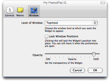 Why would anyone use Dashboard for a calculator when they can summon Apple’s own desktop Calculator in one click of the Dock (or many other handy places one can store commonly used apps), or, like me, summon Quicksilver for a quick calculation? The answer is, “They won’t.” And since they won’t do that, they’re likely to dismiss the entire concept and the over 2,000 widgets that have been developed for Dashboard–many of which simply don’t have desktop equivalents, and nearly all of which are free!
No, YWE gets it right, and Apple needs to get it, too. After all, YWE runs on both Mac OS X and Windows, and we all know what percentage of the world’s desktops Windows holds, don’t we? At last count, Dashboard can claim a total of 2,088 widgets for its platform, but Yahoo! now has 2,891… having surpassed Apple and growing fast. Apple needs to keep its system competitive in features if it wants to maintain leadership in this technology. After all, you-know-who is planning to release its own widget system for Vista, and once that happens, who knows? One thing I see that Vista has right is letting users keep their widgets persistent on the desktop. As I understand it, the Microsoft way is inferior to the Yahoo! way, but it’s arguably better than the Dashboard layer alone.
Also expanding the “widget front” is Opera 9, whose users now have access to some very fine widgets thanks to Opera’s embrace of this technology. In Opera’s case, the widgets only work as long as you have Opera running, but that’s no problem if you’re an Opera user. Like YWE, Opera widgets can run on various window layers, and they share with all the other widget implementations the same open, standards-based underlying technologies. As of this writing, there are already over 400 Opera widgets! And if you think Opera developers are just trolling the same over-hunted territory where Apple and Yahoo widget developers have been, get a load of this little baby, which is one of several unique Opera widgets by Australian developer Benjamin Joffe.
In the end, I’m hoping all these widgets can coexist happily on my desktop (well, except for Microsoft’s widgets, which no doubt will only work on Windows). After all, one of the best things about widgets is that they’re just HTML, JavaScript, CSS, XML, and a few images. (Yes, they can have other things, too, some of which may be proprietary to a particular OS… but they don’t have to have anything but those basic open-standard components.) This means that if you can build a cool web page, you can build a cool widget… and there are a lot more people who can build web pages–for any platform–than can build Cocoa apps!
So a tool I’m hoping someone releases soon is a widget converter, which could convert Mac OS X widgets to run in YWE, for example, or Opera widgets to run in Dashboard. In the meantime, I’m perfectly happy to run Yahoo! Widget Engine alongside my desktop-handy Dashboard widgets. In fact, running YWE is likely to make me even more impatient to see Apple get on the ball and include a better widget system in Mac OS X 10.5, Leopard.
How’re We Doing Now? An Update on DHTML/Ajax Browser Compatibility
 Since my original report on the browser and platform compatibility of some 50 Ajax JavaScript libraries in March, the market has continued to produce new toolkits at a rapid pace. I recently finished grading all (but one) of the 8 libraries added since March, and I’ve revisited the scores of another 8. With that, the time seemed right for a report on how Ajax library developers are doing at achieving cross-browser, cross-platform compatibility in the tools they’re giving us–tools which programmers around the world are using to hammer out their unique vision of Web 2.0.
I’m very pleased to report that the trend is moving strongly toward full compatibility. Of the eight new libraries, a full five of them achieve top grades of “A”. That’s a much higher percentage of the total than in March, and of the three non-A libraries, only one was a D (D+ actually). One was graded C+ and the other B. Of the revisited libraries, I was able to raise grades for three–Backbase, ICEfaces, and MochiKit. Only one library had a lower grade (Rico, down from A- to B), and the rest were unchanged.
Only two of the 8 new libraries have commercial licenses you’d have to pay for, and in one case you are really only paying for the IDE. Three of the new libraries require a java server architecture in order to be happy, one would prefer Cold Fusion, and the others are pure client libraries that are agnostic with respect to the application server. One library was added just a couple of days ago (Jitsu), and I haven’t had time to review it yet–but you’ll find it summarized here with the rest. Only one of these 16 libraries is DHTML with no Ajax controls–Uize. Even without Ajax, however, I think you’ll find Uize to be one of the most interesting here–especially in terms of visual richness.
Here is a tabulation of the results for this group:
| Name | Grade | Date Added | Date Rated | Date Revisited | Direction | Server Req | License |
| Libraries New to the List | |||||||
| Echo 2 | A | 6/4/06 | 6/5/06 | Java | Commercial | ||
| Google Toolkit | A- | 6/4/06 | 6/5/06 | Java | Open/Free | ||
| Jitsu | NA | 6/25/06 | .NET/Mono | Open/Free | |||
| jsLINB | A- | 6/4/06 | 6/18/06 | No | Open/Free | ||
| Neuromancer | C+ | 6/4/06 | 6/18/06 | ColdFusion | Open/Free | ||
| Uize | A- | 6/4/06 | 6/24/06 | No | Open/Free | ||
| Zapatec | A | 6/4/06 | 6/22/06 | No | Commercial | ||
| ZK | D+ | 4/27/06 | 6/23/06 | Java | Open/Free | ||
| Revisited Libraries | |||||||
| AjaxFace | E | 6/5/06 | o | Proprietary | Commercial | ||
| Atlas | D | 6/27/06 | o | Proprietary | Open/Free | ||
| Backbase | B | 5/3/06 | + | Proprietary | Commercial | ||
| Dojo | A | 6/5/06 | o | No | Open/Free | ||
| ICEfaces | B+ | 6/25/06 | + | Java | Commercial | ||
| MochiKit | A | 6/18/06 | + | No | Open/Free | ||
| Rico | B | 6/18/06 | - | No | Open/Free | ||
| Tibco General Interface | E | 6/23/06 | o | Proprietary | Commercial | ||
All of the notes about these libraries are now included as part of the original article, but I’m presenting the brief writeups about each one here as well, since some of these may be new to you. The libraries are presented in the same order as the preceding table–the new libraries first, and then the revisited libraries.
One other general observation I can make before getting into the details… It’s clear that the Ajax application market is splitting into two camps, pretty much the same two that have dominated application development teams since the dawn of the client-server era:
- Those who like, need, or want a visual development tool and a minimal amount of actual coding (in Ajax, this also means preferably as little JavaScript coding) as possible,
- Those who prefer to code with a text editor or equivalent, with as much control over the actual code as possible.
In general, the commercial tools lean toward the former approach, while the open source libraries lean toward the latter. The commercial products also tend to favor proprietary server-side components, either in the form of an actual server or in the form of the data formats delivered by their own GUI IDE tool. It’s probably as a result of their use of proprietary components that the scores for the commercial products are, by and large, much lower than the open source products in terms of platform and browser compatibility.
Finally, a quick note about the lengthy table on Microsoft Atlas: Atlas is the only one of the many libraries I’ve tested that doesn’t seem to understand that if a control or link causes a page refresh, it isn’t Ajax. In that case, it’s just a synchronous server connection like we’re all used to. One of the aspects of Ajax that makes it special is the ability to design a user interface that doesn’t disappear on you just because you entered some data or made a selection in a form. Web users have become accustomed to the page refresh as normal behavior, since it’s what all web applications do. Linking from one page to the next is just the web norm and has been since the web was born.
Don’t misunderstand me to be saying that Ajax is meant to put an end to the page refresh. It’s not, and I’m not. I’m merely saying that Ajax provides the technique to allow seamless contextual changes to a persistent user interface, where that’s appropriate… As it’s often described, Ajax lets you make web interfaces more like the interfaces of desktop software, which don’t do page refreshes. What we now call Ajax is a new tool that user interface developers can work with in order to improve usability as they continue on their quest for that Holy Grail of usability: Providing a truly intuitive web interface. Eliminating the page refresh is one of Ajax’s signature features, and the presence of a page refresh means it ain’t Ajax.
Many of the Atlas controls require a page refresh to get the job done, and therefore I have counted them as “not working.” Yes, some of them “work”, but not as Ajax controls, and that’s what Atlas is supposed to be providing. I have no idea what techniques Microsoft engineers are trying to use in Atlas, but I do know that by and large the controls Atlas provides are extremely pedestrian and have been available since DHTML was new. Why these simple DHTML behaviors would cause a page refresh in modern browsers like Firefox and Safari–and why they don’t work at all in Opera–is a complete mystery to me. By all means, visit the Atlas site and judge for yourself.
Note that nowhere in late June could I find a statement that Atlas is a “preview” or “beta” product, which was the excuse many Atlas defenders used when I pointed out some compatibility issues back in April. In April, the reference to “preview” release was on a page linked to the Atlas home page, but if such a statement exists today I couldn’t find it. My purpose here is not to “bash” Microsoft or any other developer, and if I seem to dwell on Microsoft’s weaknesses here, it’s only a reflection of the company’s dominating position in computing. Every action Microsoft takes automatically receives a great deal of attention, and many people who look at Atlas may have no idea how weak it is compared with most of the competition. In this field, not only was Microsoft late to the game, but they are entering with very few chips. The chips may appear large and shiny, but if you look closely, you’ll find they are quite thin–and actually hollow on the inside.
Once you try out the Atlas demos, be sure to also visit the many A-rated toolkits in this list, as well as in the full list from the April article. I think you’ll find that the A-rated libraries not only provide superior compatibility across browsers and platforms, but also embody amazingly innovative thinking and offer some truly elegant, mind-opening approaches that will get your wrists itching to get typing. ![]() I’ve tried to point out each library’s noteworthy features in the library summaries, but I’m sure I missed some. If you know of a particularly cool feature of your favorite library that’s not mentioned here, by all means let me know!
I’ve tried to point out each library’s noteworthy features in the library summaries, but I’m sure I missed some. If you know of a particularly cool feature of your favorite library that’s not mentioned here, by all means let me know!
Frankly, the hard part about settling on an Ajax library these days is getting over the yearning to try all the great ones out! I’ve personally been doing nearly all of my Ajax experimentation with Prototype and Script.aculo.us, but I really want to set them aside if time permits and try jQuery, Dojo, and MochiKit, all of which I find appealing for one reason or another. Did anyone say “kid in a candy shop?” That’s truly what delving into these wonderful JavaScript libraries has been like for me.
Ajax/DHTML Libraries New to the List
Echo 2
Grade: A
Server Required: Java
License: Commercial
Echo2 is the next-generation of the Echo Web Framework, a platform for developing web-based applications that approach the capabilities of rich clients. Echo2 applications are developed using only server-side Java code. No JavaScript, HTML, or XML development is required.
Echo 2 uses a java-based server architecture, plugged into a servlet engine, to transform HTTP requests into client-side Javascript that run in the user’s web browser. The FAQ’s claim that you don’t need to know JavaScript to build an Echo application, and if you use the company’s Echo Studio, an Eclipse plugin, you probably don’t as long as you don’t want to do anything Echo Studio can’t do. The library itself is free and open source, but the IDE is available as a 30-day trial. For the life of me, I couldn’t find anywhere on the site any information on how much a full license for Echo Studio costs. The Echo 2 website has a large number of sample applications and includes an interactive tool for building Echo widgets that presumably is similar to the kind of work you would do in Echo 2. Also available is a tutorial and a full javadoc (in HTML) that fully documents the java API.
Echo 2 has this statement about browser support: “Echo2 supports browsers that support the Level 2 DOM and CSS specifications and provide XMLHttpRequest support.” They specifically mention Firefox/Mozilla, and also note that they support IE “because of its widespread use.” I encountered no difficulties navigating the Echo 2 demos in Firefox 1.5, Opera 9, and Safari 2. Echo 2 has a complete set of DHTML and Ajax components that feel very robust and are thoughtfully designed, including an accordian widget, window widget, tabbed panes, and split panes. DHTML effects are limited to a few transition effects. I also downloaded the Echo Studio IDE, and it worked just fine in Eclipse on Mac OS X Tiger. If you’re a Java developer who doesn’t know (or want to know) JavaScript, HTML, CSS, and the rest, and who is used to working in a full-featured visual IDE, Echo 2 may be a good choice. Certainly, I saw no browser or platform-compatibility issues.
Google Web Toolkit
Grade: A-
Server Required: Java
License: Open Source/Free
Google Web Toolkit (GWT) is a Java software development framework that makes writing AJAX applications like Google Maps and Gmail easy for developers who don’t speak browser quirks as a second language.
The GWT has attracted the kind of attention you would expect for an Ajax toolkit developed by the company that released what many consider the first major Ajax applications: Gmail and Google Maps. If you’re a java developer, it’s especially appealing since you don’t have to know JavaScript or other server languages, just java. GWT comes with a command-line tool for compiling your files into a project, and that project can also be built to be Eclipse-aware. To avoid what Google refers to as “browser quirks”, the GWT is extremely spartan in the DHTML department, having only the kind of widgets that have been stable for many years: DHTML menus, trees, buttons, and tabs. It steers clear of effects completely, and in general reflects the developers’ disdain for JavaScript and the state of compatibility in today’s web browsers. Here’s Google’s statement about browser compatibility with the GWT: “If you stick to built-in widgets and composites, your applications will work similarly on the most recent versions of Internet Explorer, Firefox, and Safari. (Opera, too, most of the time.) DHTML user interfaces are remarkably quirky, though, so make sure to test your applications thoroughly on every browser.” Indeed, I found nothing that didn’t work fine in my test browsers.
Google Web Toolkit provides the fundamentals for Ajax application development, and if you favor the spartan appearance and functionality found in Google Calendar and Gmail, and if you are a java programmer who doesn’t require anything more than Eclipse for development, GWT is certainly worth a try, and you can be certain you won’t be building incompatible Ajax web apps. (Note: I’ve subtracted 1/2 point for GWT because it’s so bare-bones in the DHTML department. One of the reasons it’s able to be cross-browser compatible is that it eschews DHTML to a great extent.)
Jitsu
Grade: Not Yet Rated
Server Required: .NET/Mono
License: Open Source/Free
Jitsu contains an integrated set of tools to enable developers to build and deploy sophisticated user interfaces for web applications. These include an Xml markup language, page compiler, data binding engine, JavaScript runtime, control library, runtime inspector, animation engine, cross-platform library, Ajax, and back button support. Jitsu apps use DHTML and run in most modern web browsers.
Jitsu is an open-source Ajax toolkit and framework that’s been in development for a couple of years. Unlike most, it uses XML as the presentation language, and I believe it’s unique in providing a compiler for the XML. It works in all modern browsers and has the usual full range of user interface controls and widgets for web interfaces. The site has plenty of documentation, a free download (it’s an .exe), and a slew of demos available. It uses Microsoft’s .NET framework, so much run either on a .NET server or a Mono server (Unix port of .NET). The product has just entered public alpha stage, with production release planned for March 2007.
jsLINB
Grade: A-
Server Required: None
License: Open Source/Free
jsLINB (Lazy INternet and Browser) is designed to allow developers coding in a more targetable, clearly, and efficiently way. jsLINB is platform-independent and language-independent, which is C/S, B/S, RIA and Web2.0 compatible.
This toolkit appears to be the product of a Chinese developer, and the English documentation is shaky in spots. Oddly, the toolkit home page uses jQuery and moo.js rather than jsLINB itself for the DHTML bits. Like several other toolkits, the documentation itself is a demo of the JavaScript widgets and DHTML effects. The javascript navigation for the documentation loaded unreliably or not at all in Safari and Firefox. The developer states that the jsLINB library has been tested and certified in IE6/IE7, Netscape 8 Firefox 1.5, Opera9, and Safari 2.0 (limited). Indeed, I had no trouble running any of the widgets and demos except for the Windows widget, which didn’t work in Safari (though this may have been a temporary glitch). The developer doesn’t make the library available for anonymous download, but will provide the URL on request. Overall, my impression is that jsLINB is a work-in-progress by a single developer, who has developed some striking and unique approaches to JavaScript-enabled web interfaces using a rigorous object-oriented framework.
Neuromancer
Grade: C+
Server Required: ColdFusion
License: Open Source/Free
Neuromancer is a set of javascript libraries that provide a common interface between browsers and allow for javascript remoting.
This is an open source library with nightly builds that was begun in 2004. The library provides APIs for Ajax functions as well as “eye candy”–in other words, DHTML effects. The site has very good documentation and a set of sample applications built with Neuromancer. Unfortunately, it provides no systematic demos of all the Ajax/DHTML functions, and the demo applications don’t cover all of them. Further, the demo apps didn’t work consistently, or at all, in some of the test browsers. For example, the OS emulator partially worked in Opera, but the window wasn’t movable; the window wasn’t resizable in any of the browsers, though it’s not clear that it should have been. The first demo, the online presentation package, crashed Opera without trying too hard, and it was impossible to add text to the bullet lists in Safari and Firefox. The photo slideshow worked fine in Safari and Firefox, but failed to load images in Opera. My impression is that some of these applications may not be using the most recent version of Neurmancer, and that they are, in fact, old demos rather than ones prepared to show off Neuromancer. Therefore, it’s hard to rate the library objectively. I did download the latest version and ran the test page, but the server-side installation requires Cold Fusion in order to test. In fact, it appears that Neuromancer has been used thus far primarily with Cold Fusion as the back end app server. All three browsers passed the tests that don’t require a server, except Safari failed the cookie tests (even though I set its permissions to “accept all”). The rating given here reflects my inclination to give the Neuromancer developers the benefit of the doubt for functions I couldn’t test.
Uize JavaScript API
Grade: A-
Server Required: None
License: Open Source/Free
The UIZE JavaScript API is a suite of code libraries to help you create more effective user interfaces in your Web content and Web-based applications and services. Many of the UI widgets have been designed using the GLUE (Glue Logic Upon Elements) paradigm. At its heart, GLUE aims to aid the Web interface design process by decoupling the interface skin development from the interface functionality development.
UIZE provides some of the most sophisticated DHTML effects available from any library in these lists. The developer has conceived some truly original and unique user interface enhancements, particularly in transition “wipe” effects, a unique slide show widget, a “marquee” image viewer, dynamically beveled images, and many others. As the author states, UIZE is a “work in progress” that began in April 2005. Like Dojo, it comes with a “scruncher” to pack the code as tightly as possible. At this time, UIZE contains no Ajax functions, but it does have a sophisticated event model and highly evolved widget system. There is no simple download offered, but all of the javascripts are available in “scrunched” form at http://tomkidding.com/uize/uize-js-api/js/.
The UIZE documentation says nothing about the library’s browser support goals, but I’m happy to report that the vast majority of UIZE’s widgets and effects work fine in all the modern browsers. I noted that generally performance was slower–in some instances, quite noticeably so–in Firefox, although Firefox was the only Mac OS X browser that correctly displayed every UIZE demo. There were 6 demos out of the 40 total that didn’t work in Safari, and smaller subsets of those six demos affected Opera (5) and WebKit (Safari nightly build) (2) as well. Although some of the magic displayed here appears to be using Ajax, in fact the library doesn’t make use of the XMLHttpRequest method at all.
Zapatec
Grade: A
Server Required: None
License: Commercial
Jump start your AJAX deployment by using the Zapatec suite which includes six widgets, three modules and a library. Don’t be intimidated by the Suite’s breadth, its components are built with ease of use in mind, and you can start with one or two and migrate to using the full suite as your needs and familiarity increase.
The Zapatec Suite is a commercial toolkit for building Ajax-enabled, rich-interface web applications. It has modules and libraries that provide a wide range of DHTML effects and widgets. The Zapatec website is rich with examples and demos, and an evaluation copy of the suite can be downloaded, along with documentation. Some of the widgets come with web-based “wizards” that allow you to develop JavaScript code without knowing JavaScript. A “lite” license is available for free, which requires the developer to link to Zapatec for each module used. The commercial licenses start at $399 for a single-server license.
This is one of the most impressive commercial Ajax/DHTML suites I’ve encountered since starting this list. I downloaded the “lite” Zapatec suite and went through all of the demos with Firefox, Opera, and Safari on Mac OS X. I’m pleased to report that everything worked, and in fact worked in almost exactly the same way in each browser. There were a few anomalies that I noted–for example, the custom visual effects are “flickery” in Firefox, and the background color for the modal windows appears opaque black in Safari and Opera rather than translucent grey. There were a few others, but frankly the suite is so strong that I started noting every tiny discrepancy simply because there was so little deviation in appearance and functionality.
Particularly impressive are Zapatec’s powerful and flexible menu, calendar, tab, and table grid widgets, as well as the suite’s visual effects. To date, I’ve found the Script.aculo.us effects to be about the best out there in terms of variety and flexibility. But Zapatec’s go a step further. Like Script.aculo.us, Zapatec offers combo effects, but the effects are much smoother, and it’s much easier to set up and modify them. The table grid widget is likewise the best I’ve encountered. Not only can you do the standard column sorting, you can also filter the HTML table on any of the various column fields it contains. You’ll have to see this to believe me, but it’s truly remarkable. One of the grid demos shows how Zapatec can even take Yahoo search results and set them up as a grid on the fly, allowing you to sort on modification date, URL, title, etc. Simply amazing.
All this power would be for naught if the company had built it on lousy, proprietary, and difficult to maintain JavaScript. But I’m also pleased to report that their DHTML implementations are pure DOM scripting–Unobtrusive JavaScript in the very best sense. Behind their menus, tabs, table grids, etc. are simply HTML constructs with DOM ID’s–Unordered lists, HTML tables, and so on. All of the JavaScript is in the header, where it belongs. One additional advantage that helps in implementing the library quickly is that each set of functions is associated with a discrete combination of JavaScript files that have little if any overlap. Aside from a utility (util.js) file that’s common to all, you add to your application only the needed components, and those are clearly documented.
Which brings me to the final strength of this package–Documentation. Whereas Dojo has some terrific widgets, and even some you won’t find in Zapatec (yet… its scope is quickly being expanded), you also can’t find documentation on the Dojo widgets. The Zapatec developers have meticulously documented each and every function, widget, and demo they’ve provided, and it’s all presented in a clean, consistent manner with convenient print versions available as well. If you investigate, I do recommend downloading the full suite. In one case, I found a couple of drag-and-drop demos that aren’t on the website or in the demo index file, but which filled in a functionality it seemed to lack: Namely, sortable, draggable lists. Those are there, hidden in the drag/drop demo folder.
ZK
Grade: D+
Server Required: Java
License: Open/Free
ZK is an open-source Ajax Web framework that enables rich UI for Web applications with no JavaScript and little programming. With event-driven feature-rich components, developing becomes as simple as programming desktops. With a markup language, designing becomes as simple as authoring HTML.
ZK uses XUL and XHTML components, together with its own scripting language, XUML, to build rich interface Ajax applications. Your web pages are served up by any of a number of java servlet engines (including Tomcat and JBoss), and the XUML code is transformed into client-side javascript on the fly. The ZK website has a tree-based list showing all of its interface elements. When I first visited in April 2006, viewing this page generated an “unsupported browser” message in Safari 2.0.
Update 6/23/06: ZK’s support for Safari 2.0 didn’t improve over the last 2 months, but it does now support the WebKit nightly to a large extent. Although support for WebKit doesn’t substitute for support for Safari 2.0 (the latest supported browser), I’m giving the kit a “+” for it. Unfortunately, ZK also fails completely in Opera 9, on both Windows and Mac OS X. (I’ve made a screenshot of the javascript error message in Opera for future reference.) On the Mac, Firefox was supported to about the same extent as WebKit: The sliders didn’t work quite right (though better on Windows), and the right-click menus didn’t work at all. Even in IE6 on Windows, this library had some quirks: The tab boxes drew themselves painfully slowly–the only browser that exhibited this behavior.
ZK does have a couple of unique and worthy features. The two I really liked were the dynamic table demo, where data is pulled from the server as you scroll down a long set of data (sort of like the Google Maps functionality). And also this is the first attempt I’ve seen to demo drag-and-drop for tables where the user can move entire rows of multi-column data. All of the other demos of this kind show only single-column data.
Unfortunately, ZK has not reached the maturity level needed for cross-browser, cross-platform functionality, primarily because of insufficient testing by the development team. Here is their statement on browser support: “Theoretically, any modern browser supporting DOM and JavaScript could be used. However, due to compatibility issue, we don’t know whether a browser is supported, until we test and make some adjustments. Currently, ZK has been tested on Internet Explorer 6+ and Firefox 1+.”
Ajax/DHTML Libraries Revisited Since March
AjaxFace
Grade: E
Change from Previous Grade: No change
Server Required: Proprietary
License: Commercial
AjaxFace from VertexLogic is a framework for building rich WEB UI using client-side rendering architecture. The main component of the framework is a rendering-engine written in JavaScript. Developers use a high level API for constructing UI in JavaScript.
Evaluation copy available for download by registering. No documentation available on the website. Application scheduled for production in March 2006. Demos say they work only in IE 6.0 and that Firefox support is in development, “Please check back after 1/15/2006.” However, when I turned on Safari’s “spoof” mode to IE 6.0, the widgets loaded, though most were semi-broken. The data load function, in particular, did not work at all. (Note from 6/5/06: The individual component demos still have the same message originally reported in March–”Please check back after 1/15/2006″.) AjaxFace is a commercial product that uses a proprietary server component.
Atlas
Grade: D
Change from Previous Grade: No change
Server Required: Proprietary
License: Commercial
ASP.NET “Atlas” makes it easy to build rich, interactive web-based applications for personalized web experiences. It allows you to create rich web applications that also harness the power of the server and browser. This brings a richer, user experience to web applications without the traditional need to post-back to the server.
Since my first in-depth review of Atlas in mid-April, Microsoft has had a couple of small upgrades, one of which claimed that Atlas now supports Safari. So on June 27, I returned to test Atlas again, and much to my surprise, Atlas was actually no better than when it was first released in April. Although Microsoft is claiming they now support Safari, that’s not really true. Of 13 controls now available (up from 9 in April), only 4 work as they’re supposed to in Safari. Whereas 3 controls worked in Opera in April, none work in Opera now. This is actually moving backwards from standards compliance, folks, not forward. With Firefox, the same control that didn’t work in April still doesn’t work. It also doesn’t work in IE 6.0, as it turns out. Here are a few details of my latest test of Atlas.
|
Microsoft Atlas Control Toolkit (June 2006) |
|||||
|
Opera |
Safari |
Firefox |
Comment |
||
|
Always Visible Control |
No |
Yes |
Yes |
This control is so 1990’s. Why would you bother doing this, when you can use a CSS element with position:fixed? I don’t get it. Besides the control itself failing in Opera, the "Additional Text for Scrolling" link also fails. In Safari, each change in positioning causes a complete page refresh, which means it doesn’t work as an Ajax control. It works fine in Firefox. |
|
|
Cascading Drop Down |
No |
No |
Yes |
The submission form for this basic JavaScript form causes a page refresh in Safari. |
|
|
Collapsible Panel |
No |
Yes |
Yes |
Still No in Opera. Why doesn’t Microsoft just go to one of the other vendors on this list and borrow their JavaScript? Seriously, every library can do this but Atlas. |
|
|
Confirm Button |
No |
No |
Yes |
In both Opera & Safari, clicking these links causes a complete page reload. Note, this control worked in both browsers in April. |
|
|
Drag Panel |
No |
No |
Yes |
In Opera, nothing happens at all. In Safari, bizzarely enough, dragging causes the whole window to move, though at a somewhat slower pace. This was working in Safari in April. (Note: the window drag probem does not affect WebKit, the Safari nightly build.) |
|
|
Drop Shadow |
No |
Yes |
Yes |
This is the lamest drop shadow script I’ve ever seen. The script also tries to "round" the square box and sort of succeeds. The drop shadows are nothing a professional web designer would ever be happy with. If you want to see what configurable, good-looking drop shadows would be like, check out the ones implemented in Dojo. As with the shadows, this control’s “show more” link is the worst implementation of a simple DHTML animation I’ve ever seen. If you think I’m exaggerating, take a look at the screen movie of how it looks in Firefox. |
|
|
HoverMenu |
No |
No |
Yes |
As with the Reorder List control, this control completely refreshes the page in Safari in attempting to work some Ajax magic. Note that this is not the case for Firefox. Why can’t Microsoft achieve what so many other vendors with far skimpier resources have, and provide a uniform interface experience for all modern, standards-compliant browsers? This is far inferior to the many excellent in-page editing controls from other Ajax toolkits, such as Dojo and Script.aculo.us. In April, this control was the same in Safari as in Opera. Now, Safari gets the menu, but the whole page has to reload with each action you take. See screen movie. |
|
|
Modal Popup |
No |
Yes |
Yes |
Opera does a page refresh when you click the link, but that’s all. |
|
|
Popup Control |
No |
No |
Yes |
This is one of the four new controls. In Safari, you get the popups, but as the Atlas page notes they don’t work to populate the field. If you fill in the field manually and click the submit button, the page reloads and displays the new information. The same is true in Opera, except there you don’t see the popups, which are the whole point of the demo. |
|
|
Reorder List |
No |
No |
No |
The probem with drag/drop introduced for Safari and noted in the drag panel control affects this one, too. Firefox still has the bizarre refresh behavior. (See screen movie.) I also tested this in IE 6 on Windows, and it has the same refresh behavior. (Note: WebKit does not have the window-drag problem that Safari does.) |
|
|
Rounded Corners |
No |
No |
No |
Opera does nothing but a page refresh for each selection. Safari does a complete page refresh too, accompanied by a strange, jerky transition. (See screen movie.) Firefox does the jerky transition too, which appears as a flicker in some cases, but Firefox users are spared the page refresh. (See screen movie) IE6 is fine. |
|
|
Textbox Watermark |
No |
No |
Yes |
First of all, I object to Microsoft’s use of the term "watermark" in this context. This is not a watermark in any sense of the term (see Wikipedia’s disambiguation page for "watermark". This appears to be a case of Microsoft trying to make a commonly used technique sound more important and special than it is. There’s nothing at all special here… web designers have been putting labels and instructions in text fields for ages using standard JavaScript. Here, however, the control causes a page refresh in both Opera and Safari. (Now, that is special!) |
|
|
Toggle Button |
No |
No |
Yes |
As an indication of the amateurish nature of most of the Atlas controls, check out what happens when you load a page with this "toggle button" control. That’s right… in both IE and Firefox, where it actually works, the page loads with a regular HTML checkbox which is visible for a moment before being replaced by the thumbs-up image. How lame is that? In Safari, Microsoft has managed to get the thumbs images to work as in IE and Firefox, but not in Opera. And both Opera and Safari do a full page reload when you submit the form. |
|
Backbase
Grade: B
Change from Previous Grade: Up
Server Required: Proprietary
License: Commercial
Our goal is to make development of rich AJAX applications fast and easy for you. We want to provide you with AJAX development software that is fully based on open Internet standards, doesn’t require plug-ins and operates on all browsers, offers over 50 out-of-the-box AJAX widgets (including source code), and runs on any platform (e.g. J2EE, .NET, PHP, Coldfusion, or XML).
(Updated 5/3/06) Backbase has a lofty vision and promises to provide a comprehensive ajax/dhtml library with impressive gui controls, which will be free for noncommercial/noninstitutional use. Backbase eschews JavaScript on the client, instead introducing its own XML-based markup language, BXML. Backbase relies on an XML server to generate native JavaScript from the BXML/HTML pages it receives, tailored for each client. The Backbase server can be used with a variety of back-end server architectures, including J2EE, .NET, and LAMP. Although the Backbase home page still puts up a roadblock to Safari, Opera, and other DOM-compliant browsers that use neither an IE nor Gecko engine, Backbase this week released a public preview of its Backbase Explorer application for testing by Opera and Safari users. (Note! This pre-release of Backbase works only in the WebKit nightly build, not in the Safari that Apple includes with Mac OS X 10.4 (Tiger). References to Safari in this description are to the WebKit nightly.)
In my tests, I found the Explorer to be very slow, especially in Opera. (Backbase acknowledges slow JavaScript on Opera to be a known problem.) However, the vast majority of Backbase’s rich GUI widgets worked in both Safari and Opera on my test G5 PowerMac. The experience wasn’t 100%, however: With both Safari and Opera, Backbase’s drag-and-drop Tree Widget failed to function as expected. In addition, the Backbase datagrid widget failed (rather horribly) in Opera. Nevertheless, this is a step in the right direction for Backbase. Although this version of Backbase is not officially released, and though it’s still got some work to be fully functional in Safari and Opera, and though it still doesn’t support Apple’s official Tiger version of Safari, I’m upgrading Backbase’s score to a B from a C. Now all they have to do is finish eliminating those caveats, and they’ll be at an “A!”
Dojo
Grade: A
Change from Previous Grade: Unchanged
Server Required: None
License: Open/Free
Dojo is the Open Source JavaScript toolkit that helps you build serious applications in less time. It fills in the gaps where JavaScript and browsers don’t go quite far enough, and gives you powerful, portable, lightweight, and tested tools for constructing dynamic interfaces. Dojo lets you prototype interactive widgets quickly, animate transitions, and build Ajax requests with the most powerful and easiest to use abstractions available.
Dojo is one of the most mature and most popular DHTML/Ajax toolkits now available. It was initiated by and is still closely affiliated with Jot.com, which uses Dojo as the Ajax/DHTML engine of its powerful wiki system, Jotspot. (Updated 6/5/06) Dojo clearly states its broad browser support to include Safari 2.0+, Opera 8.5+, IE 5.5+, Firefox/Mozilla 1.0+, and Konqueror 3.5+. A new home page now provides a fully Dojo-powered, Ajax interface to all of Dojo’s many widgets and to its Ajax and DHTML features. Dojo’s documentation has also improved, as the company’s new wiki provides a growing set of API documentation and tutorials.
ICEfaces
Grade: B+
Change from Previous Grade: Up
Server Required: Java
License: Commercial
ICEfaces is an Ajax application framework that enables J2EE application developers to easily create and deploy thin-client rich web applications in pure Java.
This is another impressive framework for building rich web 2.0 interfaces using client-side javascript and ajax technologies, but using a java server framework to manage the view. ICEfaces is available in a free “Community Edition” that has most of the product’s full functionality, and a commercial “Enterprise Edition” that adds features of interest to large deployments. The ICEfaces website has a comprehensive demo of their user interface components, as well as three complete applications built with the product. Each of the demos is documented and provides a “peek” at the source code.
Update 6/25/06. ICEfaces was released as a production application in May 2006, so I decided to take a second look at the product. This time around, I tested all of the online demos in all of the modern browsers for Mac OS X, since previously the grade was based on IceSoft’s statement that Opera was not supported, while Safari, Firefox, and IE were.
As it turns out, ICEfaces doesn’t work 100% in any of the three browsers, though it supports all of them about equally. The failures are relatively minor and can generally be worked around by an end-user. Of the 22 interface demos, I noted 4 problems in Opera, 3 in Firefox, and 2 in Safari. (This document shows the specific problems I found.) In WebKit, the Safari nightly edition, ICEfaces worked perfectly. Given the relatively broad–but still incomplete–support for these browsers, I’m giving ICEfaces a “+” for effort. Clearly, they need to do a little more testing of ICEfaces on different platforms.
MochiKit
Grade: A
Change from Previous Grade: Up
Server Required: None
License: Open/Free
MochiKit is a highly documented and well tested suite of JavaScript libraries that will help you get things done, fast. MochiKit makes JavaScript suck less.
Updated 6/18/06. When reviewing Mochikit 3 months ago, the DHTML functionality provided was pretty weak, which is fine for some kinds of apps. The MochiKit team also had a relatively few number of demos available online. What a difference 3 months makes in AjaxLand, eh? Now, MochiKit has incorporated the Script.aculo.us effects library, has a full drag-and-drop suite, and has added a number of innovative demos to their site. Everything I tried passed with flying colors, and I noted that the team has this statement on browser compatibility: “Our current test platforms include all of the modern and popular browsers: Safari 2.0.2, Firefox 1.0.7, Firefox 1.5b2, Internet Explorer 6, and Opera 8.5. Other JavaScript platforms should work if they’re standards compliant.”
On top of its powerful Ajax and DHTML libraries, MochiKit provides some unique and extremely useful tools for developers–an interactive JavaScript interpreter, a logging pane (either floating or embedded) for displaying errors and debugging, a terrific code-display module that includes syntax highlighting (!), and “hundreds” of tests for–among other things–reporting errors in MochiKit back to the development team, led by Bob Ippolito. As Dan Webb noted in a recent article in SitePoint, MochiKit appears to be an extremely well designed JavaScript library that draws from both Objective C and Python for its inspiration, syntax, and structure. And if you’re looking for top-notch documentation, MochiKit will not disappoint. It’s very detailed and well organized. I noticed also that the TurboGears Ajax application development framework is built with MochiKit as the JavaScript backbone, and TurboGears itself looks very inviting, especially if you are a Python programmer.
Rico
Grade: B
Change from Previous Grade: Down
Server Required: None
License: Open/Free
An open-source JavaScript library for creating rich internet applications. Rico provides full Ajax support, drag and drop management and a cinematic effects library.
Rico is another DHTML/Ajax toolkit based on Prototype. It focuses on an accordian widget, a data grid widget, some effects, and an Ajax engine. It was originally financed by Sabre Airlines, which retains rights to widgets developed by Rico. All demos but those that use drag/drop work in Safari.
Updated 6/18/06. The original grade of A- was giving the Rico team the benefit of the doubt on their support for Safari. However, after 3 months, two of the drag and drop demos still do not work in Safari, and in general progress on this toolkit has been agonizingly slow. Rico’s best feature is the accordian widget, but if that’s your main interest, you can use Moo.fx for a lot less disk space. In addition to weakness in Safari support, Rico also has a couple of bugs in Opera 9. The first is a simple display anomaly in the first motion effects demo, but more seriously, the Ajax Weather widget demo fails in Opera. Also odd in Opera is Rico’s DataGrid demo, which shows the scrollbar below the table rather than within it (as usual).
A sneak preview of Rico build 31 is available for download, though it represents only a small part of Rico–namely, it serves to show some new “skins” for the accordian widget and presents four demos of the widget.
Tibco General Interface
Grade: E
Change from Previous Grade: Unchanged
Server Required: Proprietary
License: Commercial
TIBCO General Interface is a framework that enables you to quickly and easily develop and deploy rich Internet applications (RIAs) using AJAX—the asynchronous JavaScript and XML capabilities already in Web browsers.
From original March 2006 review: Tibco requires developers to register, but then use of the client-side toolkit is free (as stipulated). However, Tibco’s download is a Windows .exe file, and the company’s browser compatibility statement still claims that IE is on 97% of corporate and end-user desktops. Support for Firefox is “forthcoming,” and support for Safari is not mentioned.
Update 6/23/06: About a month ago (mid-May), Tibco announced plans to integrate their toolkit with Dojo and Yahoo! User Interface, saying “With our open architecture, we’re addressing the needs of developers who want to include open source and commercial AJAX components in their applications.” So I added a re-review of Tibco to the punchlist, hoping to get some better news this time around and raise their grade. Unfortunately, it turns out that Tibco’s marketing language is highly exaggerated. To say that Tibco has an “open architecture” is misleading in a style worthy of “Microsoft’s greatest hits” when you consider that this is one of the very few Ajax libraries that can only be used on a Windows platform.
Anyone who has worked with JavaScript and modern browsers know that you have to tie yourself pretty tightly to Microsoft’s Internet Explorer platform to have a hard time making your scripts work with Firefox, Opera, and Safari. And I don’t think basing your code on IE’s proprietary extensions can be called “open.” The best Tibco has been able to say to date is that partial Firefox support will be coming in “late Summer.” This means it’s taken them 3 months simply to get to the point of providing a timetable, and it’s going to be another 2-3 months before they’re ready to let developers try the code–and then, only Windows developers.
Tibco makes a point of saying that their applications require no special server or client components. But if you read the installation instructions, it’s clear that you can’t build or deploy a Tibco application without using their GUI Tibco General Interface software, which is a visual builder tool like Microsoft’s Visual Studio. It writes out proprietary format files that contain the XML, XSL, and JavaScript that will be transformed into your Ajax application when served through HTTP.
It’s clear from reading their developer forum topic on this subject that they have no intention of widening support beyond Firefox, which simply isn’t adequate unless you’re interested only in covering Windows users. To show their progress toward Firefox, they’ve posted a video of Tibco working in that browser, but unfortunately–like everything else they make available–it’s in a video format that’s very difficult to view on a Macintosh. With all the other truly excellent JavaScript libraries available today for DOM scripting and Ajax, I can’t imagine why anyone would even give a second look to Tibco’s tool if they care about providing truly open, standards-based Web 2.0 applications. Perhaps if a company is firmly committed to Windows and has no non-Windows desktops, Tibco might be appropriate for building Intranet applications. I’ll keep an eye on Tibco, only because they do so much advertising it’s hard not to. I hope things improve, and I’ll certainly document that here if they do.
Poor Microsoft! Nobody, It Seems, Has Anything Nice To Say About Vista
All The Lovely Browsers!
 Lately, I’ve been on a bit of a rampage on the subject of cross-browser compatibility, becoming especially incensed by prominent websites and web 2.0 applications that don’t work in Apple’s Safari browser. I know some of you are sympathetic, but think I should just be pleased that these sites work in Mozilla Firefox, which runs on all platforms known to man (or woman (or Martian)).
Yes, it’s definitely worth celebrating that Firefox has broken through the stranglehold with which Microsoft’s Internet Explorer had gripped the industry for so long, providing not just a viable alternative, but a demonstrably superior web browsing experience. Firefox is the descendent of Netscape Navigator that’s finally returned to beat off the IE interloper, and it has a huge following among developers as well as users.
But there are a number of other excellent web browsers that get shortchanged when a company is testing its site or application in only IE and Firefox. For as good as Firefox is, it’s not the best in all aspects of web browsing, either on Windows or the Mac. This article highlights a few facts about the browser market and points to some really useful features found in non-IE, non-Mozilla browsers that explain why users remain devoted to them and, like me, continue to raise a stink when they are ignored. The other two browsers I use pretty much every day, in addition to Firefox, are Opera and Safari.
A Rapidly Changing Browser Market
 Everyone who’s been paying attention to the browser market knows that the times they are a-changin’ there… IE’s share is slowly being whittled down by two rising stars: Firefox and Safari. The accompanying chart shows the change in shares from October 2004 (shortly after Firefox 1.0 was released) to April 2006, and though the drop in IE share looks small, it’s actually almost 10 full percentage points. Likewise, though the increase in Safari’s share looks small, it’s actually more than doubled over this time period–from less than 1.5 percent to over 3.0 percent. Firefox has gotten the most attention, and deservedly so… it’s gone from about 2.5 percent to over 10 percent since October 2004–a quadrupling! Opera, which just went “free” last fall, remains at only about 0.5 percentage point, although in interpreting these data it’s important to understand that Opera, in particular, is able to masquerade as other browsers, and it’s not clear that these data (which come from Net Applications) are able to distinguish real IE from fake IE.
Safari
Safari’s share is particularly interesting because its 3.3-percentage-point share in April 2006 consists entirely of Mac OS X users. That’s because, for now at least, Safari only runs on that operating system. However, in the months since Apple open-sourced its KHTML-forked WebKit core last summer, a great deal of activity has occurred in the Safari nightly builds, and recently the team made clear they are working on versions of WebKit that will run on other operating systems. Already, Konqueror, the original KHTML browser, runs on Linux, but it has an unmeasurably small share of the market at this point. WebKit itself has already been ported to Linux, though the port is still in the alpha stage.
When you realize that the Mac market share in April 2006 stands at 4.3 percent, Safari is apparently the browser of choice of over 75% of Mac users. There are good reasons for that, though like their Windows counterparts, many Mac users browse with whatever web browser is installed on their system. Until Microsoft stopped producing IE for the Mac, Apple included IE as well as Safari with Mac OS X. Now, however, Safari is it unless you download another browser.
Regardless of why it’s favored, developers need to understand that when they fail to include Safari in their compatibility testing, they are basically thumbing their nose at Mac users. In my world, that’s not just a nasty thing to do, it’s also illegal. After all, it’s essentially the same as putting a sign on your shop window that says “No Jews served,” or “No Illegal Immigrants served,” etc. The web belongs to everyone, and if you’re going to set up shop there, you should have to do it in a way that doesn’t discriminate against a particular group. Mac users browse with Safari, so if you’re a developer on a Windows system, you need to find a way to test your code with Safari.
By the way, developing for Safari isn’t as hard as it’s made out to be. In my latest update to this heavily JavaScript/CSS/Ajax-driven website experiment, there were only one or two items that worked differently in Safari than in Firefox or Opera. The only hard browser to support was IE. And I do mean hard, as in forget it hard. I probably spent three full days just getting the site to its current level of support for IE, and even then I had to dumb down certain features to get it to work.
Why do developers think supporting Safari is hard? For one thing, they have no way to test their code. Like Opera, Safari used to be pretty quirky when it comes to JavaScript support, and they remember that. But mostly, I think, it’s because they’re using Microsoft development tools to build their code. The problem is, if you use Microsoft tools, you inadvertently produce non-standard JavaScript and CSS code that won’t work in other browsers. Microsoft knows this, and in fact does this in all of its tools as a way to make cross-platform development more difficult than it should be. (Remember what they did with Java, after all!) So if you’re developing for the web and you want to be standards-complaint, definitely avoid Microsoft tools (whether they’re free or not).
It’s worth noting that not only has the Safari market share doubled in the last 18 months, the Mac OS X share has increased by one-third. If I were a betting man, I’d put down a big wager that the Mac market share will continue to grow for the next year or two at least.
Opera
So, if Safari is ignored by developers today, does it surprise anyone that Opera is, too? After all, the Opera market share isn’t growing at all, and at 0.6 percent in April, it’s almost below the radar screen. Yet Opera is by many measures the best browser available, and the latest versions are free, with no annoying ads to try to get you to pay up. Both Opera’s status as a free browser, and its status as one of the most standards-compliant browsers are fairly new. Opera has been around for so long that many of the nerds who would be inclined to try it out against IE or Netscape still haven’t gotten their head around the fact that it’s worth another try in 2006. When that happens, I suspect Opera’s share will start to rise. (Readers interested in standards compliance, as measured by the ACID2 test, might like to visit this list showing the current status of compliance in all the major browsers.
As I mentioned before, Opera can easily masquerade as other browsers. In a world where so many legacy websites are still around that work best (or only) in IE, it’s most likely that any masquerading done would be with an IE mask. Once you start masquerading, you may not remember to set Opera back. That happened to me just yesterday. I was coding a notice of apology aimed at IE users and was surprised when I kept getting it in Opera. Although I had Opera’s overall preference set to browse as itself, I had at one point set a site-specific preference to masquerade as IE on Musings from Mars, and never changed it back. (Speaking of compatibility, the WebKit team has compiled a “Compatibility Hit List” of the major websites that Safari fails to render correctly, inviting users to participate in identifying and fixing the errant WebKit code.)
One final point about Opera is that its user base is overwhelmingly non-U.S. in origin. When I look at the usage statistics Google Analytics provides me for both this site and my commercial website, Classic 45’s, Opera is the only browser where the percentage of U.S. visitors is significantly under 50%. Opera has a large and enthusiastic community of users and developers, and deserves support because it is now just as standards-compliant, if not more so, than Firefox. Just because many of its users are European doesn’t mean you should ignore them. ![]()
Performance Data
One of the metrics of web browsing that’s relatively easy to measure is speed. There are any number of ways to measure speed, but two that are particularly relevant for developers building Web 2.0 sites and apps are CSS and JavaScript performance. It’s when you look at the data for these two components of a website that you realize why geek types avoid Internet Explorer like the plague. Not only is it quirky and require a great deal of special handling in building code, but it’s slow as well.
Mark Wilton-Jones (”Tarquin”) maintains the incredibly useful and informative “How To Create” website, which I referenced as a source of DHTML code in an earlier article. One of the sets of data he maintains is a comprehensive suite of browser speed measures. For the JavaScript measures, the author uses the BenchJS test. If you haven’t used BenchJS yet to test JavaScript performance in your browser of choice, I encourage you to do so. Not only can you get a useful measure, you can compare it with the results that other users are currently getting.
What Tarquin’s measures show is that, if speed were all we cared about in a browser, everyone would be using Opera. Seriously… it tops the list in nearly every measure on the site. I’m going to focus here on just the CSS and JavaScript measures, and I’ll try to go over these quickly because most people, I find, are easily bored by statistics. ![]() (By the way, I’m going to exclude historical browsers and only report on the latest versions from the major players.)
(By the way, I’m going to exclude historical browsers and only report on the latest versions from the major players.)
CSS Rendering Speed
Here’s the way the browsers shake out on the Windows platform (data measured in seconds):
- Opera 9 (beta) (0.92)
- Opera 8 (0.92)
- IE 6 (1.32)
- Netscape 8 (1.43)
- Mozilla 1.8 (1.49)
- Firefox 1.5 (1.52)
- IE 7 (beta) (1.58)
Opera clearly leads the pack in this measure, and after you jump from Opera down to IE 6, the rest of the browsers are all in a pretty tight range. So, aside from Opera’s clear lead in CSS rendering on Windows, all the browsers perform well with no clear reason to prefer one over another.
Here’s the picture on Mac OS X (again, in seconds):
- Safari 2 (0.35)
- OmniWeb 5.1 (1.41)
- Opera 9 (beta) (1.57)
- Opera 8 (1.71)
- Mozilla 1.8 (2.88)
- Firefox 1.5 (3.04)
- Camino 0.8 (3.08)
Wow! Here, you can see that Safari is way ahead of the pack, and in fact is the CSS Rendering King with by far the fastest performance on both platforms. So, unlike IE, Mac users actually have a performance reasons to choose Safari over other browsers. OmniWeb uses the WebKit engine at its core, but clearly uses something else as well, which may explain why it’s so slow at JavaScript parsing (as we’ll see). Opera is the next-fastest browser, followed by the Mozilla family, the members of which are significantly slower on Mac OS X than on Windows.
JavaScript Parsing Speed
Take a look at the way the Windows browsers perform in parsing JavaScript (in seconds):
- Opera 9 (beta) (13)
- Opera 8 (13)
- Firefox 1.5 (21)
- Mozilla 1.8 (23)
- Netscape 8 (28)
- IE 7 (beta) (40)
- IE 6 (60)
Woah! No wonder Windows users are switching to Firefox when their native browser is the slowest of the pack by a country mile! IE 7 appears to be improving the situation somewhat, but is still only about half as fast as the Mozilla family of browsers. Opera again tops the list on Windows.
On the Mac, the browsers are much closer together in JavaScript performance, with one big outlier (again, in seconds):
- Opera 9 (beta) (22)
- Opera 8 (22)
- Safari 2 (27)
- Mozilla 1.8 (38)
- Firefox 1.5 (40)
- Camino 0.8 (48)
- OmniWeb 5.1 (121)
Here’s where Opera really shines, performance-wise, on the Mac. (Actually, Opera also tops several other Mac OS X performance measures from Tarquin’s website, though Safari is usually not far behind.) But the difference between Opera and Safari is pretty close in JavaScript speed. By contrast, Firefox is only half as fast as Opera on the Mac, and again, only half as fast as its PC equivalent. It’s in perceptions and measurements like this that Mac users feel somewhat short-changed by Mozilla’s Gecko engine, which apparently is optimized for performance on Windows, but not on the Mac. Since IE has been the focus of their competition, this is understandable, and clearly they have proven that Firefox is a much better browser than IE on Windows. But it’s not there yet, performance-wise, on the Mac. OmniWeb’s back-of-the-pack status in JavaScript performance is odd, and I suppose someone from the Omni Group could explain what’s going on there. They must be using a different JavaScript run-time engine than WebKit (though the Omni Group website says otherwise), though they use WebKit for other page rendering tasks. I ran OmniWeb myself through the BenchJS tests, and sure enough, OmniWeb simply sucks at certain types of JavaScript-powered manipulations.
And now for the pretty pictures! The charts below are the same data I just described, rendered through Apple’s Pages software into lovely visuals. (All data courtesy of the How To Create website.)


A Few Favorite Features
My opinion of the browser market right now is that there are three excellent web clients available to users, with other excellent variations thereof, and there’s one web client that’s pretty bad. Fortunately for Mac OS X users, there are no real clunkers at the moment. Even OmniWeb, which has such miserable JavaScript performance, has many other unique virtues that presumably entice its users to shell out $30 to use it without annoying registration reminders. I have personally never been so enticed, but I came close shortly before Apple released the first beta version of Safari in January 2003.
For those who like Safari, there are a couple of top-notch, full-featured WebKit-based browsers available, both for free, and dozens of other products that use WebKit as a web rendering engine for part of their functionality. (For a full list of  every such product, check out Darrel Knutson’s comprehensive list of every Mac web browser known.) Both of these browsers, interestingly, are from Japanese developers, and both are worth checking out:
- Shiira
Shiira is a web browser based on WebKit and written in Cocoa. The goal of the Shiira Project is to create a browser that is better and more useful than Safari. All source code used in this software is publicly available.
- Sunrise Browser
Light & fast. The open-source browser for web developers.

 Mac users who like Firefox but would prefer a browser that uses Mac OS X’s native Cocoa framework have an excellent option in Camino, a side project of the Mozilla group. Before Tiger (Mac OS X 10.4), I had given up Safari completely and was using Camino full-time. It was noticeably faster and otherwise a joy to have with me on the web.
I’m also a fan of the Mozilla browser Seamonkey , which is the “all-in-one” application suite that Netscape Communicator tried to be. I’ve heard people grumble about Nvu, the web page editor that’s descended from Netscape Composer, but actually I find it to be one of the best free web page builder on the market today. A subset of Nvu is built into Seamonkey in the same way that Composer was built into Netscape Communicator. I always found this to be a powerful combination… open any web page you meet in an HTML editor! But the idea fell into the garbage heap along with several other great features of Communicator, when the Microsoft monopoly juggernaut awoke and flicked the whole Netscape thing off its back.
 Windows users have it pretty good, too, of course, but this is one category that they can’t claim to have more software available than Mac users. That’s probably because Microsoft has so cowed Windows developers that no one’s been seriously challenged to develop a competitor to IE, except for open-source developers who use Windows, of course. So you’ll find all the same Mozilla browsers that are available to Mac users, plus a few Windows-only flavors that use the Gecko rendering engine. Windows users also have Opera, of course, but the other main family of browsers is based on Microsoft’s proprietary Trident rendering engine that’s at the core of IE. And as these objective speed tests prove, Trident is way behind both Gecko, Opera, and WebKit in powering a web surfer’s activities in 2006. What’s missing on Windows, then, is WebKit, which despite being the butt of a surprising number of snotty remarks in blog comments, is a truly powerful, open-source engine that nowadays far outpaces Gecko in performance on Mac OS X.
Opera 9
 Opera 9 was a revelation to me (For a rundown of its features, see this review by the founder of OperaWatch.com). Like many users, I had tried Opera off and on over the years as new versions were released. But I was never hooked, especially since I didn’t want to pay for a web browser, and I certainly didn’t want to be subjected to advertising for the privilege of using any browser… no matter how good it might be.
But Opera 9 was different. For one thing, this website you’re visiting suddenly worked, when previously it required as much hacking as IE to get it to render in Opera as well as in Firefox and Safari. This is obviously a reflection of Opera’s maturing support for web standards, which they do tout as a feature in the new release. I’ve now used Opera off and on for a couple of months, even switching from Apple Mail to Opera Mail for awhile. Opera has won me over as a fan, and I now use it every day… though not as my default browser.
Here are the things I really like about Opera that make it worth returning to for awhile each day:
- JavaScript Debugger
- Even as good as Firebug for Firefox is today, with its new JavaScript debugger built in, I still find Opera’s handy debugger superior. With Opera, I get a succinct statement of the problem, with a detailed backtrace from the offending event through each line of relevant JavaScript back to the source line where the problem originates. 99 percent of the time, this cleanly formatted statement is all I need to know how to fix the problem. To illustrate this, take a look at these two debugging statements. The first is from the Mozilla Venkman debugger, which required me to do a great deal of clicking and setting of breakpoints to get this information.
#0: function anonymous(element=void:void) in  line 543
	541:
	542: Effect.Fade = function(element) {
	543: element = $(element);
	544: var oldOpacity = element.getInlineOpacity();
	545: var options = Object.extend({
	Continuing from breakpoint.
	Exception ``TypeError: element has no properties'' thrown from function anonymous(element=void:void) in  line 544.
	[e] message = [string] "element has no properties"
	Exception ``TypeError: element has no properties'' thrown from function updateContent(box=void:void, url=string:"/ajax_software.php?numberposts=20&postcat=25&cat=26&tag=Freeware") in  line 363.
	[e] message = [string] "element has no properties"
	Exception ``TypeError: element has no properties'' thrown from function onclick(event=MouseEvent:{0}) in  line 1.
	[e] message = [string] "element has no properties"
	#0: function oncommand(event=MouseEvent:{0}) in  line 1
This next debugging statement is from Opera, which didn’t require anything of me other than to open the Error Console (which also debugs CSS, HTML, XML, and many other protocols but, like the Mozilla console, lets you focus on one type if you choose):
JavaScript - http://test.musingsfrommars.org/?cat=25&p=646
Event thread: click
Error:
name: TypeError
message: Statement on line 544: Could not convert undefined or null to object
Backtrace:
  Line 544 of linked script http://test.musingsfrommars.org/js/src/effects.js
    var oldOpacity = element.getInlineOpacity();
  Line 363 of linked script http://test.musingsfrommars.org/js/newsbox.js
    new Effect.Fade(box, {duration : 0.6});
  Line 1 of  script
    updateContent("post", "/ajax_software.php?numberposts=30&offset=0&tag=Automator&postcat=25&cat=118");
Now honestly, which do you prefer?
- Tab Navigation
- I don’t understand why the browser makers don’t understand that we need better navigation tools for a tabbed-browsing experience than we have. Using the OS’ application-switching keyboard shortcuts (Alt-Tab, Cmd-Tab) just doesn’t cut it. Opera is the only one that gets it right thus far. In Opera, you can use the same sort of keyboard shortcut you use for navigating among windows, to move from tab to tab. On the Mac, it’s Option-Tab, and you can configure the functionality to go straight through the tabs either forward or backward, or (and this is my current favorite) to have the switcher navigate to the previously used tabs in order of use.
- Speed
- Opera is definitely a speed demon on the Mac, just as it is on Windows. I often have to do a double-take to realize the browser has already rendered a page I just requested, it’s that fast. I’ve read that Opera’s speed difference becomes more noticeable as your system’s free memory becomes tighter, and that’s been my impression as well. Whereas Safari starts out like a racehorse, it seems to flag after awhile and needs to have its cache emptied to keep it going. I tend to browse in Opera with the cache totally disabled, which is useful for development anyway, and I hardly ever need to restart the browser or feel it slowing down. That’s a very significant virtue, in my book.
- Stability
- I’m trying to remember if Opera 9 has ever crashed on me… well, maybe once or twice over 2-3 months. I’m now using the second beta version of Opera 9, which is even more stable than the first. And keep in mind we’re talking about beta software here, folks. That’s stability!
- Drag to Text Fields
- Firefox can do this, too. Why can’t Safari? As embedded (so to speak) as drag/drop is in the Mac computing culture, it’s inconceivable that after 3 years Apple’s engineers haven’t recognized the need–and addressed it–for dragging text to an HTML form’s text field. You can drag to a
TEXTAREAfield, but not to aTEXTfield. In Opera, you can, and I like it. - Draggable Tabs
- Speaking of dragging things, Safari is way behind in not letting you drag and reorder your tabs. It’s not a failing of WebKit, because other WebKit browsers (Shiira, for one) can do this, so what’s the prob? Like Firefox, Opera lets you easily rearrange your tabs… though, oddly enough, Camino doesn’t. Something else about Opera tabs that I really like: You can choose to have new tabs open adjacent to the one you’re currently using, rather than at the end of the row of tabs. This is quite often very useful and saves a lot of mousework. In conjunction with this, you can choose to lock certain tabs in position. In general, Opera has more options than any of the other browsers and includes natively most of the useful features that are available in Firefox through plugins.
- Easy Theming
- Firefox users will say, “Hey, we got lots of themes, too!” And that’s certainly true. Safari has none, which is sad and reflects Apple’s control-freak impulse that makes modding the OS more difficult than it needs to be. (But that’s another article…) However, when you want to try out a new Firefox theme, you have to shut your browser down and restart! And Firefox is easily the slowest browser out of the starting gate of all the ones discussed in this article, so that’s no insignificant time-waster when you’re trying a lot of themes.
 Opera, on the other hand, lets you change themes–and preview them–without doing anything more than selecting one from a list. After working with themes in Firefox, this was quite a shocker. A good one!
 - Zoom and “Small Screen” View
- These are both simply amazing tricks. The zoom feature is interesting mainly as a technical marvel… Opera has implemented a Zoom that actually magnifies all page elements equally… graphics, CSS styles, text, and all. You can zoom up to 1000 percent (that’s BIG, folks!), and down to 20% (anybody need a thumbnail quick?) But while that’s cool, Opera’s “Small Screen” view is both amazing and a practical boon to developers.
You choose “Small Screen” as one of the “View” menu options, and Opera immediately reorganizes all of the page’s content–including the content set with a
display:hideattribute–into a thin vertical strip 250 pixels wide. That’s about the width of your typical PDA screen, so right away this is a useful way of seeing how your web site will render on a screen that size. What about all the graphics? And JavaScript? And Ajax? Believe it or not–and you really do have to try this for yourself to appreciate what I’m saying–everything works correctly. The images are all neatly scaled down, and the content is arranged in the order presented on the page. As such, this feature is ideal for checking the accessibility of your content. And I do mean all of your content. If anyone else is like me, you are tempted to echo database queries in hiddenDIVtags during development, as a debugging technique. If so, you will realize those are still “accessible” when you view your site in Opera’s “Small Screen” mode. Um, of course, I had already–(cough)–removed those debugging echos from my code before I did this check just now.
There are many other great features of Opera, but these are the ones that make me launch it so often during the day now. Opera also has its share of quirks and drawbacks, which keep me from using it full-time. Since the focus of this article is on the great features of these browsers, I won’t spend a lot of time on them. But to give you an idea of what I’m talking about, here’s a short list:
- Trouble downloading zip files… takes more than a point-and-click for some reason.
- Source view is sometimes incomplete. I noticed this recently when I tried to get my weekly newsletter in the usual way from a PHP script I built. I had to run back to Safari.
- Drag/drop problems. I found I couldn’t drag and drop text from a web page like you can in Safari. There may be a trick I’m missing, but when you try to drag the text, the mouse loses the selection.
- Missing contextual menus. As with Firefox, none of my usual contextual menu items (and I have a ton of ‘em) work in Opera.
- No AcidSearch! Opera’s customization options for the web search field are weak compared with its strengths in other areas. It does have one cool feature that almost–but not quite–suffices: Go to any site, right click on its search field, and you can add the site to your search engines list. Problem is, you can’t easily rearrange the items in the list. No, nothing–not even any of Firefox’s many plugins–equals what AcidSearch lets you do in Safari. That’ll have to be the subject of another story.
Firefox
 The best thing about Firefox is that it’s so extensible, and that there is so much development taking place around it. You can find Firefox extensions for virtually anything it seems, and if you have enough time, you’ll probably find two or three that you’ll actually use every day. The main ones I use are
- Scrapbook
- Weather
- AdBlock, and
- Web Developer
I’ve never been a big fan of the sidebar, so most of the Firefox plugins that work there don’t have much appeal. The same is true for Opera and Safari. (Safari has some plugins that introduce a sidebar, and both Shiira and OmniWeb employ them.)
Most recently, my one big reason for running to Firefox is FireBug. Now here’s an extension I can really dig my teeth into! Where the Web Developer extension was nice, it wasn’t a whole lot more than a bunch of bookmarklets all rolled up into a neat little interface. FireBug is worth writing home about… the equivalent of which today is “worth blogging about.”
Even surpassing what Microsoft  provides IE developers, the Mozilla group and its legions of open source developers has assembled the very best tools for debugging and testing web pages of any browser on any platform. With FireBug, Firefox now has a tool that combines usefulness with ease of use. The Mozilla DOM inspector is useful, but very clunky to use when compared with the Web Inspector tool the WebKit boys have cooked up. The Mozilla Error Console and Venkman JavaScript debugger were a formidable pair, though as I’ve noted earlier, Opera’s relatively simple interface provides the gist of what you need to know in a much more usable form. FireBug combines the best of all the Mozilla tools into one interface that I now rely on for a number of tasks. In FireBug, all you have to do is go into Inspect mode and troll around the page peeking into the guts of each element through the tabs below. If you want to focus on one element, just click on it. At that point, you have five tabs full of info about the element:
- Source code
- The basic source code, though oddly, in a form you can’t copy/paste from.
- CSS styles
- Here, you can see what the browser thinks the CSS styles are for the element. (Often quite different from what you thought!)
- Layout Info
- A wealth of useful information here, these are the element’s style properties you can access in JavaScript, both for DOM scripting and for dynamic style changes. Want to know what the
offsetLeftorscrollHeightvalue is for an element? Now you can find out without having to resort to alert tags or poking through Venkman’s interface! - Events
- Here you can test–in real time–the mouse events an element is receiving, as well as their values… For example, the element’s
clientXandclientYvalues. - DOM inspector
- Finally, here is all the DOM detail you will ever need, presented in an interface that’s much easier to use than the DOM Inspector or Venkman extensions.
Aside from the Inspector, the new Debugger is useful when I can’t get what I need from Opera, but FireBug’s Console is critical to me in doing Ajax pages. The Console displays errors, of course, but you can also ask it to display remote page requests. So now, each link I click that runs an Ajax call gets displayed in the Console, and I can inspect both the returned data and the page headers for the request.
Speaking of bugs, Firefox has a few that aren’t going to be easy to eradicate. The biggest aspect of Firefox that bugs me is the absence of my treasured contextual menus and inability to access my Mac OS X Keychain, but it’s also the browser’s poky startup time and relatively slow page rendering. The look/feel thing isn’t such a problem now that Firefox has native OS X form widgets and a huge store of nice themes. Oh, and I’d also miss AcidSearch in Firefox as well.
Safari/WebKit
 As noted in the speed tests, Safari really is just about the fastest browser available for Mac OS X. I actually find Opera to be faster in continual use, but the difference isn’t huge. For a period of time, Camino was clearly the fastest Mac browser, but that’s just not true anymore.
Aside from speed, Safari is the best there is at remembering your form information. And I’m not talking about just usernames and passwords. You can configure Safari to keep a running history of everything you’ve typed in any form field you encounter. Why is this useful? Well, suppose that you, like me, do a great deal of data entry in your web browser. For example, in managing Classic 45’s, I fill out a form of information for each 45 that goes into inventory. Safari remembers everything, so when it’s time to type “Tetragrammaton” one more time in the “Label” field, Safari does its useful autocomplete thing for me. When it’s time to enter a new B side product number, Safari remembers the last one entered, so it’s easy to update. Opera has a “Wand” feature that lets you remember form data, and I haven’t fully tested it. But I’ve tested it enough to know it only remembers one value per field. Safari can remember hundreds of values. None of the other browsers even comes close to Safari in this functionality, and it’s one of the things that keeps me returning. (Sadly, WebKit leaves this feature out, so even WebKit can’t fully substitute for Safari for me.)
Then there’s Safari’s Magic Page Cache. That’s my term for it, but it’s a very useful feature that’s saved me an untold amount of time. Here’s what you can do in Safari. Say you’re halfway done filling out a form, when you remember some text you’d like to include from two pages back. You could open a new tab and browse to the page using the browser’s history, but the most intuitive thing to do, and the fastest, is to just hit the back button a couple of times, copy what you need, and then hit the forward button a couple of times. In Safari, you can actually do this, and the browser won’t wipe out the info you’d already typed when you return. All of the Mozilla browsers wipe forms clean by default when you browse backward or forward to them through the browser cache. Opera comes close, but Safari is the Page Cache king, in my experience. Likewise, it’s fast as lightning in Safari to browse back a number of pages through your history cache. Firefox wants to render each page afresh, even if you have it set to use the cache. I remember this was an annoyance with Netscape Communicator, too, and it appears that Gecko still has this behavior.
Though Safari doesn’t have nearly as many plugins and extensions as Firefox, it’s got some great ones that Firefox lacks. Besides the aforementioned AcidSearch, which is a simply amazing free extension to the Safari web search field, the main one I can’t live without on other browsers is SafariBlock. All the browsers have some way to let you block ads nowadays, but I find SafariBlock to be the most convenient and easily customizable; unlike AdBlock for Firefox, the Safari equivalent follows the Mac philosophy of keeping things simple and focused. For example, in Firefox if you want to remove an image that has an imagemap on it, you first have to remove the imagemap. Now, I ask you… Why on earth would you want to remove just the imagemap? (Does it have an ad in it?) Or, to put it another way, is the price of accommodating the extremely rare occasion when you want to remove the imagemap but not the image worth the cost of having to do it every time? That’s the kind of basic usability mistake that infests the Windows OS but which the Mac OS blissfully avoids for the most part: Just because you can provide an option in your software doesn’t mean you should.
I also use SafariExtender, which lets you rearrange tabs and save tab sets, and SafariStand, a free extension with an amazing array of functions (including rearranging tabs), the most useful of which to me is its history and bookmark search features. These last two don’t top anything available for Firefox, but they encapsulate probably a dozen extensions into only two. If you’re interested in exploring the wide world of Safari extensions, there’s a great site for that, appropriately called Pimp My Safari.
Finally, there’s Safari’s interface and foundation as a Cocoa application. Cocoa offers Mac OS X users a wealth of mostly open-source tools that can be shared among all the Cocoa apps you use. For example, one little fellow makes it so I can navigate to a URL merely by selecting and clicking it while pressing the command key. There’s a whole set of TextExtras that you can activate in any Cocoa app, and a system of mouse gestures that work likewise. I make heavy use of a Cocoa extension that puts the Mac OS X Services menu in my contextual menus, and you just can’t do that in non-Cocoa applications. On the lighter side, there’s my favorite, SetAlphaValue, which lets you adjust the transparency of each application’s windows. A large number of contextual menus are available only in Cocoa apps, as well as a large library of other “Cocoa enhancers”, most of which are offered by developers for free. Camino is the only Gecko-based browser that’s written in Objective-C, the Cocoa language of choice, so none of this wealth is available if you choose to browse with Firefox or Opera. Some of the functionality is available, but if you’re a Mac user, wouldn’t you prefer to access the same function in the same way? Besides that, to use Firefox you’d have to locate, test, and install all of the extensions that get you there. Frankly, I can’t help but feel that as Firefox gets more and more loaded down with extensions, both its stability and its performance will degrade. So for me, the fewer extensions one has to rely on, the better.
Safari’s has two primary failings. The first is one that pisses off developers but has little, if any, impact on users. Namely, Safari still doesn’t have a built-in XML/XSLT parser, so if you want to serve XML files, you have to XSLTize them on the server. This is a serious failing, though, because there are some cool advances in developing dynamic pages that apparently provide some speed improvement over parsing the DOM. The good news is that the WebKit team has announced that support for XSLT is now available in the nightly WebKit builds, so we can assume this capability will make it to Safari soon.
The second is one that’s bad for users, too. Again, the WebKit project is moving along in this one, but it’s still much harder to develop a WYSIWYG editing tool for Safari than for Firefox, IE, or Opera. Safari has lacked support for the “ContentEditable” API that enables this functionality. As a result of this, Safari users are typically presented with a blank TEXTAREA field where other users get a nice, word-processor-like interface to format their text.
All the Lovely Browsers, Redux
Did it really require so many words to explain why I use Safari and Opera? Well, anyone who knows me knows I like to be thorough–and accurate. Though I could have spent another several pages explaining the good features of these browsers, my point is that they’re all very good browsers!
It strikes me that today we have the largest number of truly great browsers than we’ve had in a long time. All three of the major competitors to IE–Firefox, Opera, and Safari–have matured to the point that they are not only way ahead of Microsoft’s line-in-the-sand, but they are all well worth getting to know and perhaps using daily for different kinds of tasks. From the turbulent 1990’s browser war, which was fought between only two primary browsers, we now have four players worthy of entering the race. As a result, web developers should avoid seeing this race as a two-way “battle” between IE and Firefox. Rather, we should celebrate the terrific browser diversity we now have at our disposal, and take advantage of it.
Mac users have very good reasons for not choosing Firefox, as good as it is, as their default browser. And if you’re developing for the web and aren’t knowledgeable about WebKit-based browsers like Safari, it’s time you took a walk on the wild side! You might just understand why some of us Safari users keep making a fuss when we get left out of the game.
Achieving relative functional and design parity among Firefox, Safari, and Opera is incredibly easy if you stick to JavaScript/Ajax libraries that are certified to work in all three. The only problem comes when you have to tune the site for IE or for browsers older than that. But universal accessibility is a burden everyone must bear who presents information, products, or services of interest to those user groups on the web.
You know how everyone understands by now that “friends don’t let friends drive drunk”? Well, I’m hoping to influence one or two web developers to start adopting the attitude that “developers don’t let developers build non-standard web code.” If you adopt this attitude, you will pretty much by default produce code that works in Safari and Opera, as well as Firefox. Of course, it will still leave you hacking away at IE (yes, even IE 7), but maybe if enough websites start being optimized for standards-compliant web browsers rather thann for IE, the IE-to-Firefox/Opera/Safari migration will pick up some additional steam. And that would definitely be a good thing for web developers!
Review of Aperture 1.1: Software Has Received A Bad Rap
Apple deserves tremendous credit for Aperture 1.1. In just five months, the company managed to improve a major part of the program -- raw conversion quality -- and not only improve it, but add very capable raw adjustment tools... no matter what kind of Mac you run it on, Aperture 1.1 is a very good upgrade that should set aside a number of Aperture concerns. If you're a photographer who's been considering the application, the new version provides several good reasons to pick up a copy and give it a try.
Macworld Reviews Parallels Workstation
Web-Based Collaborative Editing: Twiki, Tiddly, or TikiWiki?
 I spent a few weeks in December 2005 investigating the universe of wiki software, and confirmed what I already suspected: It’s a very big universe with many wikis! It would be impossible to explore them all, so I first tried to come up with a short list of wiki engines to focus on. Fortunately, there are a number of excellent sites that attempt to provide matrices of wiki software functions and abilities. Here are a few I used and recommend:
- Good reviews of wiki software at onLamp.com, a site devoted to open-source LAMP products.
- This is a very thorough “choice tree†for wikis.
- Splitbrain, which makes Dokuwiki, has a good comparison page on wikis.
- Best of all, don’t miss the new Wiki Matrix website, which evolved from a static HTML table matrix last fall.
After studying these various resources, I was able to narrow the list of wikis down to the following:
MediaWiki was the default choice, since I assumed it was probably the best of the lot, given its starring role in powering Wikipedia and just about every other high-profile wiki you encounter on the web. After a painless default installation of MediaWiki, I had the usual MediaWiki shell and did a few quick walk-throughs of the structure just to make sure all the plumbing was in place. It seemed to be, so I proceeded to install a few of the others from my short list.
In fairly quick succession, I installed Dokuwiki, PMwiki, and Tikiwiki, reviewed their documentation and capabilities, and did some basic configurations. They all seemed to be reasonably good, but none was noticeably superior, at first glance, to my initial configuration of MediaWiki. It seemed to make sense to stick with MediaWiki, given its large market share and equally large mind-share.
So, over a period of about 2 days, I began trying to configure MediaWiki to do some things beyond its default behavior–things I knew would be needed to provide a useful wiki for my target, non-technical clientele.
What a mess! I had spent 2 solid days without accomplishing much of anything toward setting up the desired wiki, which by the way was intended for use by a Federal organization that was interested in testing the use of wikis for developing and maintaining standard operating procedures for its divisions and branches.
Here is a summary of the problems I encountered with MediaWiki:
- Basic help on structured wiki markup was not available from within the software. In fact, no help files were loaded by default. Users are expected to create their own help pages.
- Basic help on structured wiki markup was not available from within the software. In fact, no help files were loaded by default. Users are expected to create their own help pages.
- The software’s documentation is terrible. The main problem is that there are so many sources of information, you get conflicting instructions. Many of the conflicts have to do with the various versions of mediawiki (1.3, 1.4, 1.5, etc).
- Creating simple navigation is quite difficult. One approach to navigation is to use “sub-pages,†but then forming links is tricky, and the page names include their parents by default. In other words, the relationships are discovered strictly by naming. Using piping, it’s possible to make the link text look OK, but the titles on the pages are another issue.
- MediaWiki includes no basic, web-based administration tools at all. In fact, there’s no detection of sysadmin capability at all in the interface. To change the links in the Navigation box, for example, it turns out (after hours of hunting) that you are supposed to change the text in a page called Special:Allmessages. Not exactly intuitive, and it’s set up by default so as to be editable by anyone.
- Another useful navigation feature–breadcrumbs–don’t exist, and they can’t be created without custom coding. (There’s an extension for this, but it only works in an older version of MediaWiki.)
- Skinning is also very difficult compared with the other wiki software I had looked at.
- A basic requirement for this project that I understood was not natively wiki-like was the need for some basic authentication and the ability to write-protect certain parts of the wiki tree for different groups. MediaWiki has a plugin for authentication, but it turns out that anyone who has administrator privileges can edit any part of the tree, and that wasn’t going to be sufficient in my security-conscious Federal agency.
After this experience, I decided to return to the drawing board, and take a second look at the short list packages. I also added a new one: Twiki. It’s written in Perl and uses flat files, but appears to be much more “mature†than some of the others.
In general, my impression after working with these various software packages is that wiki software is not nearly as “mature†as blog software. I was looking for an open-source wiki that would be as powerful as WordPress is in the blog world, while also being as easy to design, configure and administer as WordPress.
Twiki wasn’t much better, and neither was MoinMoin, which I also ended up checking out (even though MoinMoin is written in Python, and I had no Python programmers to call on). Despite much positive press, MoinMoin has the same deficiencies as other wiki software. And what are those?
Basically, wikis were developed for use by programmers as a way of sharing information on software projects. They developed around a culture of highly sophisticated hacker-types who didn’t need a lot of hand-holding when it came to navigation. The main concern was to allow rapid development of pages on a new topic, with automatic links to pages that hadn’t yet been written (but which needed to be written). Wikis were designed to grow organically, as one writer filled in the blanks in another’s page by adding information to it through hyperlinks, or as multiple writers contributed to fleshing out the details on a particular topic. In both cases, the result was to produce a decentralized information resource that relied primarily on search for finding things.
On Wikipedia today, it’s become clear to those “in charge†that strong editorial oversight is needed to keep a wiki useful. For one thing, wikis don’t automatically understand synonymous terms. One person may write a page that has a link to a new page called “WikiSystemsâ€, and another may already have filled in a page called “WikiSoftware.†Unless someone were watching “from above,†you could end up with two pages that covered pretty much the same ground.
Also, notice the terms “WikiSystems†and “WikiSoftware.†In wikis, the default way of linking is to write new pages in what is known as “camel case:†Two words “munged†together, each having an initial cap. Wiki software is designed to recognize camel-cased terms and to automatically hyperlink them. Again, this is useful in its original conception, but it’s not particularly intuitive for a nontechnical user base such as you would find in most business or government organizations.
Another shortcoming that many wikis don’t handle well is authentication. Most wikis are designed to allow content editing by anyone. Most also allow administrators to restrict editing to registered users only. However, the ability to restrict access to certain pages to only certain people is not a native ability in most wiki systems.
 Before I get around to describing the software I ultimately selected, I want to include my impressions of a few commercial software packages that have developed in the last year in an attempt to feed the growing market for wikis in corporate Intranets. One of the most well-known is Jotspot, an outsourced wiki system that can be purchased for a monthly fee. Jotspot is probably the most advanced wiki of this type, although since December there have been a fairly large number of newer entrants to the field, and it’s possible that Jotspot has some good competitors by now. Jotspot is actually more of a full-blown Intranet than a wiki. Indeed, it shares this characteristic with Twiki, which branches out way beyond the central wiki functionality. Besides being a wiki, Jotspot (and Twiki) comes with a large number of plug-in applications that can be used for various Intranet functions (e.g., Project Management, Bug Reporting, Company Directory, Knowledge Base, Call Log Management, Blogging, Group Calendaring, Meeting Management, Polls and surveys, Personal to-do lists, etc.) The hosted version has a reasonable price tag, maxing out at $199 a month for unlimited users.
Jotspot also has an enterprise version for companies that want to host the software themselves. I set up a test wiki at Jotspot, and although it definitely has a lot to offer, it also isn’t nearly as configurable as one of the open-source packages. In addition, I felt certain I could find a perfectly good wiki package for my target organization without investing a lot of money.
Another impressive, hosted wiki-like system is Backpack, and I also set up a test there. However, Backpack is designed to work best as a personal wiki, rather than for collaboration. The same company also makes a web application called Basecamp that looks like an ideal solution for project management uses, but is not designed for documentation or knowledge management–the two main uses that this pilot wiki would be put to.
And if anyone was interested in a personal wiki, I don’t think you could do much better than Tiddlywiki, an amazing, rich-web interface “wiki on a stick†that literally packs all of its information into a single portable file. It works an amazing amount of magic that could possibly be useful collaboratively, but that is designed to work best for individuals.
Finally, I looked at Projectforum, a commercial package that the customer was interested in. It turns out that Projectforum is not a wiki system, actually. Rather, it’s a discussion forum package (there are hundreds–possibly thousands–of such packages) that is trying to leverage the buzz around the term “wiki†and RSS.
The critical difference is that a wiki is primarily a content management system, not a system for user discussions. MediaWiki uses the term “collaborative editing,†because wikis typically have built-in discussion forums for each piece of content that gets added to the wiki. For example, if I post a Standard Operating Procedure on designing a website, readers would have the ability to create a discussion about that SOP. Also very important is the ability for users to interlink content into a growing content tree, producing in the end a very useful knowledge-base of information on a given topic.
Projectforum doesn’t have those features, and is missing other standard wiki features as well. As its name implies, Projectforum is actually designed for project management rather than content/document management, and it excels at the collaborative discussion part of project management. In that sense, it is similar to Basecamp.
So after this market review, I had almost concluded that no wiki was really yet up to the challenge I was hoping to put it to, when I decided to try a relatively new, little known package called Wiclear. After reading through the website documentation, I tried to quell my growing excitement, because on paper at least, Wiclear was designed to overcome all of the shortcomings that were so obvious in all the wikis I’d tried.
Developed by a French programmer and modeled after a French blog system called Dotclear, Wiclear shares with nearly all other wikis the virtue of being open-source. Meaning, I can freely download the source code and install it. Wiclear is written using PHP, an increasingly popular web programming language, and the open source database MySQL. Since I happen to have some expertise in both, I felt comfortable with the prospect of possibly having to tweak the system to my requirements.
Indeed, after only 3 hours of work, I was able to configure Wiclear with all the basic requirements:
- Apply a customized style sheet
- Customize the section navigation
- Customize the page elements
- Customize the heading
- Set up test users
- Enter test content
- Set up appropriate help documentation for a wiki-nubi.
Compared with my experience with the other wiki software–in particular, with MediaWiki, Wiclear was very easy to work with. Furthermore, Wiclear had the following required features, some–but not all–of which were available in one or more of the other wiki systems.
- Browser-driven installation
- Web administration interface
- Easy templating
- Hierarchical page structure enforcing parent-child relationships between pages
- Individual page access controls through use of industry-standard ACL’s (access control lists); the system provides an easy web-based interface for setting per-page permissions
- An automatically generated “site plan‖site map–for navigation
- Automatically generated “breadcrumbsâ€
- Automatically generated “sub-page navigation†(showing all child pages to the current one)
- Registered users can add comments about any page, whether they are the author or not. (This feature is configurable and is in fact a standard feature of most wiki systems.)
- Users can attach external files to individual pages (a relatively rare wiki feature, but one that I was sure would be “oohed and aahed†at by my customer base.
- Enables user self-registration, and provides flexible User/group management tools.
- Provides a “Post New Content†feature that’s unique in wiki’s, but extremely useful for adding new content to the tree.
- Usual features that made wikis so popular for collaborative editing in the first place:
- Page history
- Comparisons with and rollback to earlier pages
- Subscriptions by email
- RSS feeds
- List of recently changed pages
- Search
- “What links here†feature
- Simple editing system for easy content entry (with optional HTML entry), as well as an optional preview capability
Further, if my customers were ever to require the ability to support multiple languages, they could turn on one of Wiclear’s most impressive features: built-in multilingual support.
Wiclear has a clear, well documented code base, and with my knowledge of PHP and MySQL–plus HTML, CSS, and JavaScript–I was quickly able to add a few custom features that I thought my customers would appreciate. The first was a simple WYSIWYG HTML editor that would give our writers the comfort of having Word-like editing tools in place. For this, I chose Dojo’s excellent DHTML, rich-text editor, which is one of the few that supports Safari on the Mac as well as all the other usual suspects (Mozilla/Firefox and IE). The Dojo editor is a breeze to set up, and works beautifully. It doesn’t “do tables,†but my pitch to users is to keep the text structure simple, so hopefully nothing more complicated than headings and nested lists will be needed.
The second tweak that might be of interest to readers was a default setting to automatically subscribe an author to the page he/she has written. This ensures that anyone who authors a page gets notified whenever it has been changed. (You cannot opt out of this feature, but you can always unsubscribe.) I hope this will take care of the worry over unauthorized edits, since it will be hard to not know when “your†page has changed, and quite easy to go in and fix any errors.
The author of Wiclear has steadily continued to improve the product. There have been 3 new releases since I installed Wiclear in late November 2005. In fact, the author has incorporated at least one of the features I requested after my initial configuration–namely, the ability to define a “root†page that could be ACL-protected against accidental damage. This was kind of important to give my customers the necessary comfort level to know that their part of the tree wouldn’t be uprooted someday, either advertently or inadvertently. ![]() I actually hand-coded the hack into Wiclear at the time, but the software’s author had finished integrating that function by January.
I actually hand-coded the hack into Wiclear at the time, but the software’s author had finished integrating that function by January.
So far, I’m very pleased with my choice, and still relieved that I didn’t have to back out of the idea of testing the wiki waters for collaborative editing. Next comes the more difficult part–convincing users that this is a tool that can work for them rather than simply another complication to their working lives. Fortunately, there are several forward-thinking groups in the agency that are anxious to try the wiki out. I was delighted to set up the first group with their own branch of the wiki tree, and look forward to getting their feedback.
In a dumbed-down form appropriate for non-geeks, Wikis have great potential to be a key knowledge-management solution for a lot of content management problems in an organization. I think with Wiclear I’ve set up a foundation that won’t scare people away without even giving it a try, and that, in my organization, would be called a victory!
Philippines Writer Touts the Mac Alternative
CNET prizefight: Apple 30-inch LCD Bests Dell’s
 And actually, it would be a whole lot more lopsided if CNET hadn't given Dell the edge because it provided antialiasing while the Apple monitor did not. Mac readers are going, "Huh?" Why should a monitor provide antialiasing? That's the job of the OS, isn't it? Well, when you're using Windows, it's not, apparently. Still, glad to see the Cinema Display showing it's "true colors" to the CNET reviewers.
Stereophile Editor Raves About the iPod Hi-Fi
Advanced Mac OS X Programming Topics and Tools
 This programmer has released a large number of interesting experiments, research results, and software in the course of exploring Mac OS X programming and the OS system architecture. So much I'm bookmarking this for a future visit! I found this since the author is the guy who wrote fslogger.
Apple’s Remote Desktop Software Gets Overdue Respect
Too many pundits I’ve read seem happy to dismiss Remote Desktop as a lightweight virtual desktop client that offers nothing other tools don’t for free. Probably they tried out version 1.0 and never gave Apple another chance. I’ve always thought they were wrong, being a Remote Desktop user myself, and this informIT article, the first of three apparently, gives the goods on why you should give RD another try.