


News Posts In Category
Can You Fall In Love With A Watch Face?

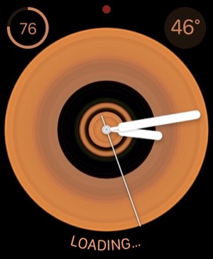
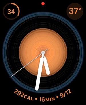
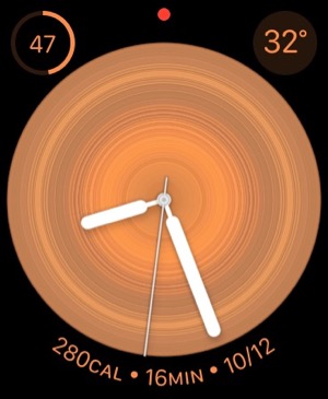
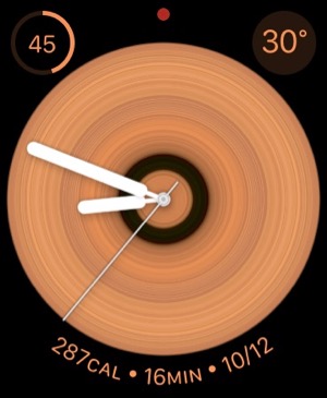
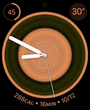
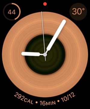
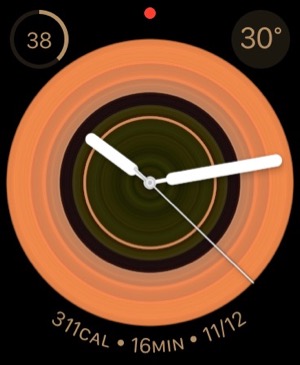
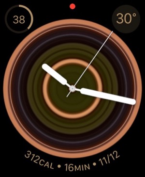
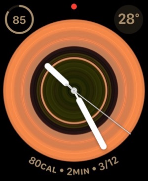
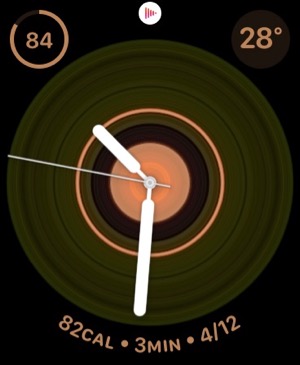
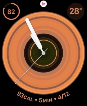
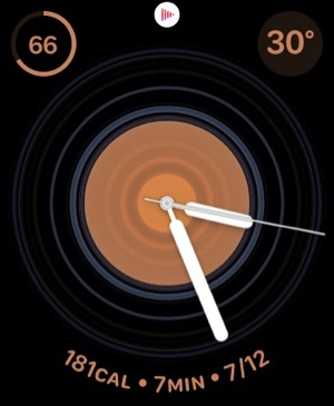
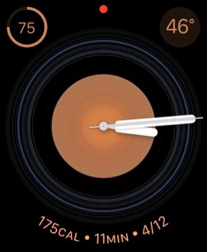
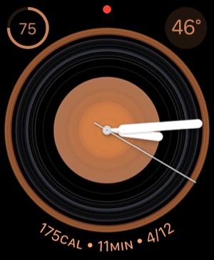
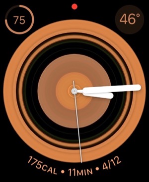
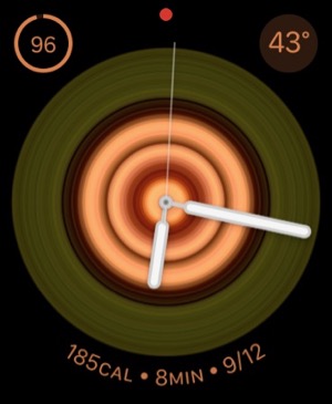
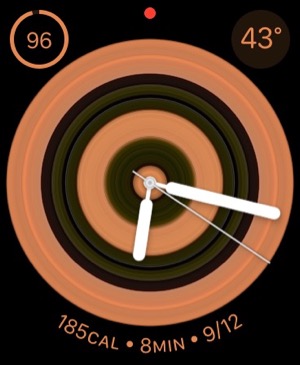
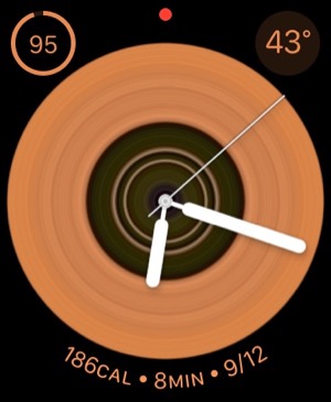
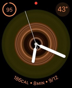
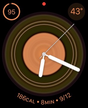
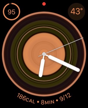
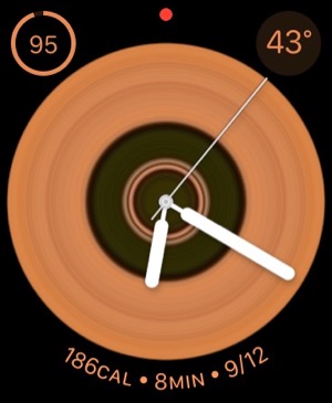
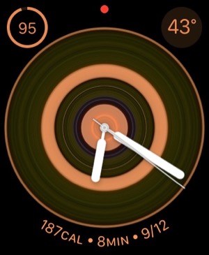
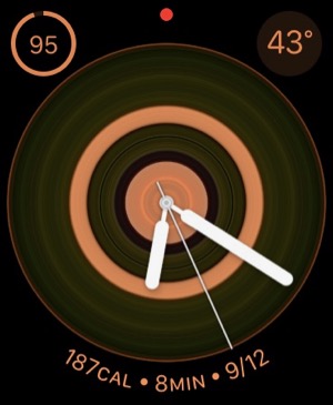
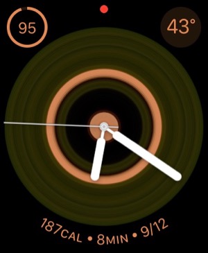
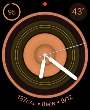
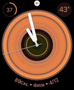
I recently began exploring all the different faces that are now available for the Apple Watch. There are many cool options these days, but I happened upon one that I simply can't get enough of. It's the kaleidoscope face, which comes with a nice array of image options and several "facet" styles.
After playing with the face and the built-in options for awhile, I discovered that you could use a custom image as the source for the kaleidoscope effects. I chose the one I use on my computer desktop and on my iPhone home screen... It's a photo I took during an especially beautiful sunset at our favorite beach destination in North Carolina. You can check it out here: 
After doing this, I realized I had found watch face nirvana for me. I settled on the radial facet effect, and now I have incredibly beautiful animations as the kaleidoscope cycles through the source image. The animations are sometimes quick, sometimes subtle, but always calming. I find myself looking at my watch now and then as a sort of meditation exercise. My watch is no longer just a great utility — a computer on my wrist! — it's a piece of art that's contantly changing.
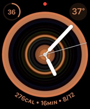
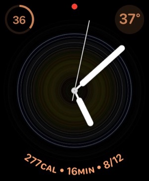
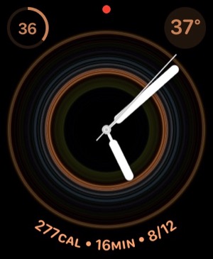
During the course of the last week or two, I've screen-captured my watch face, and although some are similar, no two images are alike. I hope you enjoy perusing them as much as I enjoy seeing them on my watch face.
One note to "complications" fans... I keep my fully loaded modular face a swipe away, so I can quickly see things this face can't accommodate. (Note to Apple Watch newbies, once you set up more than one face, you can simply swipe to the left or right on the watch face to cycle through your custom faces.)
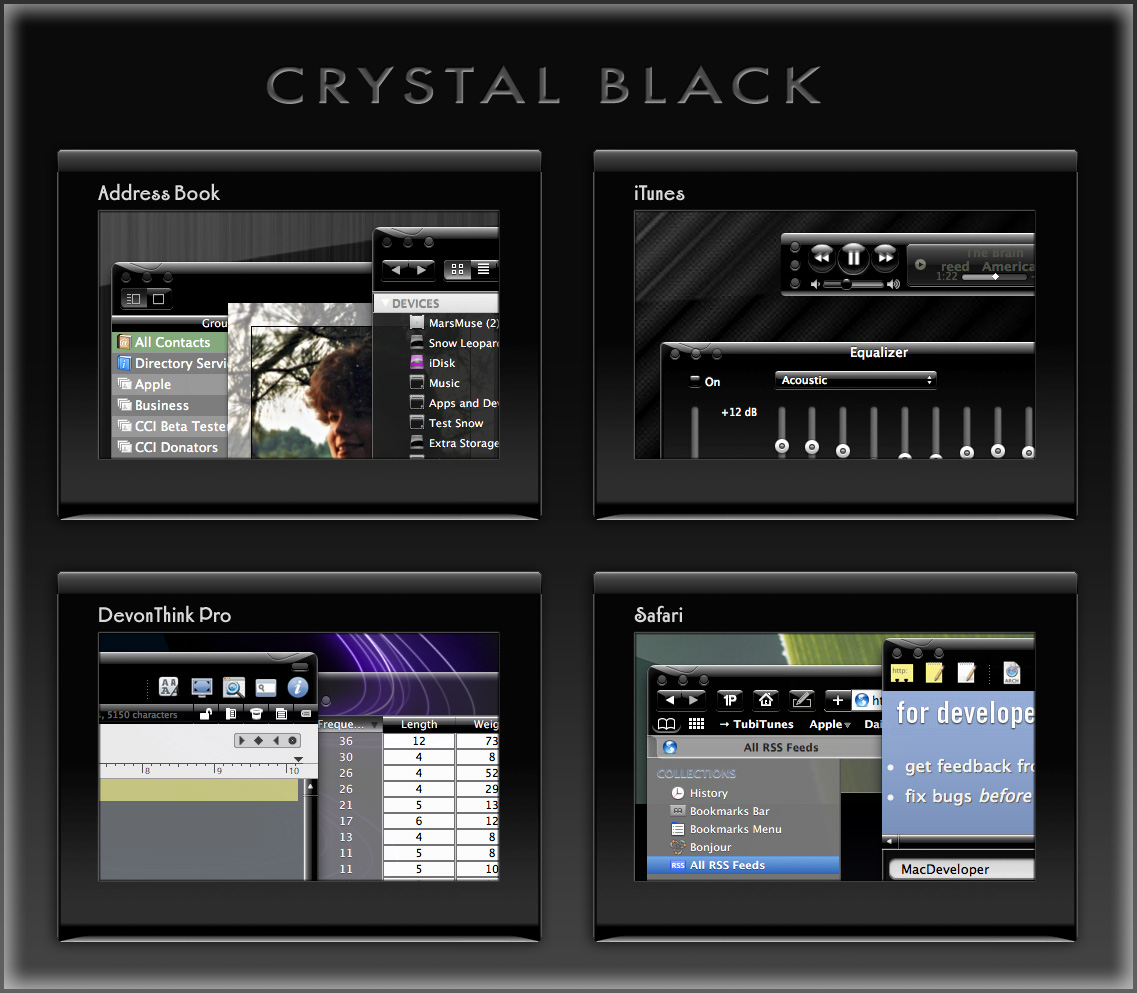
Introducing Smooth Black: A New Button Theme for CrystalClear Interface
 In my previous article I spoke of a desire to get back to theming, and specifically mentioned a desire to do that "black matte" theme I've been thinking about. I guess the article helped spur me on, because after several weeks of work I'm now ready to release Smooth Black, a new button theme for CrystalClear Interface (CCI).
Smooth Black complements existing CCI components, including its Black Gradient menubar and Smooth Black window theme. It rides on top of existing code that made Crystal Black possible, so the implementation went rather, ah, smoothly.
At this time, the theme is missing graphics for all of the "mini" components in Mac OS X buttons. As a fill-in, Smooth Black incorporates the Black Gloss graphics for the "mini" buttons. On Lion and Mountain Lion, the theme also needs to be fleshed out with a complete set of "small" buttons.
Again, implementing Smooth Black hit a reality wall when time came to take it from Snow Leopard to Lion and Mountain Lion. Because the Lion systems require a tedious manual process to update their buttons, this wasn't any fun. But CCI 2.7.6, released today, does incorporate the buttons for all three operating systems.
Note: Smooth Black owes a debt of gratitude to the authors of the ShapeShifter themes Rhino and Carbon Polymer.

On Theming Mac OS X: How Long Can I Hold On?
CrystalClear Interface and Crystal Black are marvelous, foolhardy, and frivolous experiments in theming the Mac OS X user interface. As they were in the beginning, so they remain today: Elegantly imperfect software products, which will always be buggy. It's just the nature of the experiment. Why? Because they try to do something Apple works hard to prevent, and therefore are outlaw apps: Only able to pop up here and there with a sparkling, think-different approach that just isn't meant to be.
I am the foremost user of these two themes, and I continue to develop them because (1) it's still possible and (2) I really like them. As the author, I'm tolerant of their occasional misbehavior, but I understand that not all observers are so patient. Nobody likes a screaming 3-year-old while enjoying a quiet evening at one's favorite restaurant. I'm no different in that, but I do try to make sure my children learn how to behave as new situations arise that cause them to flare up.
Still, there are always new situations, and, well, children will be children. My children are still quite young, but the day may come when either they are banned from new restaurants for their behavior, or I become too exhausted from apologizing for them to take them out in public any more.
With each release of its operating system, Apple drives me one step closer to that edge. It's not intentional, I'm sure... In the interest of providing a safe OS environment, Apple continues to tighten the knot around inter-application interactions — especially those that allow third-party software, like CrystalClear Interface (CCI), to load itself into other applications, such as the Finder or TextEdit. And yet, without that kind of interaction, CCI and Crystal Black (CB) could not function.
For now, it appears that CCI will survive the transition to Mountain Lion (Mac OS X 10.8), but as with every release of Mac OS X since Tiger (Mac OS X 10.4), the amount of effort to do so is greater. And I fear that as the technologies introduced by Apple for increased security in Lion and Mountain Lion are more widely adopted by software developers, the number of applications that won't run CCI properly will increase.
In some future update, Apple could introduce a change that will turn off the lights for CCI and CB for good, as well as those for AppMenu Magic and my freeware Text Tools. Such a change would mean I could no longer develop the software, let alone support it.
On a personal level, this would mean giving up an obsession that's outlived enormous odds. When I first took up theming for Mac OS X back in 2005, it was strictly a design job, with lots of time spent in Photoshop working with teeny, tiny bits of buttons and other interface elements. And there was a stable theming environment provided by a third-party application called ShapeShifter, which became obsolete when Apple released Mac OS X 10.5 ("Leopard').
CrystalClear Interface became possible only after I learned how to make application windows with transparent-capable backgrounds. And I learned how to do that only by gradually teaching myself how to write programs for Mac OS X using Apple's Cocoa frameworks and its native language, Objective-C.
I didn't sit down tonight to write a history of CCI, so suffice it to say that as CCI evolved, the programming component grew in inverse proportion to the design/graphics component. In fact, the design work is now quite subservient to the code.
This means I can no longer amuse myself by designing new themes. Instead, I spend most of my time making sure the existing theme designs will work on Apple's new Mac OS X releases. I already gave up the Glossy design on Lion, but I'd really love to rescucitate it — And I'll have to if I actually upgrade to Mountain Lion. Why? Because I really like the Glossy theme, and I'd want to use it myself. And then there's the matte black theme I keep dreaming about...
On a side note, have you noticed that in Lion Apple has almost eliminated the Aqua interface? In fact, the button theme they're using for most items looks and works suspiciously like CCI's "Unified Gradient" theme, which I introduced in 2009 to uniformly apply to all interface elements a button style Apple had added to Leopard. In Lion today, the main elements that remain candy-colored are Apple's "stop light" buttons, the progress bars, and odd pieces like the titlebars of list-view tables. Otherwise, Aqua is gone, though not replaced with anything so memorable. And hard-core themers continue to weep and satisfy themselves with such trivia as themes for the Dock (easy) or Menubar (much harder). Some also try theming buttons and such, but with Lion Apple has made even that mundane endeavor mysteriously difficult. (Buttons are composited against window backgrounds in a mysterious way that requires providing whole separate sets of buttons for Snow Leopard and Lion.)
Which brings me to the crux of this overly-long, overly-dreary essay: CrystalClear Interface exists today only because once I had seen how beautiful it could be, I couldn't let that beauty go. I simply can't stand working with gray-gradient windows all day, no matter how elegant they may be. And there are times when I really want/need a dark interface like the Black Gloss theme from Crystal Black.
So either I sever the cord with Apple's future OS X updates, or I sever the cord with CCI. It will have to be one or the other, and I'm not yet sure which that will be.
In the current setting, supporting Lion (and soon, Mountain Lion) has been royally painful. So much so that for the last 6 months I've spent most of my time getting CCI to run on Lion, or merely keeping it running. Not very satisfying for me, since I don't use Lion myself (yet).
An earlier article discussed the grief involved in updating CCI for Lion, and I mention it here because the problems haven't gone away. They've merely formed a continuous obstacle that becomes more and more tedious to work around.
In other words: Most of the fun of developing CCI has been held at bay, and the drudge work of keeping up with Apple has made me wonder how long I can hold out.
My fondest hope is that next time, Apple will make us wait longer than one year before throwing a new OS our way.
Mars Themes Website: New Home For Mars Downloads
A few weeks ago, I launched a new website — Mars Themes — as a central repository for all the various themes, app skins, applications, widgets, and so on that I've developed over the years.
These items — all available as free downloads, except for two — were previously in a section of the Mars website linked to the "Downloads" item in the navigation bar. That link now takes you to Mars Themes. (Oh yeah, the two not-free items are the software apps CrystalClear Interface and Crystal Black. They have their own websites, but are also linked to Mars Themes.)
 The new site has all the content previously available here, plus a few more things. The site has a News section where all recent additions or changes are announced, and separate pages for Themes (for ShapeShifter only), Icons, Widgets, App Skins, and "More Freebies."
Not previously available are a set of icons I designed back in 2005, which were included in my ShapeShifter theme DeStyl Ruler. These icons are inspired by the early 20th Century Dutch art movement De Stijl, whose most famous adherent was Piet Mondrian.
Also now available are a set of desktop pictures that accompanied the DeStyl icon set. These designs deconstruct the Schroder House, one of the only examples of De Stijl architecture.
Introducing “Clear Crystal” System Icons for Mac OS X

I'm happy to present a complete, new set of icons for Mac OS X, specifically designed to complement the Crystal Black theme. These icons can be used to replace the default "system" icons for folders, devices, toolbar items, Finder sidebar items, and others. The screenshots below display the icons for each system type.
These "Clear Crystal" icons come in sizes from 256 to 16 pixels. (I'm not a big fan of 512 pixel icons, which is why they're missing.) In the screenshots, the icons are shown at 72 pixels for the first four system groups. The fifth screenshot shows them at 24 pixels, and the screenshot of the Finder sidebar shows them at 16 pixels.
I see no reason to prepare unique icons for every flavor of removable disk one can use these days, mainly because at 16 pixels (which is how they typically appear in the Finder sidebar), the different designs are indistinguishable. Therefore, I've used the same design for CDs, DVDs, BDs, and all their various permutations.
Beginning with Mac OS X 10.6 ("Snow Leopard"), Apple defines a distinct set of icons for the Finder sidebar. Since these mostly duplicate those used for folders, I've chosen to use the same icon set for both. This is possible because icon sizes down to 32 pixels use the full design, while those from 32 pixels and smaller use a simpler design more distinguishable at small sizes.
Note that although I designed the icons for use with Crystal Black, I also tried to make them compatible with the default Aqua theme. They'll look best with dark backgrounds, but light backgrounds will work too. (The screenshots show them in use with Crystal Black.)
At the end of this article is a list of the icon sets that provided either templates or inspiration for the Clear Crystal icons. My sincere thanks to the many great icon designers who provide their work free of charge to the Mac user community.
Enjoy!
Installing the Clear Crystal Icons
This icon set is available as an iContainer for the application CandyBar, which provides a convenient way of quickly installing (or uninstalling) icons for the various system types. In addition, the Clear Crystal icons are available as Apple icon files for those of you who don't want to shell out for CandyBar.
If you have CandyBar, simply double-click the Clear Crystal Icons iContainer file to add them to CandyBar. Follow the instructions in CandyBar to apply the newly added icons.
To install the icons manually, you first select an icon in Finder and open the Info window (Cmd-I). Next, copy the small icon at the top of the Info window (to the left of the icon's name). Then, select the folder or item to which you wish to apply the Clear Crystal icon and open its Info window. Then, paste the copied icon over the small icon at the top of the Info window. Repeat for each icon in the set.
Clear Crystal Icon Set (Download file is 9.1 MB)
Credits
I used the following icon sets to provide templates or inspiration for the overall design and for various individual Clear Crystal icons. I am deeply indebted to those who designed these sets, both for their graphic design skill and for their generosity in providing their icons for free to the Mac user community.
- Albook
- Antares
- Black N White
- G5 System
- Glass Globes Desktop
- Black N White
- Mistikons
- Neige
- Photopro
- TiCons
- Tokens
- XPack
Theming Snow Leopard:
How Hard Could It Be To Paint A Leopard Black?

Dark interface themes are extremely popular with a small, but very passionate, group of Mac users. Sadly, since Apple introduced Leopard (Mac OS X 10.5), the old, relatively simple method of creating such themes on the Mac can't be used, and it took the theming community a good year and a half to figure out the current, relatively hobbled tools to theme the few bits of the interface that can be themed.
Given the weakened state of theming on the Mac, it's not surprising that the number of themes available has dwindled to a mere handful. And even those only go part of the way compared with what we used to be able to achieve with ShapeShifter. Still, the yearning for Mac themes remains strong among this community, and black themes are virtually nonexistent now.
Black themes have always been a challenge, because the frameworks used to build applications were designed to assume that text would always be black and the color of windows and buttons always light. Apple introduced a dark-theme paradigm a few years ago with its Heads-Up Display window style, which, with its translucent black background actually assumes that text will be white.
Starting with Leopard, developers using Xcode could tap into the HUD window style and use it whenever they want to, but most application windows aren't well suited to this, and Apple's user interface library still assumes that regular windows will be light, with black text.
It's not only desktop applications that make this assumption. Web pages with button widgets also assume that the widgets will be light and their text black. On the Mac, it's becoming common for desktop applications to embed the WebKit for parts of their user interface—meaning that the button widgets are HTML- and CSS-based, not AppKit-based.
In addition to this basic problem, there's also the challenge of handling legacy applications based on Apple's earlier Carbon frameworks, as well as apps that are a blend of Cocoa and Carbon. Complicating this issue is that, as it turns out, applications built for the older PowerPC processor platform use a different part of the system graphics than those built for Intel chips.
If you try to design a theme that introduces black interface controls, you run into another challenge that has nothing to do with text. Many interface widgets use images rather than text to convey their purpose, so what if—as is usually the case—the application designer provides only black images for these buttons? Is a themer supposed to provide white images for every application a themee might want to use?
One specialized case of the images problem is the Mac OS X statusbar. Here, applications represent themselves almost exclusively as images, and nine times out of ten, the images assume that the menubar is light, so they should be black. Some enterprising themers have tried to solve this one by providing alternative white images for the most common statusbar applications, but usability can still suffer if someone using a black menubar launches an application that insists on putting a black icon up there.... one for which no white alternative exists.
Given all this, why would anyone undertake an effort to introduce a fully black theme for Snow Leopard?
I suppose it's because we Martians just can't step back from a challenge. Not to mention the fact that we, too, are afflicted with the passion for dark themes that many Earthlings suffer from. I also have a good starting point, having developed some useful techniques for the challenge through building CrystalClear Interface.
That said, the best I can offer still has compromised usability, which I detail below. But for the most part, I think I've succeeded in bringing to life a useable version of the legendary Cathode theme for ShapeShifter, in a redesign appropriate for Snow Leopard. The theme covers window backgrounds, background colors for tables and outline views, interface buttons, menubar, and text colors. It also coerces various types of windows to theme themselves in HUD style.
To acknowledge the theme's heritage, I've dubbed the theme Crystal Black. Crystal Black will be available for download soon, with a 15-day trial period and a purchase price of $6.00
It's important to note that Crystal Black and CrystalClear Interface can not coexist on the same system. You can't install Crystal Black until you uninstall CCI.
For my own documentation of this work, as well as to highlight the theme's strengths and weaknesses, the following list shows the various unique challenges I've faced in building Crystal Black and the solutions, if any, devised. Other challenges have been faced—and largely solved—in developing CrystalClear Interface, so I won't spend time on them here.
In the list, I've used a small graphic to indicate the degree of success in addressing each challenge:
★ Solid solution
☆ Partial solution
∅ No solution
For Cocoa applications:- Images on buttons and in column headings ★
- Images and icons in the statusbar ★
- Text color of buttons in web pages ★
- Applications that use non-standard buttons and GUI frameworks. ☆
- Text color on Finder items with color labels ∅
Cocoa applications that can't or won't take theming by Crystal Black ☆(Problem solved 4/13/11.)- Cocoa applications that are on the user's "Disabled Applications" list ☆
- Text color for control widgets ☆
- Color of titlebar and toolbar text ∅
- Window and control object background colors ☆
Cocoa applications
- Challenges
-
- All images need to be made white, but without making custom button images for every possible application. Somehow, black images must be inverted as windows load.
- Some images are already "templates," easy to invert. However, other images look like "templates," but aren't, and making them templates isn't a reliable technique.
- Images with color (hue > 0) need to be distinguished from black/white ones. Knowing the image's color space doesn't help.
- Some images are "Core Image" images, which don't have a bitmap representation that can be easily analyzed. In this case, Crystal Black must create a bitmap representation in check it out.
- Images in column headings aren't buttons, so they require extra processing. In many cases, they change often so must be analyzed repeatedly. Some have proven inaccessible.
- Solution
- Each button and column heading in application windows are analyzed as they load to determine whether—and how—they require inverting. If inverting is needed, Crystal Black generates a new image and sets in place of the original.
 Still, there are a few cases that haven't yet been addressed. One is the case where a pull-down menu contains an image. I hope to deal with this in a future update.


- Challenges
-
- For nearly all applications that have a statusbar item and associated image/icon, the image/icon is black in normal state and white when highlighted. This means the image is unreadable against a black menubar.
- Unfortunately, the solution to the problem of images on buttons can't be applied to images and icons in the statusbar. In a few cases, the technique of inverting "template" images works, but applications with statusbar helpers that have invertable images are in a large minority.

- Solution
- Most of your applications that have a presence in the statusbar—including all of Apple's—must have custom-built images. In Crystal Black, these images are installed in the application's Resources folder, while maintaining a backup of the original images. Crystal Black also runs an inversion method that works in a few cases, but can't be relied on for most.
- Challenges
-
- Requires digging through the page's document object model and checking for buttons. Technique for theming push buttons is quite different from that for pop-up buttons.
- Many pages use nonstandard button styles, themed through CSS, and these are much trickier to coerce into using white text.
- Solution
- Crystal Black installs a custom CSS style sheet, which can be used with browsers that support custom style sheets. In the case of Safari, Crystal Black enables the style sheet automatically. Although this works, it manages to destroy a lot of custom-designed buttons along the way...


- Challenges
- Many newer Mac applications have buttons that are subclassed from the standard Cocoa button class and therefore don't respond to theming. Similarly, various open-source frameworks for building windows and buttons are in use, with similar challenges to theming.
- Solution
- Unfortunately, since Crystal Black cannot convert such buttons to its dark theme, it must apply a custom modification for each application to ensure buttons are readable. This means that some apps will have buttons with white text, since they aren't accounted for in Crystal Black.
- Challenges
-
- When the Finder is in column or list view, and these views have the dark background users normally prefer in themes like Crystal Black, the names of files and folders that have colored labels cannot easily be read.
- Despite numerous attempts, I have not discovered any method for changing the colors of these labels to provide ☆suitable contrast for white text.
- In addition, because of the way the Finder's file browser works, it's not possible to coerce a specific file or folder to use black text instead of white, when the item uses a label.
- Solution
- There is no good solution to this problem. To keep Finder's column and list views readable, Crystal Black prevents the background color for these views from darkening to the point that would trigger the use of white text. In other words, the names of files and folders in the Finder will always display as black.


 Challenges
- If a user disables Crystal Black for a specific application, the software no longer has a way to transform text or images from black to white.
Without some action, this would be the same as a user downloading the (free) Crystal Black system graphics files and installing them without the software: You wouldn't be able to read a lot of the interface elements.
 Solution
- The problem can't be totally solved. However, Crystal Black does three things to maintain usability. First, the CB filter module (which is what determines whether to load Crystal Black or not) installs a minimal set of color instructions before declining to load the core software. These colors keep text on buttons readable. Second, the old Extras resources files have a few text-color settings that still have an effect, and these take care of text color on segment tabs. Third, Crystal Black sets some specific defaults for the disabled application that prevent it from using a totally black window frame. These defaults are swapped out if the user re-enables the app for CB.
Carbon applications
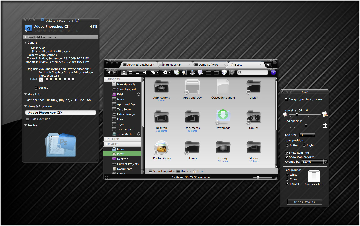
Carbon applications are incapable of loading Crystal Black to any meaningful extent. However, some such applications have components built with the Cocoa frameworks, and these components will load Crystal Black (unless the app is in CB's disabled apps list). An example of the latter is Adobe Photoshop CS4, which itself is a Carbon-based lifeform, but may have plugins that are Cocoa-based. In this case, the plugin will load Crystal Black as long as Photoshop itself does not have CB disabled.
At the time of this writing, the Carbon universe is split into two difference species: Those that will only run on PowerPC chips, or under Rosetta on an Intel chip, and those that will run natively on both kinds of chips. The distinction is important, because the different species, it turns out, use different system resources for some of their graphics.
In any case, the challenge for affecting Carbon applications with a dark theme is that it must be done in the "old-fashioned" way—using the graphics files that used to enable theming in the age of ShapeShifter.
- Challenges
- How to enable white text on black buttons and other interface elements without using software or the post-Leopard system resources.
 Solution
- To a large extent, this is solved by relying on the pre-Leopard Extras resources files. Carbon applications make more use of these than Cocoa ones do, and Carbon apps that require Rosetta under Leopard make even more use of them.
 Challenges
- How to enable white text on the labels of toolbar buttons and on window titlebars, without using software or post-Leopard system resources.
- Solution
- No solution found. This is one challenge Crystal Black has been unable to overcome. Since toolbars are an interface element that's uncommon on Carbon applications, the toolbar label problem isn't a huge issue. (The only such app I use is Yummy FTP.) However, nearly all windows have a title, and it remains black against a black background.
 Challenges
-
- The background colors of various objects on a Carbon window are drawn from ancient system resources that aren't straightforward to use and that can mix with unexpected results.
- The elements that must mesh to make a smooth, pleasing, darker-than-white color are nested, and some resources are used for more than one level in the nest.
- One complication that became clear from this exercise is that resources used differ between Universal-binary applications and apps that must run under Rosetta.
- The background color must remain light enough to provide contrast for both white and black text.
- Solution
- Ultimately, this goal required detailed mapping of resource "PPAT" (pattern) objects in the Extras files to observed results. Thereafter, a good deal of trial and error was required to get the colors to mesh—for example, the background color of a "group box" nested in a "tab view", and the background color of buttons and other controls nested inside the "group box."
I couldn't theme some elements to my satisfaction, however. In particular, I wanted the background color of a group box within a tab view to be lighter than that of the tab view. This isn't a problem, but, because the background color of objects within the group box use the same pattern resource as the tab view, the objects have a darker background than that of the group box itself. You can set distinct background colors of control objects that are inside a tab view from those that are outside the tab view, and of those that are in a tab view from those that are nested inside "secondary group boxes" within the tab view. But you can't do the same for objects within the tab view and those within nested group boxes.


Theming A Web Page With Crystal Black:
A CSS Design for Web Inspector
One of the many challenges of building a usable black theme for Mac OS X is making it work with web pages. If you use Safari, the buttons, scrollbars, and other interface widgets on web pages get their marching orders from the system's graphics files—the same ones that regular applications use.
So, if a web page has a pushbutton, the button will by default take on the style of the active theme. If you're running Crystal Black, this means that the button inherits the Crystal Black style. We like this.
Color for the button's text, on the other hand, gets its marching orders from the browser's default Cascading Style Sheet (CSS) file—which, naturally, makes the text black, and therefore unreadable on top of a black button. We don't like this.
On first glance, the solution seems to merely design a special CSS file for Crystal Black and make Safari use it.  And that does work for many web sites and many buttons. However, many folks who design web pages like to fiddle with the CSS style for their pages' buttons, and such fiddling means that there's nothing "mere" about designer a Crystal Black style sheet.
Further, many Mac applications these days have views that are simply embedded web content using Apple's WebKit framework. The practical implication here is that Mac apps don't know how to read a Crystal Black CSS file, so Crystal Black must do some fiddling under the hood to avoid having unreadable buttons in such web views.
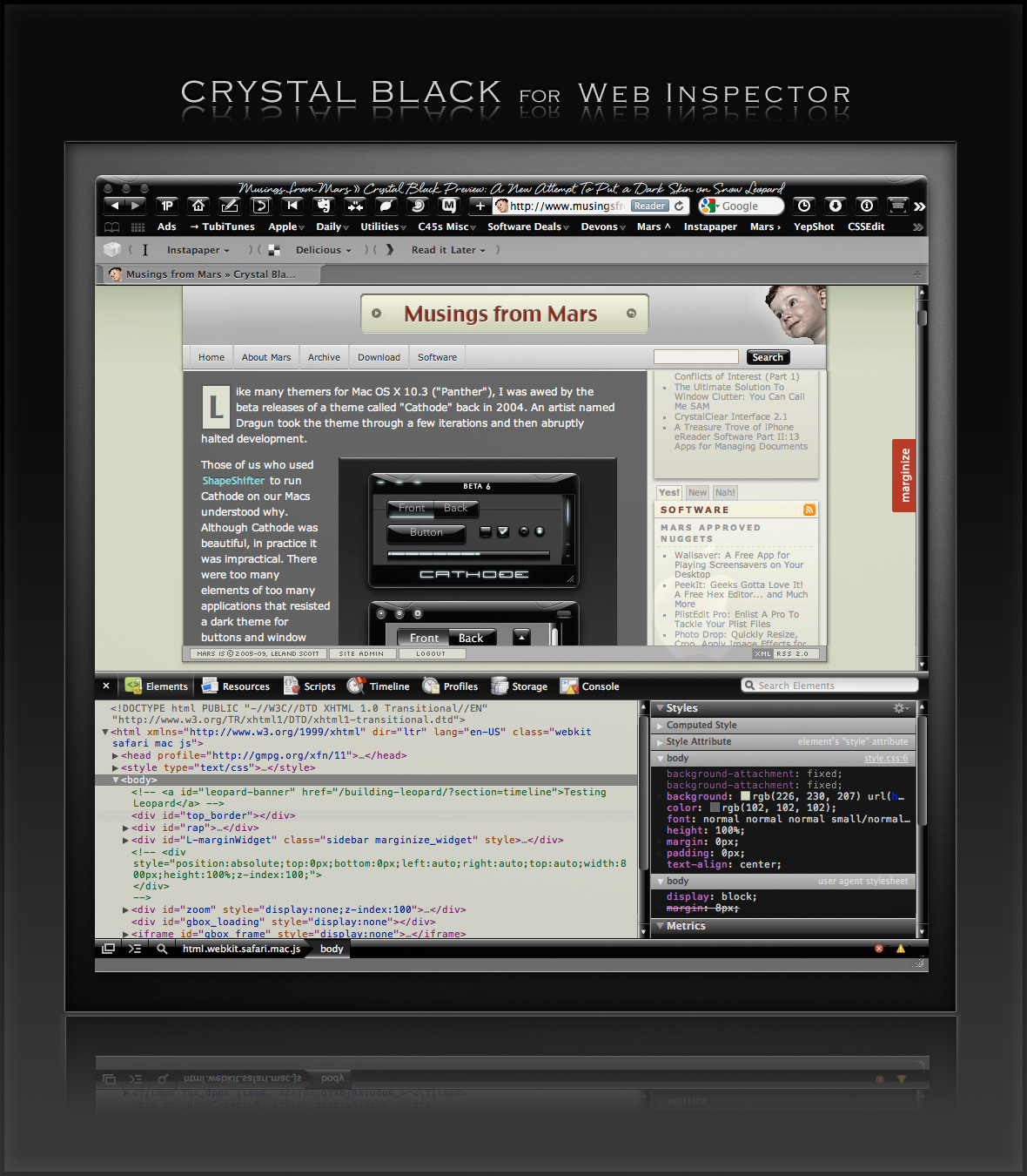
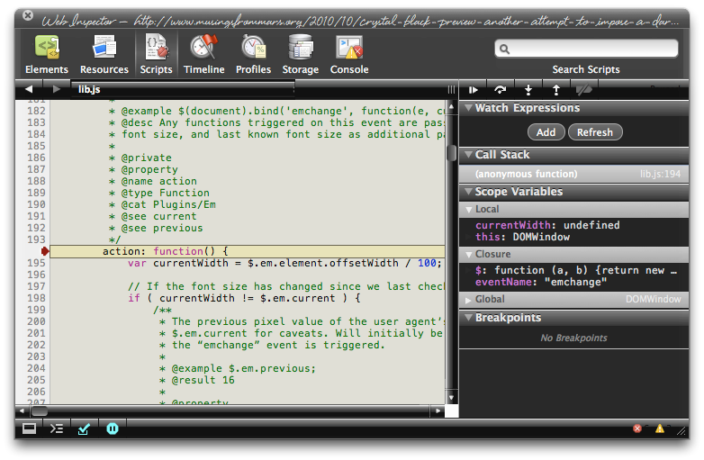
Then there's Safari itself. I really wanted to theme the Web Inspector—the incredibly useful built-in website viewer/debugger/designer assistant—with the Crystal Black look and feel, but it wasn't immediately obvious how to do this. I assumed that the tool was just a part of Safari, and therefore built with classes and widgets from the Cocoa AppKit (which is the framework all Cocoa apps are built with). However, when I began to inspect the Inspector, I discovered that everything contained within its borders was simply web content: HTML, CSS, JavaScript, and images.
In other words, the Web Inspector tool is nothing but an intricate, sophisticated, and extremely well designed web page!
Having built a Crystal Black CSS file for web pages in general, and with my past expertise in CSS, I attacked this challenge with relish! It reminded me of the time I realized that Dashboard widgets are, at their core, nothing but little web pages (as are simply apps for the iPhone). In tackling this one, the main question was, How should the various elements look? And the hardest part was inspecting the various parts in of the Inspector in great detail to determine which CSS rules governed their default appearance and behavior.
As I discovered, the WebKit has a a sub-framework called "WebCore," which in turn has a folder of resources specifically for the Web Inspector. In the Inspector folder, among other things, is a suite of CSS files that handle different aspects of the Inspector's design and behavior. Of these, the primary one I needed to tweak was called simply "inspector.css."
Besides controlling the usual attributes of a web page—document elements, text elements, image elements, layout elements, form elements, and so on—this style sheet applies various advanced CSS properties that serve the purpose that in years past would have been handled by many individual images. As I've described this CSS 3.0 magic previously, there's no longer a need for using graphics and JavaScript to add box shadows, rounded box corners, borders, gradients, and reflections to your web pages.
Naturally, since the open-source WebKit project was initiated by Apple, and since that project zoomed ahead of all other browser engines in developing new ways to design with CSS, that's how the Web Inspector is built. This approach—using a command syntax rather than images to design a user interface—is one that Apple has been adopting for its desktop applications. In recent years, Apple has been adding new classes and methods to the AppKit that make it a trivial matter to build a window frame, a border, a toolbar, or a button using code rather than individual graphics.
While this is a logical and efficient approach, it also presents challenges for theming Mac applications, a challenge that Crystal Black is often unable or unwilling to overcome. (The story of all the challenges in building Crystal Black are described in this article.)
Not so with the Web Inspector, fortunately.
The Inspector does use a few images in its design, but most of the toolbar, separators, and section headers are built with CSS gradients. Very cool indeed!
This bit of Crystal Black will eventually be bundled with the whole theme, but for now I offer it as a free download. Admittedly, the audience for such software is small—you have to like Crystal Black, and you have to be a regular user of the Web Inspector—but it might be of interest to others who are curious about how such things are done.
One caveat in viewing the screenshots... The scrollbars that appear, as well as the HUD window style, are part of the overall Crystal Black theme and are not part of the Web Inspector theme itself.
Enjoy!
Update 4/18/11: The full Crystal Black 1.0 theme is now available from the Crystal Black website.
Installing Crystal Black for Web Inspector
The download contains a small application that you can use to install—and to uninstall—the theme. Simply double-click and select "Install" to apply the theme. Or select "Uninstall" to restore the default CSS files and graphics.
After installing or uninstalling the theme, you'll need to quit and restart Safari for the theme to take effect.
Crystal Black for the Web Inspector (Download file is 1.0MB)


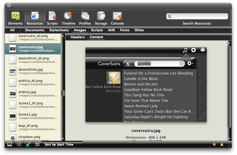
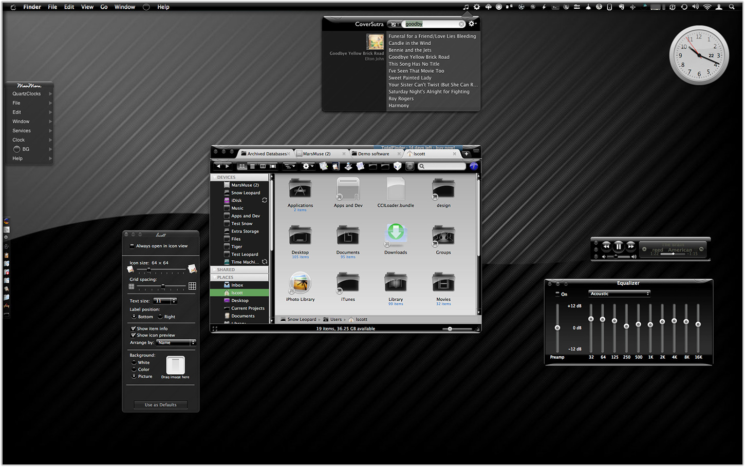
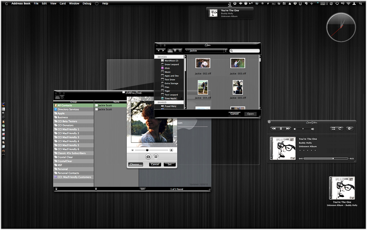
A Black Gloss Theme for CoverSutra
I recently posted another member of the coming Crystal Black theme for Snow Leopard on my deviantART site. This new component is a glossy black theme for the popular iTunes controller CoverSutra.
Crystal Black is a theme for Mac OS X "Snow Leopard" that I'm still refining and plan to release eventually. I published a preview of the theme last fall, and a few weeks ago released a Crystal Black theme for iTunes. The skins for both iTunes and CoverSutra will, of course, be included in the full theme once it's out.
One more application-specific Crystal Black theme I plan to release soon will be of interest primarily to web developers: It's a theme for Safari's Web Inspector module. Stay posted for more on that, and for more about Crystal Black as a whole.
Update 4/18/11: The full Crystal Black 1.0 theme is now available from the Crystal Black website.


Installing Crystal Black for CoverSutra
The download contains a little application that installs the Crystal Black theme for CoverSutra. To install, simply doubleclick the application and select "Install." You can also use the app to restore the default CoverSutra theme. To restore, doubleclick the app and select “Uninstall.”
After installing or uninstalling the theme, you'll need to quit and restart CoverSutra for theme theme to take effect.
Also included in the download is a folder containing CoverSutra's default (black) menubar icon, as well as a white alternative for those who use a dark menubar.
Crystal Black for CoverSutra (Download file is 1.5MB)

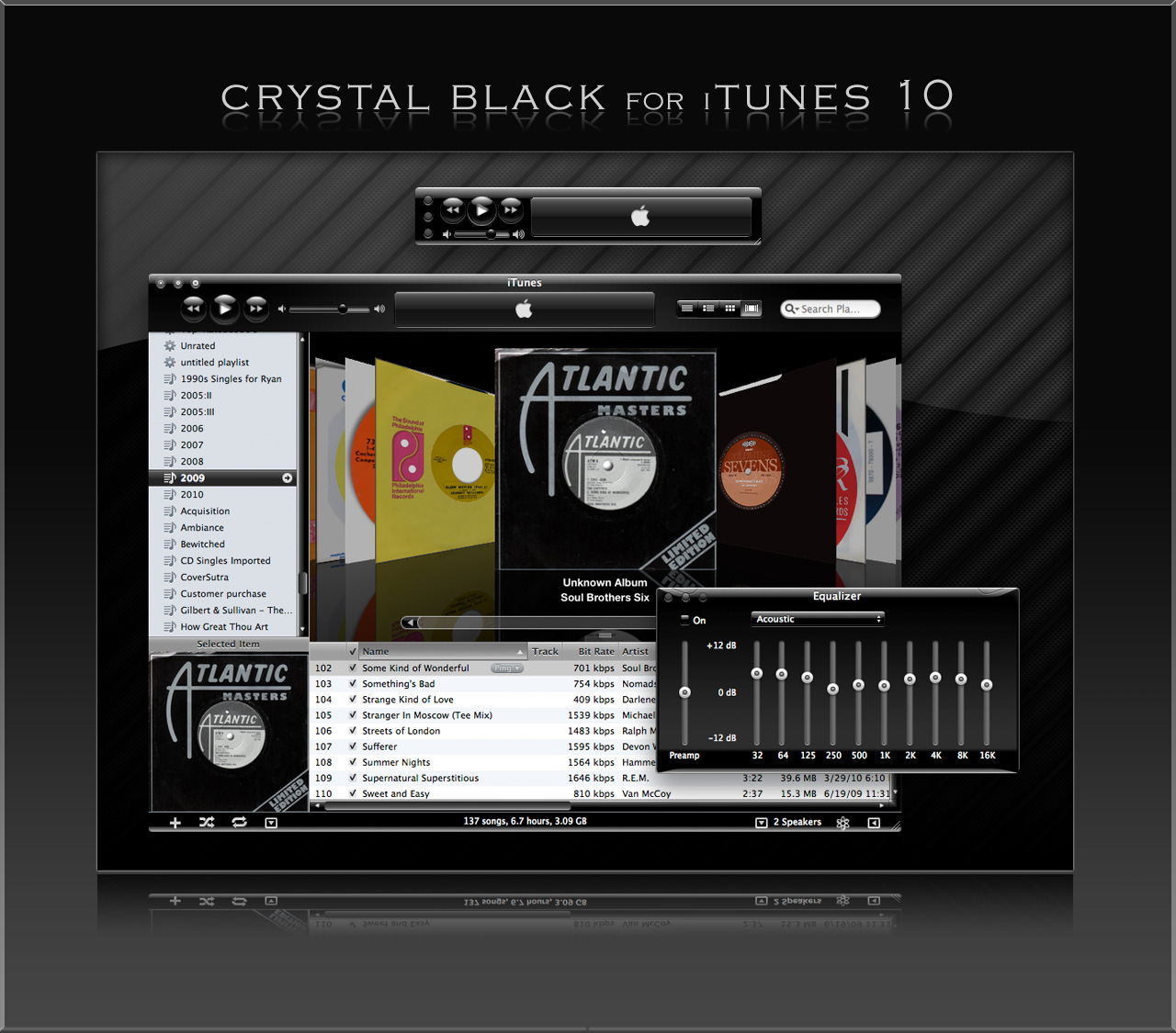
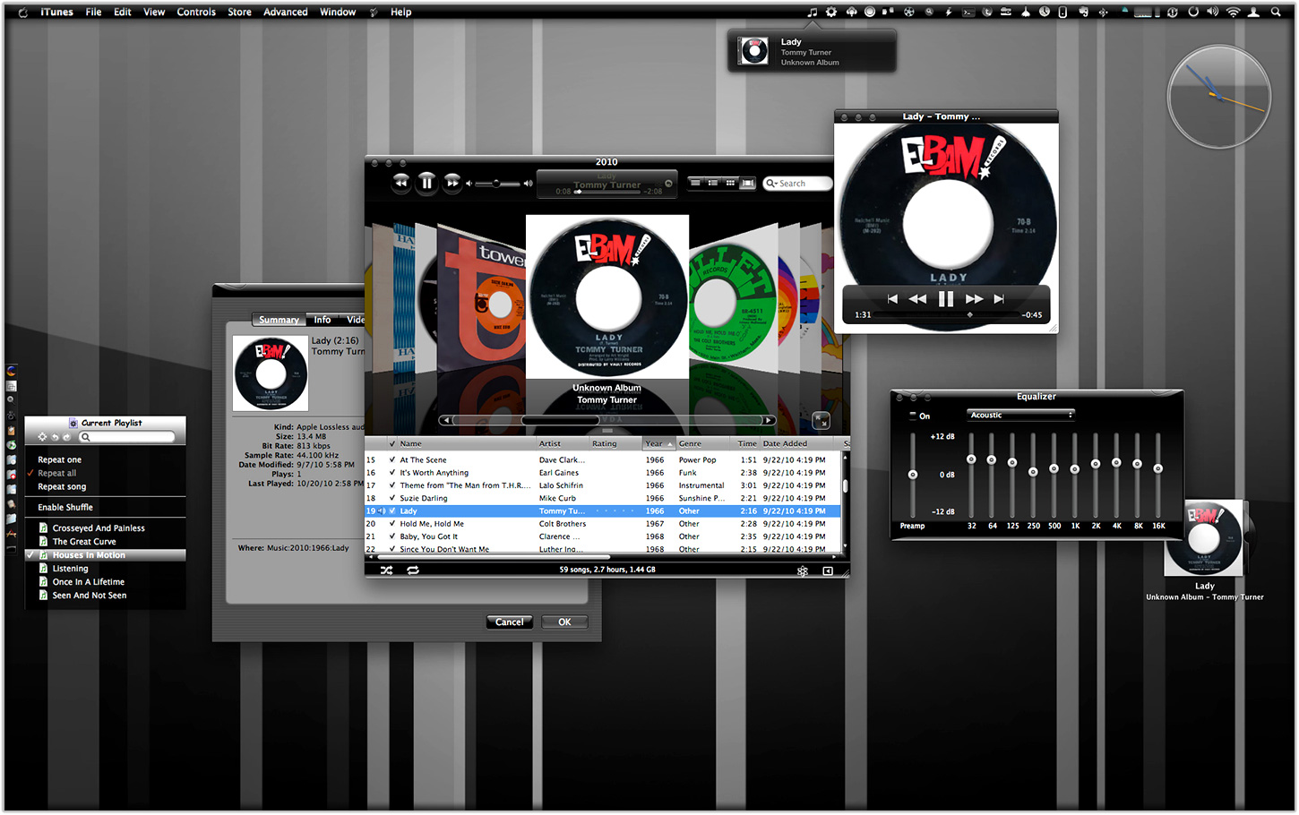
Crystal Black for iTunes
Last fall, I released an early version of Crystal Black for iTunes 10.1 on my deviantART site and have updated it once or twice since then. This post announces an update of the theme for iTunes 10.1.2 and adds a couple of minor enhancements for 10.1.1.
Crystal Black is a theme for Mac OS X "Snow Leopard" that I'm still refining and plan to release eventually. I published a preview of the theme last fall, and also migrated the theme to iTunes 10 when it came out. Since theming iTunes is  quite a bit easier than theming the entire operating system, I decided to release Crystal Black for iTunes first.
This version of Crystal Black for iTunes continues to improve its usability when iTunes is set with the hidden "High Contrast Mode" option. High Contrast Mode effectively inverts white and black in the iTunes sidebar and playlist contents (see screenshot at right), and looks great with Crystal Black. The high-contrast option is accessible through various utilities you can download to customize "hidden" features of Mac OS X. I use and recommend the free, open-source Secrets for such customizing. Secrets installs an easy-to-use and auto-updated Preference Pane and includes hidden options for a wide variety of third-party apps, in addition to Mac OS X.
One more application-specific Crystal Black theme I plan to release soon will be of interest primarily to web developers: It's a theme for Safari's Web Inspector module. Stay posted for more on that, and for more about Crystal Black as a whole.
Update 4/18/11: The full Crystal Black 1.0 theme is now available from the Crystal Black website.
Installing Crystal Black for iTunes
The download contains a little application that installs the Crystal Black theme for iTunes. To install, simply double-click the application and select "Install." You can also use the app to restore the default iTunes theme. To restore, double-click the app and select “Uninstall.” You will need to authenticate as the admin user to make these changes
After installing or uninstalling the theme, you'll need to quit and restart iTunes for the theme to take effect.
Crystal Black for iTunes (Download file is 24.2MB)

Crystal Black Preview: A New Attempt To Put a Dark Skin on Snow Leopard
Like many themers for Mac OS X 10.3 ("Panther"), I was awed by the beta releases of a theme called "Cathode" back in 2004. An artist named Dragun took the theme through a few iterations and then abruptly halted development.
 Those of us who used ShapeShifter to run Cathode on our Macs understood why. Although Cathode was beautiful, in practice it was impractical. There were too many elements of too many applications that resisted a dark theme for buttons and window backgrounds.
For me, however—and I'm sure for many theming fans—the dream of using a beautiful black theme like Cathode was a siren call impossible to forget. Over the years, the dream receded further from our grasp because of roadblocks Apple erected—intentionally or not—to the existing mechanisms of theming Mac OS X.
Starting with Mac OS X 10.5 ("Leopard") in 2007, the main tool for applying Mac themes, ShapeShifter, went bye-bye and has never returned. This is one of the main reasons I continued development of CrystalClear Interface, because it was the only way for me to apply a fully realized theme to Mac OS X.
Since Leopard, themers have been able to finesse the problem by changing the system graphics files that apply buttons, menubar background, basic window shape and color, and a few other items to your window appearance. Despite best efforts to unravel the secrets of the Mac's new ways of drawing itself, this mechanism isn't able to consistently change text color in the many contexts in which it appears in a window, thus making design and use of dark theme impractical.
As I'll describe in a future article, tackling the design of Crystal Black, a new theme inspired by Cathode, has been far from easy. And there remain user interface elements that totally resist its charms. But for me, those elements are few enough to make Crystal Black practical.
At this point, I'm confident that I'll be able to complete Crystal Black and release it at some point for all Mac users of Snow Leopard (Mac OS X 10.6). The theme is an offshoot of CrystalClear Interface (CCI) and uses much of the same code. However, Crystal Black is much simpler, has a smaller impact on the operating system, and is compatible with many more applications than CCI. Also unlike CCI, Crystal Black provides a complete theme for iTunes 10.
During early development of Crystal Black, I had intended it to be a feature of the next major release of CCI—and eventually it will be. In mid-September, though, I got the bright idea of forking Crystal Black as a separate application, mostly because I thought it would simplify its development and allow me to get it into user's hands more quickly.
Like all software development, it seems, the code cooperates only so far, and timelines end up stretching beyond intentions. That's been the case with Crystal Black, but I'm happy to say that not only is it nearing the end of its core development, but a lot of the Crystal Black code will be able to optimize CrystalClear Interface. It's kind of like what Jobs talked about in the recent keynote about Mac OS X and the development of the new Macbook Air: Things I've learned in developing Crystal Black will ultimately make CCI a better product as well.
As an aside to CCI users, I'm planning to put out a minor update soon that will incorporate the Crystal Black-enabled optimizations as well as address bugs and other changes made since the release of version 2.5.6.3 in August.
This post, then, is simply a preview of Crystal Black, showing how it appears in various widely used Mac applications as well as in full desktops. I hope you find it to be as gorgeous as I do!


Eight New Themes Coming in CrystalClear Interface 2.5
Besides the set of Crystal Document icons previewed recently, another feature of the forthcoming CrystalClear Interface 2.5 is a new set of eight beautiful preset themes, shown below. (Click the images for a closer look.) The themes are designed to complement the eight Frosted Crystals desktop pictures released with CCI 2.2. Of course, you can still set colors, frames, and transparency settings for Mac OS X windows to your own taste, as always. The preset themes are ones I've enjoyed and find a convenient shortcut to designing custom themes.


Introducing Crystal Documents:
A Set of Document Icons for CrystalClear Interface
This is a set of 74 document icons intended to complement CrystalClear Interface and the set of Crystal Albook system and application icons I released a couple of years ago. The set covers most of the document types used by Apple's applications as well as a limited set of document types for third-party applications. The icon set for third-party apps will be augmented substantially as time permits.
These icons are available for download now, and they will be included in the forthcoming release of CrystalClear Interface 2.5 (more on that in another article). In CCI 2.5, you will be able to automatically install and uninstall the various icon sets displayed below, including any of the Crystal Docs icons for any of the third-party applications you use. The new icon install feature will be included in the new CCI Preferences window.
Enjoy!


Introducing Frosted Crystals for CrystalClear Interface
These are snippets of the 9 "Frosted Crystal" desktop pictures that'll be distributed with CrystalClear Interface 2.2. The look of frosted glass looks terrific when viewed through CrystalClear windows! I hope you enjoy using them as much as I have.