


News Posts In Category
Apple v. Samsung: The True Story


The Future for Home Computing
ComputerWorld Pits Snow Leopard Against Windows 7 (Again)
As an IT professional, I support both operating systems at work. But I have Macs at home; after all, who wants to troubleshoot computer problems on their own time? My final verdict in this smackdown? It's not even close: Snow Leopard is the better OS.I couldn't have put it better myself.
WebKit Introduces Styleable Scrollbars
Compass: A New Concept for Managing CSS Styles
Without Even Trying, Apple’s iPhone Takes the eBook Reader Sweepstakes
I recently decided it was time to look again at the state-of-the-art in eBook reader hardware. It seems like I've waited forever for a company to design one I could really use in place of the traditional paper-filled parallelepiped. I first got excited by the possibility while implementing the PDF format for a magazine on CD-ROM back in 1995. "Wow!," I thought, "Whoever wrestles PDF onto a small electronic device is going to make a mint!"
This article utilizes some WebKit-specific CSS coolness, which those of you running Firefox, Opera, or other browsers will miss out on. (Even users of Safari 3.1 can't see the image reflections... that CSS feature is as yet only available in the latest versions of WebKit.) These CSS 3.0 tricks eliminate the need for a whole slew of graphics, JavaScript, and other code that were previously needed to produce them. Instead, with one simple CSS style element, I can add shadows to page elements (like tables or boxes), set elements with rounded corners (even table cells!), and set reflections on images. It not only makes the page download faster, but it saves me a heckuva lot of time to boot! I'll be documenting more of these CSS advances in the ongoing Mars article, WebKit/Safari Keep Blazing the Trail to CSS 3.0.
Here are some screenshots in case you can't see what I'm talking about: Fancy image, Fancy table, Fancy box.
Of course, PDF turned out to be not particularly well suited to small viewing screens, since publishers would have to make a special layout for the PDF version. And so, years went by, with talk of E-Ink, electrowetting, electronic paper, and other exotic technologies appearing to be on the verge of practicality.
What most of the would-be designers of eBook readers have seemingly failed to grasp, however, is that to replace paper books, eBooks must be nearly as light and portable as a paperback. They must work without cords, and be compatible companions to one's daily trip to the little boy's room. (I've honestly never met a woman who reads in the john, but it seems nearly all men do.) They must be able to accompany you to the beach, the pool, or the mountains. I'd really like something I could read while holding it in one hand, like I do a paperback. I don't want a reader that will break the bank, either. And most of all, an eBook reader needs to be comfortable to use in bed or in your favorite armchair.
Even today, with devices shrinking towards the ideal size and weight, nearly all fail to meet my needs for one reason or another. Quite surprisingly, one device has in fact replaced books for me, and it's not one I ever thought would or could. Because I had bought the device for another purpose entirely, this eBook reader has actually cost me nothing whatsoever.
This article covers five eBook reader devices, including two that are full-fledged personal computers serving as an eBook reader by way of third-party software, and another that is a multifunction "smart phone" with eBook reader capabilities. All five devices have strongly positive characteristics, and two of of them possess the full range that would allow them to serve as portable eBook readers for organizations that need access to technical and policy documentation. Even though I personally need a reader that's useful for novels and such, I'm evaluating these based on their utility as devices for storing and reading technical and other documentation rather than literature, each of which have quite different requirements for eBook reading. The five devices reviewed are:
Of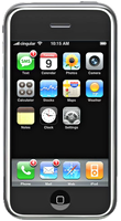 these five devices, the one that emerged as the runaway winner for both literature and documentation--much to my surprise--is Apple's iPhone or iPod Touch. The iPhone's small display, it turns out, is plenty big for comfortable reading, and its form factor make it the ideal eBook reader I've been looking for. Given its numerous other capabilities besides eBook reading, the iPhone / iPod Touch is an obvious choice. Among its virtues are its
- Ability to manage all the relevant native-format files an organization is likely to produce,
- Instantaneous availability,
- Easy navigation,
- Wide variety of eBook reader software,
- Simple and powerful connectivity,
- Integrated web browser and mail client,
- Bright screen,
- Excellent readability, and
- Advanced security.
In addition to its use as an eBook reader, the iPhone has many other enterprise uses, not the least of which are its built-in cellular phone, Bluetooth receiver, GPS, and synchronized email. The iPhone also has excellent support for Windows users and can be centrally managed by an IT organization to enforce configuration and security standards.
 For personnel who require a highly portable, full-featured PC, the Eee PC is an excellent choice. Given its very reasonable price, this device is an engineering marvel:
- Tiny, yet with a decent-sized keyboard,
- External controls for essentials like screen resolution and brightness,
- Built-in state-of-the-art Wi-Fi and Bluetooth,
- Ethernet port and 3 USB 2.0 hubs,
- Video camera and microphone.
With dedicated eBook reading software such as MobiPocket installed on the Eee PC's Windows XP operating system, this micro-laptop can serve users well as an eBook Reader. The only downside is the eBook reader software's lack of support for native document formats, which must be converted to the MobiPocket format (and many cannot be so converted). For users who do not need the resources of a full-blown PC, the iPhone or iPod Touch would be a better solution.
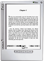 The Iliad's primary virtue is its wonderfully readable e-Ink text display, and it also has a good, portable form factor and hardware navigation controls. The Iliad also allows users to set a PIN number to protect content stored on it. Beyond those positive characteristics, there's not much to recommend the Iliad as an eBook reader for use in storing and accessing documents other than literature. And the price one has to pay for this one-trick pony, literature-only reader is far too high, in my opinion.
The Amazon Kindle is an impressive dedicated eBook Reader. The device's
- Reading software,
- Navigation ease,
- Annotation support,
- Searchability,
- Readability,
- Rapid start-up time, and
- Form factor
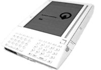 access to content stored on it. The Kindle does not accept USB "sticks," either, so the possibility of storing sensitive documents externally is limited to Amazon's online Kindle service. Unfortunately, in my testing, that service was not always available, so in emergency situations I would not want to rely on it (for now, at least). Like the Iliad, the Kindle serves no purpose other than as an eBook reader, and as such its price seems quite high.
The Samsung micro-laptop gets excellent scores for search, document-format support, ease of adding documents, bookmarking, networking, and eBook navigation. However, all of these scores reflect attributes of the top-notch MobiPocket reader software, as well as its accompanying Creator software, which does a good job at converting common office-type files to HTML and/or Mobi format. Unfortunately, the Samsung hardware, combined with its reliance on the underlying Windows XP operating system, make this a poor choice as a portable eBook reader. The device is very slow to start up, has a very tiny and hard-to-use keyboard, and offers navigation options that aren't suitable for the onscreen software. The Samsung supports touch control, but the display targets that one must interact with to navigate are much too small. The same problem holds for the device's 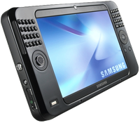 wand, which requires a very steady hand and precise accuracy to reliably trigger onscreen controls. The device's external keypad is horrible and requires far too much effort for an emergency operation. Using a portable keyboard is probably not a practical alternative, either, since it requires the user to have access to a table and chair to enter data or navigate the Samsung. Finally, when not plugged in to an electrical outlet, the display's screen is so dim that I had to bring out a magnifying glass in order to navigate. I won't even mention here how ridiculously expensive the Samsung is, since it can also be used (*wink* *wink*) as a portable PC.
The summary table below presents a matrix of the various attributes used for this review. Items in light green indicate the basic criteria were met, and items in the darker gradient green indicate that the device excelled in fulfilling that particular requirement. White cells are those where the given reader failed to meet a requirement. Following the summary table are detailed tables for each of the five devices, with my review notes organized into Pros and Cons for each.
Functions/Usability Matrix
| Device Characteristics | Iliad | Kindle | Samsung w/ MobiPocket | iPhone | EeePC w/ MobiPocket |
| Supports native formats including images | |||||
| Can organize documents into folders | |||||
| Is password protected or supports encryption | |||||
| Enables full-text search | |||||
| Documents can be easily transferred from a computer | |||||
| Bookmarks can be added within files | |||||
| Documents can have a table of contents | |||||
| Provides both portrait and landscape modes | |||||
| Support web hyperlinks | |||||
| Can browse and download files from the web | |||||
| Font faces and sizes can be customized | |||||
| Accessing and navigating content is easy | |||||
| Documents are easy to read | |||||
| Hardware design is well suited to reading | |||||
| Has easy connectivity to local networks, or supports USB | |||||
| Provides speedy access in emergencies | |||||
| Has good hardware navigation (pen, keypad, touch screen, other controls) |
Eee PC 901
(with MobiPocket Reader Software)
| Pros | Cons |
|---|---|
|
|
Irex Iliad
| Pros | Cons |
|---|---|
|
|
iPhone/iPod Touch
| Pros | Cons |
|---|---|
|
|
Amazon Kindle
| Pros | Cons |
|---|---|
|
|
Samsung Q1 Ultra Premium
(with MobiPocket Reader Software)
| Pros | Cons |
|---|---|
|
|
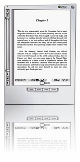
Image Reflections with CSS
Box Shadows and Rounded Corners with CSS
Box Shadows and Rounded Corners with CSS
WebKit/Safari Keep Blazing the Trail to CSS 3.0

A lot has happened in the world of web browsers and CSS 3.0 since I wrote this article last summer at the time Safari 3.0 became available as a public beta. Besides WebKit/Safari, Opera, iCab, Konqueror, and Firefox have all made progress in adopting CSS 3.0 specifications, the next generation of the W3C's Cascading Style Sheets standard.
However, the WebKit team continues to lead the pack, as they have since I first contemplated this article over a year ago. In the last 6 months, that team has not only adopted more of the CSS 3.0 specs ahead of the others, but they have proposed several exciting new specs of their own, which the W3C is taking up as draft recommendations.
In addition to updating the state of CSS 3.0 in WebKit/Safari, I've also added some new demos for the Backgrounds section of my CSS playground at the end of the article.
Here are the CSS 3.0 features I wrote about in July 2007:
- Box-shadow: Yes! Add drop shadows through CSS!
- Multi-column layout: Can we really do this now? With HTML?
- Resize: Give JavaScript hacks a rest and let users relax when typing input on web pages.
- Rounded corners: The corners of any
element can be made round to any radius you specify. - Colors with transparency: There goes another ugly hack from way back!
- Background image controls: Remember how great it was when you could add images as well as colors to an element's background CSS style? Well, it's about to get a whole lot better!
And since then, WebKit and Safari 3.1 have adopted the following bleeding-edge CSS features:
- Adopted last October, WebKit introduced its first take at CSS Transforms, which it has submitted to the W3C for consideration. With CSS Transforms,
s can be scaled, rotated, skewed and translated... all without using JavaScript! - Announced at the same time is the equally exciting implementation of CSS Animations. At the moment, the only type of animation that's documented and demonstrated on the WebKit blog is based on CSS Transitions, which let you define how an object or attribute changes over time from one state to another. Using this specification, you can now program many kinds of animations with CSS alone.
- Also in October, WebKit added the CSS Web Fonts feature, which lets designers beam fonts to users through CSS and HTML, approximating the capabilities of PDF in a much lighter-weight form.
- Then, after a lull, things started to heat up again last month, when Apple released Safari 3.1. Safari 3.1 incorporated all of the CSS 3.0 features WebKit had pioneered earlier, plus it added a bunch of things the WebKit team hadn't blogged about. Chief among these was support for CSS Attribute Selectors. This is something of a holy grail to advanced web developers, since it opens up a whole world of possibilities for using the Document Object Model (DOM) to build better web interfaces. When released, WebKit was the first and only browser to fully support this geeky, but highly practical feature. (Some of the other browsers have implemented partial support.)
- And then, just today, WebKit added support for CSS Gradients to its portfolio. Gradients are not yet a CSS 3.0 specification, but they are part of the HTML 5.0 spec. No doubt Apple's implementation will be referred to the W3C for consideration. (This is the only new feature in this list that as yet works only in the latest WebKit nightly build.)
This article lists the CSS 3.0 features that were first available in Safari or the nightly WebKit browser. Besides listing them, I've tried to keep up with what the features can actually do for me as a web designer, so each feature is accompanied by a demo or two and some explanatory notes. Since some of the features are a bit complex, and almost totally lacking in documentation from either W3C (which only lists the standards, not the implementation details), Apple, or the WebKit team, I've had to experiment to discover what some of the attributes do.
Fortunately, a forward-thinking group of techno-weenies is keeping a close eye on the emerging details of the CSS 3.0 implementations, and they have done some experimenting of their own. Since they're in the same boat I am (actually, they have a much better boat!), it's not surprising that I'm finding ambiguities in the way they've built some of their demos. Still, it's the closest thing to documentation that I've found, and I highly recommend that anyone interested in learning more about CSS 3.0 pay a visit to the terrific CSS3.info website. In fact, you'll find links to their pages throughout this site.
Following CSS3.info's lead, I'm organizing the (at this time) CSS 3.0 available in Safari into four categories: Borders, Background, Effects, and User Interface. These correspond to the W3C draft modules for CSS 3.0. The fifth tab in the navigation control below gathers the CSS 3.0 specifications that have been implemented by Safari and at least one other major browser. As you browse through these up-and-coming features, I think you'll understand my excitement about the benefits they offer to web graphic- and user-interface designers.
In the first release of this article, I only had demos for the section on Borders. Today I've added demos for CSS Backgrounds, and I plan to continue experimenting with the rest as time permits. In the meantime, as mentioned before, do pay a visit to CSS3.info for their demos of each, or follow the links to demos at the WebKit site. I hope you're inspired to take up a keyboard and pound out some experiments of your own!
MacFUSE and MacFusion: Very interesting development in information management
Leopard’s “Quick Look” Raises the Bar for File Previewing
 Each new operating system that's come out in recent years has tried to make previewing content from your file system easier and easier. Both Mac OS X and Windows have been able to preview images and some other types of documents within their relative file browsers (Finder and Explorer) for several years, and with both Leopard and Vista, the two are once again trying to outdo each other.
Mac OS X has had the upper hand in handling digital media, though, since you can browse and play live audio and video within the Finder as well. As far as I can tell, this functionality, which has never been part of Windows XP, is still left out in the forthcoming Windows Vista.
 Vista has a document preview pane that lets you scroll through Office documents (and possibly text files), but as far as I can determine it doesn't help you with PDF files. Microsoft has added a number of other features like "smart" folders and live search, which of course come straight from Mac OS X.
But despite Microsoft's attempts to improve Explorer's looks and functions, it mostly seems to keep making Explorer more complicated than anyone really wants or needs. Of course, this is the Windows Way, isn't it? Never miss an opportunity to add an "Advanced" button whenever possible in order to cram in more useless but impressive-looking functions that only a Help Desk person could love. ![]()
 This has left the field free for Apple to continue raising the bar on usability, making the Finder more and more indispensable. Although many of us keep hoping they'll rewrite Finder in Cocoa and add useful features like tabs, I have to say I'm pretty delighted with a new feature they've slipped in to the latest build of Leopard.
With "Quick Look," Apple is leaping ahead of the file-previewing game by providing a separate, translucent preview window of amazing flexibility and beauty. It can preview movies at full size or even full screen. It can preview text, HTML, and PDF documents and even let you navigate them. If you select multiple files, Leopard provides an "expose"-like view that lets you navigate among them. Or, if the files are images, you can quickly go into slideshow mode. There's much more... but ain't that enough for now?

Last night I made three movies of "Quick Look" in action. The first shows simple file browsing with multiple file types--HTML, PDF, and images (including a Photoshop file).
The second one I made while quickly browsing some Apple "Mac vs. PC" ads that I'd downloaded in QuickTime format. In recording the movie, I was simply moving my cursor in the Finder from one video to the next, and somehow Quick Look picked each movie up at the same point in the timeline rather than starting at the beginning each time.


The final movie is a quick snippet of one of my favorite scenes from Stanley Kubrick's A Clockwork Orange. To me, this is the most amazing innovation of Quick Look. Although in Tiger, you can preview movies right in the Finder... it's not much fun, since you can't make them more than about 128 pixels square. In Leopard, you'll be able to resize the Quick Look bezel to full size or even full screen, just as easily!
And of course, Apple has endowed Quick Look with some eye-catching animation techniques, so that it's almost as much fun to invoke as it is to actually employ for previewing your files.
Besides Quick Look, Apple has enhanced file previewing in Leopard in a few other ways. First, you can now set a view preference to see file previews, which makes thumbnails for movies, images, PDF files, text documents, and other types. Of course, Quick Look can be invoked in any Finder view, even icon view. Also, if you're in column mode, you can now resize videos to their full size, whereas in Tiger there is some arbitrary size limit to video resizing, just as there is for images.
Parallax Web Page Background Using Javascript and CSS
inkBook: Time To Get A Writing Tablet?
 Originally downloaded January 27, 2007. I wonder how well this really works...? Writing is still the most intuitive data entry method for certain tasks, and Apple does have the Inkwell technology built in to Mac OS X. But how would this work for me? I guess I'll never know unless I find or buy a graphics tablet and try it out... I'm definitely curious.
Version as tested: 1.3.1.
iPhone: OK, I’m Impressed… Now Gimme The Goods!
 In these jaded times, it's hard to impress people. But I sincerely doubt that even the most ardent Apple-haters will be able to look at these demos of the new iPhone by Apple, Inc. (yes, they just dropped "computer" from their name!) without giving in to awe... pure, marvelous awe. If the delivered product is half as good as it looks, I'll be standing in line for one, because it so far exceeds my expectations that I'm really, really... impressed! The iPhone is a misnomer, because this is the "convergent" product the market has been anticipating for years. The iPhone is:
- A widescreen iPod for video and audio, synked through iTunes
- A mobile phone (yawn) with integrated camera, voicemail and photo sharing
- A web browser (Safari), including email, Google maps, search, and widgets
- A technological marvel, featuring a new "multitouch" touchscreen system (no buttons), an embedded copy of Mac OS X, wireless computing (bluetooth, 802.11b/g, and Cingular's Edge network, and sophisticated new sensors that do a heckuva lotta cool things just by moving the device around.
Did I mention it comes with a Bluetooth headset?
Help! I can't wait until June!
Zirrus: An Online To-Do List App With Clear Clouds
Mogopop: New Web 2.0 Publishing Tool for iPod
![]() This looks like a really cool Web 2.0-style application, designed specifically for the iPod. Mogopop provides a small application for Mac OS X and Windows users, which manages the installation of Mogopop content (and removal), which you can browse and download from the Mogopop website. Content appears to run the gamut of simple text to complex multimedia presentations with linked images, movies, and sound. In some ways, Mogopop is like some iPod notes creation tools, except that the content builder is part of the Mogopop website. Using the “Publish” part of the site, you can sign up for a 50MB space to create your multimedia masterpiece, which any user can then find and download to their iPod. To understand what’s really going on with Mogopop, I recommend checking out the excellent, short screencast. I’m looking forward to making some Mogopop content myself here soon!
This looks like a really cool Web 2.0-style application, designed specifically for the iPod. Mogopop provides a small application for Mac OS X and Windows users, which manages the installation of Mogopop content (and removal), which you can browse and download from the Mogopop website. Content appears to run the gamut of simple text to complex multimedia presentations with linked images, movies, and sound. In some ways, Mogopop is like some iPod notes creation tools, except that the content builder is part of the Mogopop website. Using the “Publish” part of the site, you can sign up for a 50MB space to create your multimedia masterpiece, which any user can then find and download to their iPod. To understand what’s really going on with Mogopop, I recommend checking out the excellent, short screencast. I’m looking forward to making some Mogopop content myself here soon!
WebKit Team Adds New CSS Methods for Text-Stroke
Onlife: Automatically Stores and Indexes Your Daily Activities and Content
 Originally downloaded 3/20/06. Is there a category for a product like Onlife? Not that I know of. BackTrack stores all the keystrokes you type, and there are a variety of tools that store all the web pages you visit. But nothing that does that plus all of your mail, chats, etc. Sounds very interesting indeed! Did I mention that this is freeware?
Update 12/19/06. I’ve let onLife run freely on my system for weeks at a time on two or three occasions since I downloaded beta 3 in March. I still think this is a very cool concept, and the visuals and interface ideas are really terrific. There’s even been a slow but steady increase in support for more apps, but honestly I haven’t yet found a reason why I would use onLife. The one thing I kind of hoped to get out of it was an alternative safety net to retrieve lost text and the like. However, early on I discovered that onLife doesn’t preserve information you type into web forms.
Part of the issue for me is that like many “discover yourself” applications, onLife requires a lot of setup to be really useful. If you take the time to set up projects, and then remember to tell onLife you’re switching to a given project, you might come away with some useful data about your activities. But I’m not sure what I’d do with it, quite frankly. I’d rather take the time to set up projects in an Personal Organizer application like LifeBalance (which I haven’t had time to do) than go through a similar exercise in onLife.

And despite the increase in supported applications, there are still quite a few that I use regularly that aren’t being captured in onLife. Right off the top of my head, I can think of DevonThink Pro and Ecto, both of which I use heavily in blogging and doing research. Newer apps like WriteRoom, of course, won’t be supported for months (if ever). A tool like onLife needs a whole gang of open source coders devoted to making it really useful… or else, they need to turn it into a money-maker so they can hire someone else. Heck, there hasn’t been any change of significance to the software since May, and the developer said recently that the next version would be trimming back features rather than adding them.
Bottom line, if onLife’s life-cycle regains some energy I’ll be the first to notice and take another look. In the meantime, I’m tossing this aside and closing the loop on this demo.
Version as tested: 1.0b5.
Edgies: Super-Stickies on the Edge of Your Screen
 Originally downloaded 7/19/06. Edgies remind me of Sticky Windows or, more recently, iXiu. However, unlike either of those, (iXiu isn’t released yet), Edgies is freeware, which makes it much more interesting. The other thing Edgies reminds me of is the way I used to use Drag Thing, with small, colorful tabs along the edge of the screen. Edgies can apparently hold anything a Sticky can, and will accept items dragged to them from other apps. Could be very cool indeed!
Update 10/14/06. Edgies is now $10 shareware.
Update 12/9/06. This latest version of Edgies is the real thing. It has now become a seriously great Mac OS X application that is well worth the money. It’s the best “edge of the screen” software I’ve ever tried and has customization options that will delight and surprise you. Unlike some earlier versions, this latest (1.1 beta 5.3) is stable and reliable. I guarantee that Edgies will teach you new ways of using your Mac and demonstrate once again that Mac developers are making the best and most exciting personal-use software on the planet. (I’ve added a screen movie at the end of the review, as well as a screenshot of the Edgies “memo list” window, which lets you manage your Edgies is a typical Cocoa word-processor mode, like TextEdit.)
Lest my rave leads you to think I believe Edgies is perfect, here’s my brief list of pros/cons notes on it. As you’ll see, there’s plenty of room to improve. But then, isn’t that true of just about everything?
|
Pros |
Cons |
|---|---|
|
|

Version as tested: 1.1b5.3
Contrepoint: A Unique, Rails-Like Way To Build Static Websites
Contrepoint - A Mac OS X website builder written in Ruby
 This looks like an interesting tool… The company’s website was developed with Contrepoint, and from what I could tell the software is freeware. With all the hoopla over Google’s Page Creator and Apple’s iWeb, it’s worth taking a look at another quick site developer like this one. Maybe I’ll be pleasantly surprised! (The developer is also working on a Mac OS X Mail package, which, I pray, will provide a decent alternative to Apple’s Mail once he gets IMAP support added.)
Update 12/7/06. OK… I get it now. Contrepoint is more a proof-of-concept application than something appropriate for most publishers. Although it really does take a paradigm-shift away from database-driven websites and back to simple static text files. With Contrepoint, you just organize directories that are named to reflect the sections of your site, and you put simple text files (HTML not necessary) in them to contain your content. You can also put images and special text files that can act as captions. Contrepoint supports a simple markup that lets you set up tables and lists, and the application itself takes care of converting everything to HTML when you’re ready. It comes with several example websites and everything you need to learn how to build one of your own.
Contrepoint is built with Ruby, and its approach to website building reminds me a lot of the Rails way of building database-driven content. Not something I’d use myself, but very interesting all the same. Kudos to the developer!
Version as tested: 1.0.2.
Zune’s Debut Spoiled by a Brief Shuffle on CNN
CNN.com Video: Microsoft’s New Zune
 I saw this on TUAW, and had to share it here as well. This is a hilarious video that all Apple/iPod lovers will get a kick out of. While looking sheepishly like a Microsoft-paid spokesman, the New York Times fellow shows off the new Zune to a somewhat skeptical pair of CNN anchors. Then, at the end, one of the anchors whips out her new iPod shuffle and pins it to her lapel. Everyone agrees it’s much sexier than the Zune, and the other anchor wonders why Microsoft “can’t get some good designers in there” because the Zune is so “clunky” looking. Priceless!
How Many Firefox Extensions Does It Take To Make One SafariStand?
The title of this  article is deliberately provocative: I don't know the answer to the question, and I don't really care. But having been there with Firefox many times, all I can say is that Safari add-ons like SafariStand make me grateful that I don't have to find out. For me, it's much easier to utilize and keep track of one extension rather than keeping, say, six or more in sync and up-to-date.
Our culture is generally dominated by a "more is More" attitude, so that the browser with the most plugins is believed by definition to be the best horse to bet on. This is the same argument some Windows users have made for years with respect to their choice of operating system: I want to use the computer that has the most software to choose from. This argument is proven empty when you actually sit down and compare the quality of Mac software in a given functional category versus that of Windows software (don't take my word for it: Actually do it yourself sometime), and that emptiness carries over to the issue of browser plugins. Certainly, there are some software categories that you legitimately need access to a Windows PC for. But if you notice, nearly all such categories cover business, rather than personal, requirements, and they're for very narrow fields of interest indeed. The only personal software category where the Mac actually lags Windows is gaming, and I predict that the gap in gaming titles won't be nearly so large a year or two from now as it is today.
As far as the supposed dearth of plugins for Safari in comparison with Firefox, SafariStand is an excellent case-in-point. There are other excellent multifunction Safari add-ons (Saft, PithHelmet, Safari Extender, for example), but I'm highlighting SafariStand because it's not only great, but also free. After all, if a Safari user finds they are starting to buy plugins, they really should consider paying for a browser that has dozens of plugins already built in, like OmniWeb. Being the cheapskate I am, I like free things, and SafariStand is one of my favorite freebies for Safari. Besides, most Firefox extensions are free, so it seems only fair to restrict this plugins conversation to those that Safari users can add without paying extra.
 In this article, I'm going to focus on just a couple of the best bits from the latest SafariStand beta, which are too wonderful to remain obscure from the Safari-loving hordes. But very briefly, here is a list of the main functions that SafariStand adds to Safari. To gather these functions into Firefox would require the gathering of a half-dozen or more separate extensions, each of which would have to be authorized and kept up to date, etc.
- Option to restore your last workspace, or any of the pages you had open, on launch.
- Add sidebar with thumbnail tabs.
- Customize search engines available in the standard Google search form.
- Automate "find" function without having to type Cmd-F.
- Add color labels to your bookmarks.
- Enable site alteration, customizing allowable plugins, images, JavaScript, style sheets, and more for any website.
- Colorize the HTML source window, and make it editable.
- Reorder tabs in a window (this is a native feature of Firefox and will be one in Safari 3.0).
- Use the "Stand Bar", a floating palette with searchable bookmarks and history, as well as customizable SafariStand folders and RSS feeds.
- Configure your "Bookmark Shelf," a floating palette that lets you build and access saved "workspaces," which are lists of sites you open up in a browser session and want to save for later use.
- Access one of the best "Page Info" stores now available for any browser.
- For any site you're visiting, easily see a list of all the cookies the site has set, examine their contents, and/or delete one or more of them.
 Believe me, that's not the entire list... but I think you get the idea. SafariStand is free, is continuously being developed, and works seamlessly and quietly with Safari. You access SafariStand's settings either by the "Stand" menu that's added to the top-level menubar, or via one of two new icons you can add to your Safari toolbar. (If you try SafariStand, be sure to customize your Safari toolbar in order to add at least the SafariStand Actions Menu icon... it's the only way to access the new Page Info window, which I'll describe in a moment.)
Yet Another Improvement To Browser Tabs
The two features I want to provide more information about just showed up a few weeks ago in the latest beta release. One is a really useful, but simple, enhancement to SafariStand's thumbnail-icon sidebar that actually makes this tool usable for me. A couple of months ago, I went into detail about the design of the forthcoming Shiira 2.0's graphical tabs, comparing them with those in the new OmniWeb 5.5. As it turns out, as much as I like Shiira's thumbnail tab implementation, SafariStand's innovation is a brilliant improvement. I hope the Shiira developers are paying attention!


The main problem I've had with thumbnail tabs up to now is that if you make them small enough so that they don't consume too much screen real estate, you can't (or rather, I can't...) distinguish them clearly enough to be useful. You might as well click on the tab to see what page the tab is for, since the teeny icon is too muddy to be recognizable. You could make the tabs big enough to see the thumbnail, but then you're eating up valuable screen space. (An approach some browsers have tried, including Opera and the forthcoming Safari 3.0, is to enable tooltip-like page previews when you hover the mouse over your tabs. This is another great way of letting users distinguish tab content, although it arguably takes more effort than well-implemented thumbnail tabs.)
 What SafariStand's developers have done is to add a cropping tool that lets you select the portion of web pages you want to see represented in the thumbnail. This lets you tell the browser to make a thumbnail of only a certain rectangular portion of a given web page. Since most web pages have their main graphical identification in the upper left-hand corner, you can now basically tell the browser to "blow up" that portion into your tiny thumbnail. This also lets you define how high the thumbnails will be, since you can define the height and width of the rectangle to be "iconized."
This is very cool indeed. It's also the kind of feature that a small movie can describe better than words, so check out the accompanying QuickTime animation if you're having trouble visualizing this functionality.

 The new SafariStand sidebar has also been cleaned up in small ways that bring it up to date with the latest and greatest Mac OS X software: You now have the light-blue background from Mail, Ecto, iTunes, and dozens of other Mac apps, and you have the "new" standard drag bar that you can use to resize the sidebar. The new sidebar preferences let you decide whether the drag bar goes at the top of the sidebar or at the bottom. All in all, I really, really like the new sidebar. I also like the fact that I can use it while still keeping my regular Safari tab bar, because I like it, too... for different reasons.
"Page Info" Goes Graphical
The second big news in SafariStand is the "Page Info" window. I swear these developers must have read my raves about Shiira's new "Page Info" window back in August, because the new SafariStand window bears a striking resemblence to the one planned for Shiira 2.0. I find this new window invaluable, since as a developer it lets me very easily identify and peruse all the components of a given web page.
Inside the new window, you've got a screen with the basic page information: File size, referrer, user-agent string, and server headers. Next, a pane showing the page's "Sub Resources," a list similar to Safari's standard "Activity" window.
Then we get to the really good parts. First, a pane listing all the CSS files used in the page. Like Shiira's, just click on one, and the CSS file's contents can be browsed in the pane below. The list of the page's JavaScript resources works the same way. Both of these are the easiest way I've seen of quickly peeking at the scripts and CSS instructions used for a web page.
 Finally, SafariStand's Page Info window has a paneful of the page's images. Here, rather than simply mimicking Shiira's excellent implementation, SafariStand's developer has improved on it. Where Shiira's window gives you a list of filenames, which you can then click to see each image in the lower pane (the same model used for CSS and JavaScript files), the latest SafariStand provides an instant preview of all the page's images, arrayed as in a Finder window set to Icon View. You also get a slider at the top of the window, which lets you set the scale factor for the icon view, so you can make the images larger or smaller. Click on an image, and a form at the bottom of the pane fills in information about it: Its filename, dimensions, and file size.
This is again so great, I had to capture a quick screencast of the way it works. Hopefully it's clear enough that you can get an accurate picture of how the window works.
Making Safari The Best That It Can Be
Now, it would be great if Apple would simply build some of these features into Safari. What I hear so often is that users think Safari simply can't do this thing or that thing... when I know for a fact that it can. You just have to find the right plugin. And there's a plugin for nearly everything you really want Safari to do. No, you can't have weather forecast information displaying in your status bar, and there's nothing quite like the Scrapbook you can use with Firefox. But honestly, there's probably more free stuff you can get for Safari than you realize.
 To begin exploring, start with Jon Hicks' great compilation of Safari add-ons at PimpMySafari.com. Here, you'll find over 50 great plugins for Safari, as well as an extensive collection of "bookmarklets," which are little JavaScripts you can add to your bookmark bar to perform a variety of useful tricks. (Hicks also maintains a similar site for Camino, Firefox's native Cocoa cousin that like Safari is viewed as "plugin poor" compared with Firefox and Mozilla. )
In a quick inventory of my own Safari add-ons, here's what I'm currently using in addition to SafariStand:
- SafariBlock, an excellent ad-blocking tool comparable to Firefox's AdBlock extension. It can block Flash as well as image content, is free, reliable, and very easy to use.
- The aforementioned Safari Extender, a $10 plugin that adds a variety of functions to your contextual menu in Safari.
- Acid Search, a free plugin that adds extensive search engines and customization to the Google search bar, as well as find-as-you-type.
- Safari Tidy, a terrific free plugin that validates web pages for (x)html compliance using HTML Tidy, and puts error and warning messages in your status bar. It also does some great upgrades to Safari's standard "View Source" window.
- SafariScript, a terrific extension that takes advantage of the fact that Safari can do a heckuva lot with AppleScript that other browsers simply can't. The developer's website is a wonderland of great scripts that you can add to your new Safari Script menu, including some which are full-fledged plugins themselves.
- WebDevAdditions, a plugin that corresponds roughly with Firefox's terrific Web Developer extension. It adds an array of menu items and contextual menus that let you parse, poke, and peek at a web page's structure, design, and functionality. It's gotten steadily better since it was first introduced in mid-2005.
 I highly recommend all of these add-ons to Safari, but if you're intrigued, be sure to pay a visit to PimpMySafari.com, where you'll find plenty more where those came from, with even more being added each month. You'll certainly find a prominent link to SafariStand as well! With all of these riches, there really is no need for Safari users to look enviously at the more than 1,500 extensions available for Firefox. After all, a huge number of the Firefox extensions merely cover functionality that Mac OS X "Tiger" users can get through Dashboard widgets (which are just little web pages, after all). And how many Dashboard widgets are available now, a year and a half after they were introduced? That's right... almost 2,400 as of today. Believe me, widgets are a heckuva lot more fun than browser extensions, and they're available when your browser isn't running, too.
 ![]()
Uh-oh, you got me started on widgets... So, just to keep this in perspective, if you don't have Tiger and want widgets, Konfabulator is now free and living at Yahoo. Wouldja believe there are now over 3,200 Konfabulator-style widgets at Yahoo's widget portal? Like the Apple-style widgets, nearly all of these are free for the taking.
If that weren't enough, Google is now in the widget business, and though fledgling at this point, has a gallery with hundreds of little web widgets that you can add to your browser to do nearly anything you can think you might want to do on the web.
Now, I don't know about you, but that's more than enough "stuff" I can get nowadays to make accessing web content easier and more enjoyable on my Mac, no matter which browser I'm using. And isn't your ability to access content and services on the web faster, easier, and more fun the final measure of success for whatever web-browsing tools you use?
Desktop Picture Imperium: A Widget for Controlling Your Desktop Pics
 Originally downloaded 10/22/06. The tag line for this Dashboard widget says it all. This is the most unique widget implementation I've seen to date... extremely thoughtful and innovative. It's a little finicky, but definitely worth the download.
 Version as tested: 1.2.
Google Chief Praises Apple’s “Most Remarkable” Resurgence
Apple is engaged in probably the most remarkable second act ever seen in technology. Its resurgence is simply phenomenal and extremely impressive.
Ain't it the truth?
Three New Safari 3.0 Tricks Are Producing Leopard Lust
You’ve heard about one or two of them, and you may even have seen a YouTube video of Safari 3.0’s tab tricks. But let me tell you, as part of my Building Leopard project, discovering Safari 3.0 has left me with an insatiable desire to work in Leopard full-time. There are three standout features that I really miss when I “degrade gracefully” to other modern web browsers on my Mac—and that includes Firefox 2.0x, Opera 9.x, and Safari 2.x as my regular web companions.
Even though Firefox has enough cool extensions to keep a software addict fed from now until next year, none of them match the upcoming features Apple has cooked up for Safari 3.0 in Mac OS X 10.5 (”Leopard”). Likewise, Opera and its talented development team is going to be left behind the curve for awhile, as are better-than-Safari wannabes like Shiira and OmniWeb on the Mac. (It took Microsoft 5 years to add tabs to its browser, and from the way they’ve implemented them, I still don’t think they quite get it. So, no, I’m not expecting any innovative new ideas in web browsing from Redmond any time soon.) (Update 10/5/06, 7:30PM EST. Someone has pointed out that Firefox does indeed now have an extension that enables resizable textarea boxes in Firefox 1.5! It doesn’t work quite right yet in 2.0, but it will soon I’m sure. See this site to download it.)
Ok, with a buildup like that, I can hear you Safari naysayers out there beginning to clear your throats in preparation for throwing out some canned dissults about Safari. Save ‘em.
I’m not sharing these in order to put down anybody else’s browser of choice (well, IE is so far down it’s hard to do anything else!), and I’m not suggesting they are going to revolutionize web browsing, even remotely. The ideas Apple has implemented are not so unique that the company should have taken out patents or anything. Rather, these are incremental innovations of the sort that keep the art of web browsing moving forward. It’s ideas like these that could potentially jog the minds of other creative programmers, who will then go off and imagine some other cool new enhancements for Firefox or Opera or Shiira or OmniWeb.
In the end, it’s all good for web surfers like you and me. (Hey! Are humans and martians who browse the web “web browsers”? If so, when do we get new features?)
One final note before I get to the good stuff is that these three features aren’t the end of the story for Safari 3.0. There are lots of other enhancements, small and large. Two of the large ones are Web Inspector, which I’ve blogged about before, and which is now incorporated into Safari (if you enable the “debug” menu). And the feature Apple highlighted in the August developer keynote: Instant widgets, which Apple is calling “Web Clips.”
Trick One: Tabs on Steroids
With that, here are three short screencasts showing Safari 3.0 in action. The first is showing off Safari’s new tab tricks. Besides catching up with most other browser makers in letting users reorder their tabs through drag-and-drop, Apple is adding the ability to drag tabs off your browser and make new windows with them. Or you can drag tabbed windows from one window to another. You can also ask Safari to consolidate all open windows into one, making tabs for each. In all, these new tricks promise to make power-surfing even easier! (Note: Safari users have had several plugins available to enable rearrangeable tabs for quite some time… just not the real thing!)
Update 10/5/06, 8:00PM EST. It turns out that OmniWeb 5.5 now includes the capability of dragging page icons—the OmniWeb equivalent of tabs—from one window to another. However, you can’t drag them into new windows, and the mechanics of dragging to another window can be awkward since you can’t switch windows while dragging. However, for another take on tabs—and another glimpse into the future of web browsing—take a look at the article I wrote about Shiira a couple of months ago… more droolworthy tab goodness.)
Streaming QuickTime (1 Min, 7 Secs). Audio On | Off

Trick Two: Lightbox Searching
It’s very old news to Firefox fans that the Mozilla crew devised a wonderful enhancement to in-page searching some time ago, which lets you search “live” on any web page. Hitting Ctrl-F or Cmd-F (depending on whether you’re the Control type or the Command type) produces a nifty horizontal search area just above the browser’s status bar, and lets you enter various searches or navigate through results. Firefox also gives you a “Highlight All” button and a checkbox to do case-sensitive searching. Now, this is all well and good, and it’s one Firefox feature that I’ve really wanted Apple to bring to Safari. But you didn’t think it was the be-all and end-all of in-page search, did you?
With Safari 3.0, Apple’s engineers have buffed the idea to a fresh new sheen, in the process simplifying it and enhancing it so that it’s a noticeable improvement over the Firefox original. The simplifying part comes from eliminating the “Highlight All” button, for example. Apple’s usability radar clearly understood that having to make that a separate choice is simply redundant. Why not make “highlight all” the default? Who would want to see only one instance of their search term, anyway? When you’re looking for a word or phrase, you usually want to see all instances so you can pick the right one. One step eliminated.
The enhancement part comes from understanding the human mind’s need for contrast and clarity. It’s often difficult to pick out the highlighted search term, depending on how “busy” and colorful the web page you’re searching is. On a page with a lot of yellow graphics, a small yellow background behind your search term is not going to pop out at you. So, Apple deployed the same “lightbox” technique they invented for Dashboard—and which has since taken Web 2.0 by storm via a plethora of cool and useful JavaScript implementations, mostly for web galleries: Why not dim the page background and shine a sort of spotlight on the search terms? Hmmm… good idea!
Streaming QuickTime (1 Min, 5 Secs). Audio On | Off

Trick Three: TextAreas Come Alive!
As I note in the short video on this feature, this new capability of Safari 3.0 fulfills a dream that web designers have had since web applications were babies. How many times we’ve had to size and re-size TEXTAREA boxes to satisfy user requirements, while also maintaining some semblence of good page design? And how many times have we rearranged whole applications in order to avoid TEXTAREA input fields that were too many, too big, or too small?
So, what if you didn’t have to worry about that anymore? After all, is there a perfect-size-fits-all for a TEXTAREA field? Nah, definitely not. It depends on how much you have to say, and on how territorial you are.
Safari 3.0 in Leopard, at least in the preview release I’m working with, enables a “resize” corner that lets the user drag the damn text field to be as big as you want it. Could it be more perfect? Probably, but at the moment it doesn’t seem obvious to me how that would be possible. Take a look and see. (Note: This feature flickered briefly in and out of the nightly WebKit builds this summer… I guess it was Apple leprechauns trying the code out.)
Oh, by the way… Many enterprising JavaScript coders have figured out how to do enable resizable text fields by hacking the form code using CSS and JavaScript. So this feature is coming one way or the other. For a brief period, Firefox had a plugin that enabled resizable text fields, but for some reason that didn’t survive the transition to Firefox 1.5. I’m sure, after seeing this feature in Safari 3.0, the Mozilla folks will figure out how to bring it back. ![]()
And just so you don’t think I’m leaving anyone out… The bright guys at OmniWeb have added a similar feature to their latest browser. At least, it’s going after the same usability problem… but from a different angle. Instead of resizable fields, OmniWeb users can click an icon to bring their text into a larger, resizable window to do their editing. A click in that window sends the text back to the text field. Sweet!
I just think the resizable TEXTAREA is better… it’s more intuitive for the user, and is more likely to bring a satisfied smile to their eyes.
Streaming QuickTime (2 Min, 33 Secs). Audio On | Off

Tom Yager in MacWorld: An Apple for the enterprise?
- Macs are so expensive
- A PC is a PC; who cares who makes it?
- It's a proprietary platform
- Why invest in OSX when Vista is going to wipe it off the map?
- I can't manage a network of mixed platforms
- OS X Server is unproven in critical, high-availability, and large-scale deployments. It's an enterprise wannabe
- Apple controls the availability of systems, parts, upgrades, and service
- Apple's got a smoke-and-mirrors hack that makes Macs run Windows
- Apple's product line is tiny. All other Intel OEMs focus on choice.
Tom, thank you for tackling these myths so publicly. It's time more people in positions of IT influence did the same.
And Another Thing The Mac Can Do That Windows Can’t: Remember Your !*?\&^!*% PaS$w0rdZ!
4. Easily Manage Your Hundreds of Passwords
I didn’t intend to write this article today… In fact, I’m right in the middle of three others that I want to finish. However, it just leaped at me from the front page of today’s Washington Post Business page, and I couldn’t resist. In an article called Access Denied, the writer bemoans the many passwords and PINs and such that the modern, web-connected human must juggle in daily life. People today have so many passwords to remember, they simply can’t, and this undermines the very security the passwords are set up to ensure, since companies will typically allow a shortcut to someone who claims to have forgotten a password—for a bank account, for example.
 The Post article requires a registration, but even if it didn’t, it’s worth quoting a few paragraphs from it before proceeding:
Between work and personal e-mail, multiple banking and retirement accounts, two association memberships, photo sites, Web communities, and retailers like Amazon.com and eBay.com, C. David Gammel maintains 130 online accounts, each requiring a user name and password.
Gammel tracks his sundry log-in information in a file on his computer, but on at least two occasions he’s confused or mistyped his password, and been locked out of his SunTrust bank accounts, forcing him to call the bank or look for an open branch to regain access.
“It’s frustrating — if understandable,” said Gammel, a consultant in Silver Spring. He has also been denied access on a news site when he couldn’t remember his log-in information, he said. “I bail on them if I’m having a difficult time,” he said.
Password peeves come as a cost of doing business online using multiple computer applications. A typical professional relies on a dozen or more programs or Web sites to manage his life at home and work, and many of those require user authentication for access.
But the increased reliance on technology and the commensurate accumulation of passwords has reintroduced human fallibility into the security equation. Consumers’ memories are straining under the pressure of remembering so many passwords. And when they fail to, companies increasingly are having to rely on the judgments of their employees to decide how to field calls from forgetful customers.
The average number of passwords used at work is between six and 12, and is increasing at about 20 percent a year, according to RSA Security Inc., a software and security consulting firm. To make matters more complex, Web sites and workplaces often ask users to change passwords at regular intervals, or require a mix of lower-case and capitalized letters, numbers, and special characters such as “#” or “$” — a practice that makes it harder for a hacker to guess at a person’s password.
But the abundance of frequently changing passwords — and the confusing jumble of permutations and combinations most computer users create — are not only inconvenient, they often undermine the very security goal they were meant to achieve.
At two-thirds of companies, workers kept passwords by writing them on a piece of paper kept in the office, according a study released last week by RSA. Another 59 percent stowed them in files on their computer, and 40 percent wrote them on sticky notes pasted around their computer monitor, allowing any passerby to see.
My first thought was, “Hmmm… These guys obviously use Windows. Probably never heard that life is not this way on a modern Mac.” Now, before you Windows bigots get your backs up and start thinking to yourself, “Oh, right. This guy is biased, always proselytizing for the cult of Mac, acting smug and superior”, just consider the possibility that Apple has figured this one out better than Microsoft, and that a reasonable solution actually does exist to ease the password burden.
My wife is always amazed when I whip out Keychain Access and look up a password to some long-forgotten website where I’d shopped once upon a time. Or if I forget my login to Wachovia, I just do a quick search in Keychain Access for the password. Again, in the interests of time, I’m going to skip a third-party description of what a Keychain is, and give it to you straight from the horse’s mouth (in this case, from Apple’s “Help” documentation on Keychain Access):
About keychains
You can use keychains to reduce the number of passwords you have to keep track of. A keychain can store all your passwords for applications, servers, and websites; cryptographic keys and X509 certificates; or even sensitive information unrelated to your computer, such as credit card numbers or personal identification numbers (PINs) for bank accounts.
When you connect to a network server, open an email account, or access any password-protected item that is keychain-aware, your keychain can provide the password so you don’t have to type it.
You start with a single keychain, which is created automatically the first time you log in to your Mac OS X user account. Your default keychain has the same password as your login password. This keychain is unlocked automatically when you log in to Mac OS X and is referred to in Keychain Access menus as the “login” keychain.
You can create different keychains to store passwords for different purposes (for example, one for work and one for online shopping) or make a copy of a keychain so you can take it with you to other computers.
Keychains can be accessible to just a single user or shared with the other users of the computer.
Now, I’ve done some research on this topic, folks, and as far as I can determine, Windows has no concept analogous to Apple’s Keychain. If someone knows otherwise, please enlighten me. You can write your own blog about how the Washington Post writer was being ignorant and not using his computer to his best advantage.
As that writer points out, you can buy third-party Windows software and services that attempt to do what Keychains do, but there are several pretty important ways that this solution is inferior to Apple’s:
- They cost money.
- They require learning yet another password.
- If you forget that other password, you’re f**ked.
- If you use one of the web-based services, your passwords are floating out there in someone else’s data server, vulnerable to breakins. Especially if they’re being stored on a, god-forbid, Windows server.
- They require setup.
- They might break if basic Windows APIs for password or security change in the future.
- They rely on companies that might go out of business, possibly taking all of your passwords with them.
Apple’s Keychain technology has gotten much better as Mac OS X has matured. In the first round or two—up until Jaguar (10.2)—it seemed to me that Keychains were vulnerable to getting mixed up. Not in a security-problem way, but just that you couldn’t always rely on Keychain Access to find a lost password. However, that was years ago now, and Keychain today is a marvel of efficiency and ingenuity. It’s saved me dozens of times from having to get a new password—which usually means having to change the password again—or, worse yet, having to call up a company, sit on hold forever, and convince the bored answering-service attendee to give me a new password.
As the Post article points out, this is a frequent possibility given the number of times we have to log in to websites and applications nowadays. Keychains and Keychain Access are simply wonderful tools that Mac users have at their disposal to ease one of the burdens of modern life.
I’ll leave it to the curious reader to discover an in-depth discussion of how Keychains work in a Mac user’s daily life. Very briefly, most Mac programs that set passwords give the user the option of storing that password in their Keychain. Safari and other WebKit-based web browsers have a preference setting that lets users store their login information to websites in their Keychain. One of the reasons I don’t use Firefox regularly is that it doesn’t have this option. I just really like having all my passwords consolidated in an easy-to-search, secure archive. Not only that, Safari can be configured to automatically fill in usernames and passwords for any items you’ve stored in the Keychain… something Firefox, unfortunately, just can’t do. (Note: Safari won’t do this for passwords stored on secured websites, but you can still look the password up in your Keychain if you don’t remember it.)

When I forget a password, I launch Keychain Access, which is a surprisingly sophisticated application that I use in a very simple way. Namely, I enter a search term in the search field, which invokes a live search on the Keychain database and displays matching results below. Each result shows the username associated with the website or application, so it’s easy to find which Key I’m looking for. Double-clicking on the Key brings up a dialog panel that gives me some management capability on the particular key. I’m sure this is cool and significant, but I go straight for the “Show password” checkbox.
 If I’m trying to access a password in a Keychain other than the one I logged into the Mac with, clicking on the “Show password” checkbox will require that I authenticate to see the password. If I don’t have rights on that Keychain, I’m blocked. But normally, the Key I’m looking for is one associated with my own user account, so when I click on the checkbox, my password displays in the little text field there.
That’s all there is to it.
Actually, I hardly ever see the Keychain Access interface in the screenshots I just showed you, lovely though they may be. That’s because I’m a Quicksilver user. Quicksilver can do just about anything, you know… including quickly looking up lost passwords. Just a couple of keystrokes here, a couple of flicks of the arrow key, and voila! Here’s a short movie to show you what I mean:

Miraculous? Hardly. Obvious? Definitely. Convenient? LOL
A reason to switch from Windows? Nah. I wouldn’t call Keychains a Windows killer, unless they happened to be your last straw.
I’m keeping this short because I’ve learned from previous writeups that the old adage, “You can lead a horse to water, but you can’t make him drink”, is definitely true for stubborn Windows devotees. They will always think of some reason why this or that feature of Mac OS X is unimportant to them, and why they should continue acting as if Macs don’t really exist. This article is not intended to benefit those guys (and gals). It’s simply intended to point out that password management doesn’t have to suck.
If you were looking for a last straw to consider ditching Microsoft Windows, Keychains just might be it. In any case, they’re definitely another small thing Macs can do that Windows PCs can’t.


")

")

")

")

")

")

Quicksilver Dresses Up Its Cube
If you’ve been hoping Blacktree would enable the planned customization feature for Quicksilver’s Cube interface, I’m happy to report that the wait is over!
Now everybody can have their own cube, using the simple settings in the Cube’s new preferences pane. This feature showed up in Quicksilver build 50.

Tofu: Improves Onscreen Text Readability and Navigation
Tofu version 2.0 is available for alpha testing, adding columns to PDF files as well as HTML
 Originally downloaded 3/28/06. This should be interesting… having been a typesetter at one point in my life and having worked in print media for longer than I care to remember, I know how hard it must be to develope a reliable algorithm for this kind of reorganization. Still, it really could make online reading easier. The alpha release of Tofu 2.0 is a first attempt to apply the algorithm to PDF documents as well as web pages. Oh, and it’s free, by the way.
Update 8/29/06 I meant to move Tofu to my “Recommended” list a long time ago, but forgot. I don’t use it all that often, but it’s an amazing demonstration of how to make text more readable onscreen. Works great with PDF files as well as regular text. I only wish the developer would spend a little more time stabilizing Tofu, because unfortunately I find it crashes more often than I’d like. Definitely give the 2.0 “alpha” a go, since it has some very nice extensions to the 1.1 version. One aspect I haven’t tried is Tofu’s speech recognition, which would make navigating multicolumn onscreen text even easier than with a mouse.
Version as tested: 2.0a2
3D-Space VFS: File Viewer/Launcher in Fly-By 3D!
3D-Space VFS (Visual File System): Fast, Spectacular 3D File Browser/Launcher
 Originally downloaded 7/29/06. After a year’s lull, this project came back in June with a new release, and now they have another upgrade. I’m curious to see if the “major rewrite” that occurred prior to the June release had a significant impact on usability. Certainly, this is a cool idea, and worth taking a look-see. It’s shareware, with a free trial.
Update 8/27/06 I’m delighted to report that this alternative Finder interface is making terrific progress, and though it’s not yet an actual Finder replacement, it’s certainly a heckuva lot of fun! The current version (as tested) is stable, fast, visually stunning, marvelously addictive to navigate with, and provides a glimpse of what a usable 3D file system could be like. The developer has plans to fill some crucial functional gaps (as noted in the “cons” below) soon, and when he does, I expect to be using 3D-Space VFS for more than simple entertainment value. ![]() At that point, I’d gladly plunk down some bucks to encourage his efforts on this little jewel. In the meantime, I highly recommend downloading and trying this one out. If nothing else, you can amaze your friends—whether they’re running Mac OS X already or are still hanging on to Windows!
At that point, I’d gladly plunk down some bucks to encourage his efforts on this little jewel. In the meantime, I highly recommend downloading and trying this one out. If nothing else, you can amaze your friends—whether they’re running Mac OS X already or are still hanging on to Windows!
Here’s a list of the pros and cons I noted in testing the software over the last few weeks:
|
Pros |
Cons |
|
|
Version as tested: 1.9.3
Time Machine Is Leopard’s New Killer App
Visor: How About A Bezel Terminal?
Visor: A systemwide, Quake-like terminal window accessible via hotkey
 Originally downloaded 8/1/06. From Blacktree, the developers behind Quicksilver, comes this new, innovative terminal “skin.” Visor is a terminal window that slides down from the top of your monitor and lets you start typing at the command line. This functionality will be familiar to folks who play Quake and other games, which has a console you can invoke at the top of the screen. Can’t wait to try Visor out!
Update 8/6/06 OK, it’s a keeper! Those of you who enjoy endlessly tinkering on the details of your user interface will get a kick out of Visor. Of course, you also need to be geeks who enjoy opening up terminal now and then. If your personality type is in the venn diagram of those two types, you will no doubt have already customized your terminal windows just so. In Terminal–as in iTerm, another great terminal app–you can specify fonts, antialiasing, background colors (or graphics), and type/hightlight colors, for example, among many other details. You can specify this information as a default, but then also customize individual windows with a certain look.
So along comes Visor, which is a SIMBL plugin that adds a new feature to Terminal app. Basically, Visor becomes a special Terminal window that you can style using the normal Terminal window tool. In this early stage of Visor’s life, you have to follow a couple of awkward rules in order to apply visual stylings to the Visor window. (I recommend that you set up your default Terminal window look/feel the way you want it before you begin styling Visor. This way, Visor will inherit your default Terminal window style and you won’t have to mess with the awkwardness very much.) First, you need to activate Visor when you open Terminal. Then, open the Terminal Window preferences. Then, close the Visor window (not absolutely required, but it might be more convenient). At this point, you can set your Visor window prefs and then relaunch the Visor window.
I found that Terminal—with or without Visor installed—can be a little unstable when you fiddle with the window preferences too much, so the fewer times you have to go there, the better. The one thing you can’t set when styling Visor is the font, including the font size. To style the font for Visor, you have to set it as the default for Terminal before launching Visor for the first time. If you don’t, and you want to change the font size in Visor, you’ll have to trash your Terminal preferences file and restart, or—and this was my approach—open the Terminal plist file in the Property List Editor (if you have installed Apple’s Developer Tools), or another package such as PrefSetter or PlistEdit Pro that can edit .plist files) and change the font size here. (This is the main glitch that makes me recommend setting your Terminal window preferences before installing Visor.)
 By default, Visor installs itself both as a root-level item in the Terminal menu, just above “Window settings…”, and as a menu extra on the left-hand side of the menubar. You can activate Visor from the menu extra or from a customizable keyboard shortcut (by default, it’s Ctrl-F1). Visor’s own preferences allow you to customize the timing and characteristics of its window animation, and most important, you can specify a quartz file as the window background… which combines with the Window settings (including opacity) to greatly expand your options for designing “cool” terminal windows! The Visor prefs also let you disable the menubar extra if you need to.
After setting up Visor, you now have a really cool way to get into Terminal, and as long as you leave Terminal running, that Terminal window is no more than a Ctrl-F1 away from you no matter what application you’re working in. When inactive, Terminal consumes Zero CPU cycles, and less than 50mb of RAM. One of the nice things about SIMBL plugins is that they don’t add process threads of their own… rather, they simply add themselves to the process thread of the application(s) they plug in to, so running Visor doesn’t put much additional strain on your Mac at all, while adding a level of cool that’s just too awesome to miss! Is Visor essential? Heavens, no. Visor is more icing on this very rich cake. But man, do I love icing! ![]()
Considering that Visor is only a couple of months old at this point, and considering its source, I’m extremely confident that adding it to my permanent bag of Mac OS X interface tricks is a great idea indeed.
Visor with a translucent bezel-style background:
Visor with an image gradiant background:
Visor with a quartz movie playing in its background:
Version as tested: 1.2
Will iPods Become eBooks, Too?
Yahoo! Widget Engine: Konfabulator’s Legacy A Worthy Sidekick for Dashboard
Mars Software Nuggets: Yahoo! Widget Engine
 I admit I was skeptical when Yahoo took over Konfabulator last year. Apple had released Dashboard for Mac OS X 10.4 (”Tiger”), which had some clear advantages over the old Konfabulator widget model. The first time or two I tried the Yahoo widgets, I was singularly unimpressed not only with the performance of the widgets but also
 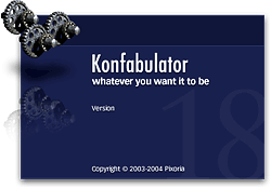 with their quality. They reminded me of why I had never been impressed with Konfabulator, although I’m sure Konfabulator’s wanting money for their product had something to do with that, too.
Also there was Yahoo! itself… a company that until the last 12 months or so had been growing more conservative, more commercial, more corporate, and less fun than the Yahoo I started loving 10 years ago. Not only that, but Yahoo appeared to be less and less friendly toward the world’s Mac-minded minority. I had grown so disenchanted with Yahoo mail that I finally gave up last summer and packed my bags for the terrific IMAP mail service called Fastmail.  So it was a bit of a surprise when Yahoo wandered into territory that originally had been 100% populated by Mac-type aliens. Clearly, the visionaries had regained some influence at the company, as other recent smart moves testify (see all the cutting edge Yahoo goodies at the Yahoo Developer Network). Microsoft probably thinks Google is worried about its recent attempts to catch up in the web services arena… but I suspect that the real competition is between Google and Yahoo. Of course, being from Mars, my instinct is to say,
“Hey fellas, it’s OK, now. You can both be great without trying to run each other into the ground. Just ignore all the media banter about battles and winners, and who Microsoft is gonna wipe off the face of the earth next. Just concentrate on what you do best: Being innovative… Imagining the unimagined… in other words, pushing that f**king envelope and finding the next paradigm to shift!”
So, when I downloaded the Yahoo Widget Engine (YWE) 3.0 in December, I was pleasantly surprised to notice that things had changed quite a bit. Setting it aside until last month, YWE 3.1, the latest release as of this writing, confirmed my first impressions. YWE widgets are now very well behaved, for the most part, and take no more system resources than Dashboard widgets do. Plus there are actually some widgets that don’t have good Dashboard counterparts.
For example, a little gem that’s been around since Konfabulator called Picture Frame does what I keep hoping iPhoto Mini will–namely, let me run a slide show from my iPhoto library inside the widget. Seems like a pretty basic need, but somehow Apple’s developers have missed out on that opportunity. The closest they’ve come is a fairly recent widget simply called Photo, which does the basics, plus adds all the groovy Core Image transitions to the mix. However, you can’t resize the widget, so you’ll miss out on the beauty of seeing your favorite shots sized to their full glory. You also can’t pause the show, which is a bummer because I often have to keep my favorite picture of Jackie beaming out at me for more than the default number of seconds. iPhoto Mini is a great widget with a lot of cool tricks, but your basic slideshow isn’t one of them.Â
Another must-have from YWE is Minty, which is the best widget for monitoring your Mint usage stats.
And in a category so saturated with good apps and widgets that you’d think there couldn’t possibly be another great idea, a YWE widget called MemoPad has won a place on my desktop. It does three things well that beats out all other widgets:
- Provides a “file cabinet” where all your sticky notes can go when you want them off the desktop
- Provides a minimized tear-off pad for your stickies that’s so small as to be unobtrusive on even the most cramped desktop, and
- Looks so much like actual sticky notes adorning your monitor screen that you may be likely to try pulling one off in a fuzzy-headed moment.
I haven’t even begun to explore YWE widgets as I’ve done with Dashboard ones, so I’m sure there are many other splendid little goodies waiting in the Yahoo widget gallery.
But finding more great widgets isn’t the only thing that’s made YWE a standard part of my desktop. What I really admire is the YWE implementation of widgets, which has firmed up my longstanding view that Apple needs to modify the Dashboard concept to make it more flexible, if they want Mac users to truly embrace widget-dom. The particular traits I admire are nothing new… they were standard in Konfabulator, and there’s one application for Mac OS X called Amnesty that will emulate the concept. I have stubbornly refused to pay the $20 that Mesa Dynamics wants for Amnesty, especially now that I use YWE, which does most of Amnesty’s tricks for free. So what exactly are those tricks?
- Run widgets like normal applications outside of Dashboard
- Easily change a widget’s “window level”–meaning, where it resides starting from the desktop itself up to a window that floats persistently above all regular windows, with several layers in between.
- Ability to lock a widget in place
- Ability to set transparency for a widget.
- Ability to access widgets–and their preferences–from a handy menubar item.
- Ability to stop and start the widget layer as the need arises.
As you can probably tell, I’m completely sold on the utility of widgets… so many of these are at least as useful as some shareware desktop apps or menu extras. But if I were using a laptop or had a 17″ monitor (or smaller), I’d be less inclined to experiment with them. I didn’t fully embrace widgets until I began running them in “developer mode,” which lets you keep your favorite ones handy… right on the desktop. (If you want to try developer mode, check out this article from MacOSXHints, or you can also get this widget to help out.)
Using developer mode requires some compromises, however, since in this mode widgets live in the top layer of your desktop window hierarchy. Unlike YWE, you can’t adjust the window level, so Apple’s widgets always run on top of anything else you’re working on (except for a screen saver). For example, if you run Aperture in full screen mode, your widgets will get in the way of Aperture’s controls…. unless you move them somewhere else.
With a 23″ Cinema Display, I’ve learned to work around this problem by carving out a slice of screen real estate for my widgets. But most Mac users don’t have the luxury of a big monitor, and this, I’m convinced, explains all the grousing about and dissing of widgets that I hear constantly. People may really like this or that particular widget, but they’re never going to take the time to explore the rapidly expanding world of widgets if they don’t like having to switch to the Dashboard layer every time they want to use one. After all, if widgets are actually replacing desktop apps or docklets or menubar items, the Dashboard actually makes those functions a click or two farther away (unless you spend most of your time in the Dashboard layer, which I doubt). Not only that, but quite often starting Dashboard takes precious seconds while you wait for the widgets you have activated to “wake up” (unless you happen to know about and are using the handy, free Dashboard Kickstart utility).Â
 Why would anyone use Dashboard for a calculator when they can summon Apple’s own desktop Calculator in one click of the Dock (or many other handy places one can store commonly used apps), or, like me, summon Quicksilver for a quick calculation? The answer is, “They won’t.” And since they won’t do that, they’re likely to dismiss the entire concept and the over 2,000 widgets that have been developed for Dashboard–many of which simply don’t have desktop equivalents, and nearly all of which are free!
No, YWE gets it right, and Apple needs to get it, too. After all, YWE runs on both Mac OS X and Windows, and we all know what percentage of the world’s desktops Windows holds, don’t we? At last count, Dashboard can claim a total of 2,088 widgets for its platform, but Yahoo! now has 2,891… having surpassed Apple and growing fast. Apple needs to keep its system competitive in features if it wants to maintain leadership in this technology. After all, you-know-who is planning to release its own widget system for Vista, and once that happens, who knows? One thing I see that Vista has right is letting users keep their widgets persistent on the desktop. As I understand it, the Microsoft way is inferior to the Yahoo! way, but it’s arguably better than the Dashboard layer alone.
Also expanding the “widget front” is Opera 9, whose users now have access to some very fine widgets thanks to Opera’s embrace of this technology. In Opera’s case, the widgets only work as long as you have Opera running, but that’s no problem if you’re an Opera user. Like YWE, Opera widgets can run on various window layers, and they share with all the other widget implementations the same open, standards-based underlying technologies. As of this writing, there are already over 400 Opera widgets! And if you think Opera developers are just trolling the same over-hunted territory where Apple and Yahoo widget developers have been, get a load of this little baby, which is one of several unique Opera widgets by Australian developer Benjamin Joffe.
In the end, I’m hoping all these widgets can coexist happily on my desktop (well, except for Microsoft’s widgets, which no doubt will only work on Windows). After all, one of the best things about widgets is that they’re just HTML, JavaScript, CSS, XML, and a few images. (Yes, they can have other things, too, some of which may be proprietary to a particular OS… but they don’t have to have anything but those basic open-standard components.) This means that if you can build a cool web page, you can build a cool widget… and there are a lot more people who can build web pages–for any platform–than can build Cocoa apps!
So a tool I’m hoping someone releases soon is a widget converter, which could convert Mac OS X widgets to run in YWE, for example, or Opera widgets to run in Dashboard. In the meantime, I’m perfectly happy to run Yahoo! Widget Engine alongside my desktop-handy Dashboard widgets. In fact, running YWE is likely to make me even more impatient to see Apple get on the ball and include a better widget system in Mac OS X 10.5, Leopard.
Automator Virtual Input: Extend Automator To Control Mouse and Keyboard
Automator Virtual Input: Take control of your mouse and keyboard via automator
 Originally downloaded 7/13/06. Now this is getting strong:really interesting. Of the three huge new Tiger innovations Apple unleashed on the world in May 2005 (Spotlight, Dashboard, Automator), Automator has been a real sleeper. Though my sense is that it wasn’t embraced immediately by a lot of Mac users, its growth in functionality and scope is perhaps even greater than Dashboard’s, and a few years from now we may look back and realize that Automator was the most revolutionary of the three. Here’s a shareware set of actions that takes Automator where previously only tools like iKey and QuicKeys could go: Deep into Applescript’s user interface controls to make them accessible to ordinary mortals. It’s also precisely the kind of tool you’d need if you really want Automator to take the next leap beyond simple actions that have to be build for each application individually. Here’s a generic set of actions that theoretically will let you do anything to any application… anything a mouse and keyboard can do, that is. You can be sure I’ll give this a try soon, and if it works as advertised, fork over my $25.
Version as tested: 1.0
Bullseye: A Radial Menu Launcher
Bullseye by Old Jewel Software
 Bullseye is, as far as I’ve been able to determine, the first commercially available implementation of “radial” or “pie” menus in a desktop application geared to everyday use. Old Jewel Software released Bullseye back in 2004, but it only came to my attention a few months ago. Perhaps it never comes up in searches for “radial menus” or “pie menus” because the site doesn’t describe its user interface that way. However, that’s indeed what Bullseye is: A Mac OS X launcher app that uses radial menus as its organizing metaphor.
After testing Bullseye, I decided to not buy it for myself, since I’ll be using Quicksilver for everything I could do with Bullseye. However, I’m including it as a recommendation because it’s such a wonderfully innovative implementation of radial menus, which have just this year captured the imagination of user interface designers after having been on the drawing board by researchers for years. In fact, in the early days of the GUI, there were some primitive implementations. Bullseye gets it quite right, however. It’s a very easy to use, quite intuitive and flexible file and application launcher that is in many ways much more useful than the Mac OS X Dock. For $8.85, it’s quite reasonably priced and definitely worth a try if you’re interested in the concept.
Most Mac users encountered radial menus for the first time when an implementation of them was added to Quicksilver earlier in 2006 via the Constellation plugin. Where that plugin acts more as a file browser in one mode or as an alternative way of inserting the “predicate” in Quicksilver “sentences” in the other, Bullseye presents users with a radial menu of all their currently running applications.
Bullseye then lets you add all of your usual Dock items to the menu if you like, and you can drag folders and apps to the menu as the spirit moves you. Folders can be browsed as in the Dock through a contextual menu. Anything added to Bullseye can be dragged off with a “poof”–again, like the Dock–or you can modify the list of “Bullseye items” in the application’s preferences.
The preferences also let you customize the look and feel of the radial menu itself and its behavior in a number of useful ways. One note of warning… After upgrading to 10.4.7 this week, I’ve found Bullseye to suddenly be prone to “not responding” without trashing the preferences file. This had not been a problem at all before then, and it’s possible the problem is due to some other system configuration changes I’ve made lately… or even to a conflict with Quicksilver, since I’ve been fooling around with Constellation lately too.
Update 2/25/07. Bullseye has morphed into Trampoline , released today as version 2.0. The price has gone up to $20, so presumably Trampoline has more functionality than Bullseye.
Liquifile: New Visual Paradigm for the Finder
Liquifile 1.0 –liquid browsing for your desktop
 OK, I’m hip… I took one look at this one and knew it was outrageous enough to be possibly useful. There have been many attempts to improve on the “find” functionality of the Finder. Lately, I’m moving more and more toward using just Quicksilver for Finder functions. But Liquifile is “designed for visual thinkers” that represents characteristics of your files and folders in visual terms. Not sure exactly what that means yet, but the developers have a video available to help “visualize” the concept. Liquifile is shareware about $10. It’s a realization of a theoretical user interface known as “liquid browsing” which grew from the demos and trials explained on the Liquid Browsing website.
Apple Uniquely Positioned To Lead Web 2.0 Charge
Tell Me One Thing You Can Do With a Mac that I Can’t Do With Windows! (Part 3)
3. Use Real Productivity Applications To Get Work Done Faster, Easier
As inventors of new tools have done throughout human history, the visionaries who designed and built the first personal computers saw them as tools that would provide an immense boost to human productivity. And they weren’t just thinking about business productivity, folks. They were also thinking of personal productivity: Getting more things done faster so we’d have more leisure time.
 Today, in our Microsoft-Windows dominated world, we use the term “productivity application” to refer to Microsoft Office, and we think of the personal computer as a business tool. (Quick: Do a Google search for that term–”productivity application”–and see what you get.) But has Microsoft Office provided us with more leisure time? Of course not. Microsoft Office is a business tool that replaced prior, non-electronic tools like the typewriter and pencil. If it has enhanced productivity at all (and that is arguable), the productivity gain has come in the form of more output per worker… not more leisure time for the individual. In any case, whatever productivity impact Microsoft Office and its ilk had on the business world was completed many years ago. Yet even for businesses, productivity didn’t stop with improving our ability to prepare reports and memos, or compile numbers in spreadsheets, or do overlays for a presentation in PowerPoint.
Productivity goes up whenever you can suddenly do a task in less time than before, either at home or at work. Since its beginnings with the original Apple computer, Apple has appeared to be pursuing a vision that steadily expands the personal computer’s potential to save you time… to do complicated things simpler. Apple’s operating system recognizes that this kind of productivity gain begins with the simplest interface to the computer: Finding things, opening applications, printing, opening documents, organizing information, and the like. As a result of this vision, Mac OS X has two built-in features that are simply lacking in Windows, and they enable “productivity” applications that are truly the envy of the Windows world:
Applescript and Application Services.
These two technologies work together to make possible software like Quicksilver, Automator, Butler, Launchbar, Proxy, iKey, and many many others that make working with applications, files, and folders on the Mac a joy rather than a headache. In fact, the web is littered with plaintive conversations among Windows users trying to find a Windows app that’s like Quicksilver or Butler. There simply aren’t any such apps. Yet on the Mac, there are numerous apps that are similar to Quicksilver, which itself is still free in its beta mode. Automator and Proxi are also free. So is the amazing Butler. Mac users love to argue amongst themselves about which is better, Quicksilver or Launchbar or Butler, when in fact they’re all simply excellent. On Windows, the options are slim and only half-baked (in that they do only a small subset of what the best Mac OS X tools do):
I’m sure there must be others, but that’s all I could find quickly. On Mac OS X, I could list literally dozens of apps that do what the Windows utilities do, plus a lot more. Quicksilver, Butler, Automator, and the others are simply the cream of the crop.
As a demonstration of this, I went to VersionTracker to compare the number of tools in this category between Windows and Mac OS X. Unfortunately, VersionTracker has no such category… they lump all of these into a “System Utilities” category. On Windows, this means “backup, defray, disk space”, and on the Mac it means “repair, customize, optimize, synchronize, backup.” Even though Windows has 95% of the market for PC’s (supposedly), it has only 1,745 items listed on VersionTracker, where Mac OS X has 949. If the proportions were true to the market share numbers, Mac OS X would have only 87 “System Utilities” apps.
But it gets even more interesting when you try to narrow this category down. I typed “Launcher” into both databases, and on Windows VersionTracker found 82 apps, yet on Mac OS X there are 90 “launcher” apps. Looking for “shortcuts”, I find 30 apps for Windows, but 28 for Mac OS X. The term “workflow” finds 38 Mac apps, 36 Windows ones. How can this be? If the apps were distributed according to market share, Windows would have 1,800 “launcher” apps, 560 “shortcuts” apps, 760 “workflow” apps, and a whopping 18,980 “system utilities.” (Who says Windows has more software?) In this one particular category, the huge difference simply demonstrates how much easier it is to write applications for the Mac that
- Launch applications, open files, and do other related tasks,
- Enable keyboard shortcuts that combine multiple steps across multiple applications into one step, and
- Design workflow systems that do even more complicated sets of inter-Application tasks much more quickly than is possibly with a manual process.
And the reason this is easier is that Apple provides the fundamental building blocks of Applescript and Application Services as part of the Mac OS X operating system.
Before I begin, let me make clear that I am no expert in either of these topics… my admiration for them comes strictly from my perspective as a Mac OS X end-user. Though I have tinkered with a few Applescripts, I have never written one from scratch. All the scripts mentioned here were obtained from the resources cited.
Applescript has been around forever, it seems… at least since I got my first Mac in 1996. (Here’s a nice, concise history of Applescript in the Mac OS.) The closest equivalent on Windows is Visual Basic, but my experience as a programmer makes clear that these are not, in fact, equivalent technologies. For one thing, Applescript is not a compiled language like Visual Basic, and it’s not reliant on process-intensive run-time libraries. More important perhaps, Applescript is designed for programming in natural language rather than machine-talk. From this excellent and very helpful comparison of the two scripting environments on xvsxp.com, here’s a brief example of what a script to display your startup volume’s free disk space looks like in each language:
Mac OS X:
tell application "Finder" to display dialog (free space of startup disk) as string
Windows XP:
Set objWmiService = GetObject("winmgmts:")
Set objLogicalDisk = objWmiService.Get("Win32_LogicalDisk.DeviceID='C:'")
WScript.Echo objLogicalDisk.FreeSpace
Now clearly, Applescript is more concise, easier to read, and easier to build other scripts from than the Windows scripting language. Perhaps this is why Applescript websites are filled to the brim with thousands of scripts, whereas Windows scripting sites such as this one offer just a handful of Visual Basic scripts. On Mac OS X, Applescript is used for inter-application communication, not so much for system administration. For that, Mac users are more likely to use the standard Unix shell scripts or Perl. The Windows Script Host (WSH) that Visual Basic communicates with works primarily at the lower level of the sysadmin rather than the higher level of the end-user.
Further, unlike Windows, which provides nothing for a budding scripter other than Notepad, Apple provides a couple of free first-class tools to help users build Applescripts: Script Editor, and Applescript Studio. These are designed to help prepare scripts of varying complexity, from a simple one-command script to a complex GUI tool that looks like any other Mac OS X application.
 In Mac OS X, you can easily make use of the incredibly huge universe of prebuilt Applescripts and related tools by turning on Apple’s context-aware “Script Menu.” Once enabled, you can fill it up with a vast array of useful productivity scripts by first visiting Apple’s own library and then, as the need arises, explore the many other third-party libraries of AppleScripts. Then, when you’re in Safari, for example, the Script Menu will display Safari-related scripts; when in Mail, mail scripts; when in iTunes, iTunes scripts; and so on. The Script Menu is always present until you turn it off, or replace it with an excellent script menu like FastScripts. Besides this system-level script, many Mac applications come with their own set of Applescripts, which they provide in a separate menu: BBEdit, Adobe Photoshop, Endo, Growl, Soundtrack, DevonThink Pro, PulpFiction, and Ovolab Phlink are just some of the ones I have open at the moment which provide Script menus of their own.
So, what are some examples of scripts I use this menu for? I knew you’d ask!
- Every day I use a script called FinderDuo that takes my jumble of Finder windows and rearranges them per my specifications into two neatly organized windows, one on top of the other. The script also opens the windows to my specified folder and view options.
- Two scripts make it easy to turn Dashboard on and off with the click of a menu item.
- I have separate scripts for Safari, Mail, BBEdit, and others that automatically position and resize the application’s front window per my specifications.
- In iTunes, I have a set of scripts that lets me rate songs from 1 to 5. The set of scripts also lets me start and stop iTunes, move to the next song, increase the volume, etc. For iTunes scripts, be sure to check out the amazing Doug’s Scripts for iTunes.
- I use a script that lets me switch to the Finder by pressing Control-F.
- There are many more, but I want to move on to the next topic, which covers another kind of script.

In addition to the Script Menu, you can attach Applescripts to file folders. The advantage of doing this takes awhile to sink in, but once it does… Woah! The possibilities are enormous for enhancing productivity. Apple provides a contextual menu that lets you enable/disable/configure Folder Action scripts for any folder on your file system. You can attach Applescripts (including Automator workflows) to do anything you can dream up. Here are some examples, which I benefit from many times every day:
- FolderOrg. This script automatically organizes any files dropped into a folder by date. It will create a folder for the date the file was added, and add any other files added on that day to the folder. It’s particularly useful for software downloads.
- Growl notification. Growl is another app that has no equivalent on Windows and could be the subject of an entire article. I use a folder action script from Growl that pops up a notification whenever a new preference file is added to my Preferences folder, or a new file is added to the Application Support folder.
- Upload Mars Images. I built this script with Apple’s Automator, and it saves me many steps in uploading images for this website. The script (1) checks to see if the added file is a PNG image, (2) renames it to lowercase and removes spaces, (3) FTP’s it to specific directories on both my test server and my production server, and (4) uses Growl to display a notification when done.
There are many other possibilities for what Windows users think of as “hot folders,” and I’m sure I’ll be expanding my use of them as time permits. On Windows, by the way, the main company that has provided this kind of functionality is Adobe. They were also the first to enable the use of “droplets” on Windows, as well as widespread use of drag and drop. All of these ideas come from Apple’s operating system, building software for which used to be Adobe’s bread and butter.
This brings me to the topic of Automator, the workflow automation tool Apple built as a new feature of Mac OS X 10.4 (”Tiger”). Automator has no equivalent on Windows whatsoever, and it really is a huge leap for improving your productivity with computer tasks. Automator is built on top of Applescript and in fact can be thought of as an “Applescript programming tool for the rest of us.” Like Applescript, Automator has in less than a year produced an entire ecosystem of websites, developers, and tools to take advantage of it. One of the coolest aspects of Automator is that it’s totally free, including nearly all of the prebuilt workflows you can download from the web. This includes the comprehensive set of Automator actions for Photoshop that Ben Long is providing on his digital photography website.

Most Mac OS X applications released these days now provide Automator actions that you can use as building blocks for a workflow. Where before an application would be “scriptable” by publishing its Applescript dictionary, it now also provides prebuilt Applescripts as Automator actions. As a result, my personal library of Automator actions has grown exponentially since Tiger was released last year (I now have 460 actions), and as the library grows, the possibilities of enabling cross-application automation grows likewise.
If you’re a Mac user and haven’t begun to play with Automator, it’s time to do so. Just pick one of these great websites and start reading, learning, and downloading:
If you’re inclined to be a bit more geeky, check out Apple’s “Working with Automator” article on its Developer website. It’s for folks who want to build actions themselves rather than folks who want to build workflows with the actions, but it’s quite informative to understand a bit about what’s going on under Automator’s “hood.”
 Every time I open Automator, I come out armed with another useful little workflow that shaves a few seconds or minutes off my workday. Those seconds and minutes add up, folks, and they are the true measure of whether an application is improving your productivity. Keep in mind that before Automator, I was never able to learn enough Applescript to write any scripts myself and was reliant on web resources and the kindness of its many Applescript gurus. With Automator, I can now build a custom workflow involving several different applications in a matter of minutes. Here are a few of the workflows I use regularly:
- Upload PNG-24. This workflow is similar to the folder action I built to move files to this website, but for a variety of reasons, I launch the workflow manually rather than automatically through folder changes. I keep the action on my Finder toolbar (see screenshot below), so all I have to do is drag the image I want to move to the toolbar icon, and this launches the workflow. The workflow connects to my Classic 45’s website and FTP’s the file to a particular folder there.
- Unmount Volumes. I built this workflow to unmount two backup partitions on my computer, and I put the workflow in my login items so it’s launched when I log in. Automator can run Unix shell scripts as well as separate Applescripts, and that’s how this one works.
- Musicstack and Froogle. For Classic 45’s, I mirror my inventory of records on both of these websites. I have a PHP script that writes my inventory into a format that works with the Froogle XML API, and that is uploadable to Musicstack through
 their web form. With Froogle, the procedure is to FTP the file to a Froogle server. These Automator workflows (1) run the appropriate PHP scripts, (2) save the resulting browser output to a file on my hard drive, (3) FTP the file to Froogle, and (4) email me a notice that the work has been completed. No more manual inventory updates for Leland! Incidentally, the way this works is through an iCal plugin. Yes, you can save your Automator workflow in various ways, one of which is a plugin to iCal. When you do, you can easily schedule the workflow through iCal. I have the Musicstack and Froogle workflows set to launch on alternating days at 9:00 in the morning. Sweet, eh?
 - Music workflows. I have a couple of workflows for handling new music recordings. In each case, I use Automator’s contextual menu in the Finder to run the workflows, which simply move the AIFF files I record in Soundtrack Pro to particular playlists in iTunes.
- Upload to Jukebox. This workflow, also launched from a Finder contextual menu, connects to a folder on .Mac and moves the file I’ve selected to it. Easier than drag-and-drop!
- Convert to PDF and Combine. Have you ever wanted to combine a bunch of text files into one PDF? I needed to do this one day, so I wrote a workflow and saved it as a Finder plugin. Now all I have to do is select the text files, click the contextual menu item, and Poof! Instant multi-document PDF.
I have more, but hopefully you get the idea. Believe me, these examples just barely scratch the surface, but take a look at the various websites linked here to get other ideas. The possible applications of Automator are literally endless, limited only by your imagination. Now, whenever I think of a way to combine some steps, I don’t have to go hunting the web for an Applescript. I just open up Automator, and 9 times out of 10, I have the actions I need to do the job. I also subscribe to Apple’s RSS feed for new Automator Action downloads as they’re published.
Despite all of its flaws, Apple gains the respect of users when it unleashes advancements in computing like Automator. It opens up enormous new doors to both developers, in devising ways to improve the functionality of their applications, and to users, in taking a fresh look at how we work. Other automation tools for the Mac helped lay the groundwork for this, and I’m still a very heavy user of iKey, for example. But Automator simply expands the automation universe in ways Apple’s customers hadn’t thought possible before.
Recently, Griffin Technologies released a free tool called Proxi that has characteristics similar to Automator. Though it’s optimized for automating Griffin’s own input devices to the Mac–like AirClick, Power-Mate, and RadioShark–it also interacts with dozens of other Mac OS X applications in very different ways. It’s promising to see Proxi released, and it’ll be interesting to see how it develops. From my perspective, Proxi is yet another example of how easy this kind of application is to build and provide for free to Mac customers nowadays.
Apple is understandably proud of both Applescript and Automator, and it’s easy to find information about them on the Apple website. The second broad technology I’ll describe in part two of this article, Application Services (”System Services”), is not so easy to find. I’ll explain why, as well as why, in spite of Apple’s reluctance to “market” them, Services are such a huge boon to Mac users’ productivity. They let us do things that are simply not possible with Windows.
OmniDazzle: Dazzle is Too Weak A Word To Describe This! Try “Awestruck”
 Don't go too much by Omni Group's slogan for this new application, which just entered public beta mode. OmniDazzle has 11 distinct functions, all having to do with the mouse, but not all having to do with losing your cursor. Some are just plain fun, others seriously silly, still others marginally useful, and one or two mind-blowingly cool and useful. I won't get into all eleven... you really have to see for yourself. It isn't too hard, either. Omni Group has provided little screencasts for each of the eleven, and then you can download the software itself to try it out. (Believe me, you won't be able to resist!) Once you do, you're in for a 12th surprise: OmniDazzle has implemented the most amazing, intuitive, dazzling, and functional preferences system you've ever seen! This is one more implementation developers are making that uses Tiger's Core Image system to stretch the bounds of user interface possibilities. Simply awesome.

I'm going to go ahead and recommend this creature without playing with it for more than 2 hours, because the feature I'm using now--which Omni calls "Focal Point" is just what I've been looking for. Focal Point draws a bright rectangle of light around the user interface object you're currently working in. If it's a form element--for example, the text box I'm typing in now--Focal Point brightly lights up that box. If it's a web browser window, then the whole window lights up. It's another example of the "Lightbox" effect that's become so popular with Ajax/DHTML web programming. Outside the bright area, the rest of the screen is dimmed... thus, the "Focal" aspect of the tool. I had previously used--and liked--a menubar widget called "Doodim", which did the same sort of thing, except it acted only on the front window, not on specific form fields within that window. But Doodim worked by a bit of Applescript wizardry that tended to be as distracting as it was useful. So far, Focal Point is just what the doctor ordered! These old eyes are growing a bit dim, and this really lights the screen up for me!

OmniDazzle has an undetermined release date, but the current beta will expire some time in July. Enjoy it while it's still free!